Comprehensive Component Library: The Syncfusion Blazor UI library includes unique components: Diagram, Smith Chart, Bullet Chart, Kanban Chart, Rating, Word Processor, Image Editor, Mention, AppBar, Speed Dial, Message, Toast, In-place Editor, Query Builder, and PowerPoint library.
Theming and Customization: Customize your Blazor application with our Fluent, Material 3, Bootstrap 5, high contrast, or dark mode themes. Additionally, our Theme Studio tool allows rich customization of these themes according to your preferences.
Performance Optimization: Syncfusion provides a CRG (custom resource group) to optimize loading performance by selectively loading specific component scripts and CSS styles as needed.
Adaptive and Touch-Friendly Design: All Syncfusion Blazor components are touch-friendly and adaptively render based on device, ensuring an optimal user experience across phones, tablets, and desktops.
Data and UI Virtualization: For large-scale applications, applicable components support data and UI virtualization, enhancing performance and scalability. This feature is available in components like DataGrid, Scheduler, and Gantt Chart.
Seamless Data Binding: Syncfusion Blazor components support seamless data binding for data-bound controls such as DataGrid, Pivot Table, Gantt Chart, and Scheduler. It includes two-way data binding for applicable component properties, enabling efficient data management.
Extensive Documentation and Demos: Access over 1,000 interactive demos, comprehensive user guide documentation, and class references to facilitate a smoother learning curve and implementation process.
Blazor FAQ - Components
SCSS, also known as Sassy CSS, is a CSS advancement that includes advanced features. It is more expressive, loads faster, uses fewer lines of code, and encourages proper rule nesting. It has all of the features of CSS and more, making it a good choice for developers to use. It is an SASS-specific file, similar to CSS, but with improved formatting.
To style your Blazor components with SCSS, follow these steps:
Create a Blazor WebAssembly application by referring to this link.
Create a new folder named TowerRange, and inside it, create TowerRange.razor, a new Blazor component, and define it as shown.
[TowerRange.razor]<div class="tower">
<div class="tower-range @BackgroundStyle"
style="height: @Height"
aria-valuenow="@CurrentValue"
aria-valuemin="0"
aria-valuemax="80">
</div>
</div>
@code
{
[Parameter]
public int CurrentValue { get; set; }
[Parameter]
public BackgroundColor Color { get; set; } = BackgroundColor.LightGrey;
public enum BackgroundColor { LightGrey, MediumGrey, DarkGrey }
private string BackgroundStyle => $"BackColor-{Color.ToString()}";
private string Height => $"{CurrentValue}%";
}Create a new SCSS file named TowerRange.scss inside the TowerRange folder and specify the style required for the TowerRange component as shown in the following.
[TowerRange.scss].tower {
width: 15px;
height: 200px;
background-color: #fff;
position: relative;
}
.tower-range {
width: 100%;
display: block;
font-family: arial;
font-size: 12px;
background-color: white;
color: #fff;
position: absolute;
bottom: 0;
}
$BackColor-LightGrey: #d4d3d2;
$BackColor-MediumGrey: #8f9194;
$BackColor-DarkGrey: #585959;
.BackColor {
&-LightGrey {
background-color: $BackColor-LightGrey;
}
&-MediumGrey {
background-color: $BackColor-MediumGrey;
}
&-DarkGrey {
background-color: $BackColor-DarkGrey;
}
}Add the following code in the Helper.scss in the Shared folder to provide custom styles for the TowerRange component’s appearance in the Index.razor main page.
[Helper.scss].marginStyle {
margin-left: 2px;
display: inline-block;
}
To combine all SCSS files, create an App.scss file in the main application and add the following code.
[App.scss]@import 'TowerRange/TowerRange';
@import 'Shared/Helper';Now, follow this link to install the Web Compiler extension and restart Visual Studio. After restarting, right-click App.css and select Web Compiler > Compile File. The compilerconfig.json file will be generated under the main application. Add the following code to the compilerconfig.json file.
  [
     {
       "outputFile": "wwwroot/css/site.css",
       "inputFile": "App.scss",
       "minify": {
         "enabled": true
       },
       "options": {
         "sourceMap": true
       }
     }
   ]
Insert the site.css file created by the Web Compiler into the index.html page.
      <head>
       …………………….
       <link href="css/site.css" rel="stylesheet" />
   </head>
To run Web Compiler during the build action (F5), install a NuGet package, or right-click compilerconfig.json and select Web Compiler > Enable compile on build, which automatically installs this NuGet package.
 <Project Sdk="Microsoft.NET.Sdk.BlazorWebAssembly">
                …………………….
                …………………….
               <ItemGroup>
                           <Content Remove="compilerconfig.json" />
               </ItemGroup>

               <ItemGroup>
                           <None Include="compilerconfig.json" />
               </ItemGroup>

               <ItemGroup>
                           <PackageReference Include="BuildWebCompiler" Version="1.12.394" />
                           <PackageReference Include="Microsoft.AspNetCore.Components.WebAssembly" Version="5.0.10"   />
                           <PackageReference Include="Microsoft.AspNetCore.Components.WebAssembly.DevServer" Version="5.0.10" PrivateAssets="all" />
                           <PackageReference Include="System.Net.Http.Json" Version="5.0.0"   />
               </ItemGroup>

   </Project>
Add the TowerRange component to the Index.razor page, as shown in the following.
@page "/"

 @using SCSS.TowerRange;

 <h1> Blazor component styling with SCSS </h1>

 <div class="marginStyle">
     <TowerRange CurrentValue="20" Color="TowerRange.BackgroundColor.DarkGrey" />
 </div>

 <div class="marginStyle ">
     <TowerRange CurrentValue="40" Color="TowerRange.BackgroundColor.MediumGrey" />
 </div>

 <div class="marginStyle ">
     <TowerRange CurrentValue="60" Color="TowerRange.BackgroundColor.LightGrey" />
 </div>
When you run the application, you will see the following output.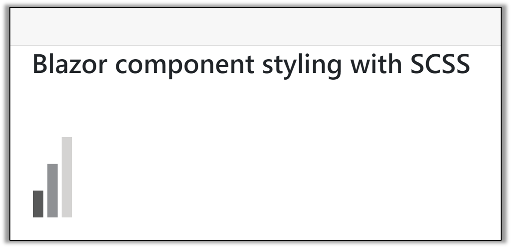

CORS stands for cross-origin resource sharing, and it is an HTTP header-based mechanism that allows the server to tell the browser whether to accept a request from a domain, port, or scheme other than its own. It is based on a process in which the browser sends a “preflight” request to the server, and the server responds with response headers indicating whether the request can proceed or not. The browser will either succeed or fail the request based on what these headers say. The browser sends headers that indicate the HTTP method and headers that will be used in the actual request in the preflight request.
To enable CORS in your Blazor Server application, follow these steps:
Create a new Blazor Server application with latest .Net support.
After creating the application, open the Program.cs file. In this file, you will find the code where the AddCors method is called on the builder.Services object to register the CORS service. Within the AddCors method, a named CORS policy called “NewPolicy” is defined using the options.AddPolicy method. If necessary, you can further configure the CORS policy by providing additional options through the builder parameter in the AddPolicy method.
[Program.cs]...builder.Services.AddCors(options => {
options.AddPolicy("NewPolicy", builder => builder.AllowAnyOrigin() .AllowAnyMethod() .AllowAnyHeader());});...
app.UseRouting();
app.UseCors("NewPolicy");
app.UseAuthorization();- AllowAnyOrigin—Allows access from any origin.
- AllowAnyMethod—Access to allow any method.
- AllowAnyHeader—Access to allow any header in a request.
Note: Call the UseCors method between the UseRouting and UseAuthorization methods.
PermalinkThe AddDefaultPolicy method allows you to add a new policy to the CORS configuration and make it the application’s default. In the Program.cs file, you can call the AddCors method to add the cross-origin resource sharing services to the service collection. To add a default policy to the configuration, you can call the AddDefaultPolicy within the AddCors method. Since you are using the default policy, there is no need to include the policy name in the UseCors method, as shown.
[Program.cs]
….

builder.Services.AddCors(options =>
{
    options.AddDefaultPolicy("NewPolicy", builder =>
     builder.AllowAnyOrigin()
                  .AllowAnyMethod()
                  .AllowAnyHeader());
});
….
app.UseRouting();
app.UseCors();
app.UseAuthorization();
The AddPolicy method allows you to add a custom policy to the CORS configuration and give it a name for identification. In the Program.cs file, to add a user-defined (custom) policy to the configuration, you can call AddPolicy within the AddCors method.
[Program.cs]
builder.Services.AddCors(options =>
{
    options.AddPolicy("NewPolicy", builder =>
     builder.WithOrigins("https://localhost:8080")
                  .AllowAnyHeader()
                  .WithMethods("GET"));
});
Then, you should call the UseCors method and pass the user-defined (custom) policy name to add the CORS middleware to the application pipeline.
[Progaram.cs]
app.UseRouting();
app.UseCors("NewPolicy");
app.UseAuthorization(); Note: Call the UseCors method between the UseRouting and UseAuthorization methods.
PermalinkTo achieve two-way binding with the Select component in Blazor, you can use the @bind directive. Here’s an example of how you can implement two-way binding with the Select component:
Razor file
@page "/"

<select @bind="selectedOption">
    <option value="option1">Option 1</option>
    <option value="option2">Option 2</option>
    <option value="option3">Option 3</option>
</select>

<p>You selected: @selectedOption</p>
@code {
    private string selectedOption = "option1";
}
Refer to this link for more details.
PermalinkBy utilizing browser storage in Blazor, you can effectively save and load data within a component. In the following example, you can see how the counter value is updated with a button click and the count value is stored in the local storage of the browser. When you refresh the page, the saved data will be loaded from the browser’s local storage.
[Index.razor]
@page "/"
@using Microsoft.AspNetCore.Components.Server.ProtectedBrowserStorage
@inject ProtectedLocalStorage LocalStorage

@if (isCount)
{
    <p>Current count: <strong>@currentCount</strong></p>
    <button class="btn btn-primary" @onclick="IncrementCount">Increment</button>
}
else
{
    <p>Loading...</p>
}

@code {
    private int currentCount;
    private bool isCount;

    protected override async Task OnAfterRenderAsync(bool firstRender)
    {
        if (firstRender)
        {
            isCount = true;
            // Get the count value into browser local storage.
            var countValue = await LocalStorage.GetAsync<int>("countValue");
            // Loaded the browser local storage value to currentCount.
            currentCount = countValue.Success ? countValue.Value : 0;
            StateHasChanged();
        }
    }

    private async Task IncrementCount()
    {
        currentCount++;
        // Set the count value in browser local storage.
        await LocalStorage.SetAsync("countValue", currentCount);
    }
}
Refer to this link for more details.
PermalinkUsing MVC in a Blazor application is not yet possible, but we have an option to migrate an existing ASP.NET MVC application to a Blazor Server application.
PermalinkTo get the page referrer of where the user came from, follow these steps:
Create a JavaScript function as a separate file in your application (~/wwwroot/interop.js).
function getPageReferrer()
  {
     return document.referrer;
 }
Add the script reference in the ~/wwwroot/index.html file of the Blazor WebAssembly application.
<script src="interop.js"></script>Invoke the JavaScript function using the IJSRuntime service in a Razor page.
 @page "/"
 @inject IJSRuntime JSRuntime
 @code {
 protected override async Task OnInitializedAsync()
 {
	var pageReferrer = await JSRuntime.InvokeAsync("getPageReferrer");
 }
 }
 View Sample in GitHub
RenderFragment is a delegate that renders a UI segment. So, it does not have an Empty state. It can be null, which is equivalent to empty in the sense that it will produce no rendered output. In the following example, see that the RenderFragments are in a null state or contain a value.
@if (childContent != null)
{
    <p>@childContent</p>
}
else
{
    <p>RenderFragment is null</p>
}

<button class="btn btn-primary" @onclick="OnButtonClick">Click</button> @*RenderFragment is null by default, click the button to update the RenderFragment*@

@code {
    private string textContent = "Welcome to your new Blazor app.";
    private RenderFragment childContent { get; set; }

    private void OnButtonClick()
    {
        childContent = BuildRenderTree => BuildRenderTree.AddContent(1, textContent);
    }
} RenderFragment is used to render components or content at run time in Blazor. The RenderFragment class allows you to create the required content or component in a dynamic manner at runtime. In the following code example, the content is created at runtime on OnInitialized.
[Index.razor]
@page "/"

@childContent

@code {
    private string textContent = "Welcome to your new Blazor app.";
    private RenderFragment childContent { get; set; }

    private RenderFragment AddContent() => builder =>
    {
        builder.AddContent(1, textContent);
    };

    protected override void OnInitialized()
    {
        childContent = AddContent();
    }
}
Refer to “ASP.NET Core Blazor templated components” for more details.
PermalinkBlazor considers each .razor file as a new component. The component class is usually written in the form of a Razor markup page. So, you can create a new component and reuse it across the application. In the following example, a Blazor component is created in the Components folder and used in the Index.razor page.
[BlazorComponent.razor]
<h1>@blazorHeader</h1>

    <div class="card card-body" style="width: 18rem;">
        <h5><b>@pageName</b></h5>
        <p>@pageDescription</p>
    </div>

    @code {
        private string blazorHeader = "Blazor App!";
        private string pageName = "Blazor Page";
        private string pageDescription = "Blazor component is created";
    }
[Index.razor]
@page "/"
@using BlazorApp1.Components

<BlazorComponent></BlazorComponent>You can use data-annotation to apply the regular expression for limiting the characters and numbers in blazor app.
In the following code, allow the char and numbers in textbox component. The RegularExpression attribute validates that the property value matches a specified regular expression.
<EditForm Model="@model" OnValidSubmit="handleSubmit">
    <DataAnnotationsValidator></DataAnnotationsValidator>
    <InputText @bind-Value="@model.Name"></InputText>
    <ValidationMessage For="()=>model.Name"></ValidationMessage>
    <button type="submit">submit</button>
</EditForm>

@code {

    private Countries model = new Countries();

    public class Countries
    {
        [Required]
        [RegularExpression(@"^[a-zA-Z0-9 ]+$", ErrorMessage = "Special characters are not accepted.")]
        public string Name { get; set; }
}In Razor, `@` symbol is used to transition from HTML to C#. To escape an ‘@‘ symbol in razor markup, use two ‘@’ (‘@@’) symbols.
<div>@@FirstName</div>The RenderTreeBuilder class will let you create required content or component in dynamic manner at runtime. In the following code example, the header Component has been created at runtime through RenderTreeBuilder.
[DynamicRenderComponent.cs]
using Microsoft.AspNetCore.Components;
using Microsoft.AspNetCore.Components.Rendering;

namespace BlazorServerApp
{
    public class DynamicRenderComponent: ComponentBase
    {
        protected override void BuildRenderTree ( RenderTreeBuilder builder )
        {
            builder.OpenElement(0, "h1");
            builder.AddContent(0, "This is Example of Dynamically Render Component");
            builder.CloseElement();
        }
    }
}
[Index.Razor]
@page "/"
@using Microsoft.AspNetCore.Components.Rendering;

<DynamicRenderComponent></DynamicRenderComponent>

@code {

}Override the ShouldRender method to suppress UI rendering. If the implementation returns true, the UI is refreshed. Initial rendering cannot be prevented using this method.
[Counter.razor]
@page "/counter"

<PageTitle>Counter</PageTitle>
<h1>Counter</h1>
<p role="status">Current count: @currentCount</p>
<button class="btn btn-primary" @onclick="IncrementCount">Click me</button>

@code {
    private int currentCount = 0;
    private bool shouldRender = true;
    private void IncrementCount()
    {
        shouldRender = false;
        currentCount++;
    }
    protected override bool ShouldRender ()
    {
        return shouldRender;
    }
} Components should be disposed properly to avoid memory leak and allow proper garbage collection. Managed resources used by the application will be disposed by the Blazor framework itself.
If a component implements IDisposable, the Dispose method will be called when the component is removed from the UI. You can use Dispose method to release unmanaged resources, unhook events, dispose DotNetObjectReference instances to avoid memory leak.
Refer to the following code sample.
@implements IDisposable
@inject IJSRuntime jsRuntime

<button class="btn btn-primary" @onclick="IncrementCount">Click me</button>

@code {

    DotNetObjectReference<HelloClass> dotNetObject { get; set; }

    protected override void OnInitialized()
    {
        dotNetObject = DotNetObjectReference.Create<HelloClass>(new HelloClass());
    }

    async Task IncrementCount()
    {
        await jsRuntime.InvokeVoidAsync("MyJavaScriptFunction", new object[] { dotNetObject });
    }

    void IDisposable.Dispose()
    {
        dotNetObject?.Dispose();
    }
}

@code{

    public class HelloClass
    {
        [JSInvokable]
        public void CustomMethod() { }
    }
}
More information about component disposal can be found here.
PermalinkIn Blazor, you can render raw HTML from a component using the MarkupString type. The MarkupString type allows you to render HTML content directly without being sanitized or escaped by the framework.
Here’s how you can use MarkupString to render raw HTML in a Blazor component:
@((MarkupString)RawString)

@code {
    public string RawString = "<span style='color:red'>Blazor is awesome</span>";
}You can use the IDisposable interface to invoke the Dispose event when a page navigation occurs or when a page is being closed. Below is a code example for your reference.
@page "/"

@implements IDisposable;

<h1>Hello, world!</h1>

Welcome to your new app.

@code {

    public void Dispose()
    {

    }
}Blazor applications are based on components. A component in Blazor is an element of UI, such as a page, input, and dialogs. The component class is usually written in the form of a Razor markup page with a .razor file extension. Components in Blazor are formally referred to as Razor components.
You can render the component at runtime using RenderFragment. The RenderFragment class allows you create the required content or component in a dynamic manner at runtime. In the following code example, the Input text Component is created at runtime on button click.
<div id="component-container">
    @DynamicRender
</div>

<button @onclick="RenderComponent">Dynamic Component</button>

@code {

    private RenderFragment DynamicRender { get; set; }

    private RenderFragment CreateComponent() => builder =>
    {
        builder.OpenComponent(0, typeof(TextBox));
        builder.AddAttribute(1, "Title", "Enter your text");
        builder.CloseComponent();
    };
}
[TextBox.razor]
<input placeholder="@Title" />

@code {

    [Parameter]
    public string Title { get; set; }
}You can create custom components in Blazor and reuse them across the application. You can also create a razor component in a shared or custom folder, and define it. Then, the custom component like HTML tag (FileName) can be used in the application.
[HeaderComponent.razor]

@using System.Globalization

<h1 style="font-weight:@fontweight !important">@_headingText</h1>

<form>
<div>
     <input type="checkbox" id="fontweight"
               @bind="bold" />
      <label class="form-check-label"
               for="italicsCheck">Use Bold</label>
</div>

<button type="button" class="btn btn-primary" @onclick="UpdateHeading">
        Update Font</button>
</form>

@code {
    private static TextInfo _tinfo = CultureInfo.CurrentCulture.TextInfo;
    private string _headingText =
        _tinfo.ToTitleCase("welcome to blazor!");
    private string _headingFontStyle = "normal";
    private bool bold = false;
    private int fontweight = 500;
    public void UpdateHeading()
    {
        //weight = 900;
        fontweight = bold ? 900 : 500;
    }
}
//parent component
[index.razor]

@page "/"

<h1>Hello, world!</h1>

Welcome to your new app.

<SurveyPrompt Title="How is Blazor working for you?" />

<HeaderComponent />
In the above example, the header component is used in the index page. Similarly, the component can be shared across the application as a HTML tag to improve code reusability.
PermalinkWe can define specific instances for custom components by using @ref while defining the component in a Razor file.
In this sample, we have created the component reference for the card components with specific names. Using this reference, we can access the card component properties and modify them. Here we have changed the display property using the component reference.
[Card.razor]
<div class="card mb-3 @display" style="width: 18rem;">
 <div class="card-body">
      @ChildContent
 </div>
</div>

@code {
    string display = "";

    [Parameter]
    public RenderFragment ChildContent { get; set; }

    public void setVisible(bool visible)
    {
        if (visible)
        {
            display = "";
        }
        else
        {
            display = "d-none";
        }
    }
}
[index.razor]
@page "/"
<Card @ref="MyCardControl1">First Card</Card>
<Card @ref="MyCardControl2">Second Card</Card>
<button class="btn btn-primary" @onclick="Hide">Hide card</button>
<button class="btn btn-primary" @onclick="Show">Show card</button>
<button class="btn btn-primary" @onclick="Hide2">Hide card2</button>
<button class="btn btn-primary" @onclick="Show2">Show card2</button>
@code {
Card MyCardControl1;
Card MyCardControl2;
private void Hide()
{
MyCardControl1.setVisible(false);
}
private void Show()
{
MyCardControl1.setVisible(true);
}
private void Hide2()
{
MyCardControl2.setVisible(false);
}
private void Show2()
{
MyCardControl2.setVisible(true);
}
}To use HTML5 Canvas in Blazor, you can follow these steps:
1.Add the necessary HTML markup for the Canvas element in your Blazor component. For example:
<canvas id="myCanvas"></canvas> Here’s an example of using HTML5 Canvas in a Blazor component:
[Index.razor]
@page "/"
@inject IJSRuntime JSRuntime
<h1>Canvas Demo</h1>
<canvas id="myCanvas"></canvas>

@code {
    protected override async Task OnAfterRenderAsync ( bool firstRender )
    {
        if (firstRender)
        {
            await JSRuntime.InvokeVoidAsync("canvasInterop.setupCanvas");
        }
    }
}
2.Add the following script source to [_Host.cshtml/_Layout.cshtml/index.html].
<script>
    window.canvasInterop = {
		setupCanvas: function () {
			var canvas = document.getElementById("myCanvas");
            var context = canvas.getContext("2d");
            // Perform various operations on the canvas using the context object
            // Example: Draw a rectangle
            context.fillStyle = "red";
            context.fillRect(10, 10, 100, 100);
        }
    };
</script>To load a dialog on demand in Blazor, we can create a modal dialog with a conditional attribute (@if). We can load the dialog in the HTML page by using the conditional attribute, which will render based on the Boolean property.
In the following code, we render the dialog on a button-click event in which the ShowPopup property will be set as true and the dialog will be shown on the page. We can remove the dialog by setting the ShowPopup property as false.
[index.razor]

@page "/"

@using BlazorApp.Data
@inject WeatherForecastService ForecastService

<h3>Dialog</h3>
<button class="btn btn-primary"
        @onclick="OpenDialog">
    Open Dialog
</button>
@if (ShowPopup)
{
    <!-- This is the popup to create or edit a forecast -->
    <div class="modal" tabindex="-1" style="display:block" role="dialog">
        <div class="modal-dialog">
            <div class="modal-content">
                <div class="modal-header">
                    <h3 class="modal-title">Modal Dialog</h3>
                    <!-- Button to close the popup -->
                    <button type="button" class="close"
                            @onclick="ClosePopup">
                        <span aria-hidden="true">X</span>
                    </button>
                </div>
                <!-- Edit form for the current forecast -->
                <div class="modal-body">
                    <input class="form-control" type="text"
                           placeholder="Celsius forecast"
                           @bind="forecasts[0].TemperatureC" />
                    <input class="form-control" type="text"
                           placeholder="Summary"
                           @bind="forecasts[0].Summary" />
                    <br />
                    <!-- Button to save the forecast -->
                    <button class="btn btn-primary"
                            @onclick="Save">
                        Save
                    </button>
                </div>
            </div>
        </div>
    </div>
}
@code {

    private WeatherForecast[] forecasts;

    protected override async Task OnInitializedAsync()
    {

        forecasts = await ForecastService.GetForecastAsync(DateTime.Now);
    }
    bool ShowPopup = false;
    void OpenDialog()
    {
        // Open the Popup
        ShowPopup = true;
    }
    void ClosePopup()
    {
        // closes the Popup
        ShowPopup = false;
    }
    void Save()
    {
        //closes dialog after the save execution
        ShowPopup = false;
    }
}Blazor automatically refreshes the component for event updates and UI updates. However, there are some cases where we need to re-render a component while updating asynchronously. In that case, we need to call the StateHasChanged() method to re-render the component
PermalinkWe can get child component values in the parent component by creating a reference to the child component using the @ref directive in the Parent component. Using the reference instance, you can access the child component values in the parent.
In the following example, textbox refers to the TextBoxComponent (child component) instance. Using textbox, we can access the properties and values in the Parent component.
[TextBoxComponent.razor]

<div class="form-group row mb-2">
    <label class="col-md-3 col-form-label"
           for="Name">@FieldName</label>
        <div class="col-md7">
            <input class="form-control"
                   type="text"
                   placeholder="@FieldName" value="@Value" @oninput="OnValueChanged" maxlength="@MaxLength" />
        </div>
    </div>

    @code {
        [Parameter]
        public string Value { get; set; }

        [Parameter]
        public string FieldName { get; set; }

        [Parameter]
        public int MaxLength { get; set; } = -1;

        [Parameter]
        public EventCallback<string> ValueChanged { get; set; }

        string LengthString;
        int TextLength;

        protected override void OnInitialized()
        {
            TextLength = Value.Length;
            LengthString = (MaxLength == -1) ? "Unlimited" : MaxLength.ToString();
        }

        private Task OnValueChanged(ChangeEventArgs e)
        {
            Value = e.Value.ToString();
            TextLength = Value.Length;
            return ValueChanged.InvokeAsync(Value);
        }
    }
[Parent.razor]

@page "/parent"

<TextBoxComponent @ref="textbox" @bind-Value="name" FieldName="Name" MaxLength="20" />
<TextBoxComponent @bind-Value="address" FieldName="Address" />
<button @onclick="Click">Click </button>
@code {
    TextBoxComponent textbox;
    string name = "Rafael Nadal";
    string address = "New York";
    private void Click()
    {
        var fNme = textbox.FieldName;
        var maxLen = textbox.MaxLength;
    }
}
We can specify what event the bind attribute should use to handle updating the value. But, in components, we need to define the event in the child component, for example, the oninput event on the child component, which triggers a method to update the value and invokes the ValueChanged EventCallback. The parent component has also been updated to use bind-Value when passing its Value parameter to the child component.
In the sample, we’re able to type in the text box on the parent component, both the values will be updated on every input change since we have bound the oninput event.
[CustomInput.razor]

<input value="@Value" @oninput="@OnInputChange" />
<h4>Welcome to Blazor Application, @Value</h4>

@code {
    [Parameter]
    public string Value { get; set; }

    [Parameter]
    public EventCallback<string> ValueChanged { get; set; }
    private async Task OnInputChange(ChangeEventArgs args )
    {
        Value = (string)args.Value;
        await ValueChanged.InvokeAsync(Value);
    }
}
[Index.razor]

@page "/"

<CustomInput @bind-Value="@InputValue" @bind-Value:event="ValueChanged"></CustomInput>

@code {
       public string InputValue = "Example";
}
The @key directive is important when creating components dynamically by iterating list/IEnumerable. Adding the @key will ensure proper change detection and UI update in the collection of components.
Reference link: https://blazor-university.com/components/render-trees/optimising-using-key/
PermalinkTo create a reference for dynamically generated components in Blazor, use the dictionary to create the reference for dynamically created elements at runtime.
[index.razor]

@page "/"

@foreach (var id in identifiers)
{
    <button @ref="myComponents[id]" @onclick="onclick">@id</button>
}

@code {
    private List<string> identifiers = new List<string> { "Button1", "Button2", "Button3" };
    private Dictionary<string, ElementReference> myComponents = new Dictionary<string, ElementReference>();
    private void onclick(MouseEventArgs args)
    {
        var d = myComponents;
        var a = args;
    }
}To disable a button in Blazor after it is clicked, set the disabled property to true for the button element by binding the property. In the sample, the disabled property of a button element is set to true on button click.
<button class="btn btn-primary" disabled=@IsTaskRunning @onclick="Clicked" > @ButtonName</button>

@code {

    bool IsTaskRunning = false;
    string ButtonName = "Click Me";
    async void Clicked()
    {
        IsTaskRunning = true;
        ButtonName = "Disabled";
        await OnButtonClick();

        //IsTaskRunning = false; use this to enable the button after the button click function executed
        StateHasChanged();
    }

    Task OnButtonClick()
    {
        //here user can perform buton click function
        return Task.Delay(6000);
    }

}
We can create elements dynamically in server-side Blazor applications by following this example.
@page "/render-fragment"

<button type="button" @onclick="@RenderComponent">
    Trigger rendering
</button>

@DynamicFragment


@code {
    private string dynamicContent = "This is a long text...";
    private RenderFragment DynamicFragment;

    private RenderFragment CreateComponent() => builder =>
    {
        dynamicContent = dynamicContent.Replace("long", "long long");

        builder.OpenElement(1, "p");
        builder.AddContent(2, dynamicContent);
        builder.CloseElement();
    };

    private void RenderComponent()
    {
        DynamicFragment = CreateComponent();
    }
}
Reference link
https://learn-blazor.com/pages/dynamic-content/
PermalinkWhen creating a cascading value, specify the name attribute in the CascadingValue component. Then specify the name in the child component.
Parent component
@page "/cascading"

<CascadingValue Value="@Id" Name="EmpId">
	<CascadingValue Value="@Name" Name="EmpName">
    	<CascadingChild></CascadingChild>
	</CascadingValue>
</CascadingValue>

@code{
	int Id = 1;
	string Name = "Test";
}
Child component
<p>Employee Id:@EmployeeId </p>
<p>Employee Name:@EmployeeName </p>

@code{
	[CascadingParameter(Name = "EmpId")]
	private int EmployeeId { get; set; }
	[CascadingParameter(Name = "EmpName")]
	private string EmployeeName { get; set; }
}
Reference link
https://chrissainty.com/understanding-cascading-values-and-cascading-parameters/
Permalink Templated components are often generically typed. To define a generic component, use the @typeparam directive to specify type parameters
Generic template component
@typeparam TItem

<table class="table">
    <thead>
<tr>@TableHeader</tr>
    </thead>
    <tbody>
        @foreach (var item in Items)
        {
            <tr>@RowTemplate(item)</tr>
        }
    </tbody>
    <tfoot>
        <tr>@TableFooter</tr>
    </tfoot>
</table>

@code {
    [Parameter]
    public RenderFragment TableHeader { get; set; }

    [Parameter]
    public RenderFragment<TItem> RowTemplate { get; set; }

    [Parameter]
    public RenderFragment TableFooter { get; set; }

    [Parameter]
    public IReadOnlyList<TItem> Items { get; set; }
}
When using generically typed components, the type parameter is inferred if possible.
<GenericTemplate Items="@forecasts">
    <TableHeader>
        <th>Date</th>
        <th>Temp. (C)</th>
        <th>Temp. (F)</th>
        <th>Summary</th>
    </TableHeader>
    <RowTemplate Context="forecast">
        <td>@forecast.Date.ToShortDateString()</td>
        <td>@forecast.TemperatureC</td>
        <td>@forecast.TemperatureF</td>
        <td>@forecast.Summary</td>
    </RowTemplate>
</GenericTemplate>
@code {
    private WeatherForecast[] forecasts;

    protected override async Task OnInitializedAsync()
    {
        forecasts = await ForecastService.GetForecastAsync(DateTime.Now);
    }
}
Otherwise, the type parameter must be explicitly specified using an attribute that matches the name of the type parameter. In the following example, TItem=" WeatherForecast "specifies the type.
<GenericTemplate Items="@forecasts" TItem="WeatherForecast">
    <TableHeader>
        <th>Date</th>
        <th>Temp. (C)</th>
        <th>Temp. (F)</th>
        <th>Summary</th>
    </TableHeader>
    <RowTemplate Context="forecast">
        <td>@forecast.Date.ToShortDateString()</td>
        <td>@forecast.TemperatureC</td>
        <td>@forecast.TemperatureF</td>
        <td>@forecast.Summary</td>
    </RowTemplate>
</GenericTemplate>

@code {
    private WeatherForecast[] forecasts;

    protected override async Task OnInitializedAsync()
    {
        forecasts = await ForecastService.GetForecastAsync(DateTime.Now);
    }
}
Reference: https://docs.microsoft.com/en-us/aspnet/core/blazor/templated-components?view=aspnetcore-3.1
PermalinkTo pass values from a child to a parent component, see the following.
Parent component
[Parent.razor]
@page "/ParentComponent"

<h1>Parent Component</h1>

<ChildComponent @bind-Password="_password" />

@code {
    private string _password;
 }
Child component
[ChildComponent.razor]
<h1>Child Component</h1>

Password:

<input @oninput="OnPasswordChanged"
       required
       type="@(_showPassword ? "text" : "password")"
       value="@Password" />

<button class="btn btn-primary" @onclick="ToggleShowPassword">
    Show password
</button>
@code {
    private bool _showPassword;
    [Parameter]
    public string Password { get; set; }
    [Parameter]
    public EventCallback<string> PasswordChanged { get; set; }

    private Task OnPasswordChanged(ChangeEventArgs e)
    {
        Password = e.Value.ToString();

        return PasswordChanged.InvokeAsync(Password);
    }
    private void ToggleShowPassword()
    {
        _showPassword = !_showPassword;
    }
}
Reference link: https://docs.microsoft.com/en-us/aspnet/core/blazor/data-binding#child-to-parent-binding-with-chained-bind
PermalinkWhen a cascading value is changed, the new value will be sent down the component tree and all components that use it will be updated. Therefore, Blazor has to keep a watch on the value continuously. This takes up resources and, in a large application, could end up causing performance issues.
If the cascading value will never change, we can stop keeping watch continuously. There is a IsFixed parameter in the CascadingValue component. It is set to false by default but if set it to true, Blazor will not monitor it for changes.
<CascadingValue Value="@Id" Name="EmpId" IsFixed="true">
	<CascadingValue Value="@Name" Name="EmpName" IsFixed="true">
    	<CascadingChild OnNameChange="@ChangeName"></CascadingChild>
    	<CascadingChild1></CascadingChild1>
	</CascadingValue>
</CascadingValue>
Reference link: https://chrissainty.com/understanding-cascading-values-and-cascading-parameters/
PermalinkThe cascading values can be updated using an event, as in the following example.
Parent component
@page "/cascading"

<CascadingValue Value="@Id" Name="EmpId">
	<CascadingValue Value="@Name" Name="EmpName">
    	<CascadingChild OnNameChange="@ChangeName"></CascadingChild>
    	<CascadingChild1></CascadingChild1>
	</CascadingValue>
</CascadingValue>

@code {
	int Id = 1;
	string Name = "Test";
	private void ChangeName(string newName)
	{
    	Name = newName;
    	StateHasChanged();
	}
}
CascadingChild.razor
<p>Employee Id:@EmployeeId </p>
<p>Employee Name:@EmployeeName </p>

<button @onclick="@ChangeName">Change Name</button>

@code {
	[CascadingParameter(Name = "EmpId")]
	private int EmployeeId { get; set; }
	[CascadingParameter(Name = "EmpName")]
	private string EmployeeName { get; set; }

	[Parameter] Action<string> OnNameChange { get; set; }

	private void ChangeName()
	{
    	OnNameChange?.Invoke("Test2");
	}
}
CascadingChild1.razor
<p>Employee Id:@EmployeeId </p>
<p>Employee Name:@EmployeeName </p>

@code {
[CascadingParameter(Name = "EmpId")]
private int EmployeeId { get; set; }
[CascadingParameter(Name = "EmpName")]
private string EmployeeName { get; set; }
}
Reference link
https://chrissainty.com/understanding-cascading-values-and-cascading-parameters/
PermalinkIf the parameter name and component name are same, don’t change the parameter name. Otherwise you will get this error.
Change the file and keep the parameter name the same. It will work now.
PermalinkBlazor will look at the type of the EmployeeId and EmployeeName parameters and try to find cascading values that match. In this case, EmployeeId will match Id and EmployeeName will match Name.
Parent component
@page "/cascading"

<CascadingValue Value="@Id">
	<CascadingValue Value="@Name">
    	<CascadingChild></CascadingChild>
	</CascadingValue>
</CascadingValue>

@code {
	int Id = 1;
	string Name = "Test";
}
Child component
<p>Employee Id:@EmployeeId </p>
<p>Employee Name:@EmployeeName </p>

@code {
	[CascadingParameter]
	private int EmployeeId { get; set; }
	[CascadingParameter]
	private string EmployeeName { get; set; }
}
When passing multiple parameters, you must identify which one is which. There are two ways of identifying cascading parameters:
- By Type
- By Name
Cascading values and parameters are used to pass a value from a component to all its descendants without having to use traditional component parameters. Blazor comes with a special component called CascadingValue. This component allows whatever value is passed to it to be cascaded down its component tree to all of its descendants. The descendant components can then choose to collect the value by declaring a property of the same type, decorated with the [CascadingParameter] attribute.
Parent component
@page "/cascading"

<CascadingValue Value="@Name">
	<CascadingChild></CascadingChild>
</CascadingValue>
@code {
	string Name = "Steve";
}
Child component
<p>Employee Name:@Name </p>
@code {
	[CascadingParameter]
	private string Name { get; set; }
 }
Reference link:https://chrissainty.com/understanding-cascading-values-and-cascading-parameters/
PermalinkThe better solution is to invoke the method in the set value of the parameter.
@code {

    string _myString;
    [Parameter]
    public string MyString
    {
        get {return _myString; }
        set {
            _myString = value;
            this.ValueChange();
        }

    }

    private void ValueChange()
    {
        Console.WriteLine("Parameter value has changed");
    }
}
You can also override the OnParameterSet or OnParameterSetAsync lifecycle methods. Those methods are triggered every time any parameter value changes.
@code
{
    [Parameter]
    protected string MyString {get;set;}

    protected override void OnParametersSet()
    {
        this.ValueChange();
    }
    private void ValueChange()
    {
        Console.WriteLine("Parameter value has changed");
    }
}You have to access the DOM elements in OnAfterRender or OnAfterRenderAsync of the Blazor component lifecycle.
[JS Helper]
window.methods = {
    accessDOM: function () {
        // access DOM here
        $(".btn").text();
    }
}
[Razor]
@inject IJSRuntime JSRuntime

<button type="button" class="btn btn-primary">Submit</button>
@code{
    protected override void OnAfterRender(bool firstRender)
    {
        base.OnAfterRender(firstRender);
        JSRuntime.InvokeAsync<object>("methods.accessDOM");
    }
}
Have a look at the Blazor component lifecycle for more information.
PermalinkInstantiating a custom component at compile time is in the development phase in Blazor.
You can track the thread Allow custom component instantiation for more information.
PermalinkYou have to include the library at the root-level _Imports.razor file through the @using directive.
@using MyComponentLibThe component instance filed is populated along with the component after rendering completion. You must access the component instance in the OnAfterRenderAsync or OnAfterRender methods of the Blazor lifecycle.
@page "/"

 <Counter IncrementValue="10" @ref="counter"></Counter>

 @code {

     private Counter counter;

     protected override void OnAfterRender()
     {
         base.OnAfterRender();
         counter.increase(); //access counter instance here
     }
} Component references are used to invoke methods from underlying components. Use the ref attribute for a component and define it filed with the same name and same type of component.
 @page "/"

 <Counter IncrementValue="10" @ref="counter"></Counter>

 @code {

     private Counter counter;

 }
While the Counter component is rendered, the field counter is populated along with the component instance.
For more information, refer to the link capture-references-to-components.
PermalinkThis is a known issue with Mono Runtime when Blazor runs on client.
Issue tracker: WebAssembly: Missing Timezone implementation
As a workaround, you can use the library Toolbelt.Blazor.TimeZoneKit.
PermalinkGenerally, we are using lambda expressions to create DOM elements dynamically like in the following code snippet.
<div class="buttons">
     @for (int i = 0; i < 5; i++)
     {
         <button type="button" class="btn btn-primary" onclick="@((e) => ButtonClicked(i))">Button @i</button>
     }
</div> You have to include local variables while rendering the button element to properly get the index value of the clicked button element.
<div class="buttons">
     @for (int i = 0; i < 5; i++)
     {
         var index = i;
         <button type="button" class="btn btn-primary" onclick="@((e) => ButtonClicked(index))">Button @i</button>
     }
 </div>
@code {
private void ButtonClicked(int index)
{
Console.WriteLine("Button clicked with index:" + index);
}
} The Web Compiler Visual Studio extension is used to compile the SASS files into CSS without having to install NPM or GULP.
Go through the blog Get Some Sass Into Your Blazor App to see how to configure and style Blazor components using SASS.
PermalinkThe RenderFragment is used to create a component dynamically.
 @page "/"

 @CreateDynamicComponent();
 @code {
     RenderFragment CreateDynamicComponent() => builder =>
     {
         builder.OpenComponent(0, typeof(SurveyPrompt));
         builder.AddAttribute(1, "Title", "Some title");
         builder.CloseComponent();
     };
} 

Share with
Couldn't find the FAQs you're looking for?