WinUI ComboBox - Feature-Rich and Editable ComboBox
- Select multiple items at once and display them with delimiters.
- Use the rich feature set: autocompletion, checkbox selection, searching, filtering, watermark text, and appearance customization.
- Select items quickly by typing them.
Trusted by the world’s leading companies

Overview
The WinUI ComboBox control (multiselect combobox) is a selection component that allows users to type a value or choose an option from a list of predefined options. It has many features, such as data binding, multiple selection with checkboxes, editing, searching, filtering, UI customization, and custom templates.
Selection
Select an item or multiple items from the dropdown.

Single selection
Select a single item from the dropdown list.

Multiple selection
Select more than one item from the dropdown list. Checkboxes can be used to select items.
Multiple selection display
Display multiple selected items with token representation or simply divide them with a delimiter character.

Delimiters
Customized delimiters separate the selected items displayed in a multiple-select ComboBox. (e.g.: ‘-‘ as a delimiter character.)

Tokens
Customizable token representation allows users to remove an item with its close button.
Editable and non-editable modes
The ComboBox control supports both editable and non-editable modes for selecting items.
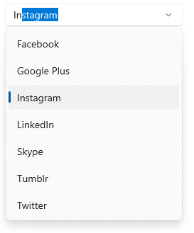
Editable mode
Edit the text in the text box. Suggestions will be shown in the dropdown list based on the input.

Non-editable mode
Items can be selected from the dropdown list, but the selected items cannot be edited.
Searching
The first item that fits the user input is highlighted in the dropdown list.

Filtering
Filter the items in the dropdown based on the starting text or on whether they contain specific text.

Start with
Filter the matching items to show those that start with the input text.

Contains
Filter the matching items to show those containing input characters anywhere in them.

Custom filter
Apply your own filter logic to display custom filtered items. E.g., in the previous image, the ComboBox filtered the cities based on the country name.
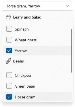
Grouping
Group data items in the dropdown.
Highlighting search text
Highlight the first occurrence or all occurrences matching the search text. This feature makes it easy to select items from the dropdown list.
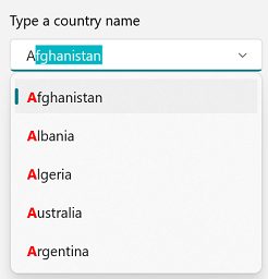
First occurrence
The search text is highlighted where it appears for the first time.
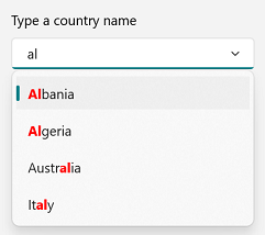
All occurrences
Highlight all occurrences of the search text.
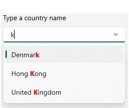
Matched
Highlight the characters that match the search text.

Unmatched
Highlight the characters that do not match the search text in the dropdown.
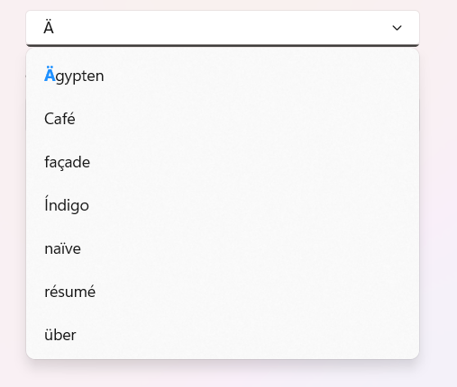
Diacritic-aware selection
Select exact items when an umlaut character is provided.
Leading and trailing views
Add a template before and after the selection area.

Leading view
Add a template before the selection area.

Trailing view
Add a template after the selection area.

Add leading and trailing views
The leading view and trailing view can be added at the same time.
Watermarks
Display hints using watermark text when no item is selected.

Display null value
Null value is supported when the selected item is cleared.
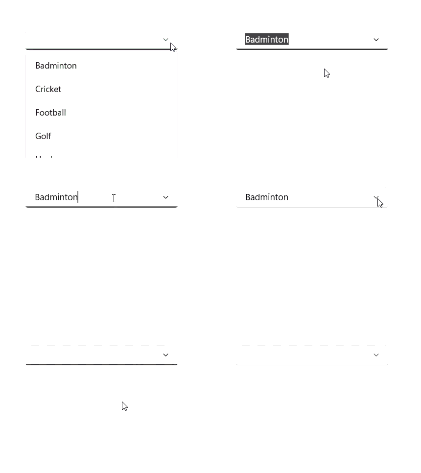
No result found
Display text indicating there are no search results found.

Data binding
Data-binding support works for all popular data sources and displays data based on display member. It automatically generates items from a data-bound collection. The application can be designed in the MVVM pattern.

Appearance

Selection box UI
Customize the appearance of the selection box.

Conditional styling
Customize the appearance of dropdown list items based on the data.
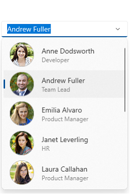
Dropdown item customization
Dropdown list items can be customized with an image or custom control.

Auto-append UI
The ComboBox control provides an auto-append UI like Windows 11 with text selection and auto-appended text with a faded text color.
Syncfusion WinUI DataViz & UI Controls
Build Document Workflows in WinUI
Integrate robust document processing libraries into your WinUI applications to create smooth document experiences. Empower users to work with documents seamlessly while developers automate document creation, processing, and management behind the scenes.
Our Customers Love Us


Awards
Greatness—it’s one thing to say you have it, but it means more when others recognize it. Syncfusion® is proud to hold the following industry awards.


