SCSS, also known as Sassy CSS, is a CSS advancement that includes advanced features. It is more expressive, loads faster, uses fewer lines of code, and encourages proper rule nesting. It has all of the features of CSS and more, making it a good choice for developers to use. It is an SASS-specific file, similar to CSS, but with improved formatting.
To style your Blazor components with SCSS, follow these steps:
-
Create a Blazor WebAssembly application by referring to this link.
-
Create a new folder named TowerRange, and inside it, create TowerRange.razor, a new Blazor component, and define it as shown.
[TowerRange.razor]
 <div class="tower">
       <div class="tower-range @BackgroundStyle"
            style="height: @Height"
            aria-valuenow="@CurrentValue"
            aria-valuemin="0"
            aria-valuemax="80">
       </div>
   </div>

   @code
   {
       [Parameter]
       public int CurrentValue { get; set; }

       [Parameter]
       public BackgroundColor Color { get; set; } =   BackgroundColor.LightGrey;

       public enum BackgroundColor { LightGrey, MediumGrey, DarkGrey }

       private string BackgroundStyle => $"BackColor-{Color.ToString()}";

       private string Height => $"{CurrentValue}%";
} -
Create a new SCSS file named TowerRange.scss inside the TowerRange folder and specify the style required for the TowerRange component as shown in the following.
[TowerRange.scss]
   .tower {
       width: 15px;
       height: 200px;
       background-color: #fff;
       position: relative;
   }

   .tower-range {
       width: 100%;
       display: block;
       font-family: arial;
       font-size: 12px;
       background-color: white;
       color: #fff;
       position: absolute;
       bottom: 0;
   }

   $BackColor-LightGrey: #d4d3d2;
   $BackColor-MediumGrey: #8f9194;
   $BackColor-DarkGrey: #585959;

   .BackColor {
       &-LightGrey {
           background-color: $BackColor-LightGrey;
       }

       &-MediumGrey {
           background-color: $BackColor-MediumGrey;
       }

       &-DarkGrey {
           background-color: $BackColor-DarkGrey;
       }
} -
Add the following code in the Helper.scss in the Shared folder to provide custom styles for the TowerRange component’s appearance in the Index.razor main page.
[Helper.scss]
  .marginStyle {
       margin-left: 2px;
       display: inline-block;
   }
-
To combine all SCSS files, create an App.scss file in the main application and add the following code.
[App.scss]
  @import 'TowerRange/TowerRange';
@import 'Shared/Helper'; -
Now, follow this link to install the Web Compiler extension and restart Visual Studio. After restarting, right-click App.css and select Web Compiler > Compile File. The compilerconfig.json file will be generated under the main application. Add the following code to the compilerconfig.json file.
  [
     {
       "outputFile": "wwwroot/css/site.css",
       "inputFile": "App.scss",
       "minify": {
         "enabled": true
       },
       "options": {
         "sourceMap": true
       }
     }
   ]
-
Insert the site.css file created by the Web Compiler into the index.html page.
      <head>
       …………………….
       <link href="css/site.css" rel="stylesheet" />
</head> -
To run Web Compiler during the build action (F5), install a NuGet package, or right-click compilerconfig.json and select Web Compiler > Enable compile on build, which automatically installs this NuGet package.
 <Project Sdk="Microsoft.NET.Sdk.BlazorWebAssembly">
                …………………….
                …………………….
               <ItemGroup>
                           <Content Remove="compilerconfig.json" />
               </ItemGroup>

               <ItemGroup>
                           <None Include="compilerconfig.json" />
               </ItemGroup>

               <ItemGroup>
                           <PackageReference Include="BuildWebCompiler" Version="1.12.394" />
                           <PackageReference Include="Microsoft.AspNetCore.Components.WebAssembly" Version="5.0.10"   />
                           <PackageReference Include="Microsoft.AspNetCore.Components.WebAssembly.DevServer" Version="5.0.10" PrivateAssets="all" />
                           <PackageReference Include="System.Net.Http.Json" Version="5.0.0"   />
               </ItemGroup>

   </Project>
-
Add the TowerRange component to the Index.razor page, as shown in the following.
@page "/"

 @using SCSS.TowerRange;

 <h1> Blazor component styling with SCSS </h1>

 <div class="marginStyle">
     <TowerRange CurrentValue="20" Color="TowerRange.BackgroundColor.DarkGrey" />
 </div>

 <div class="marginStyle ">
     <TowerRange CurrentValue="40" Color="TowerRange.BackgroundColor.MediumGrey" />
 </div>

 <div class="marginStyle ">
     <TowerRange CurrentValue="60" Color="TowerRange.BackgroundColor.LightGrey" />
 </div>
When you run the application, you will see the following output.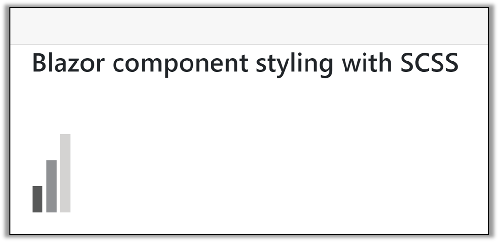


Share with