Trusted by the world’s leading companies

Overview
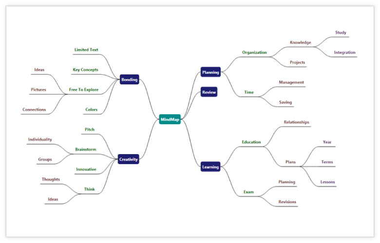
The UWP Diagram control allows users to quickly create and edit flowcharts, organizational charts, UML diagrams, swim lane charts, mind maps, floor plans, and more within their applications.
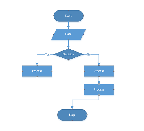
Flowchart
The UWP Diagram control provides all the standard flowchart shapes as ready-made objects to build flowcharts, making it is easy to add them to a diagram surface in a single call.
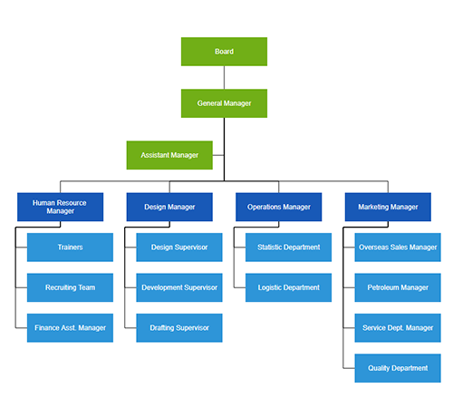
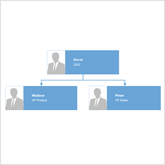
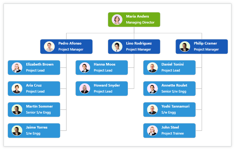
Organizational chart
Built-in automatic layout algorithm specifically made for organizational charts to arrange the parent and child node positions automatically.
High Performance
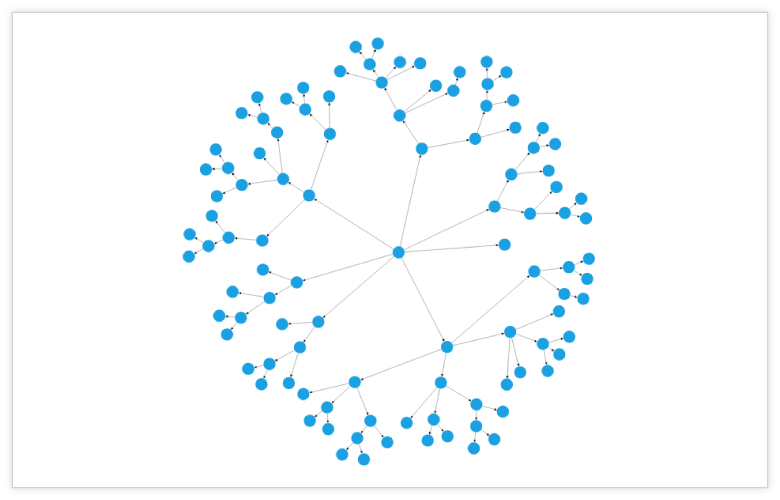
Quickly load large diagrams using UI-virtualization techniques, which selectively loads only the objects that lie within the viewport area. Smooth scrolling performance is achieved using a built-in spatial search algorithm that builds an index based on the element position.

Nodes
Visualize any graphical object using nodes, which can also be arranged and manipulated on a diagram page.
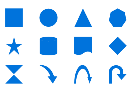
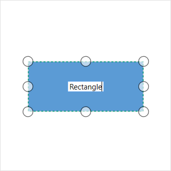
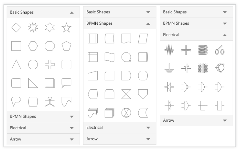
Shapes
Use 40+ standard built-in shapes or your own custom shapes.
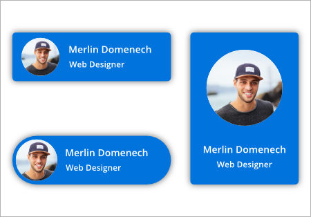
Template
You can use text, image, controls, panels, or any UIElement or template to visualize a node. It can also be bound to any of your business objects.
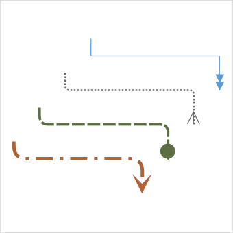
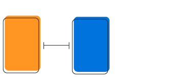
Connector
A connector is used to represent a relationship between two nodes. Some of the key features are listed below.
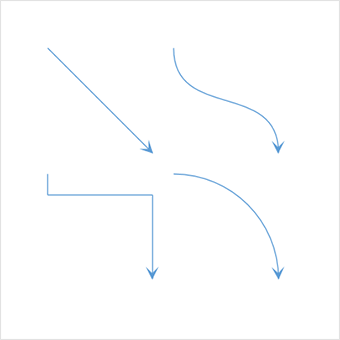
Types
There are Straight, Orthogonal, Curved types of connectors. You can choose any of these based on the type of diagram or relationship between the connected notes.
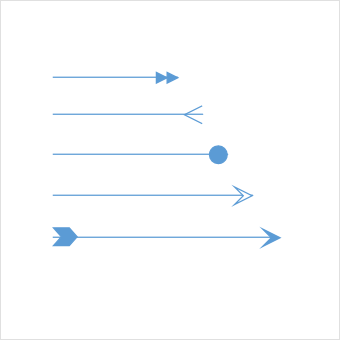
Arrowheads
Use arrowheads (decorator) to indicate the flow direction in a flowchart or state diagram. You can also build your own custom arrowheads, based on the type of diagram.
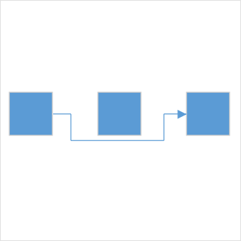
Routing
Orthogonal connectors take shortest and smart path that avoids overlapping with any neighboring nodes.
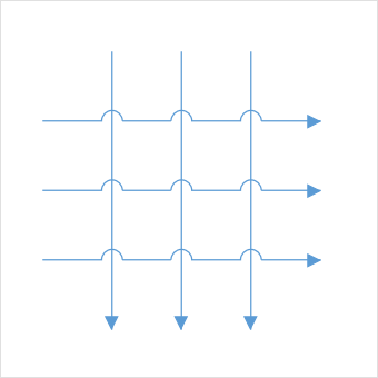
Bridging (line jumps)
Bridging (line jumps) clearly indicates connector’s route and makes it easier to read where connectors overlap with each other in a dense diagram.
Appearance
Customize the look and feel of a connector the way you want. They have a rich set of properties through which you can customize their color, thickness, dash dots, rounded corners, and decorators.
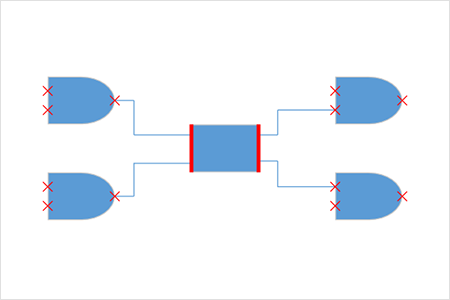
Port (connection points)
Connect to desired places of a node through different types of ports or connecting points available.
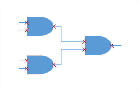
Node port
Build logic gates or a circuit diagram with dedicated pins and restrict in or out connections using node ports.
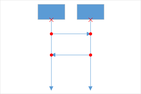
Connector Port
Use connector ports to indicate message flows between objects or lifelines in a sequence diagram.
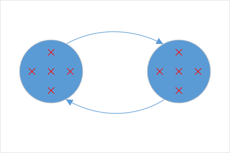
Dynamic Port
Make parallel connections to a block diagram by connecting anywhere on the side of a block. They are automatically created or destroyed.
Dock Port
Control dynamic connections to specific sides or in a specific direction using dock ports.
Annotation
Show additional information by adding text or labels on nodes and connectors.
Edit
You can add and edit text at runtime. You can also mark it read-only if it should not be edited.
Multiple Annotation
Add any number of annotations and align them individually.
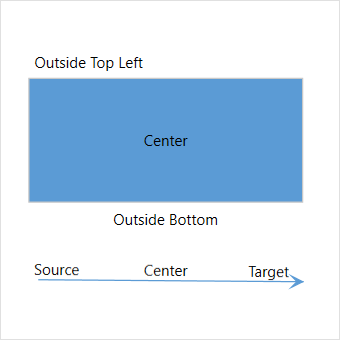
Alignment
The UWP Diagram has sophisticated alignment options where annotations can be placed:
- Inside or outside a node.
- At the source or target end of a connector.
- Automatically when the node or connector move.
Interactive features
Use interactive features to improve the editing experience of a diagram at runtime. Furthermore, you can easily edit a diagram with mouse, touchscreen, or keyboard interfaces.
Select and drag
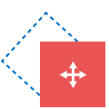
Select one or more nodes, connectors, or annotations and edit them using thumbs or handlers.

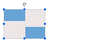
Resize
You can resize a node in in eight different directions. If you want a square to be always be square after resizing, you can lock the aspect ratio. You can resize multiple objects at the same time.

Rotate
You can rotate a selected node 360 degrees.

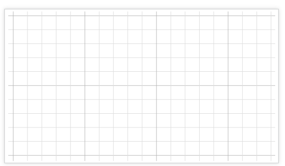
Snapping
Precisely align nodes, connectors, and annotations while dragging, just by snapping to the nearest gridlines or objects.

Undo Redo
Don’t worry when your edit ends up being a mistake. Undo and redo commands help you easily correct recent changes.

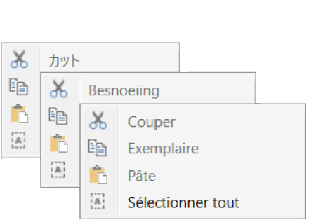
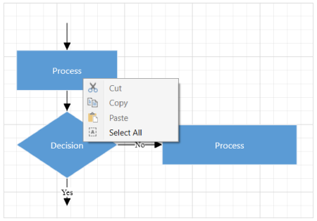
Clipboard
Cut, copy, paste, or duplicate selected objects within and across diagrams.

Z-Order
When multiple objects overlap, Z-order controls which object needs to be on top or at the bottom.
Grouping
You can combine multiple nodes together and interact with them as a single object called a group. Groups can also contain another group.

Quick command
Frequently used commands like delete, connect, and duplicate can be shown as buttons near selectors. That way, you can quickly do those operations, instead of finding buttons in a toolbox.
Alignment
Our UWP Diagram control has predefined alignment commands that enable you to align the selected objects nodes and connectors with respect to the selection boundary.
Spacing commands
Spacing commands enable you to place selected objects on the diagram at equal intervals from each other.

Sizing commands
Use sizing commands to equally size selected nodes with respect to the first selected object.

Align commands
All the nodes or connectors in the selection list can be aligned at the left, right, or center horizontally, or aligned at the top, bottom, or middle vertically with respect to the selection boundary.
Automatic layout algorithm
UWP Diagram control provides an automatic layout algorithm, which is used to arrange nodes automatically based on a predefined layout logic. There is built-in support for an organization chart layout, hierarchical tree layout, and radial tree layout.
Drawing Tool
Draw nodes and link them interactively, just by click and drag on diagram surface.

Stencil
The stencil control is a gallery of reusable symbols and nodes. Drag and drop these symbols onto the surface of the diagram any number of times.
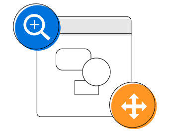
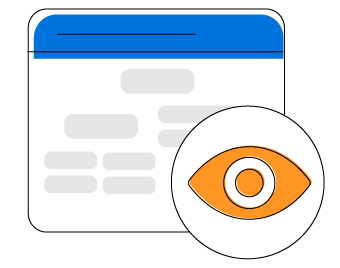
Zoom, pan, fit to page
When a diagram is large, see it closer or wider by zooming in and out of the diagram. Also, you can navigate from one region to another by panning through the diagram.
Overview control
Improve the navigation experience when exploring large diagrams using the overview control. It displays a small preview of the full diagram page. It also allows users to perform operations such as zooming and panning within it.
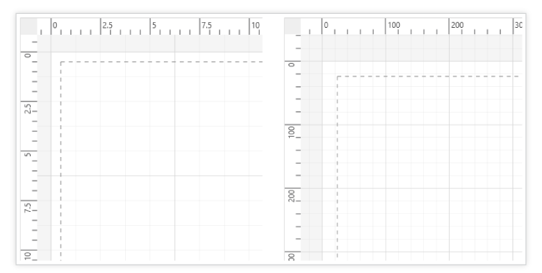
Rulers and Measurement Unit
Measure the distance of nodes and connectors from the origin of the page using rulers. In addition, specify the size and position of objects in different units like pixels, inches, and centimeters.
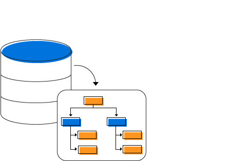
Data Source
UWP Diagram control allows you to populate diagrams with nodes and connectors based on data from data sources. Data in any format can be easily converted, mapped, and consumed in the diagram by setting a few properties, without having to write any code. It also supports loading data from an ObservableCollection, List, or IEnumerable collections.
Miscellaneous
There are several other features available to enhance the diagramming experience.
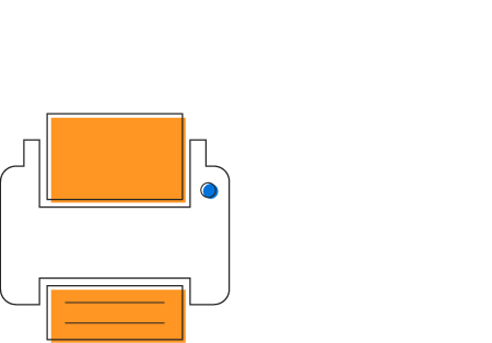
Printing
UWP Diagram control supports printing with a print preview option. You can also customize the page size, orientation, page margins, and fit to a single page.
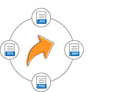
Exporting
Share your diagrams with others by easily exporting as .png, .jpeg and .bmp file formats.
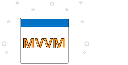
MVVM-friendly
UWP Diagram control is MVVM-friendly and seamlessly works with popular MVVM frameworks like Prism, MVVM light.
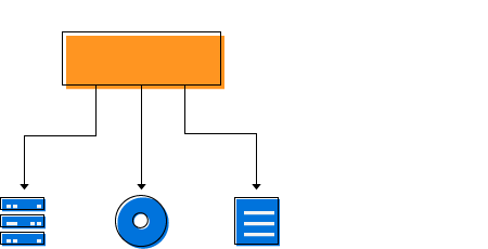
Serialization
You can save your diagram state as an XML file and load it back for editing again.
Localization
Localize every static text in the control to any supported language.
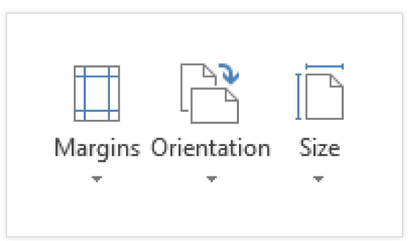
Page Layout
UWP Diagram control provides a page-like appearance to a drawing surface using page size, orientation, and margins.
Our Customers Love Us
Having an excellent set of tools and a great support team, Syncfusion® reduces customers’ development time.Here are some of their experiences.

It has more tools and support than its competitors.
Syncfusion Essential Studio samples are really helpful. Docking Manager, Diagram, Undo-Redo, Mapping, Themes.

HALİT A.

Software Developer
Nice suite of components
A very complete set of components, that has an edge on other major vendors which offer components. A lot less code required to use and code samples for more complete components. Integrates well with other 3rd party components.

John A.
C# Developer (Contract)
See Real Success Stories
Developers around the world trust Syncfusion’s Essential Studio to simplify complex projects and speed up delivery. With a vast library of UI controls, powerful SDKs, and reliable support, Essential Studio helps teams build enterprise-ready applications with confidence.
Read Our Customer StoriesIndustry
Software development
75% Cost reduction
50% Faster development
Industry
Utilities (oil and gas)
450+ hours saved
Streamlined processes and hours of development effort saved.
Advanced, flexible features
Empowered users through robust and versatile functionality.
Industry
Software and technology
1000+ of hours saved
Accelerated development with enterprise-ready UI components.
Efficient file management
Streamlined workflows with document libraries without building them from scratch.
Industry
Software and technology
2 Years of delay avoided
Two years of delays prevented with proactive planning.
On-time delivery
Projects delivered on schedule using trusted controls.
Industry
IT services and IT consulting
Improved performance
Large datasets handled with easy customization and quick debugging.
Highly customizable
Plug-and-play controls with quick template integration.
Industry
Professional services
Instant access
Quick availability of features and resources.
Reduced dependencies
Fewer dependencies for faster development.
Rated by users across the globe
Awards
Greatness—it’s one thing to say you have it, but it means more when others recognize it. Syncfusion® is proud to hold the following industry awards.

