.NET MAUI Slider - An Interactive, Rich UI Control
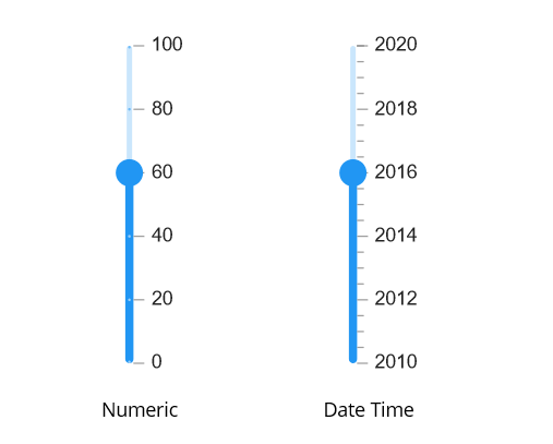
- Display numeric and date-time labels.
- Select a value precisely in any form factor with smooth and interactive sliders.
- Show tooltips and labels to indicate the selected values.
Trusted by the world’s leading companies

Overview
The .NET MAUI Slider is an interactive UI control that enables users to select a value from a specified range. It offers multiple customization features, including numeric and date-time labels, tick marks, dividers, and tooltips.
.NET MAUI Slider Code Example
Easily get started with the .NET MAUI Slider using a few simple lines of XAML code example as demonstrated below. Also explore our .NET MAUI Slider Example that shows you how to render and configure the .NET MAUI Slider.
<sliders:SfSlider Minimum="0"
                Maximum="10"
                Value="5"
                ShowLabels="True"
                ShowTicks="True"
                ShowDividers="True"
                Interval="2"
                MinorTicksPerInterval="1">
    <sliders:SfSlider.Tooltip>
     <sliders:SliderTooltip />
    </sliders:SfSlider.Tooltip>
</sliders:SfSlider>
Scales
Render intervals with precision. This slider supports setting intervals for both numbers and dates. For dates, intervals are supported in years through seconds.

Orientation
The orientation of the .NET MAUI Slider can be set to vertical or horizontal, depending on the requirement. This flexibility allows for better integration of the slider.
Labels
Customize the labels easily. Change the format, render at specific intervals, and add prefixes and suffixes. Use built-in support for numeric and date types.


Dividers
Render dividers in each interval to show the ranges accurately. Customize both the size and positioning of these dividers to enhance clarity and visual appeal.
Ticks
Set both major and minor ticks in the axis. Use major ticks to show the intervals clearly and minor ticks to help choose values between two intervals easily.


Tooltips
Use tooltips to indicate the current selection during interaction. Customize the format, whole text, and visibility using built-in APIs.
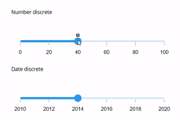
Discrete support
By specifying the StepSize, you can select discrete or continuous numeric or date values from the range of values.
 95+ UI controls
200+ interactive .NET MAUI demos
3.2M+ downloads
95+ UI controls
200+ interactive .NET MAUI demos
3.2M+ downloads
Not sure how to create your first .NET MAUI Slider? Our tutorial videos and documentation can help.
I’d love to watch it now I’d love to read it now.NET MAUI DataViz & UI Controls
Standalone UI SDKs
Integrate the DataGrid, Chart, Scheduler, and Rich Text Editor UI components into applications to enable rich interaction and visualization, delivering a seamless user experience.
Document Solutions
Integrate the PDF Viewer, DOCX Editor, Spreadsheet Editor, and document-processing libraries into the .NET MAUI applications to enable a smooth user experience.
Frequently Asked Questions
Why should you choose the Syncfusion .NET MAUI Slider?
The Syncfusion .NET MAUI Slider supports the following features:
- Select a value or range of values using a slider, range slider, or range selector.
Use sliders in both horizontal and vertical orientation.
- Display numeric and date-time ranges.
- Select linear or discrete values.
Show a tooltip to give more information about the selected values.
- One of the best .NET MAUI Slider in the market, offering feature-rich UI to interact with the software.
Simple configuration and APIs.
- Mobile-touch friendly.
Extensive demos, documentation, and videos to let you get started quickly with the .NET MAUI Slider.
Where can I find the Syncfusion Blazor .NET MAUI Slider demo?
You can find our .NET MAUI Slider demo, which demonstrates how to render and configure the Slider.
Can I download and utilize the Syncfusion .NET MAUI Slider for free?
No, this is a commercial product and requires a paid license. However, a free community license is also available for companies and individuals whose organizations have less than $1 million USD in annual gross revenue, 5 or fewer developers, and 10 or fewer total employees.
How do I get started with Syncfusion .NET MAUI Slider?
A good place to start would be our comprehensive getting started documentation.
Our Customers Love Us


See Real Success Stories
Developers around the world trust Syncfusion’s Essential Studio to simplify complex projects and speed up delivery. With a vast library of UI controls, powerful SDKs, and reliable support, Essential Studio helps teams build enterprise-ready applications with confidence.
Read Our Customer StoriesIndustry
Software development
75% Cost reduction
50% Faster development
Industry
Utilities (oil and gas)
450+ hours saved
Streamlined processes and hours of development effort saved.
Advanced, flexible features
Empowered users through robust and versatile functionality.
Industry
Software and technology
1000+ of hours saved
Accelerated development with enterprise-ready UI components.
Efficient file management
Streamlined workflows with document libraries without building them from scratch.
Industry
Software and technology
2 Years of delay avoided
Two years of delays prevented with proactive planning.
On-time delivery
Projects delivered on schedule using trusted controls.
Industry
IT services and IT consulting
Improved performance
Large datasets handled with easy customization and quick debugging.
Highly customizable
Plug-and-play controls with quick template integration.
Industry
Professional services
Instant access
Quick availability of features and resources.
Reduced dependencies
Fewer dependencies for faster development.
Rated by users across the globe


Awards
Greatness—it’s one thing to say you have it, but it means more when others recognize it. Syncfusion® is proud to hold the following industry awards.

