WinUI Shadow Control - Attractive and Beautiful UI
- A simple way to apply shadow effects to framework elements.
- Easy integration with images, shapes, paths, and other controls.
- Easy customization of the shadow’s color, offset, blur radius, and corner radius.
Trusted by the world’s leading companies

Overview
The .NET WinUI Shadow control is used to apply shadow effects to framework elements to give them an appearance of depth, allowing users to easily differentiate overlapping elements and enjoy a beautiful and appealing user interface.

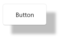
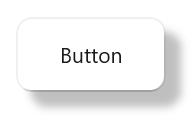
Applying shadow effects
Apply a shadow to shapes, paths, images, and any type of framework element.

Shadow effect in images
Apply a shadow effect to any shape of an image, including squares, circles, and other irregular shapes.

Shadow effect in paths
Apply a shadow effect to any type of path or shape.
Shadow customization
A shadow effect can be customized as follows.

Shadow color
Customize the color of the shadow.
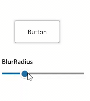
Shadow blur radius
Customize the blur level of the shadow.
Shadow offset
Customize the position of the shadow relative to the position of the view.
Shadow corner radius
Customize the corner radius of the shadow.
WinUI Shadow Code Example
Easily get started with the WinUI Shadow using a few simple lines of XAML and CS code example as demonstrated below. Also explore our WinUI Shadow Example that shows you how to apply shadow effects for controls in WinUI.
<Page
    x:Class="GettingStarted.MainPage"
    xmlns="http://schemas.microsoft.com/winfx/2006/xaml/presentation"
    xmlns:x="http://schemas.microsoft.com/winfx/2006/xaml"
    xmlns:local="using:GettingStarted"
    xmlns:d="http://schemas.microsoft.com/expression/blend/2008"
    xmlns:mc="http://schemas.openxmlformats.org/markup-compatibility/2006"
    xmlns:syncfusion="using:Syncfusion.UI.Xaml.Core"
    mc:Ignorable="d"
    Background="{ThemeResource ApplicationPageBackgroundThemeBrush}">
    <Grid>
      <syncfusion:SfShadow>
         <Button Height="50" Width="100" Content="Button"/>
      </syncfusion:SfShadow>
    </Grid>
</Page>
// Creating an instance of the Shadow control.
SfShadow shadow = new SfShadow();
// Setting the SfShadow content value.
Button button = new Button();
button.Height = 50;
button.Width = 100;
button.Content = "Button";
shadow.Content = button;Not sure how to apply shadow effect for WinUI controls using WinUI Shadow? Our documentation can help.
I’d love to read it nowSyncfusion WinUI DataViz & UI Controls
Standalone UI SDKs
Integrate the DataGrid, Chart, and Scheduler UI components into applications to enable rich interaction and visualization, delivering a seamless user experience.
Document Solutions
Integrate the PDF Viewer, DOCX Editor, Spreadsheet Editor, and document-processing libraries into the WinUI applications to enable a smooth user experience.
Our Customers Love Us


See Real Success Stories
Developers around the world trust Syncfusion’s Essential Studio to simplify complex projects and speed up delivery. With a vast library of UI controls, powerful SDKs, and reliable support, Essential Studio helps teams build enterprise-ready applications with confidence.
Read Our Customer StoriesIndustry
Software development
75% Cost reduction
50% Faster development
Industry
Utilities (oil and gas)
450+ hours saved
Streamlined processes and hours of development effort saved.
Advanced, flexible features
Empowered users through robust and versatile functionality.
Industry
Software and technology
1000+ of hours saved
Accelerated development with enterprise-ready UI components.
Efficient file management
Streamlined workflows with document libraries without building them from scratch.
Industry
Software and technology
2 Years of delay avoided
Two years of delays prevented with proactive planning.
On-time delivery
Projects delivered on schedule using trusted controls.
Industry
IT services and IT consulting
Improved performance
Large datasets handled with easy customization and quick debugging.
Highly customizable
Plug-and-play controls with quick template integration.
Industry
Professional services
Instant access
Quick availability of features and resources.
Reduced dependencies
Fewer dependencies for faster development.
Rated by users across the globe


Awards
Greatness—it’s one thing to say you have it, but it means more when others recognize it. Syncfusion® is proud to hold the following industry awards.

