WinUI AutoComplete: Fast and Feature-Rich Control
- Suggestions shown instantly with highlight on best-matching item.
- Ability to select multiple items from a suggestion list.
- Its rich, built-in feature set includes custom filtering, token display mode, and UI customization.
Trusted by the world’s leading companies

Overview
The WinUI AutoComplete control is highly optimized to load and populate suggestions quickly from a large volume of data depending on the users’ input characters. It allows users to select one or more items from a suggestion list. It can display the selected items in the input view with images, text, and close buttons to remove items as needed.
Selection
Select an item or multiple items from the suggestion list.
Single selection
Select a single item from the suggestion list based on the entered text.
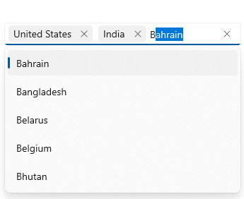
Multiple selection
Select multiple items from the suggestion list and display them as tokens.
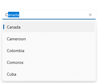
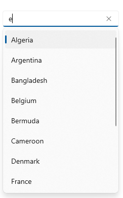
Filtering
When a character is entered, the control searches for items that include the entered character and filters the results, displaying suggestions in a dropdown list.

Starts with
Filter the matching items to show those starting with the entered text.

Contains
Filter the matching items to show those containing the entered text.

Custom filter
Apply your own filter logic to display custom filtered items. E.g., in the previous image, AutoComplete filtered the cities based on the country name.
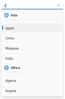
Grouping
Group data items in the dropdown.
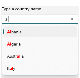
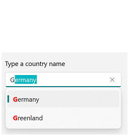
Highlighting search text
Highlight just the first occurrence or all occurrences of the search text. This feature makes it easy to select items from the dropdown list.
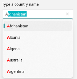
First occurrence
The search text is highlighted where it appears for the first time.
All occurrences
Highlight all occurrences of the search text.
Matched
Highlight the characters that match the search text.

Unmatched
Highlights the characters that do not match the search text in the dropdown.
Leading and trailing views
Add a template before and after the selection area.

Leading view
Add a template before the selection area.
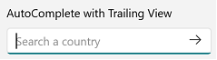
Trailing view
Add a template after the selection area.
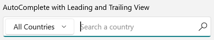
Add leading and trailing views
The leading view and trailing views can be added at the same time.
Watermarks
Display hints using a watermark text.

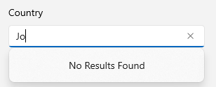
No result found
Display text indicating no search results were found.
Data binding
Data-binding support works for all popular data sources and displays data based on the display member. It automatically generates items from a data-bound collection. The application can be designed in the MVVM pattern.

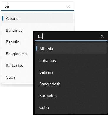
Appearance

Selected items UI
Customize the appearance of selected items in the multiselection mode.

Dropdown item customization
Dropdown list items can be customized with an image or custom control.
Dropdown height
Adjust the dropdown height based on the number of items to enhance readability without scrolling.

Auto-append UI
The AutoComplete control now provides an auto-append UI like Windows 11. The AutoComplete control provides both an auto-append UI with text selection and auto-append text with a faded text color.
Syncfusion WinUI DataViz & UI Controls
Standalone UI SDKs
Integrate the DataGrid, Chart, and Scheduler UI components into applications to enable rich interaction and visualization, delivering a seamless user experience.
Document Solutions
Integrate the PDF Viewer, DOCX Editor, Spreadsheet Editor, and document-processing libraries into the WinUI applications to enable a smooth user experience.
Our Customers Love Us


See Real Success Stories
Developers around the world trust Syncfusion’s Essential Studio to simplify complex projects and speed up delivery. With a vast library of UI controls, powerful SDKs, and reliable support, Essential Studio helps teams build enterprise-ready applications with confidence.
Read Our Customer StoriesIndustry
Software development
75% Cost reduction
50% Faster development
Industry
Utilities (oil and gas)
450+ hours saved
Streamlined processes and hours of development effort saved.
Advanced, flexible features
Empowered users through robust and versatile functionality.
Industry
Software and technology
1000+ of hours saved
Accelerated development with enterprise-ready UI components.
Efficient file management
Streamlined workflows with document libraries without building them from scratch.
Industry
Software and technology
2 Years of delay avoided
Two years of delays prevented with proactive planning.
On-time delivery
Projects delivered on schedule using trusted controls.
Industry
IT services and IT consulting
Improved performance
Large datasets handled with easy customization and quick debugging.
Highly customizable
Plug-and-play controls with quick template integration.
Industry
Professional services
Instant access
Quick availability of features and resources.
Reduced dependencies
Fewer dependencies for faster development.
Rated by users across the globe


Awards
Greatness—it’s one thing to say you have it, but it means more when others recognize it. Syncfusion® is proud to hold the following industry awards.

