WinUI Linear Gauge: Visualize Progress, Targets, and Thresholds
- Display numerical values and ranges on a linear scale horizontally or vertically.
- Customize gauges to simulate tools like a value indicator, progress bar, or thermometer.
- Use built-in animation and interactive pointers that can be dragged from one place to another.
Trusted by the world’s leading companies

Overview
The Linear Gauge control for WinUI is a multipurpose data visualization control that displays numerical values on a linear scale horizontally or vertically. It has a rich set of features, such as ranges and pointers, that are fully customizable and extendable. Use it to create a value indicator, linear progress bar, thermometer, and more.
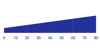
Linear axis
The axis of a WinUI Linear Gauge is a linear scale, where a set of values can be plotted based on business logic. The appearance of an axis can be customized easily. You can change the linear axis orientation to either horizontal or vertical.
Labels customization
Customize the look and feel of the default labels using various font-customized properties. You can also add prefix or suffix text to a label.
Ticks customization
Define your own style for minor and major ticks with the help of the Stroke and StrokeThickness properties.

Offset
To enhance readability, change the default axis position by setting the offset value for labels and ticks.
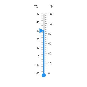
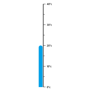
Multiple axis
Add multiple axes to the gauge to design it like a thermometer.

Custom axis
Display a set of values along a linear or custom scale.
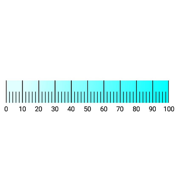
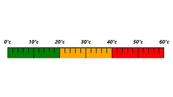
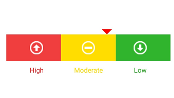
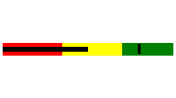
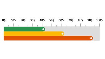
Linear range
A range is a visual element that helps you quickly visualize where a range falls on the axis track.
Range position
Change the range position to the inside of the axis, the outside of the axis, or crossing the axis.
Range width
The range width varies based on the values to enhance usage and readability.

Multiple ranges
The WinUI Linear Gauge control allows you to add multiple ranges inside the axis to indicate color variation.
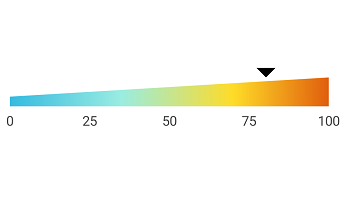
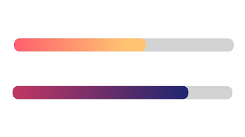
Gradient range
A range of colors can gradually change based on set values to create a smooth color transition.
Child content
The child content is used to add any content like text or images inside the range to improve readability.
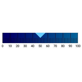
Bar pointer
Bar pointers contain a list of pointer elements. You can add any number of bar pointers inside the axis to indicate values. They are used to point out the values from the start value of a linear axis.
Pointer position
Change or move the position of the bar pointer to any place in the gauge.

Corner radius
Add a corner radius at the start, end, and both sides of the bar pointer. This support provides a rich styling experience for data visualization.
Multiple pointers
Add multiple bar pointers to the axis to show multiple value indications.
Gradient color
Bar pointer colors change gradually based on scale values, which gives a smooth color transition effect.
Marker pointer
To highlight values, set the marker pointer to a built-in shape type or custom content.
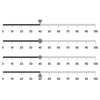
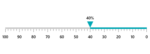
Pointer shape type
Change the shape pointer type to a built-in shape (triangles, inverted triangles, squares, or diamonds) to highlight the values.
Pointer position
Change or move marker pointers to any place in the gauge.

Content pointer
Highlight values using an image, icon, text, or any other custom view.
Pointer animation
The WinUI Linear Gauge control provides visual appeal when the pointer moves from one value to another. Gauge supports various pointer animations.

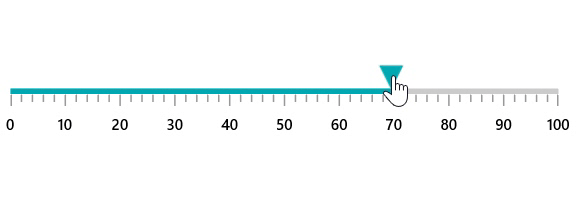
Pointer interaction
Drag a pointer from one value to another to change the value at run time.
Right-to-left (RTL)
Right-to-left rendering support is available for users working in RTL languages like Hebrew and Arabic.
Syncfusion WinUI DataViz & UI Controls
Standalone UI SDKs
Integrate the DataGrid, Chart, and Scheduler UI components into applications to enable rich interaction and visualization, delivering a seamless user experience.
Document Solutions
Integrate the PDF Viewer, DOCX Editor, Spreadsheet Editor, and document-processing libraries into the WinUI applications to enable a smooth user experience.
Our Customers Love Us


See Real Success Stories
Developers around the world trust Syncfusion’s Essential Studio to simplify complex projects and speed up delivery. With a vast library of UI controls, powerful SDKs, and reliable support, Essential Studio helps teams build enterprise-ready applications with confidence.
Read Our Customer StoriesIndustry
Software development
75% Cost reduction
50% Faster development
Industry
Utilities (oil and gas)
450+ hours saved
Streamlined processes and hours of development effort saved.
Advanced, flexible features
Empowered users through robust and versatile functionality.
Industry
Software and technology
1000+ of hours saved
Accelerated development with enterprise-ready UI components.
Efficient file management
Streamlined workflows with document libraries without building them from scratch.
Industry
Software and technology
2 Years of delay avoided
Two years of delays prevented with proactive planning.
On-time delivery
Projects delivered on schedule using trusted controls.
Industry
IT services and IT consulting
Improved performance
Large datasets handled with easy customization and quick debugging.
Highly customizable
Plug-and-play controls with quick template integration.
Industry
Professional services
Instant access
Quick availability of features and resources.
Reduced dependencies
Fewer dependencies for faster development.
Rated by users across the globe


Awards
Greatness—it’s one thing to say you have it, but it means more when others recognize it. Syncfusion® is proud to hold the following industry awards.

