Trusted by the world’s leading companies

Overview
The Blazor DataGrid is a feature-rich Blazor grid component useful for displaying data in a tabular format. Its wide range of functionalities includes data binding, adaptive UI layout for all devices, editing, Excel-like filtering, custom sorting, aggregating rows, selection, and support for Excel, CSV, and PDF formats.
Why choose the Syncfusion Essential Studio® Blazor DataGrid?
High performance
A focus on fast-paced performance allows users to load millions of records in just a second.
Seamless data binding
Bind data seamlessly with various local and remote data sources, such as IEnumerable/List, RESTful services, OData services, WCF services, ObservableCollections, ExpandoObject, and DynamicObject.
Adapts to any resolution
The DataGrid has a highly responsive layout and an optimized design for desktops, tablets, and smart phones. It works well on all mobile phones that use iOS, Android, or Windows OS.
Flexible editing
The Blazor DataGrid performs create, read, update, and delete operations more easily with a list of business objects or remote data service with the help of a data manager.
Create your own template designs
Allow users to create custom user experiences in the Blazor DataGrid using a wide range of template options.
Attractive customizable themes
Cutting-edge design with built-in themes: Fluent, Tailwind CSS, Bootstrap, Material, Fabric, and more. Utilize the online Theme Studio tool to customize themes easily.
Easy export and printing
Export the DataGrid in various file formats, including Excel, PDF, and CSV. Print all the rows, regardless of the number of pages, as well as just the currently viewed page.
Globalization and localization
Enable users from different locales to use the control by formatting dates, currency, and numbering to suit preferences.
AI-ready grid for smarter data analysis
Build smarter Blazor applications with a DataGrid that supports AI features out of the box. Add semantic search and anomaly detection to uncover insights and improve data reliability.
-
Semantic search: Connect your natural language processing (NLP) model to enable natural language queries, eliminating the need for exact keywords.
- See how to add semantic search
-
Anomaly detection: Integrate machine learning (ML) services to identify irregular trends and prevent data issues.
- See how to add anomaly detection
Blazor DataGrid code example
Easily get started with the Blazor DataGrid using a few simple lines of C# code, as demonstrated below. Also explore this Blazor DataGrid example, which shows you how to render and configure the control.
@using Syncfusion.Blazor.Grids
<SfGrid DataSource="@Orders">
</SfGrid>
@code{
    public List<Order> Orders { get; set; }
    protected override void OnInitialized()
    {
        Orders = Enumerable.Range(1, 75).Select(x => new Order()
        {
            OrderID = 1000 + x,
            CustomerID = (new string[] { "ALFKI", "ANANTR", "ANTON", "BLONP", "BOLID" })[new Random().Next(5)],
            Freight = 2.1 * x,
            OrderDate = DateTime.Now.AddDays(-x),
        }).ToList();
    }
 public class Order {
        public int? OrderID { get; set; }
        public string CustomerID { get; set; }
        public DateTime? OrderDate { get; set; }
        public double? Freight { get; set; }
    }
}
Adaptive UI layout
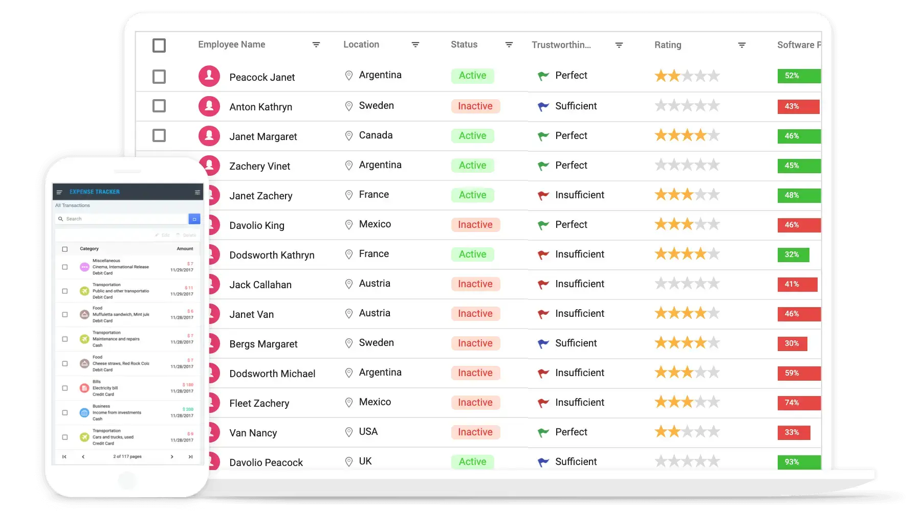
The Blazor DataGrid user interface is customized and redesigned for great views and usability on small screens. Its features include filter, sort, search, column chooser, column menu, pager dropdown, and edit dialogs that are adaptive to the screen size and render row elements vertically.

Columns
Columns define the schema of the data source in the Blazor DataGrid component. It supports formatting, auto-generating columns, column definitions, freezing rows and columns, column spanning, text wrapping, a column chooser, a column menu, and other features.
Paging
Through paging, a segment of data can be viewed from the assigned data source. The Blazor DataGrid offers a built-in pager UI with options to customize its entire UI. It also has an on-demand paging mode for effective data retrieval from remote web services.


Sorting
Sort rows either in ascending or descending order against a column by simply clicking the header. Sort multiple columns’ data by holding the Ctrl key + header click. In addition, you can define your own custom sorting logic.
Filtering
Filtering helps users view particular or related records that meet a given criteria in the data grid. The Blazor DataData supports various filter types, including powerful Excel-like filters. Choose the appropriate filter type, define your own custom filtering logic, and customize the filtering UI. Diacritic characters can also be filtered.


Selection
The Blazor DataGrid allows users to select rows or cells. One or more rows or cells can also be selected by holding Ctrl or Command, or programmatically.
Editing
The Blazor DataGrid provides full support for create, read, update, and delete operations (CRUD). In addition to built-in editor components to edit a particular column value, custom editor components can be created using templates. With the help of a data manager, you can perform editing operations with an array collection or remote data service.


Grouping
Group rows to display the data in an organized, hierarchical structure in ascending or descending order to facilitate easier expansion and collapse of records. Group the records of a desired column by simply dragging that column into an interactive drop area.
Aggregation
Aggregates for column values can easily be displayed using the aggregate feature. Aggregates can be customized to show values in individual summary rows, individual group summary rows, or group caption rows.


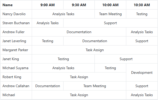
Row and column spanning
Row and column spanning allows cells to extend across multiple rows or columns, grouping identical values more effectively. This reduces repetitive data and produces a cleaner, more structured grid layout.
Frozen rows and columns
Frozen rows and columns are visible at the top and on the left, right, both, or at a fixed position, making the remaining grid content scrollable. This feature is mainly used to compare cell values in JavaScript DataGrid component.
Sticky header
The Blazor DataGrid header can be in a fixed position when scrolling the document vertically to visualize the data grid content at the same time as the column header.
Row drag and drop
Users can drag rows to another DataGrid or custom component. Users can also drag and drop rows within the same DataGrid using the drag icon and transfer rows between different groups.


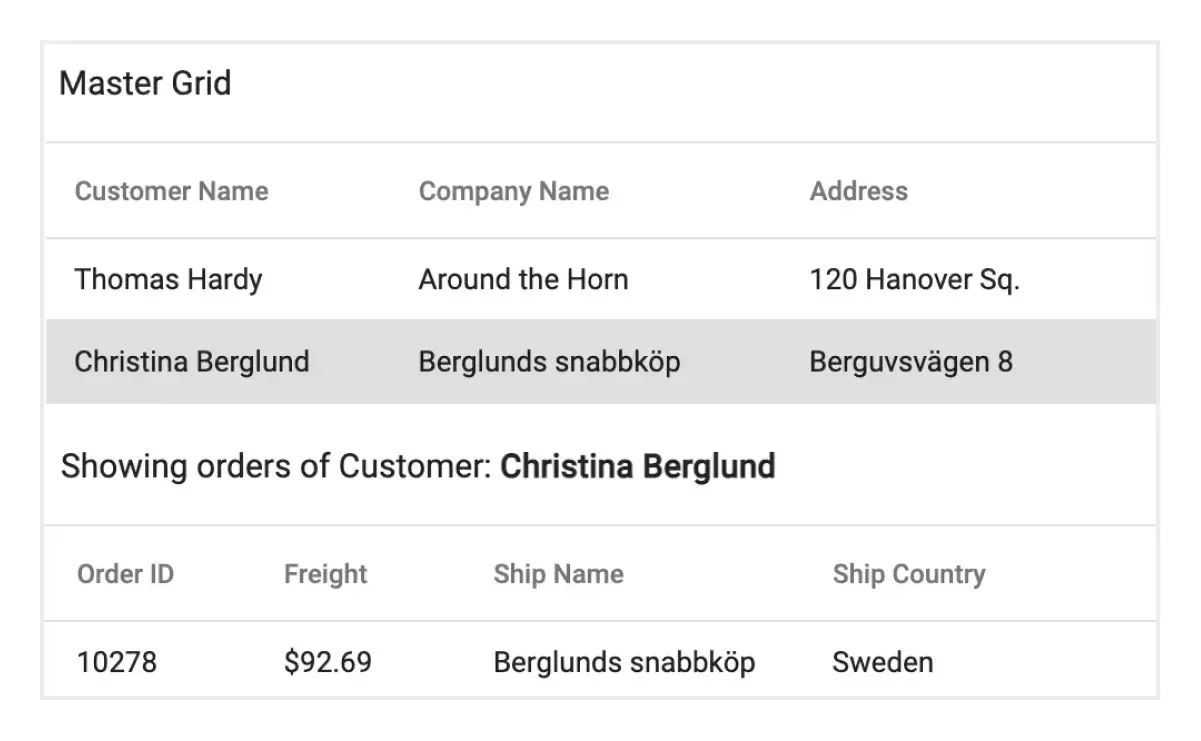
Master-detail grid
A master-detail grid is a use-case scenario in which a record’s details are viewed in a separate data grid by clicking a particular row.
Blazor live DataGrid
The DataGrid is optimized for handling and updating a large number of records in real-time, making it suitable for binding financial records and more.

Additional features

Row height
Row height is a major factor when displaying a large number of records in the viewport. It is easily customizable and the row height can be set conditionally.

Copy to clipboard
The clipboard allows users to copy selected rows or cells’ data into it. Use the Ctrl+C and Ctrl+Shift+H key combinations to copy data with and without headers, respectively.

Context menu
Perform various actions in a Blazor DataGrid using the pop-up menu that appears when a cell, header, or pager is right-clicked. In addition to default menu items, custom context menu items can be added.

Width and height
Set the width and height properties to change the size of a data grid. When the content overflows the grid element, horizontal and vertical scrollbars will appear. To fill the data grid’s parent container, simply set the height and width to 100%.

Stacked headers
Stacked headers allow grouping and visualizing column headers in a stacked manner. The number of columns that can be stacked is unlimited. Perform all Blazor DataGrid actions even when the columns are stacked.

Tooltips
Enhance the user experience with tooltips that support rich content in the Blazor DataGrid. Display images, icons, and custom components alongside plain text for more contextual and visually engaging interactions that improve clarity and usability within the grid interface.
Accessibility

Keyboard navigation
The Blazor DataGrid ensures that every cell is keyboard-accessible. Major features like sort, select, and edit can be performed using keyboard commands alone; no mouse interaction is required. This helps in creating highly accessible applications using this component.

Screen reader
The Blazor DataGrid view has complete WAI-ARIA accessibility support. Its UI includes high-contrast visual elements, helping visually impaired people to have the best viewing experience. Also, valid UI descriptions are easily accessible through assistive technologies such as screen readers.

Right to left (RTL)
Right-to-left rendering displays the text and layout of the Blazor DataGrid from right to left. This improves the user experience and accessibility for users of RTL languages.
Mobile-optimized and touch-friendly
The Blazor DataGrid has a highly responsive layout and a finely optimized design for desktops, tablets, and smartphones.

Touch support
User-friendly touch gestures and an interactive UI design help produce the best user experience. All Blazor DataGrid features work on touch devices with zero configuration.

Responsive pager
The Blazor DataGrid pager changes its complete UI responsively based on the grid dimensions. Its optimized design provides the best UI interaction on different devices.
Other supported frameworks
The DataGrid is available for the React, Angular, JavaScript, and Vue frameworks. Explore its platform-specific options through the following links:
Supported browsers
The Blazor DataGrid works well with all modern web browsers, including Chrome, Firefox, Edge, Safari, and Opera.

Not sure how to create your first Blazor DataGrid? Our tutorial videos and documentation can help.
I’d love to watch it now Start with the Blazor server-side DataGridBlazor Components – 145+ UI and DataViz Components
Frequently Asked Questions
Why should you choose the Syncfusion Essential Studio® Blazor DataGrid?
The Syncfusion Blazor DataGrid component supports the following features:
Millions of records load in just a second.
Flexible data binding with support to use data sources such as Web API, OData, Entity Framework, and more.
Rich UI interaction and keyboard navigation in both server-side and client-side (WebAssembly) Blazor apps.
Packed with a bunch of features with customization options suitable for building complex, large-scale applications.
Simple configuration and API.
- Support for all modern browsers.
- Touch-friendly and responsive UI.
Extensive demos, documentation and videos help you get started quickly with the Blazor DataGrid.
Where can I find the Syncfusion Blazor DataGrid demo?
You can find our Blazor DataGrid demo here. It demonstrates how to render and configure the component.
Can I download and utilize the Syncfusion Blazor DataGrid for free?
No, this is a commercial product and requires a paid license. However, a free community license is also available for companies and individuals whose organizations have less than $1 million USD in annual gross revenue, 5 or fewer developers, and 10 or fewer total employees.
How do I get started with the Syncfusion Blazor DataGrid?
A good place to start would be our comprehensive getting started documentation.
Our Customers Love Us


 Figma download
Awards
Greatness—it’s one thing to say you have it, but it means more when others recognize it. Syncfusion® is proud to hold the following industry awards.
Recent activities in Blazor DataGrid tutorials and blogs
Blazor DataGrid tutorial videos and blog posts will guide you in creating your first app with our Blazor components. They’ll give you problem-solving ideas, describe features and their functionality, announce new feature availability, explain Blazor DataGrid component best practices, and describe example scenarios using the Blazor DataGrid components. Check out our recent activity on our blog and tutorial video channels for the Blazor DataGrid.
BLOG
Blazor DataGrid: Implement CRUD Operations Using EF Core & Web API [Webinar Show Notes]
Sept. 5, 2025
VIDEOS
Blazor DataGrid: Implement CRUD Operations Using EF Core & Web API [Webinar Show Notes]
SEPTEMBER 5, 2025


