Highly Customizable WinUI Slider
- Select a numeric value to explore details in an another detailed view.
- Select a value precisely in any form factor with smooth and interactive sliders.
- Show a thumb icon, tooltip, and labels to indicate the selected values in a more intuitive way.
Trusted by the world’s leading companies

Overview
The Slider control for WinUI is a highly interactive UI control, allowing users to select a single value from a range of values. It provides rich features such as labels, ticks, dividers, a thumb icon with various styles, and a tooltip.
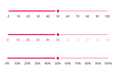
Labels
Easily customize label styles. Customize the format, render them for specific intervals, and add prefixes and suffixes. You can also visualize values as text, like Low, Medium, High.

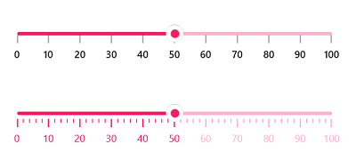
Ticks
Set both major and minor ticks in the axis. Use major ticks to show the intervals clearly and minor ticks to help choose values between two intervals easily. You can also customize the positions of tick marks.

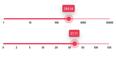
Scale
Show any numeric scale range with intervals. You can show the range with custom or logarithmic intervals.

Orientation
Render the Slider in both vertical and horizontal orientations.

Dividers
Render dividers in each interval to show the ranges in an intuitive way. Customize the size, shape, and position of the dividers.

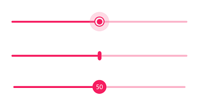
Thumb
Select a numeric value by dragging the thumb. Customize the thumb shapes with built-in shapes or a custom thumb. Add text or an icon inside the thumb using a data template.

ToolTip
Use tooltips to indicate clearly the current selection during interaction. Customize the format, whole text, and visibility using the built-in APIs. You can also place the tooltip on the top or bottom of the track.

Discrete support
You can select only discrete numeric values.

Right to left (RTL)
Right-to-left rendering support is available for users working in RTL languages like Hebrew and Arabic.

Accessibility
The WinUI Slider is easily accessed by keyboard.
Syncfusion WinUI DataViz & UI Controls
Our Customers Love Us


Awards
Greatness—it’s one thing to say you have it, but it means more when others recognize it. Syncfusion® is proud to hold the following industry awards.


