Trusted by the world’s leading companies

Overview
The Flutter Date Range Picker is a lightweight widget that allows users to easily select a single date, multiple dates, or a range of dates. It provides month, year, decade, and century views to quickly navigate to a desired date. It supports minimum, maximum, and disabled dates to restrict date selection.
Multiple Picker View Modes
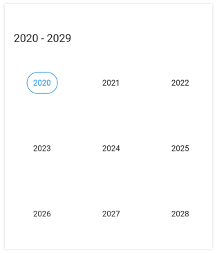
Display month, year, decade, and century views that can easily be selected and navigated, even programmatically.

Month

Year
Decade

Century
Multi-date Picker View
Display two Date Range Pickers side by side to select ranges of dates between two separate months easily.

Hijri Date Picker
In addition to the Gregorian calendar, the Flutter Date Range Picker supports displaying the Islamic calendar (Hijri date picker).

Quick Navigation
Navigate back and forth between date-range views and view modes.
Enable and Disable Built-in View Switching
Restrict users from navigating to different picker views by disabling view switching. Select values in terms of month, year, or decade with this feature enabled.

Date Selection
Select single dates, multiple dates, or a range with support for programmatic selection.


Extendable Range Selection
Extend the selected range with the newly selected dates in a Date Range Picker.

Limit Date Selection Range
Select a date range with a specific minimum and maximum number of days.

Vertical Picker
Display two Date Range Pickers side by side in the vertical direction to select date ranges between two months easily. Also enable or disable the view navigation using swipe interaction along with snap and free scroll picker view navigation modes.

Week numbers
Display week numbers of a year in the month view of the Date Range Picker.

Extendable range selection direction
Allows extending the selection by setting the extendable range selection direction as forward, backward, both and none. If it set to none, the direction cannot be selected.
Action Buttons
Display confirm and cancel buttons in the SfDateRangePicker and SfHijriDateRangePicker to confirm or cancel the selected date values.

Today Button
Display the Today button at the bottom of the Flutter Date Range Picker to quickly navigate to the current date.

Change first day of week
Customize the first day of the week as needed. The default first day is Sunday.
Selectable day predicate
Decide whether a cell is selectable or not.

Blackout Dates
Disable any date in a calendar to make it inactive. Easily prevent the selection of weekends by disabling them.

Appearance Customization
Builder
Design and set custom view to the month and year cells of the Date Range Picker.

Month cell

Year cell
Theming
Provide a uniform and consistent look to the calendar’s appearance and format with a theme.

Highlight Holidays and Weekends
Use decorations to highlight dates in a month and weekends as special days.

Right-to-left (RTL) Orientation
Flutter Date Range Picker supports right to left rendering for languages such as Arabic and Hebrew.

Globalization
Display the current date and time by following the globalized date and time formats.

Month

Year
Flutter Date Range Picker Code Example
Easily get started with the Flutter Date Range Picker using a few simple lines of DART code example as demonstrated below. Also explore our Flutter Date Range Picker Example that shows you how to render and configure the Date Range Picker in Flutter.
import 'package:flutter/material.dart';
import 'package:syncfusion_flutter_Date Range Picker/Date Range Picker.dart';

@override
Widget build(BuildContext context) {
   return Scaffold(
       body: Container(
       child: SfDateRangePicker(),
));
}
Not sure how to create your first Flutter Date Range Picker? Our tutorial videos and documentation can help.
I’d love to watch now I’d love to read nowAll our Flutter UI & DataViz Widgets
Frequently Asked Questions
Why should you choose Syncfusion Flutter Date Range Picker?
Syncfusion Flutter Date Range Picker provides the following features:
4 in-build view modes available such as month, year, decade and century, with easy view switching and unique view specific customization options.
5 types of selection modes to select multiple dates and date ranges with customization options.
Customize all the cells with builder support. Create and replace an element’s UI easily.
- The widget is touch friendly and renders adaptively based on the device, providing the best user experience on phones, tablets, and desktops.
- Easily build applications for global audience and prepare them to support various languages and cultures.
Where can I find the Syncfusion Flutter Date Range Picker demo?
You can find our Flutter Date Range Picker demo, which demonstrates how to render and configure the Date Range Picker.
Can I download and utilize the Syncfusion Flutter Date Range Picker for free?
No, this is a commercial product and requires a paid license. However, a free community license is also available for companies and individuals whose organizations have less than $1 million USD in annual gross revenue, 5 or fewer developers, and 10 or fewer total employees.
How do I get started with Syncfusion Flutter Date Range Picker?
A good place to start would be our comprehensive getting started documentation.
Our Customers Love Us


See Real Success Stories
Developers around the world trust Syncfusion’s Essential Studio to simplify complex projects and speed up delivery. With a vast library of UI controls, powerful SDKs, and reliable support, Essential Studio helps teams build enterprise-ready applications with confidence.
Read Our Customer StoriesIndustry
Software development
75% Cost reduction
50% Faster development
Industry
Utilities (oil and gas)
450+ hours saved
Streamlined processes and hours of development effort saved.
Advanced, flexible features
Empowered users through robust and versatile functionality.
Industry
Software and technology
1000+ of hours saved
Accelerated development with enterprise-ready UI components.
Efficient file management
Streamlined workflows with document libraries without building them from scratch.
Industry
Software and technology
2 Years of delay avoided
Two years of delays prevented with proactive planning.
On-time delivery
Projects delivered on schedule using trusted controls.
Industry
IT services and IT consulting
Improved performance
Large datasets handled with easy customization and quick debugging.
Highly customizable
Plug-and-play controls with quick template integration.
Industry
Professional services
Instant access
Quick availability of features and resources.
Reduced dependencies
Fewer dependencies for faster development.
Rated by users across the globe


Awards
Greatness—it’s one thing to say you have it, but it means more when others recognize it. Syncfusion® is proud to hold the following industry awards.

