Trusted by the world’s leading companies

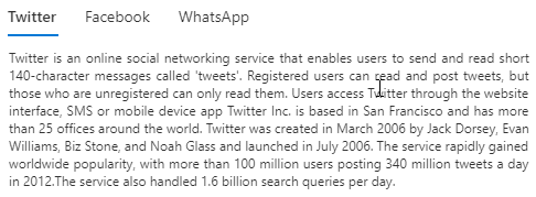
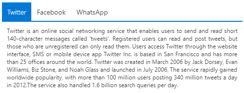
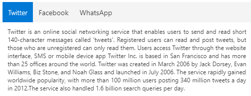
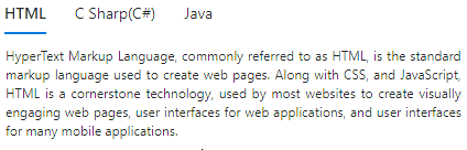
Overview
The JavaScript Tab, or HTML5 Tab control is a simple user interface (tabs UI) for organizing related content and occupying a compact space. The tabs are aligned horizontally, and each tab is associated with its header. One of the tabs must always be selected and visible. The Tabs control has a rich set of features such as animation, orientation, templating, header styles, a close button for each tab, a scrollbar or pop-up when there are many tabs, JSON support, and more.
AI-assisted development
Build feature-rich JavaScript Tabs experiences faster
Accelerate tabbed interface development with Syncfusion AI tools that turn requirements into fully configured navigation experiences with minimal manual setup.
Agent Skills
Accelerate development with Syncfusion AI Agent Skills for faster implementation and integration.
Example Prompt Generate a JavaScript tab component with dynamic tabs and lazy-loaded content.
AI Coding Assistant
Accelerate development with AI that generates, configures, and troubleshoots component code directly in your IDE.
Example Prompt Show how to dynamically add and remove tabs in the Syncfusion JavaScript Tabs.
Scrollable tabs
The JavaScript Tabs control manages additional tabs efficiently using scrollable tabs when there are a greater number of tabs than can be shown. This simplifies the design and aligns the tabs in a single line. Users can swipe left or right over the tab header area to scroll and make clearly visible the out-of-sight tabs in mobile.
Pop-up mode
The pop-up mode is another type of overflow mode in which a pop-up holds the additional tabs when there are a greater number of tabs than can be shown. You can view the out-of-sight tabs by exploring the pop-up mode.
Nested tabs
Users can nest one tab within another tab to design a complex layout.
Drag and drop
The JavaScript Tabs control allows users to drag and drop tabs to easily re-prioritize the tab item order. Also, it allows adding tabs dynamically from an external source such as a ListView, TreeView, etc.

Tabs headers (label)
The tab bar has a good visual representation for segregating active tabs and inactive tabs. It has an enormous interaction area for navigation in mobile tab view. The tab headers can be icons, plain text, or both. The position of the icons can also be changed to the left, right, top, and bottom inside tab headers.
Headers placement
A row of tabs can be aligned horizontally on the top or bottom of tab content to make a top-to-bottom or bottom-to-top hierarchy in a tab bar.
Header styles
The JavaScript Tabs control provides various built-in styles to customize the headers easily.
Remove button on tabs
Users can configure the Remove button for each tab or specific tabs to remove it dynamically.
Animation
Navigate among tabs with nice, built-in animation effects (for example: slide animation) when you click or tap a tab. The tab navigation happens on swiping within the content or tapping a tab header in a mobile tab view.
Orientation
Provides options to position the tab headers horizontally at the top or bottom and vertically at the left or right. It also provides options to rotate the header text in vertical tab orientation.
Dynamic tabs content
Users can dynamically load the content to the tab pane on activating it. They can also load the content from external pages using the AJAX library.
Adjustable height
Users can adjust a tab’s height automatically according to its content, parent container, or the height of the highest tab panel.
Easy integration
It’s easy to integrate other JavaScript controls as content of the tab’s pane. The JavaScript Tabs control can also be integrated with other controls such as Dialog and Card.
Wizard-like application
The easy-to-use JavaScript Tabs control design forms wizard-like applications that are used to perform multi step processes.
Themes
The JavaScript Tabs control has several built-in themes such as Material, Bootstrap, Fabric (Office 365), Tailwind CSS, and High Contrast.They help to design material tabs, bootstrap tabs, etc. The users can customize any one of these built-in themes or create new themes to achieve their own desired look and feel, either by simply overriding SASS variables or using our Theme Studio application.
Accessibility
- Full support for WAI-ARIA accessibility that helps the Tab control to be accessible by on-screen readers and assistive devices.
- control follows WAI-ARIA Best Practices for implementing keyboard interaction.
- UI element visuals such as foreground color, background color, line spacing, text, and images are based on WCG 2.0 standard.
Developer-friendly API
Developers can control the appearance and behavior of the Tabs control using a rich set of APIs, such as those for adding a new tab or removing a tab.
Other supported frameworks
The Tabs component is also available in Blazor, React, Angular, and Vue frameworks. Check out the different Tabs platforms from the links below,
JavaScript Tabs Code Example
Easily get started with the JavaScript Tabs using a few simple lines of HTML and TS code example as demonstrated below. Also explore our JavaScript Tabs Example that shows you how to render and configure a Tabs in JavaScript.
<div class="col-lg-12 control-section">
    <div class="e-sample-resize-container">
        <div id="tab_default">
        </div>
    </div>
</div>
import { loadCultureFiles } from '../common/culture-loader';
/**
* Tab default sample
*/
import { Tab } from '@syncfusion/ej2-navigations';
loadCultureFiles();
//Initialize Tab component
let tabObj: Tab = new Tab({
items: [
{
header: { 'text': 'Syncfusion'},
content: 'Syncfusion'
},
{
header: { 'text': 'JavaScript Controls'},
content: 'JavaScript Controls'
},
{
header: { 'text': 'Tabs Example'},
content: 'Tabs Example'
}
]
});
//Render initialized Tab component
tabObj.appendTo('#tab_default');Not sure how to create your first JavaScript Tab? Our documentation can help.
I’d love to read it now140+ JAVASCRIPT UI CONTROLS
ALL CONTROLS
SMART COMPONENTS
GRIDS
DATA VISUALIZATION
DROPDOWNS
FILE VIEWERS & EDITORS
BUTTONS
INTERACTIVE CHAT
INPUTS
NAVIGATION
FORMS
NOTIFICATIONS
Standalone UI SDKs
Integrate the DataGrid, Chart, Scheduler, Gantt, Rich Text Editor, File Manager, and Diagram UI components into applications to enable rich interaction and visualization, delivering a seamless user experience.
Document Solutions
Integrate the PDF Viewer, DOCX Editor, Spreadsheet Editor, and document-processing libraries into the JavaScript applications to enable a smooth user experience.
Frequently Asked Questions
Why should you choose Syncfusion JavaScript Tabs?
The Syncfusion JavaScript Tabs provides the following:
Render tabs based on the items collection and HTML elements.
Scrollable and popup modes make the tabs more responsive.
Customize headers with icons and orientation.
Animation effects when moving to previous/next items of the Tab.
Built-in accessibility with the WAI-ARIA specifications achieved through the attributes. By default, it allows screen readers to interact with Tab headers by using the keyboard.
- One of the best JavaScript Tabs in the market that offers a feature-rich UI to interact with the software.
- Supports all modern browsers.
- Mobile-touch friendly and responsive.
Expansive learning resources such as demos and documentation to learn quickly and get started with JavaScript Tabs.
Where can I find the Syncfusion JavaScript Tabs demo?
You can find our JavaScript Tabs demo here.
Can I download and utilize the Syncfusion JavaScript Tabs for free?
No, this is a commercial product and requires a paid license. However, a free community license is also available for companies and individuals whose organizations have less than $1 million USD in annual gross revenue, 5 or fewer developers, and 10 or fewer total employees.
How do I get started with Syncfusion JavaScript Tabs?
A good place to start would be our comprehensive getting started documentation.
Our Customers Love Us
Having an excellent set of tools and a great support team, Syncfusion® reduces customers’ development time.Here are some of their experiences.

Light and fast
I like JS controls the most, they are simple to use and easy to integrate to JS apps. In ASP.NET MVC your controls behave very nice, although I consider I have more control by using the JS version

Alexis A,

Software Architect, Small-Business
Syncfusion - Great controls and terrific support
The best in Syncfusion is the attention and efforts spent by the technical support whenever needed. It's priceless. The Syncfusion controls are really usefull to accelerate my projects, mainly those things related to UI.

David B,
CEO, Small-Business
See Real Success Stories
Developers around the world trust Syncfusion’s Essential Studio to simplify complex projects and speed up delivery. With a vast library of UI controls, powerful SDKs, and reliable support, Essential Studio helps teams build enterprise-ready applications with confidence.
Read Our Customer StoriesIndustry
Software development
75% Cost reduction
50% Faster development
Industry
Utilities (oil and gas)
450+ hours saved
Streamlined processes and hours of development effort saved.
Advanced, flexible features
Empowered users through robust and versatile functionality.
Industry
Software and technology
1000+ of hours saved
Accelerated development with enterprise-ready UI components.
Efficient file management
Streamlined workflows with document libraries without building them from scratch.
Industry
Software and technology
2 Years of delay avoided
Two years of delays prevented with proactive planning.
On-time delivery
Projects delivered on schedule using trusted controls.
Industry
IT services and IT consulting
Improved performance
Large datasets handled with easy customization and quick debugging.
Highly customizable
Plug-and-play controls with quick template integration.
Industry
Professional services
Instant access
Quick availability of features and resources.
Reduced dependencies
Fewer dependencies for faster development.
Rated by users across the globe
Syncfusion JavaScript Resources
Learning
 Documentation
 Documentation


Awards
Greatness—it’s one thing to say you have it, but it means more when others recognize it. Syncfusion® is proud to hold the following industry awards.

