WinUI DataGrid Control for Displaying and Managing Data Tables
- Instantly load millions of records.
- Use features such as seamless editing, grouping, sorting, filtering, and summaries out of the box.
- Set a light or dark theme.
Trusted by the world’s leading companies

Overview
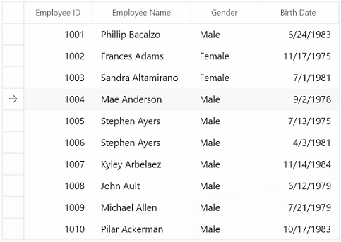
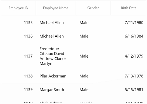
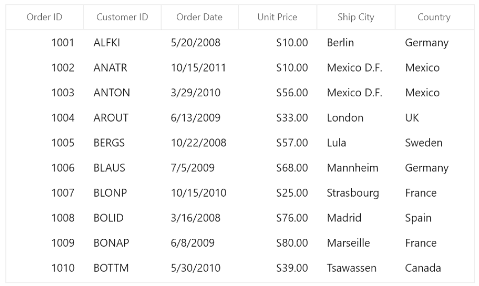
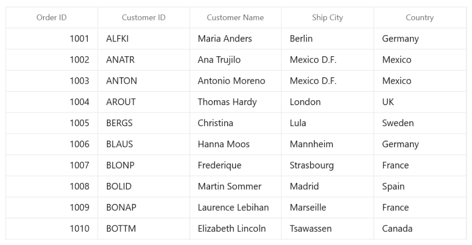
The WinUI DataGrid control is used for efficiently displaying and manipulating tabular data. Its rich feature set includes functionalities like data binding, editing, sorting, filtering, grouping, and data virtualization. It has been optimized for working with millions of records, as well as handling high-frequency, real-time updates.

Instant loading
The WinUI DataGrid can load millions of records instantly.

Fast data processing
The WinUI DataGrid supports data processing operations like sorting, filtering, grouping, summaries, and real-time updates that are handled efficiently using the PLINQ.
Data binding
Data binding works out of the box for all popular data sources. It automatically generates columns for a data-bound collection. It even assigns appropriate column types for specific data types.


Seamless editing experience
- Use different built-in column types such as combo box, checkbox, date, and text box.
- Embed any control, such as a progress bar or rating, to view or edit the data in a cell.
- Commit or rollback changes when the data object implements IEditableObject.
- Add new records dynamically.
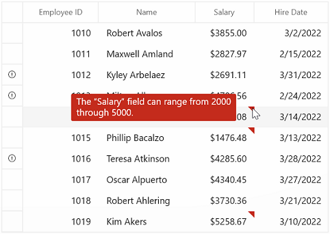
Built-in data error indication and validation
Validate cells and display error information based on the following validation types:
- INotifyDataErrorInfo
- Data annotations
Also, it’s possible to use:
- Cell validation
- Row validation
Data operations
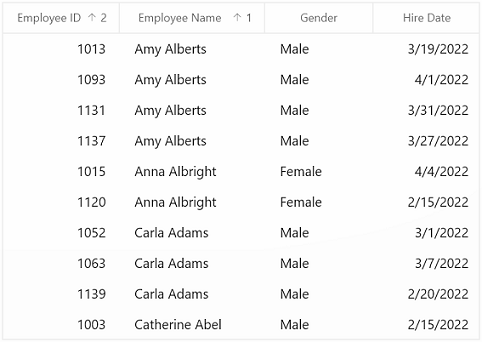
Sorting
Sort data against one or more columns with multiple customization operations. You can also sort by caption summary values when the grid is grouped or by writing custom logic.

Grouping
Group data by one or more columns either through mouse and touch interactivity in the group drop area or in code behind. Or group data with custom logic.
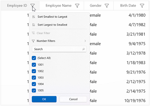
Filter
Filter data with the row filter or an intuitive, built-in, Excel-inspired filtering UI.

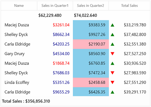
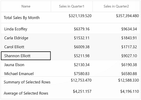
Summaries
Calculate and display sum, min, max, average, count, and custom aggregates in a table or group. Display summaries with different summary types, such as:
- Total or table summary
- Group summary
- Summary in group caption or header
Real-time updates
The WinUI DataGrid control can handle high-frequency updates even under the most demanding scenarios where the data is sorted and grouped in real time. The summaries are calculated in an optimized way and the updated summary is displayed in real-time scenarios.
Data manipulation

Built-in add new row
Add a new record in an underlying collection with a built-in row. Place the new row at the top or bottom, or stick it at the top. It’s also possible to place a newly added row at the top or bottom in a data grid.
Delete row
Delete selected records in a data grid by pressing the Delete key. You can change it to another key instead of the default, too.
Selection
The WinUI DataGrid allows you to select rows or cells in a similar way to Excel for all keyboard navigations.

Conditional formatting
Customize the appearance of cells, rows, or columns based on data.
Row and column customization
Row height
Users can adjust (auto fit) the row height based on the content of any column or certain columns to enhance the readability of content. It’s also possible to set the row height conditionally.

Freeze panes
Users can freeze rows and columns at the top, bottom, left, and right positions, similar to in Excel. Horizontal and vertical scrolling can be performed, except on fixed columns and rows.
Unbound rows
Display rows at the top and bottom of the grid with data that is not bound to the ItemsSource.

Stacked headers
Stacked headers (column header span) allow users to show unbound header rows. They span the stacked header columns across multiple rows and columns.
Column sizing
Column width can be adjusted (auto fit) based on the content of any column or column header. All the columns can be fit within the viewport of the data grid.

Master-details view
A master-details view (nested grid view) can be represented through nested grids that can be expanded and collapsed. Functionalities like editing, sorting, filtering, and grouping are supported. Unlimited levels of nested grid relationships are allowed.
Data virtualization
Create records on demand by automatically enabling data virtualization. Load millions of records of data instantly with virtualization enabled.
UI customization
The appearance of the DataGrid and its inner elements (cells, rows, headers, summaries, etc.) can be customized using a variety of available properties and keys.


Appearance style
The appearance of a data grid and its inner elements, such as rows, cells, columns, headers, and summary rows, can be customized easily by using styles and templates.
Context menu
The WinUI DataGrid control provides an entirely custom context menu to expose functionality on the user interface. Users can create context menus for different rows such as a record row, summary row, and group caption header, in an efficient manner.

Clipboard operations
The WinUI DataGrid allows you to perform clipboard operations such as cut, copy, and paste within the control and between other applications such as Notepad or Excel.

Row drag and drop
The WinUI DataGrid allows you to drag and drop the rows between datagrid and other controls such as ListView, SfTreeView, and SfTreeGrid. You can also select and drag multiple rows when the SelectionMode is multiple or extended.
Merge cells
Data in adjacent cells can be dynamically merged and shown in a single cell. By creating your own custom logic, you can merge data based on cell content.

Gridline customization
DataGrid allows you to customize gridline visibility with the following options:
- Horizontal
- Vertical
- Both
- None
Serialization
Serialize the WinUI DataGrid’s settings to XML format and load back (deserialization) to DataGrid using the built-in serialization options.
Right to left (RTL)
The WinUI DataGrid supports right-to-left (RTL) control rendering. Display text direction and layout from right to left.

Excel exporting
Export the grid data to Microsoft Excel with a variety of appearance customization options. Exclude and include specific columns and rows, set custom row heights and column widths, and much more. You can further customize the exported Excel file using XlsIO.


Localization
Localize all the static default strings in the WinUI DataGrid to any supported language.
WinUI DataGrid Code Example
Easily get started with the WinUI DataGrid using a few simple lines of XAML and C# code example as demonstrated below. Also explore our WinUI DataGrid Example that shows you how to render and configure the DataGrid in WinUI.
<Page
    x:Class="GettingStarted.MainPage"
    xmlns="http://schemas.microsoft.com/winfx/2006/xaml/presentation"
    xmlns:x="http://schemas.microsoft.com/winfx/2006/xaml"
    xmlns:local="using:GettingStarted"
    xmlns:d="http://schemas.microsoft.com/expression/blend/2008"
    xmlns:mc="http://schemas.openxmlformats.org/markup-compatibility/2006"
    xmlns:dataGrid="using:Syncfusion.UI.Xaml.DataGrid"
    mc:Ignorable="d"
    Background="{ThemeResource ApplicationPageBackgroundThemeBrush}">
    <Grid x:Name="rootGrid">
    <dataGrid:SfDataGrid x:Name="sfDataGrid" />
    </Grid>
</Page>
using Syncfusion.UI.Xaml.DataGrid;
namespace GettingStarted
{
/// <summary>
/// An empty page that can be used on its own or navigated to within a Frame.
/// </summary>
public sealed partial class MainPage : Page
{
public MainPage()
{
this.InitializeComponent();
SfDataGrid sfDataGrid = new SfDataGrid();
rootGrid.Children.Add(sfDataGrid);
}
}
}Not sure how to create your first WinUI DataGrid? Our documentation can help.
I’d love to read it nowSyncfusion WinUI DataViz & UI Controls
Standalone UI SDKs
Integrate the DataGrid, Chart, and Scheduler UI components into applications to enable rich interaction and visualization, delivering a seamless user experience.
Document Solutions
Integrate the PDF Viewer, DOCX Editor, Spreadsheet Editor, and document-processing libraries into the WinUI applications to enable a smooth user experience.
Frequently Asked Questions
Why should I choose the Syncfusion WinUI DataGrid?
- Instantly load large amounts of data.
- Handle high-frequency updates even for demanding scenarios.
- Build complex, large-scale applications with features such as seamless editing, grouping, sorting, filtering, and summaries out of the box.
- Load more rows continuously with infinite or endless scrolling.
- Interact with the software with rich UI interaction and keyboard navigation.
- Work with a simple configuration and APIs.
- Incorporate a touch-friendly and responsive control in your apps.
Access extensive demos and documentation to learn quickly and get started with WinUI DataGrid.
Where can I find the Syncfusion WinUI DataGrid demo?
You can find our WinUI DataGrid demo here.
Is the WinUI DataGrid a lightweight component?
It is a highly optimized, feature-rich WinUI datagrid component designed to virtualize millions of rows without degrading UI thread performance.
Can I download and utilize the Syncfusion WinUI DataGrid for free?
No, this is a commercial product and requires a paid license. However, a free community license is also available for companies and individuals whose organizations have less than $1 million USD in annual gross revenue, 5 or fewer developers, and 10 or fewer total employees.
How do I get started with Syncfusion WinUI DataGrid?
A good place to start would be our comprehensive getting started documentation.
Can I use this WinUI DataGrid component in MVVM designs?
Yes. The component fully supports data binding, custom cell templates, and command binding out of the box.
Our Customers Love Us


See Real Success Stories
Developers around the world trust Syncfusion’s Essential Studio to simplify complex projects and speed up delivery. With a vast library of UI controls, powerful SDKs, and reliable support, Essential Studio helps teams build enterprise-ready applications with confidence.
Read Our Customer StoriesIndustry
Software development
75% Cost reduction
50% Faster development
Industry
Utilities (oil and gas)
450+ hours saved
Streamlined processes and hours of development effort saved.
Advanced, flexible features
Empowered users through robust and versatile functionality.
Industry
Software and technology
1000+ of hours saved
Accelerated development with enterprise-ready UI components.
Efficient file management
Streamlined workflows with document libraries without building them from scratch.
Industry
Software and technology
2 Years of delay avoided
Two years of delays prevented with proactive planning.
On-time delivery
Projects delivered on schedule using trusted controls.
Industry
IT services and IT consulting
Improved performance
Large datasets handled with easy customization and quick debugging.
Highly customizable
Plug-and-play controls with quick template integration.
Industry
Professional services
Instant access
Quick availability of features and resources.
Reduced dependencies
Fewer dependencies for faster development.
Rated by users across the globe


Awards
Greatness—it’s one thing to say you have it, but it means more when others recognize it. Syncfusion® is proud to hold the following industry awards.

