Trusted by the world’s leading companies

Overview
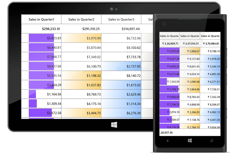
The UWP DataGrid control is used for efficiently displaying and manipulating tabular data. Its rich feature set includes functionalities like data binding, editing, sorting, filtering, grouping, and exporting to Excel and PDF file formats. It has also been optimized for working with millions of records, as well as handling high frequency real-time updates.
High Performance

Instant Loading
Ability to load millions of records instantly.

Fast Data Processing
Data processing operations like sorting, filtering, grouping, summaries, refresh, and real-time update operations are handled efficiently using PLINQ.

Print and Export
Optimized for quickly printing and exporting to Excel/PDF file formats.
Data Binding
Data binding works out of the box for all popular data sources. It automatically generates columns for the data-bound collection. It even assigns appropriate column types for the specific data types.

Seamless Editing Experience
- Support for built-in column types.
- Embed controls such as progress bar and rating to view or edit the data.
- Built-in support to commit or rollback changes when the data object implements IEditableObject.
- New records can be added dynamically using in-built functionality.


Data Error Indication and Validation
Built-in support for validating cells and displaying error information based on INotifyDataErrorInfo and Data Annotations. It also provides support to dynamically handle validations.

Data Shaping and Manipulation

Sorting
Support to sort data against one or more columns with multiple customization operations. There is also an option to sort by caption summary values when the grid is grouped.

Grouping
Support for grouping data by one or more columns either programmatically or through mouse and touch interactivity.

Filtering
Built-in Excel-inspired filter UI with advanced filtering options to easily filter and view data as required. It is also possible to filter programmatically.

Summaries
Built-in support to calculate and display sum, min, max, average, count, and custom aggregates in additional rows in a table or group.

Real-Time Updates
Handles high frequency updates even under the most demanding scenarios where the data is sorted and grouped in real-time. The summaries are calculated in an optimized way and the updated summary is instantly refreshed in real-time usage scenarios.
Conditional Formatting
Ability to customize cell and row appearance conditionally based on data.
Row and Column Customization

Individual Row Heights
Change the height of the rows based on the content of any column or certain columns to enhance the readability of content.

Cell Merging
Ability to dynamically merge data in adjacent cells and present that data in a single cell.

Freeze Panes
Freeze the rows and columns at top, bottom, left, and right positions similar to Excel.

Unbound Rows
Ability to display rows at the top and bottom of the grid with data that is not bound to the ItemsSource.

Stacked Headers
Built-in support for displaying stacked headers, unbound header rows that can span across multiple rows and columns.

Unbound Columns
Provides support to display additional columns that are not bound to a data source. It can also display the results of expressions that are calculated based on values in other columns.
Hierarchical Table View
Master-detail relationship is represented through nested grids that can be expanded and collapsed as required. It also supports functionalities like editing, sorting, filtering, etc. Its flexibility allows unlimited levels of nesting.

Data Virtualization

Data Virtualization
Ability to display records on demand by automatically enabling data virtualization when it is bound to a VirtualizingCollectionView.

Incremental Loading
Ability to load data while scrolling, if the data source is derived from ISupportIncrementalLoading interface.

Paging
Interactive support to manipulate the data using SfDataPager control. It also supports on-demand loading.
Appearance
Fully customizable using Microsoft Expression Blend and Visual Studio. It is possible to completely customize the cell and row appearance.

Interactive Features

Row Drag-and-Drop
Built-in support to drag and drop rows. Also supports drag-and-drop between controls.

Column Chooser
Column chooser UI can be selectively enabled to let end users interactively choose the visible columns. The default UI can also be customized as required.

Context Menu
Improve the end user experience by adding custom context menu entries.

Selection
Built-in support for row and cell-based selection similar to Excel, with extensive support for all keyboard navigations.
Printing and Exporting
- Rich set of options for exporting data to Microsoft Excel file formats, PDF, CSV, and printing.
- Several customization options are also provided to customize the exporting and printing operations.


Serialization
Settings in the grid can be serialized to XML format and loaded back through the built-in serialization options.
Localization
Any static text in the data grid can be localized to any desired language.

UWP DataGrid Code Example
Easily get started with the UWP DataGrid using a few simple lines of C# code as demonstrated below. Also explore our UWP DataGrid Example that shows you how to render and configure the UWP DataGrid.
<Page x:Class="GettingStarted.MainPage"
      xmlns="http://schemas.microsoft.com/winfx/2006/xaml/presentation"
      xmlns:x="http://schemas.microsoft.com/winfx/2006/xaml"
      xmlns:d="http://schemas.microsoft.com/expression/blend/2008"
      xmlns:local="using:GettingStarted"
      xmlns:mc="http://schemas.openxmlformats.org/markup-compatibility/2006"
      xmlns:syncfusion="using:Syncfusion.UI.Xaml.Grid"
      mc:Ignorable="d">
    <Grid>
        <syncfusion:SfDataGrid x:Name="dataGrid" />
    </Grid>

</Page>
using Syncfusion.UI.Xaml.Grid;
namespace GettingStarted
{
public sealed partial class MainPage : Page
{
public MainPage()
{
this.InitializeComponent();
SfDataGrid dataGrid = new SfDataGrid();
Root_Grid.Children.Add(dataGrid);
}
}
}Not sure how to create your first UWP DataGrid? Our documentation can help.
I’d love to read it now110+ UWP CONTROLS
ALL CONTROLS
GRIDS
DATA VISUALIZATION
INPUT CONTROLS
CALENDAR
NAVIGATION
BUSINESS INTELLIGENCE
LISTS & DROPDOWN
NOTIFICATION
MISCELLANEOUS
FILE VIEWERS & EDITORS
Standalone UI SDKs
Integrate the DataGrid, Chart, Scheduler, Gantt, and Diagram UI components into applications to enable rich interaction and visualization, delivering a seamless user experience.
Document Solutions
Integrate the PDF Viewer, DOCX Editor, Spreadsheet Editor, and document-processing libraries into the UWP applications to enable a smooth user experience.
Frequently Asked Questions
Why should you choose Syncfusion UWP DataGrid?
The Syncfusion UWP DataGrid provides the following:
Loads millions of records in just a second.
Flexible data binding with support to use data sources such as WCF, ADO.NET, LINQ to SQL and Microsoft Access.
Rich UI interaction and keyboard navigation to interact with the software.
Packed with a bunch of features with customization options suitable for building complex, large-scale applications.
- Touch friendly and responsive.
- Simple configuration and API.
- One of the best UWP DataGrid in the market that offers a feature-rich UI.
Extensive demos and documentation to learn quickly and get started with UWP DataGrid.
Where can I find the Syncfusion UWP DataGrid demo?
You can find our UWP DataGrid demo on
GitHub location.
Can I download and utilize the Syncfusion UWP DataGrid for free?
No, this is a commercial product and requires a paid license. However, a free community license is also available for companies and individuals whose organizations have less than $1 million USD in annual gross revenue, 5 or fewer developers, and 10 or fewer total employees.
How do I get started with Syncfusion UWP DataGrid?
A good place to start would be our comprehensive getting started documentation.
Our Customers Love Us
Having an excellent set of tools and a great support team, Syncfusion® reduces customers’ development time.Here are some of their experiences.

The best tool to operate grid like data out there
Good documentation helps you with everything you need to know. What I like the most is that it takes you from configuration to usage. I have mainly used grid and toolbar options along with dashboard.

Ivan G,

Business Application Developer
Superior components:any day anytime
Essential studio is one of a kind. The fact that they give us the community developer license has always shown how much they value the small teams creating their own startups. Essential studio has helped a lot in my almost ready business intelligence platform for the healthcare industry. The grid and the kanban components are what made us fall in love with all the other components.

Kelvin M.
Software Development Engineer
See Real Success Stories
Developers around the world trust Syncfusion’s Essential Studio to simplify complex projects and speed up delivery. With a vast library of UI controls, powerful SDKs, and reliable support, Essential Studio helps teams build enterprise-ready applications with confidence.
Read Our Customer StoriesIndustry
Software development
75% Cost reduction
50% Faster development
Industry
Utilities (oil and gas)
450+ hours saved
Streamlined processes and hours of development effort saved.
Advanced, flexible features
Empowered users through robust and versatile functionality.
Industry
Software and technology
1000+ of hours saved
Accelerated development with enterprise-ready UI components.
Efficient file management
Streamlined workflows with document libraries without building them from scratch.
Industry
Software and technology
2 Years of delay avoided
Two years of delays prevented with proactive planning.
On-time delivery
Projects delivered on schedule using trusted controls.
Industry
IT services and IT consulting
Improved performance
Large datasets handled with easy customization and quick debugging.
Highly customizable
Plug-and-play controls with quick template integration.
Industry
Professional services
Instant access
Quick availability of features and resources.
Reduced dependencies
Fewer dependencies for faster development.
Rated by users across the globe
Syncfusion UWP Resources
Learning
 Documentation
 Documentation


Awards
Greatness—it’s one thing to say you have it, but it means more when others recognize it. Syncfusion® is proud to hold the following industry awards.

