WinUI Masked TextBox Control for Validated Input and Formatting
- Easily mask input values.
- Use simple or regex masking types with a fixed or variable length.
- Format input values with prompts, literals, or both.
- Completely customize the UI of the MaskedTextBox.
Trusted by the world’s leading companies

Overview
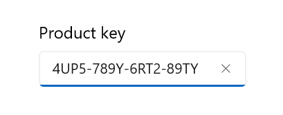
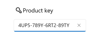
The .NET WinUI MaskedTextBox is an advanced input control that restricts the input of certain characters, text, and numbers by using a mask pattern. This control is used to create templates for providing information such as telephone numbers, email IDs, IP addresses, product keys, and so on.
Mask types
The WinUI MaskedTextBox control provides two types of masks: simple and regex. Each has a different set of mask elements that are combined to form a mask expression.
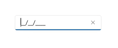
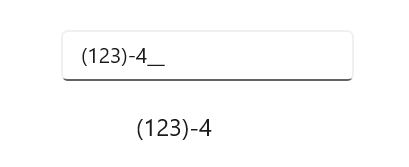
Simple mask
Generate expressions with very simple mask elements. This is mainly used for fixed-length inputs.
Regex mask
Use regex masks to create more complex expressions for input data.
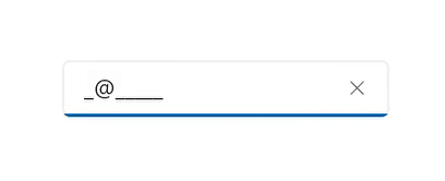
Formatting value
The WinUI MaskedTextBox control provides the option to format input values with literals and prompt characters.

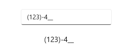
Exclude prompts and literals
Set up the MaskedTextBox to exclude prompt and literal characters, preserving only the typed characters.
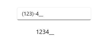
Include prompts and literals
Maintain typed, prompt, and literal characters in the input.
Include prompts
Set up the MaskedTextBox to preserve typed and prompt characters, excluding literals.
Include literals
Keep typed and literal characters in the input but exclude prompt characters.
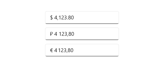
Culture
Special symbols like currency symbols, date separators, decimal separators, and others are applied based on the specified culture.
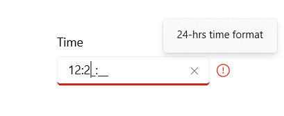
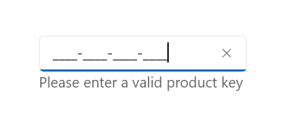
Error indication
The WinUI Masked TextBox control indicates errors by displaying an icon with additional details when hovering the cursor over the icon.

Error type
Some built-in error types are provided: default, critical, warning, information, and success.

Custom error type
Users can customize the error icon and the border brush for indication.
Error content
Show additional information when hovering the cursor over the error icon.
Customization
WinUI MaskedTextBox provides customization support for the header, header template, and description.
Header
The header is used to display the title for the MaskedTextBox control.
Header template
The header template is used to customize the appearance of the control’s header.
Description
The description is used to display content beneath the control and provide guidance on the input that the control expects.
WinUI MaskedTextBox code example
Easily get started with the WinUI MaskedTextBox using a few simple lines of XAML and C# code as demonstrated below. Also explore our WinUI MaskedTextBox example that shows you how to render and configure the control.
<Page
    x:Class="GettingStarted.MainPage"
    xmlns="http://schemas.microsoft.com/winfx/2006/xaml/presentation"
    xmlns:x="http://schemas.microsoft.com/winfx/2006/xaml"
    xmlns:local="using:GettingStarted"
    xmlns:d="http://schemas.microsoft.com/expression/blend/2008"
    xmlns:mc="http://schemas.openxmlformats.org/markup-compatibility/2006"
    xmlns:syncfusion="using:Syncfusion.UI.Xaml.Core"
    mc:Ignorable="d"
    Background="{ThemeResource ApplicationPageBackgroundThemeBrush}">
    <Grid>
      <syncfusion:SfMaskedTextBox MaskType="Simple" Mask="00/00/0000"/>
    </Grid>
</Page>
// Creating an instance of the MaskedTextBox control.
SfMaskedTextBox maskedTextBox = new SfMaskedTextBox();
// Adding the mask type to the control.
maskedTextBox.MaskType= "Simple";
//Setting the mask value of the control.
maskedTextBox.Mask="00/00/0000";Syncfusion WinUI DataViz & UI Controls
Standalone UI SDKs
Integrate the DataGrid, Chart, and Scheduler UI components into applications to enable rich interaction and visualization, delivering a seamless user experience.
Document Solutions
Integrate the PDF Viewer, DOCX Editor, Spreadsheet Editor, and document-processing libraries into the WinUI applications to enable a smooth user experience.
Our Customers Love Us


See Real Success Stories
Developers around the world trust Syncfusion’s Essential Studio to simplify complex projects and speed up delivery. With a vast library of UI controls, powerful SDKs, and reliable support, Essential Studio helps teams build enterprise-ready applications with confidence.
Read Our Customer StoriesIndustry
Software development
75% Cost reduction
50% Faster development
Industry
Utilities (oil and gas)
450+ hours saved
Streamlined processes and hours of development effort saved.
Advanced, flexible features
Empowered users through robust and versatile functionality.
Industry
Software and technology
1000+ of hours saved
Accelerated development with enterprise-ready UI components.
Efficient file management
Streamlined workflows with document libraries without building them from scratch.
Industry
Software and technology
2 Years of delay avoided
Two years of delays prevented with proactive planning.
On-time delivery
Projects delivered on schedule using trusted controls.
Industry
IT services and IT consulting
Improved performance
Large datasets handled with easy customization and quick debugging.
Highly customizable
Plug-and-play controls with quick template integration.
Industry
Professional services
Instant access
Quick availability of features and resources.
Reduced dependencies
Fewer dependencies for faster development.
Rated by users across the globe


Awards
Greatness—it’s one thing to say you have it, but it means more when others recognize it. Syncfusion® is proud to hold the following industry awards.

