WinForms ComboBox - A Multiselect ComboBox with Advanced Features
- Multiple item selection made easy with intuitive check box selection.
- Search and filter items by placing an intuitive UI at the top of the dropdown.
- Rich feature set includes autocompletion, check box selection, sorting, watermark text, and appearance customization.
.NET 10 support now available
Trusted by the world’s leading companies

Overview
The WinForms ComboBox (multiselect combobox) control allows users to type a value, choose an item, or choose multiple items. Any UI control can be loaded as the header of the dropdown. Users can perform customized actions like search and filter in the dropdown. The control’s rich feature set includes autocomplete, sorting, watermark text, appearance customization, and more.
Data binding
The WinForms ComboBox control has data binding support to work out-of-the-box with all the popular data sources like IEnumerable (IList, IBindingList, ObservableCollection) and data tables. It also supports sorting and filtering. Data can be shown based on the display member and value member. The control also allows users to bind the data source at the designer level.

Selection
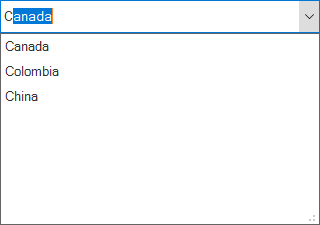
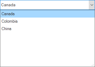
- The WinForms ComboBox control provides support to select an item or multiple items from the dropdown.
- Users can easily select multiple items by using the checkboxes in the dropdown.
- The control displays a confirmation button in the dropdown. It supports customization of the selected item’s appearance.


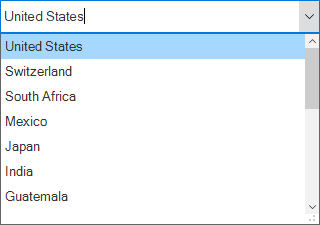
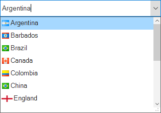
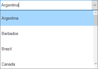
Autocomplete (filter by typing)

Suggestion
- A list of items is displayed in the dropdown based on the text typed in the editor control.
- Users can perform case-sensitive autocompletion.
- Users can filter suggested items using starts with or contains.

Append
- The control completes the user-typed word with suggestion text to help users search for correct items easily.
- Users select an item from the dropdown list based on the appended word in the edit control.
Suggest and append
- This combines the operations of suggestion and append.
- Users can perform case-sensitive autocompletion.
- Control completes a word that the user types with suggestion text and filters the suggestions. Users can choose an item from the filtered list.
Sort
- Sort the items in the dropdown in either ascending or descending order.
- Sort items by writing your own custom logic.
Filtering
The WinForms ComboBox allows users to filter data. For example, items in the dropdown can be filtered based on user input.
Watermark
A watermark provides a hint to users about the data to be selected from the listed values.

Appearance style

Styling
Customize the appearance of the edit control and dropdown list by setting the:
- Background color
- Text color
- Font
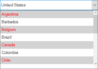
Conditional styling
Customize the appearance of the dropdown list items based on the data.
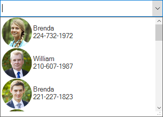
Images in dropdown
Users can load an image to each list item in the dropdown. Images can also be aligned with the text.
Custom drawing
Make a custom drawing for every list item in the WinForms Combobox control.
Dropdown position
Customize the dropdown position to load the pop-up where needed.


Clear button
Show or hide the clear button, which is used to clear the editor value and selection.
Built-in themes
The WinForms ComboBox control provides Office 2016 theme support to adapt the control to the rest of a business application. The following Office 2016 themes are supported:
- Colorful
- Black
- Dark Gray
- White

Item height
Users can adjust (auto fit) the item height in the dropdown based on the content of the item to enhance readability. It is also possible to set the item height conditionally.
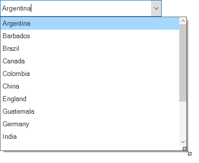
Dropdown sizing
- Change the height and width of the dropdown.
- Resize the dropdown dynamically using an intuitive resizing thumb.
Localization
Localize all the static default strings in the WinForms ComboBox control to any supported language.


Right to left (RTL)
The control supports right-to-left (RTL) rendering for users working in right-to-left languages like Hebrew, Arabic, or Persian.
UI automation
The WinForms ComboBox control is compatible with Coded UI and UFT (formerly QTP) automation tools to automate applications.

WinForms ComboBox Code Example
Easily get started with the WinForms ComboBox using a few simple lines of C# code example as demonstrated below. Also explore our WinForms ComboBox Example that shows you how to configure a ComboBox in WinForms.
using Syncfusion.WinForms.ListView;
namespace WinFormsApp1
{
    public partial class Form1 : Form
    {
        public Form1()
        {
            InitializeComponent();
            List<string> usStates = new List<string>();
            usStates.Add("Alaska");
            usStates.Add("Arizona");
            usStates.Add("Arkansas");
            usStates.Add("California");
            usStates.Add("Colorado");
            usStates.Add("Connecticut");
            usStates.Add("Delaware");
            usStates.Add("Florida");
            usStates.Add("Georgia");
            SfComboBox sfComboBox = new SfComboBox();
            sfComboBox.Size = new Size(180, 24);
            sfComboBox.AutoCompleteMode = AutoCompleteMode.SuggestAppend;
            sfComboBox.DataSource = usStates;
            this.Controls.Add(sfComboBox);
        }
    }
}
Not sure how to create your first WinForms ComboBox? Our documentation can help.
I’d love to read it now120+ WINDOWS FORMS CONTROLS
ALL CONTROLS
CONVERSATIONAL UI
DATA VISUALIZATION
INPUT CONTROLS
NAVIGATION
DIALOGS & NOTIFICATION
LAYOUT
LISTS & DROPDOWN
CALENDAR
MISCELLANEOUS
FILE VIEWERS & EDITORS
BUTTONS
Standalone UI SDKs
Integrate the DataGrid, Chart, Scheduler, Gantt, Rich Text Editor, File Manager, and Diagram UI components into applications to enable rich interaction and visualization, delivering a seamless user experience.
Document Solutions
Integrate the PDF Viewer, DOCX Editor, Spreadsheet Editor, and document-processing libraries into the WinForms applications to enable a smooth user experience.
Frequently Asked Questions
Why should you choose Syncfusion WinForms ComboBox?
The Syncfusion WinForms ComboBox provides the following features:
Multiple item selection made easy with intuitive check box selection.
- Search and filter items by placing an intuitive UI at the top of the dropdown.
A rich feature set that includes autocompletion, check box selection, sorting, watermark text, and appearance customization.
- Work with a simple configuration and API.
- One of the best WinForms ComboBox in the market that offers feature-rich UI to interact with the software.
- Use touch-friendly and responsive features.
Learn quickly and get started with WinForms ComboBox using its extensive demos and documentation.
Where can I find the Syncfusion WinForms ComboBox demo?
You can find our WinForms ComboBox demo on GitHub location.
Can I download and utilize the Syncfusion WinForms ComboBox for free?
No, this is a commercial product and requires a paid license. However, a free community license is also available for companies and individuals whose organizations have less than $1 million USD in annual gross revenue, 5 or fewer developers, and 10 or fewer total employees.
How do I get started with Syncfusion WinForms ComboBox?
A good place to start would be our comprehensive getting started documentation.
Our Customers Love Us
Having an excellent set of tools and a great support team, Syncfusion® reduces customers’ development time.Here are some of their experiences.

Excellent experience with Syncfusion!
Syncfusion is a product that makes life easier! I use it to create Blazor applications (server side and webassembly) and the controls speed up development a lot. Furthermore, if needed, it is possible to ask for direct support that is never long in coming!

Andrea Scarpante,

Sydea srl
The complete component set
It is the most complete component set available. Also very handy is the fact that there is a community edition, this gives me the opportunity to test thing at home without buying a separate license.

Johan Visser,

H and T Pawnbrokers
See Real Success Stories
Developers around the world trust Syncfusion’s Essential Studio to simplify complex projects and speed up delivery. With a vast library of UI controls, powerful SDKs, and reliable support, Essential Studio helps teams build enterprise-ready applications with confidence.
Read Our Customer StoriesIndustry
Software development
75% Cost reduction
50% Faster development
Industry
Utilities (oil and gas)
450+ hours saved
Streamlined processes and hours of development effort saved.
Advanced, flexible features
Empowered users through robust and versatile functionality.
Industry
Software and technology
1000+ of hours saved
Accelerated development with enterprise-ready UI components.
Efficient file management
Streamlined workflows with document libraries without building them from scratch.
Industry
Software and technology
2 Years of delay avoided
Two years of delays prevented with proactive planning.
On-time delivery
Projects delivered on schedule using trusted controls.
Industry
IT services and IT consulting
Improved performance
Large datasets handled with easy customization and quick debugging.
Highly customizable
Plug-and-play controls with quick template integration.
Industry
Professional services
Instant access
Quick availability of features and resources.
Reduced dependencies
Fewer dependencies for faster development.
Rated by users across the globe
Syncfusion Windows Forms Resources
Learning
 Documentation
 Documentation


Awards
Greatness—it’s one thing to say you have it, but it means more when others recognize it. Syncfusion® is proud to hold the following industry awards.

