.NET WinUI AvatarView Control
- Display initials, images, and pre-defined avatars.
- Add up to three initials or images in a single view using group avatar view.
- Customize the avatar’s border, background, and more.
- Built-in visual styles in different sizes with shapes such as circles and squares.
Trusted by the world’s leading companies

Overview
The AvatarView (profile view) control for .NET WinUI provides a graphical representation of users that can be customized by adding images, background colors, icons, text, and more.
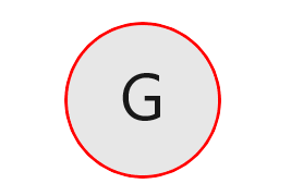
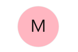
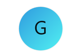
Initials
The WinUI AvatarView control supports both single and double characters in initials. So, users can generate initials based on the text provided.
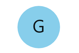
Single character
Used to show one character (first character) from the avatar name.
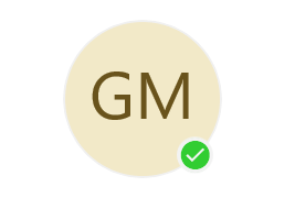
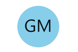
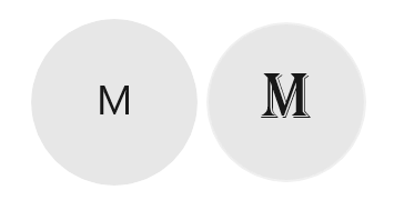
Double character
Used to show two characters (first and last character for a single word/first character for more than one word) from the avatar name as initials.
Custom image
Set any custom image as the avatar for the user in the WinUI AvatarView control.
Avatar character
The WinUI AvatarView control has 25 pre-defined avatar character images to set the avatar for users.
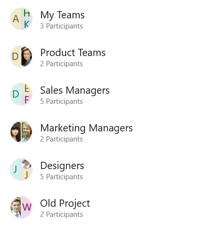
Group view
A group view is one of the most common UIs in any chat application. Almost all chat applications support group chats that require a common group picture to represent the group. The WinUI AvatarView control supports group avatar view.
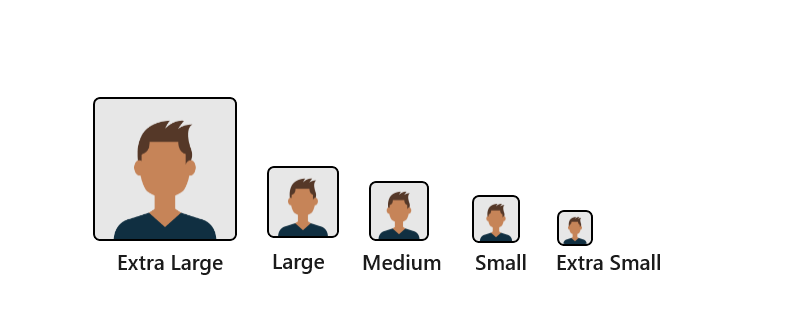
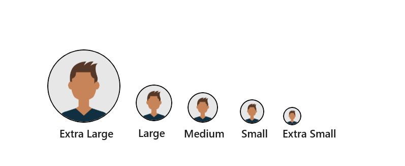
Visual style
The WinUI AvatarView control comes with a predefined style as per design guidelines. Sizing specifications based on style factors such as extra-large, large, medium, small, and extra-small for squares and circles are available.
Square
WinUI AvatarView supports pre-defined square shaped styles.
Circle
WinUI AvatarView supports pre-defined circle shaped styles.
Customization
The WinUI AvatarView control has customization options such as border, background, gradient background, font, and more.
Border customization
Users can easily customize the border color and thickness of the control.
Font customization
Users can change the font size, font color, and font family of the initials.
Background
Users can customize the background of the control.
Gradient background
Users can customize the control background with a gradient color.
WinUI AvatarView code example
Easily get started with the WinUI AvatarView control using a few simple lines of XAML and CS code example as demonstrated below. Also explore our WinUI AvatarView Example that shows you how to render and configure the AvatarView control.
<Page
    x:Class="GettingStarted.MainPage"
    xmlns="http://schemas.microsoft.com/winfx/2006/xaml/presentation"
    xmlns:x="http://schemas.microsoft.com/winfx/2006/xaml"
    xmlns:local="using:GettingStarted"
    xmlns:d="http://schemas.microsoft.com/expression/blend/2008"
    xmlns:mc="http://schemas.openxmlformats.org/markup-compatibility/2006"
    xmlns:syncfusion="using:Syncfusion.UI.Xaml.Core"
    mc:Ignorable="d"
    Background="{ThemeResource ApplicationPageBackgroundThemeBrush}">
    <Grid>
      <syncfusion:SfAvatarView ContentType="Initials" AvatarName="Glenn McGrath"/>
    </Grid>
</Page>
// Create an instance of the AvatarView control.
SfAvatarView avatarView = new SfAvatarView();
// Add the ContentType value in the control.
avatarView.ContentType = AvatarContentType.Initials;
//Set the AvatarName value.
avatarView.AvatarName = "Glenn McGrath";Syncfusion WinUI DataViz & UI Controls
Standalone UI SDKs
Integrate the DataGrid, Chart, and Scheduler UI components into applications to enable rich interaction and visualization, delivering a seamless user experience.
Document Solutions
Integrate the PDF Viewer, DOCX Editor, Spreadsheet Editor, and document-processing libraries into the WinUI applications to enable a smooth user experience.
Our Customers Love Us


See Real Success Stories
Developers around the world trust Syncfusion’s Essential Studio to simplify complex projects and speed up delivery. With a vast library of UI controls, powerful SDKs, and reliable support, Essential Studio helps teams build enterprise-ready applications with confidence.
Read Our Customer StoriesIndustry
Software development
75% Cost reduction
50% Faster development
Industry
Utilities (oil and gas)
450+ hours saved
Streamlined processes and hours of development effort saved.
Advanced, flexible features
Empowered users through robust and versatile functionality.
Industry
Software and technology
1000+ of hours saved
Accelerated development with enterprise-ready UI components.
Efficient file management
Streamlined workflows with document libraries without building them from scratch.
Industry
Software and technology
2 Years of delay avoided
Two years of delays prevented with proactive planning.
On-time delivery
Projects delivered on schedule using trusted controls.
Industry
IT services and IT consulting
Improved performance
Large datasets handled with easy customization and quick debugging.
Highly customizable
Plug-and-play controls with quick template integration.
Industry
Professional services
Instant access
Quick availability of features and resources.
Reduced dependencies
Fewer dependencies for faster development.
Rated by users across the globe


Awards
Greatness—it’s one thing to say you have it, but it means more when others recognize it. Syncfusion® is proud to hold the following industry awards.

