
Xamarin.Forms DataForm - Create Interactive Data Entry Forms
- Various built-in and custom editors efficiently display and edit the properties of any object based on the data type.
- Built-in data validation is made easy with different validation modes and data annotation support.
- Support to design the UI as required. Linear and grid layouts, different label positioning, and grouping are also supported.
Trusted by the world’s leading companies

Overview
The Xamarin DataForm is a data-oriented control that is used to display and edit the properties of any data object using a wide range of built-in editors for different data types. Custom editors are also supported. It simplifies the development of various forms such as login, reservation, and data entry. It supports built-in data validation and data annotation. It also provides support for linear and grid layouts, label positioning options, grouping, and more features to design the UI as required.

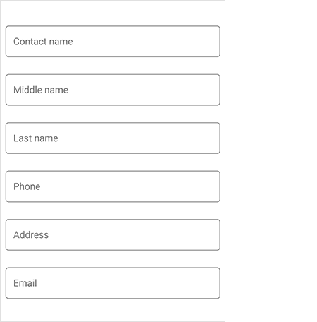
Default and Custom Editors
The Xamarin.Forms DataForm includes built-in support for various editors to handle different data types, as well as custom editors. Built-in editors are automatically generated based on data annotations and the type of field. The following built-in editors are available:

Text Editor

Numeric Editor

Numeric Up-Down Editor

Date Picker

Time Picker

Password Editor

Masked Text Editor

DropDown Editor

Checkbox Editor

Switch Editor

Segment Editor

Radio Group Editor

Autocomplete Editor
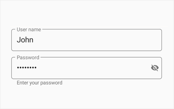
Floating label layout
Xamarin.Forms DataForm editors are integrated with TextInputLayout, which provides floating and assistive labels, leading and trailing icons, and password toggle icon to show or hide password. Support has been provided to select either filled or described container for DataForm publishers based on the application’s requirement and appearance.


Password visibility toggling
Enable password toggle icon to show or hide the password interactively in DataForm password editor.
Assistive labels
Assistive labels provide more information about the DataForm editors.

Hint label
Avoid additional labels to provide more space to input view by adding hint text. It is moved from the middle to the top to show a floating label when the DataForm editors become active.

Helper text
Helper text provides additional information about the text to be entered.

Validation label
Validation label displays error text that assists in solving validation errors.

Counter label
The maximum characters to be entered in the text field can be displayed.
Leading and trailing views
Add leading and trailing icons to indicate the DataForm editors, such as birth date, phone number, and password.

Appearance customization
Apply appealing colors to all the elements of DataForm editors to match your app theme.

Background color
This feature allows users to customize the background color of the editor view in floating label layout.

Hiding helper text
Provided support to hide the helper text in floating label layout based on the user’s requirement.

Editing

Commit Mode
Editing support is provided with the following commit modes that determine when an edited value should be updated in the data object.
- LostFocus
- PropertyChanged
- Explicit

Read-Only Mode
The DataForm supports read-only display mode. It also allows specific fields to be made read-only.

Converters
Support to show the original value in a different format or as different value using converters.

Two-way data binding
The DataForm editors are always synced with the business object. When a business object is updated, the values of the DataForm editors are updated, and when a value is edited in the DataForm, business object values are updated.
Validation and error Indication
- Built-in support to validate data and display error information based on INotifyDataErrorInfo and data annotations.
- Different validation modes such as LostFocus, PropertyChanged, and explicit to determine when the value should be validated.
- Provides support for custom validations.
- Support to display a positive message on valid data fields.
- Support to customize validation message using templates in DataForm.

Custom data fields
Support to manually generate data fields without using data object. This is used to load data from another source such as Dictionary. It also has support to read and write from/to another data source.

Grouping
- Group data fields with captions for better categorization.
- Expand or collapse groups to easily navigate through more data fields.
- Each group can have different columns.

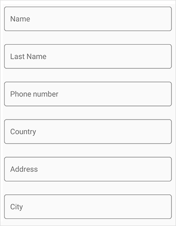
Layouts
Provides support for linear and grid layouts.


Grid layout
The grid layout arranges items in a predefined number of columns.
Order of the fields
You can change the order of the fields regardless of the position in the data object to view it in the desired position.

Regenerate data fields
Support to add or remove fields and regenerate fields dynamically to show the fields only when required.
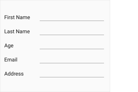
Appearance

Label Position
You can position the labels to the left or at the top of the editor.

Label and Editor width customization
You customize the label and editor width ratio to set the width proportionally based on the requirement.

Width and Height Customization
Support to customize each data field’s width and height for better readability.

Watermark
Display watermarks to guide end users.

Hiding the fields in Xamari.Forms DataForm
Showing the fields in Xamari.Forms DataForm
Show or Hide Fields
Support to show or hide data form fields dynamically based on the application needs.


Exclude fields
Support to exclude specific fields of a data object in UI.

Data Annotations
Options to customize data form fields based on data annotation attributes.


Localization
The Xamarin.Forms DataForm supports localizing label text, group name, watermark, and validation messages in the desired language.

RTL support
The Xamarin.Forms DataForm supports right to left (RTL) direction for users working in right-to-left languages like Hebrew, Arabic, or Persian.
Not sure how to create your first Xamarin DataForm? Our documentation can help.
I’d love to read it now150+ XAMARIN UI CONTROLS
ALL CONTROLS
-
Xamarin.Forms
-
Xamarin.Android
-
Xamarin.iOS
-
GRIDSDATA VISUALIZATIONNAVIGATIONEDITORSLAYOUTPROJECT MANAGEMENTNOTIFICATIONDOCUMENT PROCESSING LIBRARIESVIEWER/EDITORMISCELLANEOUSCHAT
-
GRIDSDATA VISUALIZATIONNAVIGATIONEDITORSLAYOUTPROJECT MANAGEMENTNOTIFICATIONVIEWER/EDITORDOCUMENT PROCESSING LIBRARIESMISCELLANEOUS
-
GRIDSDATA VISUALIZATIONNAVIGATIONEDITORSLAYOUTPROJECT MANAGEMENTNOTIFICATIONVIEWER/EDITORDOCUMENT PROCESSING LIBRARIESMISCELLANEOUS
The most downloaded control (based on the nuget.org download count).
Frequently Asked Questions
Why should you choose Syncfusion Xamarin DataForm?
The Syncfusion Xamarin DataForm provides the following:
17 built-in and custom editors.
A floating label layout for editors that includes features such as assistive labels, leading and trailing icons, and a password toggle icon to show or hide passwords.
- Grouped data fields for better categorization.
- Built-in support to validate data and display error information.
- Data fields that can be arranged in linear and grid layouts.
- A read-only display mode.
- Different types of commit mode: PropertyChanged, LostFocus, and Explicit.
- Support to show the original value in a different format or as a different value using converters.
- Support for localizing the label text, group name, watermark, and validation messages.
Right-to-left (RTL) rendering for users working in right-to-left languages like Hebrew, Arabic, or Persian.
- Appearance customization.
Extensive demos and documentation to learn quickly and get started with Xamarin DataForm.
Where can I find the Syncfusion Xamarin DataForm demo?
You can find our Xamarin DataForm demo here.
Can I download and utilize the Syncfusion Xamarin DataForm for free?
No, this is a commercial product and requires a paid license. However, a free community license is also available for companies and individuals whose organizations have less than $1 million USD in annual gross revenue, 5 or fewer developers, and 10 or fewer total employees.
How do I get started with Syncfusion Xamarin DataForm?
A good place to start would be our comprehensive getting started documentation.
Our Customers Love Us
Having an excellent set of tools and a great support team, Syncfusion® reduces customers’ development time.Here are some of their experiences.

Amazing tool, great designs
Using Xamarin templates from Syncfusion I can focus on the code and do not have to worry about design. Very easy to implement.

Dirk F,

Software Development Engineer, Small-Business
Essential for any Xamarin developer!
A large number of components that complement or improve almost everything that does not yet exist in Xamarin. The support is the best I've ever seen! They fix bugs quickly and are always willing to listen to suggestions.

Cezar W,
Co-Founder, Small-Business
Rated by users across the globe
Syncfusion Xamarin.Forms Resources
Learning
 Documentation
 Documentation


Awards
Greatness—it’s one thing to say you have it, but it means more when others recognize it. Syncfusion® is proud to hold the following industry awards.

