.NET MAUI TreeView - High-Performance Tree List Control
- Display hierarchical data, such as organizational structures and nested connections.
- Customize TreeView nodes, expanders, and selections.
- Create a hierarchical navigation UI using the unbound mode.
Trusted by the world’s leading companies

Overview
The .NET MAUI TreeView control displays data in a tree structure. It allows users to expand and collapse nodes, bind data, create nodes, and customize the UI easily. It is optimized for smooth scrolling and efficient data reuse. It also supports different selection modes, complete UI customization, and MVVM commands for better performance.
.NET MAUI TreeView code example
Get started with the .NET MAUI TreeView using a few simple lines of XAML code, as demonstrated below. Also, explore this .NET MAUI TreeView example, which shows you how to render and configure the .NET MAUI TreeView.
<ContentPage xmlns="http://schemas.microsoft.com/dotnet/2021/maui"
             xmlns:x="http://schemas.microsoft.com/winfx/2009/xaml"
             xmlns:syncfusion="clr-namespace:Syncfusion.Maui.TreeView;assembly=Syncfusion.Maui.TreeView"
             xmlns:treeviewengine="clr-namespace:Syncfusion.TreeView.Engine;assembly=Syncfusion.Maui.TreeView"
             x:Class="GettingStarted.MainPage">
    <ContentPage.Content>
       <syncfusion:SfTreeView x:Name="treeView">
            <syncfusion:SfTreeView.Nodes>
                <treeviewengine:TreeViewNode Content="Australia">
                    <treeviewengine:TreeViewNode.ChildNodes>
                        <treeviewengine:TreeViewNode Content="New South Wales"/>
                    </treeviewengine:TreeViewNode.ChildNodes>
                </treeviewengine:TreeViewNode>
                <treeviewengine:TreeViewNode Content="United States of America">
                    <treeviewengine:TreeViewNode.ChildNodes>
                        <treeviewengine:TreeViewNode Content="New York"/>
                        <treeviewengine:TreeViewNode Content="California"/>
                    </treeviewengine:TreeViewNode.ChildNodes>
                </treeviewengine:TreeViewNode>
            </syncfusion:SfTreeView.Nodes>
        </syncfusion:SfTreeView>
    </ContentPage.Content>
</ContentPage>
Data binding
The .NET MAUI TreeView control allows users to utilize both ItemsSource binding and unbound mode for populating nodes. By populating nodes in unbound mode, it can easily be changed to a navigation control. When using the MVVM approach, all the relevant properties and commands of the .NET MAUI TreeView can be utilized.


Load on demand
The .NET MAUI TreeView control is designed to optimize performance by dynamically loading child items when a node is expanded. This on-demand loading approach reduces initial load times and memory usage, for a more responsive and efficient experience as users navigate through hierarchical data.
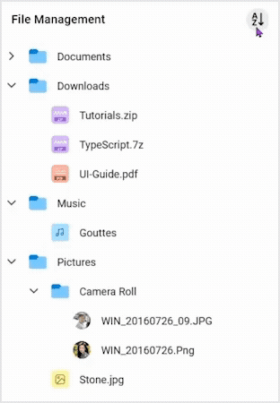
Custom template
The TreeView control allows users to customize tree nodes using images and custom views through templates. Customize each node, including parent and child nodes, by dynamically choosing a UI using a data template selector.

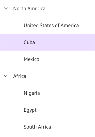
Selection
The TreeView enables item selection through programmatic and touch interactions. It offers single, single-deselect, multiple, extended, and none selection modes. It allows users to apply background colors to selected items, as well.

Sorting
The .NET MAUI TreeView control allows users to sort TreeView items to organize hierarchical data.
Drag and drop
Reorder items by dragging them with a long press. The control supports customizing the appearance of items while dragging them.

Checkboxes
The .NET MAUI TreeView control allows users to load a checkbox in each node, and toggle the checked and unchecked state of the nodes.

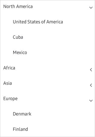
Expander position
Customize the placement and alignment of the expander view within tree nodes to better fit your design. Adjust the position of the expander icon to enhance usability and visual appeal.

Appearance

Expander customization
The .NET MAUI TreeView control offers an expander interface with adjustable sizing for creating a stylish appearance.

Item sizing
Modify the item height within the .NET MAUI TreeView control.

Indentation
Define the necessary indentation space for child nodes.
Interaction with nodes
- Expand and collapse nodes using the expander, either programmatically or through user clicks.
- Use events to manage user actions at the application level.
- Utilize command properties to create MVVM-based applications.
Auto-size tree nodes
The control adjusts the tree node height automatically to enhance content readability. Users can also set the node height conditionally, including for just one level or node.


Right to left
The .NET MAUI TreeView component lets users adjust the text flow direction, allowing them to switch between left-to-right and right-to-left.
 95+ UI controls
200+ interactive .NET MAUI demos
3.2M+ downloads
95+ UI controls
200+ interactive .NET MAUI demos
3.2M+ downloads
Not sure how to create your first .NET MAUI TreeView? Our tutorial videos and documentation can help.
I’d love to watch it now I’d love to read it now.NET MAUI DataViz & UI Controls
Standalone UI SDKs
Integrate the DataGrid, Chart, Scheduler, and Rich Text Editor UI components into applications to enable rich interaction and visualization, delivering a seamless user experience.
Document Solutions
Integrate the PDF Viewer, DOCX Editor, Spreadsheet Editor, and document-processing libraries into the .NET MAUI applications to enable a smooth user experience.
Frequently Asked Questions
Why should you choose the Syncfusion® .NET MAUI TreeView?
The Syncfusion® .NET MAUI TreeView component supports the following features:
- Bind hierarchical data or manually add unbound tree nodes.
Select nodes through different selection modes and keyboard navigation.
- Load child items dynamically through lazy loading when expanding the node.
Load a checkbox in each node and toggle their checked and unchecked states.
Work with a simple configuration and API.
- Touch-friendly UI.
Extensive demos, documentation, and videos help get started quickly with the .NET MAUI TreeView control.
Where can I find the Syncfusion .NET MAUI TreeView library demo?
You can find our .NET MAUI TreeView demo, which demonstrates how to render and configure TreeView control.
What is the .NET MAUI TreeView?
The .NET MAUI TreeView is a hierarchical data control that enables the display of data in a tree-like structure. It supports features like data binding, selection, and custom templates for nodes.
How do I export TreeView data?
There is no direct or built-in support for exporting TreeView data. Implement custom logic to export the data as JSON, XML, or Excel, depending on your application’s needs.
Can I enable checkboxes in the .NET MAUI TreeView?
You can check/uncheck the corresponding nodes by adding the SfCheckBox control in ItemTemplate and binding TreeViewNode.IsChecked to the SfCheckBox.IsChecked property. Also, you can set or get the list of checked/unchecked items using the CheckedItems collection property.
Can I download and utilize the Syncfusion .NET MAUI TreeView library for free?
No, this is a commercial product and requires a paid license. However, a free Community License is also available for companies and individuals whose organizations have less than $1 million USD in annual gross revenue, 5 or fewer developers, and 10 or fewer total employees.
How do I get started with Syncfusion .NET MAUI TreeView library?
A good place to start would be our comprehensive getting started documentation.
How do I bind data to a .NET MAUI TreeView?
To bind data, set the hierarchical data collection to the ItemsSource property and define the child object name as ChildPropertyName. You can bind it in XAML or C#.
How do I set up context menus in the .NET MAUI TreeView?
There are no built-in context menu options in the TreeView. You can add custom a context menu through ItemTapped, ItemRightTapped, or ItemLongPress events.
How do I load data dynamically in the .NET MAUI TreeView?
You can load the child nodes when the parent node is expanded by using the LoadOnDemandCommand property of TreeView. This feature is applicable for bound mode only.
Our Customers Love Us


See Real Success Stories
Developers around the world trust Syncfusion’s Essential Studio to simplify complex projects and speed up delivery. With a vast library of UI controls, powerful SDKs, and reliable support, Essential Studio helps teams build enterprise-ready applications with confidence.
Read Our Customer StoriesIndustry
Software development
75% Cost reduction
50% Faster development
Industry
Utilities (oil and gas)
450+ hours saved
Streamlined processes and hours of development effort saved.
Advanced, flexible features
Empowered users through robust and versatile functionality.
Industry
Software and technology
1000+ of hours saved
Accelerated development with enterprise-ready UI components.
Efficient file management
Streamlined workflows with document libraries without building them from scratch.
Industry
Software and technology
2 Years of delay avoided
Two years of delays prevented with proactive planning.
On-time delivery
Projects delivered on schedule using trusted controls.
Industry
IT services and IT consulting
Improved performance
Large datasets handled with easy customization and quick debugging.
Highly customizable
Plug-and-play controls with quick template integration.
Industry
Professional services
Instant access
Quick availability of features and resources.
Reduced dependencies
Fewer dependencies for faster development.
Rated by users across the globe


 .NET MAUI UI Kit
Awards
Greatness—it’s one thing to say you have it, but it means more when others recognize it. Syncfusion® is proud to hold the following industry awards.

