React Scheduler Component for Building Calendar & Scheduling Apps
- A React Scheduler is an event calendar UI component that allows you to display, create, edit, and manage appointments, meetings, and events in React applications.
- It supports multiple calendar views, recurring events, drag-and-drop scheduling, resource scheduling, and time zone handling.
Trusted by the world’s leading companies

Overview
The Syncfusion React Scheduler is a flexible and high-performance event calendar component built for managing time-based data and resources in React applications. It is commonly used to build booking systems, appointment scheduling solutions, and resource planning applications where accuracy, usability, and scalability matter. Designed to handle complex scheduling scenarios, it helps teams deliver rich, user-friendly calendar experiences without extensive custom UI work.
Interact with the Live React Scheduler
Runs in-browser. No installation required.
Why choose Syncfusion React Scheduler?
High performance
Optimized rendering and efficient data handling ensure fast load times and smooth scheduling, even when managing large volumes of events in enterprise applications.
Flexible data binding
Connect easily to REST APIs, JSON, or cloud data sources. Supports real-time updates and seamless integration with modern application backends.
AI-Assisted Development
Build scheduling and calendar experiences faster with the Agentic UI Builder and Syncfusion Agent Skills. Generate appointment workflows, recurring events, resource scheduling, and timeline views with minimal manual effort.
Fully responsive
Adaptive layout delivers a consistent scheduling experience across desktops, tablets, and mobile devices without additional configuration.
Customizable themes
Personalize the scheduler’s appearance using built-in themes or custom styling to match your application’s design and branding. Utilize the online Theme Studio tool to customize themes of Scheduler easily.
Globalization support
Supports multiple languages, time zones, and regional formats, enabling developers to build scheduling applications for global users.
AI-assisted development
Build feature-rich React Scheduler experiences faster
Accelerate scheduling application development with Syncfusion AI tools that turn requirements into fully configured calendar and event management experiences with minimal manual setup.
Agentic UI Builder
Turn prompts into ready-to-use UI screens, layouts, and workflows with Syncfusion React components.
Example Prompt Create a doctor appointment scheduler with recurring events and timeline views.
Agent Skills
Accelerate development with Syncfusion AI Agent Skills for faster implementation and integration.
Example Prompt Generate a React scheduler with recurring appointments, resource grouping, and drag-and-drop editing.
AI Coding Assistant
Accelerate development with AI that generates, configures, and troubleshoots component code directly in your IDE.
Example Prompt Show how to bind remote appointments and enable timeline views in the Syncfusion React Scheduler.
AI Scheduler for Smarter Planning
The AI Scheduler organizes your calendar with ease. Just type instructions like, “Meet the team every Friday at 10 AM”, and it handles the rest. It checks for conflicts, suggests optimal times, and organizes your calendar visually.
React Scheduler Use Cases
Build powerful scheduling and booking applications using the Syncfusion React Scheduler. It supports real-world scenarios such as healthcare scheduling, resource booking, hospitality reservations, and workforce management.
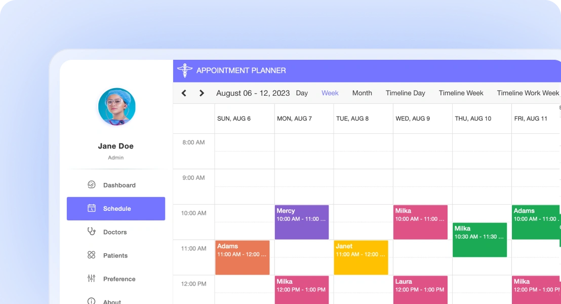
Healthcare scheduling
Manage patient appointments, doctor availability, and recurring visits efficiently. Prevent conflicts and support accurate scheduling across departments and locations.
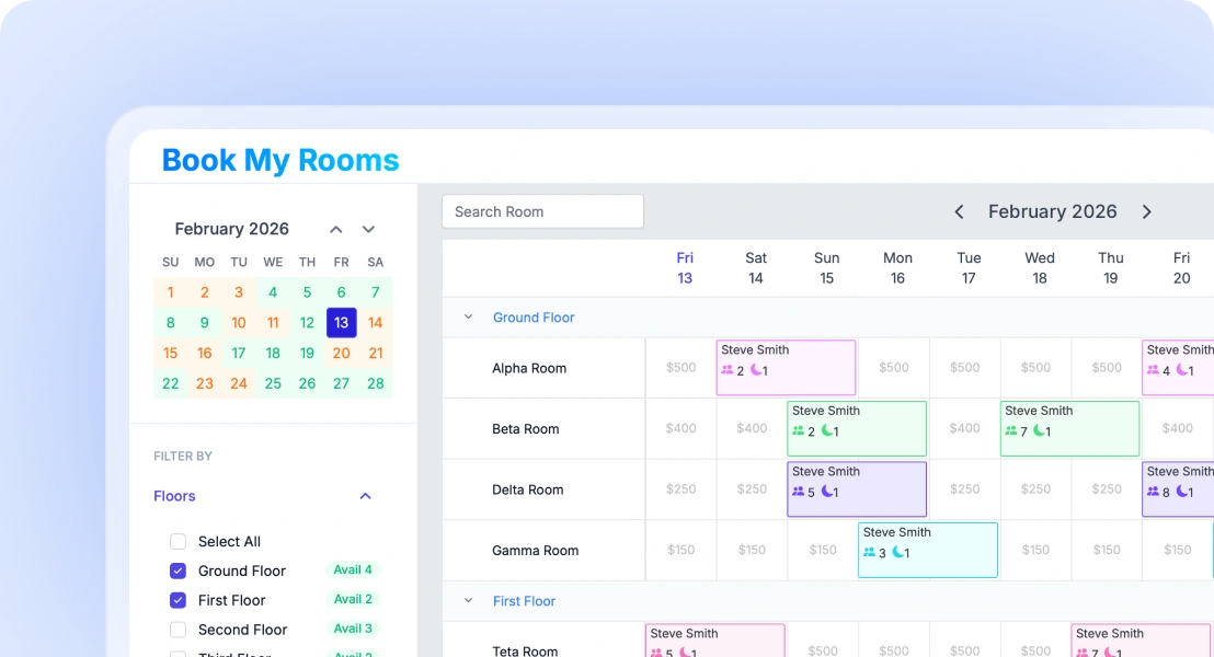
Resource and room booking
Enable users to reserve meeting rooms, equipment, or shared spaces. Prevent double bookings and manage resource availability with ease.
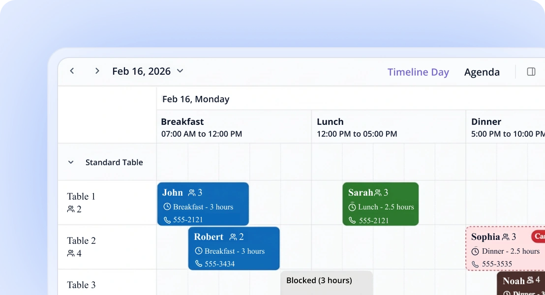
Hotel reservations
Handle room bookings and guest schedules efficiently. Easily update and reschedule reservations using intuitive scheduling interactions.
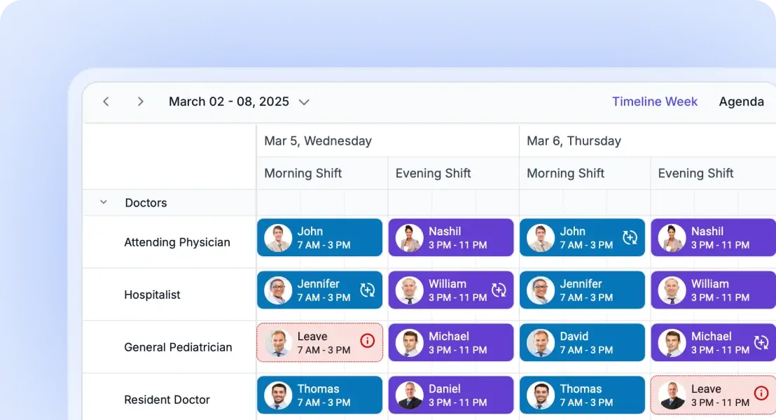
Employee shift scheduling
Plan employee shifts, assign roles, and manage workforce availability. Simplify staff coordination and scheduling operations.
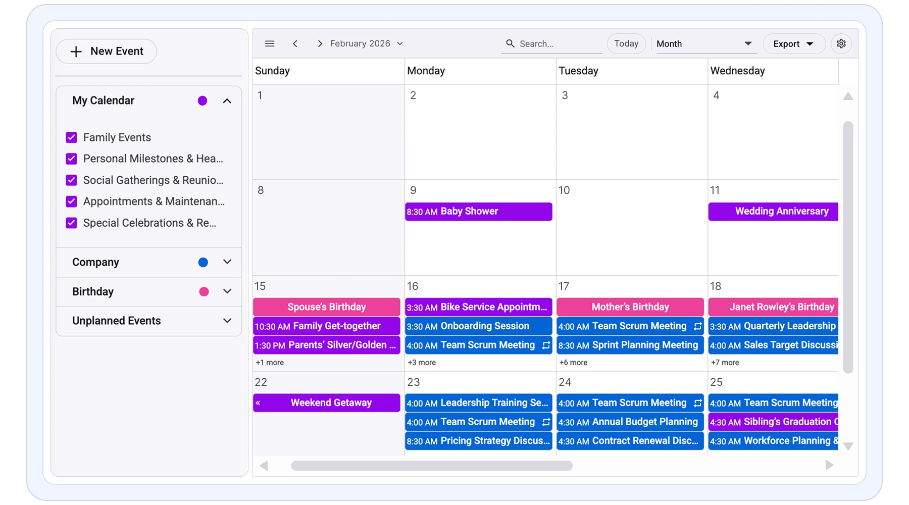
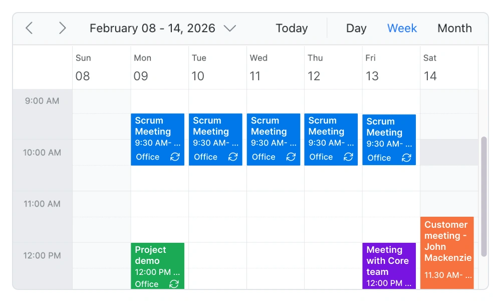
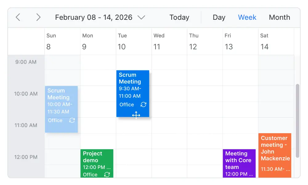
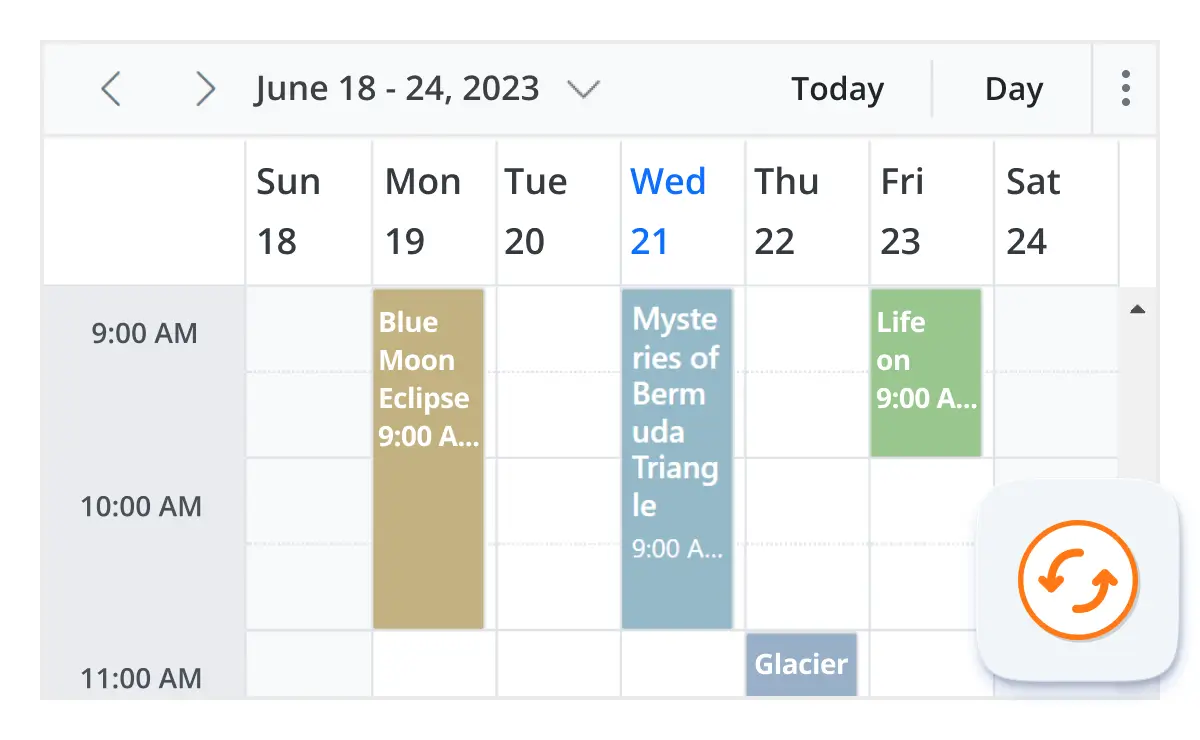
Multiple calendar views
A wide variety of built-in view modes are available: day, week, workweek, month, agenda, month-agenda, year, and timeline. Easily configure each individual view with different, view-specific options.
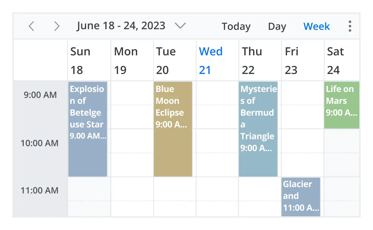
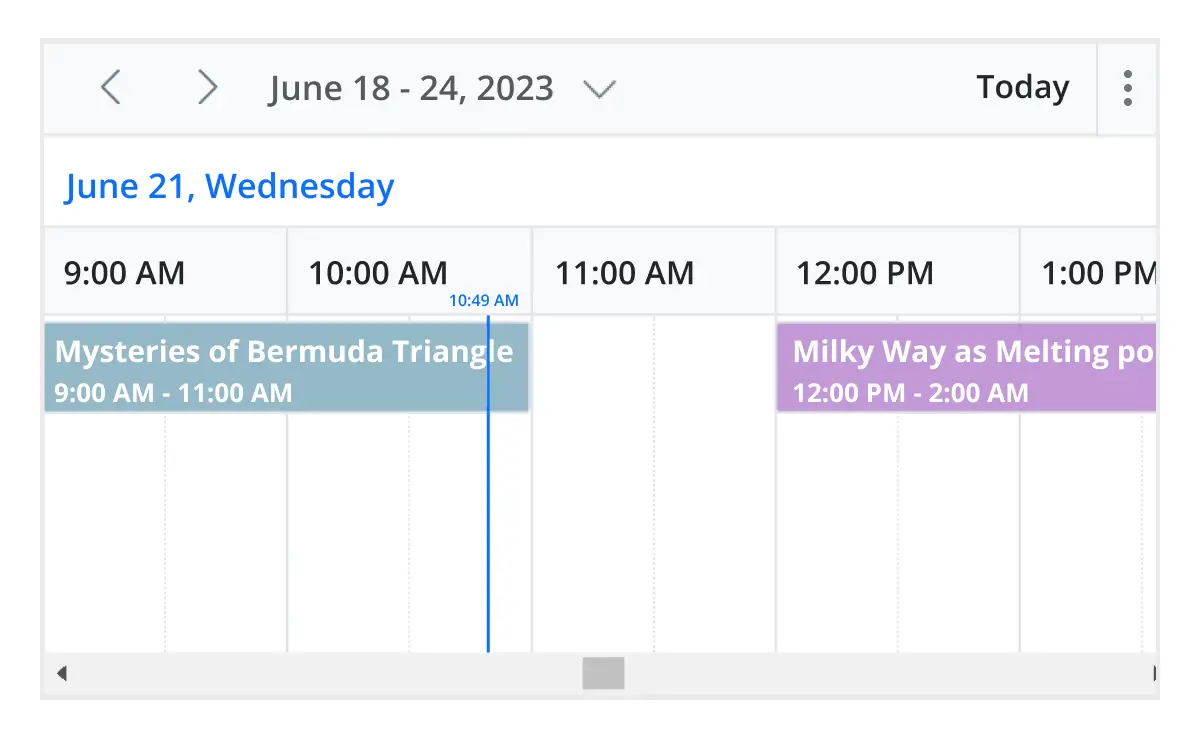
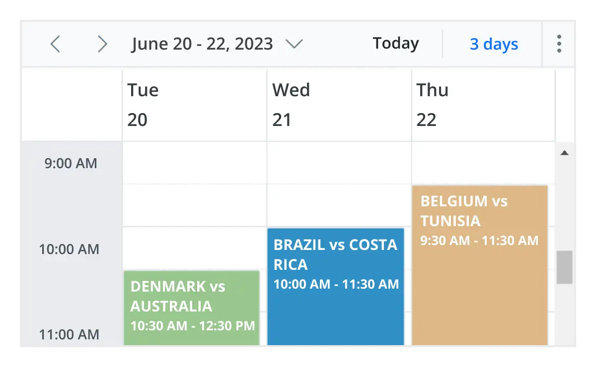
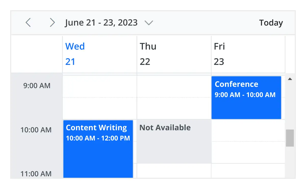
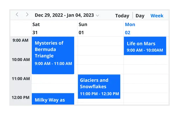
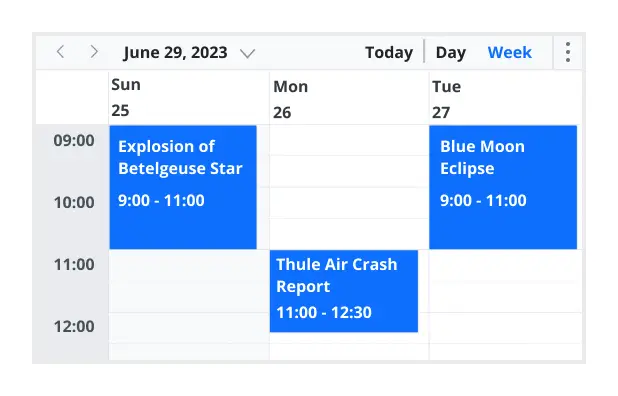
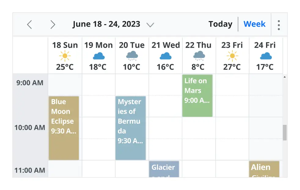
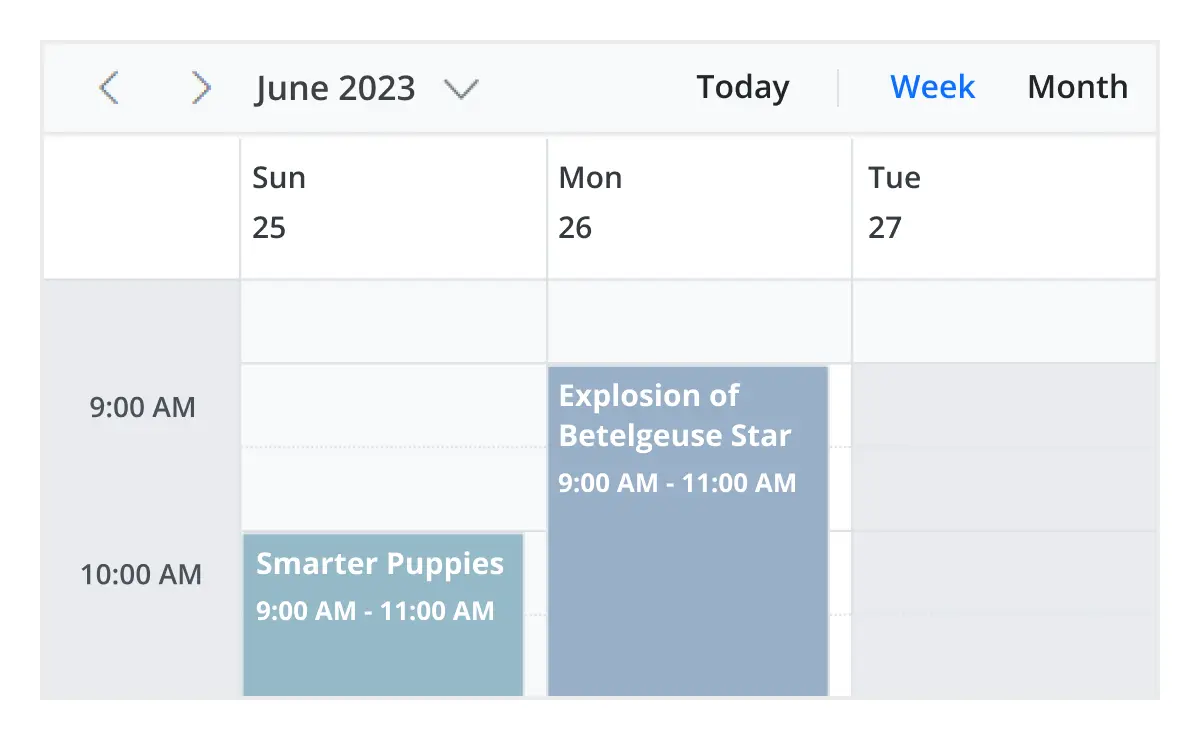
Day, week, and workweek views
Display appointments for a single day or across multiple days using React Scheduler.
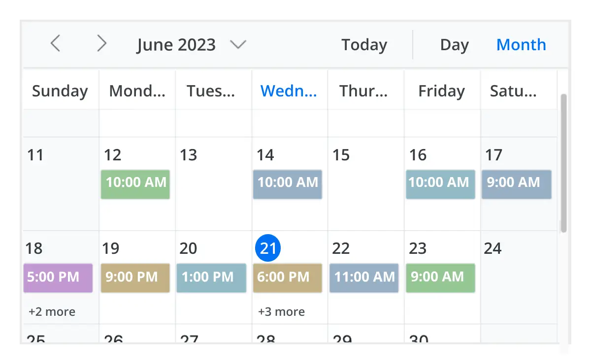
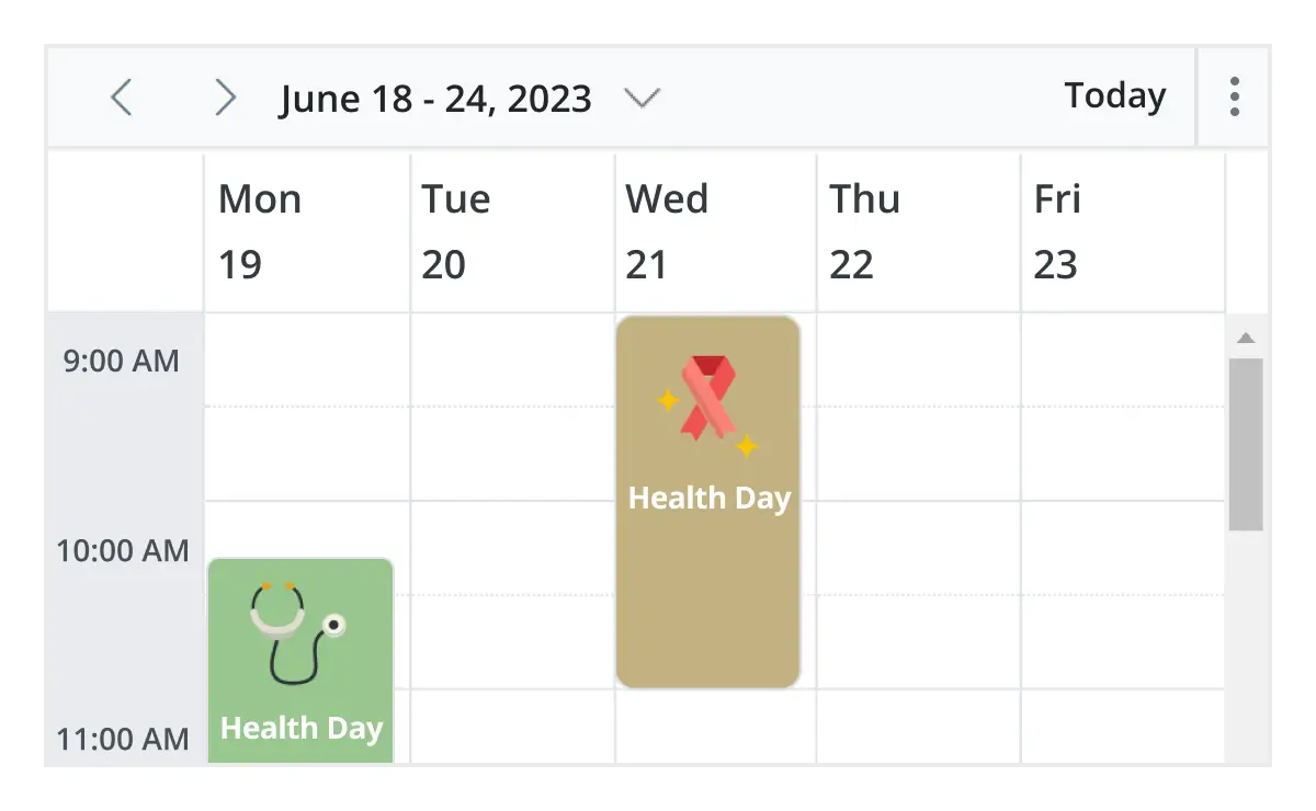
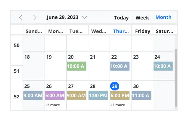
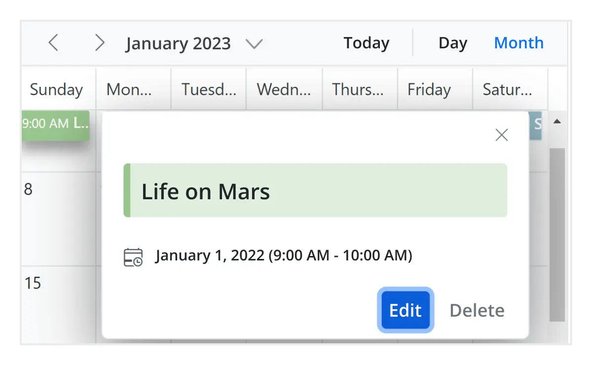
Month view
In React Scheduler, you can display events and appointments on a single day or multiple days for an entire month.
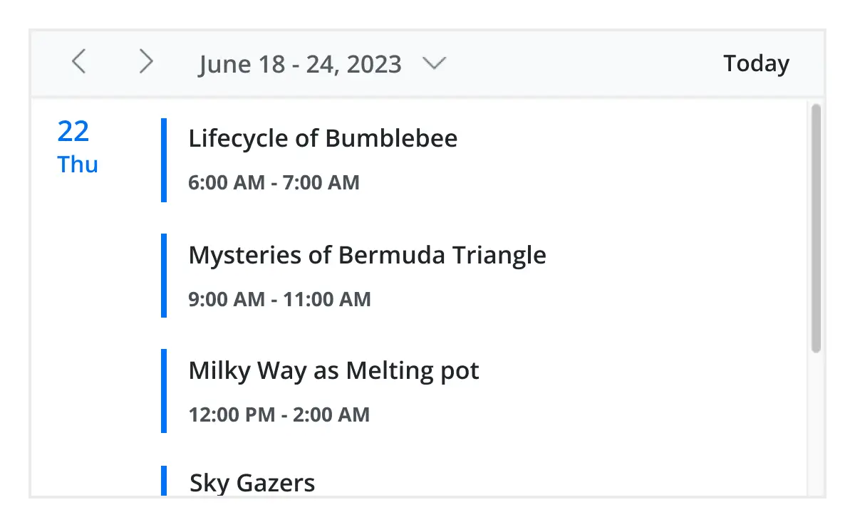
Agenda view
Load events virtually and display them as a list in a sequential order grouped by day. An option exists to specify the number of days to load initially in the agenda view of React Scheduler.
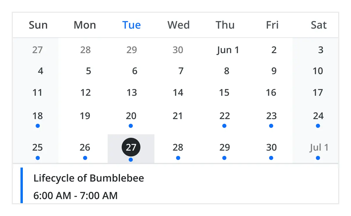
Month agenda view
Display the calendar layout and the events of the currently selected date. A round indicator at the bottom of a date shows the presence of one or more events on that day.
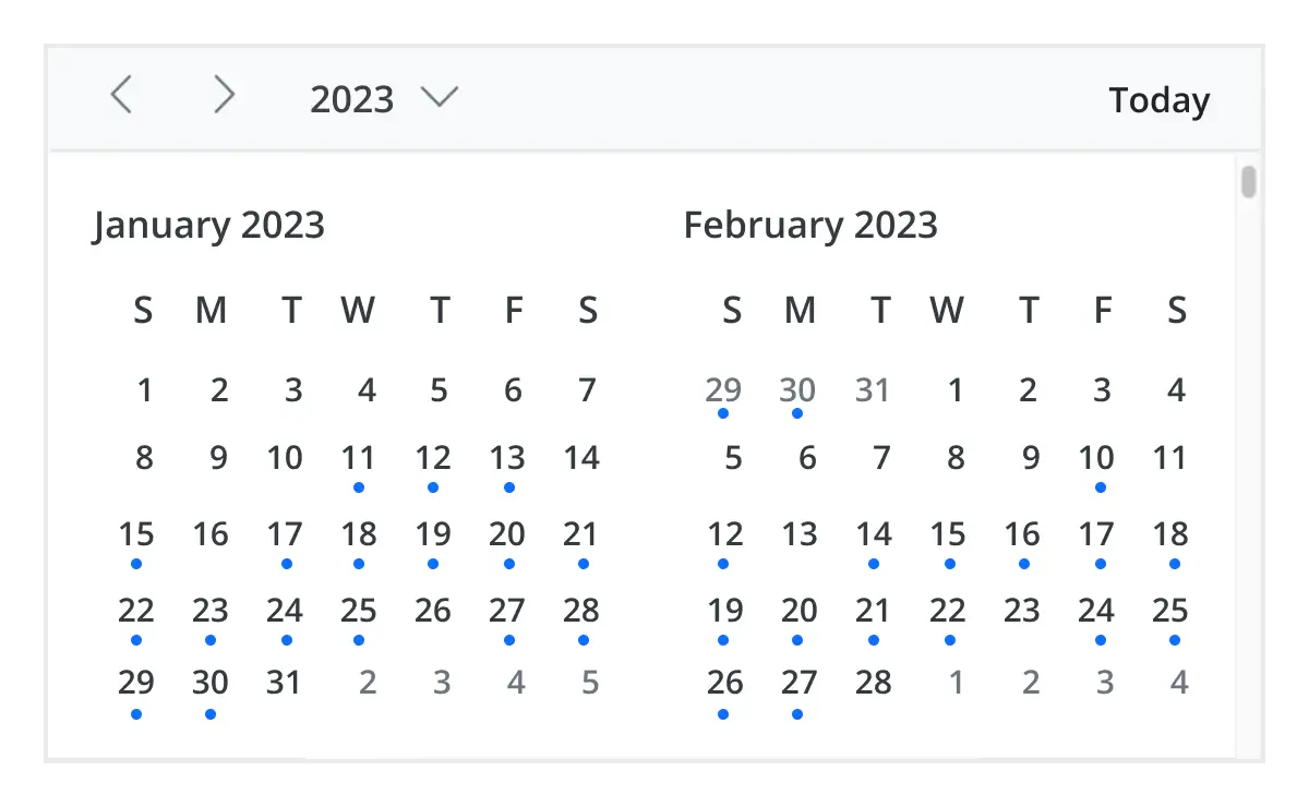
Year view
Year view displays all the months of a particular year in a calendar view format. In that calendar view, dates containing events and appointments are highlighted with dots placed under the individual date. When you click on the date, the event pop-up will be displayed and the events will be listed.
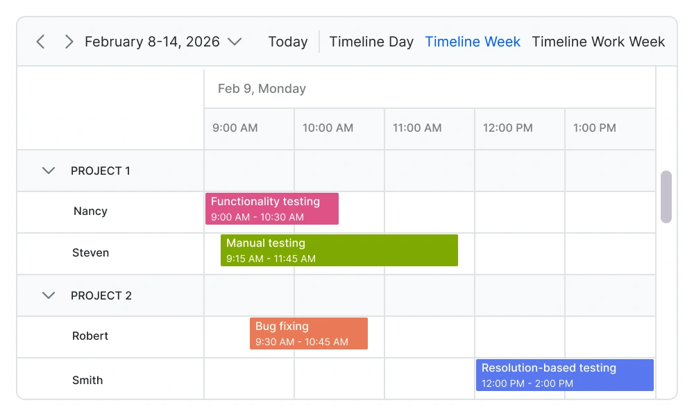
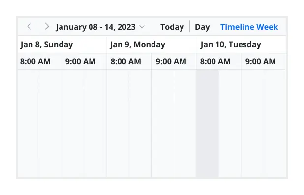
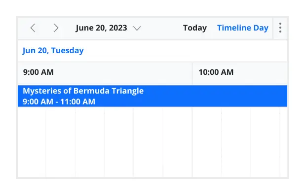
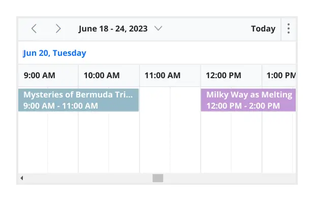
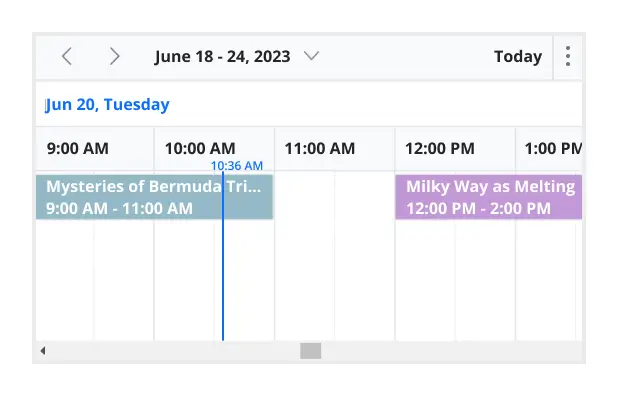
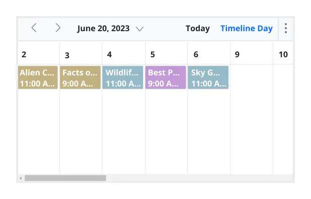
Timeline views
React Scheduler provides five built-in timeline views: timeline day, timeline week, timeline workweek, timeline month, and timeline year. Each view displays events accurately across a horizontal time axis for a single day or multiple days. To provide better performance, timeline views load resources, and appointments virtually on every scroll action.
Recurring event scheduling
Easily create and manage recurring appointments with flexible recurrence rules. Schedule daily, weekly, monthly, or custom recurring events, and handle exceptions or modifications without affecting the entire series. This makes it ideal for applications such as appointment booking systems, healthcare scheduling, and workforce planning tools.
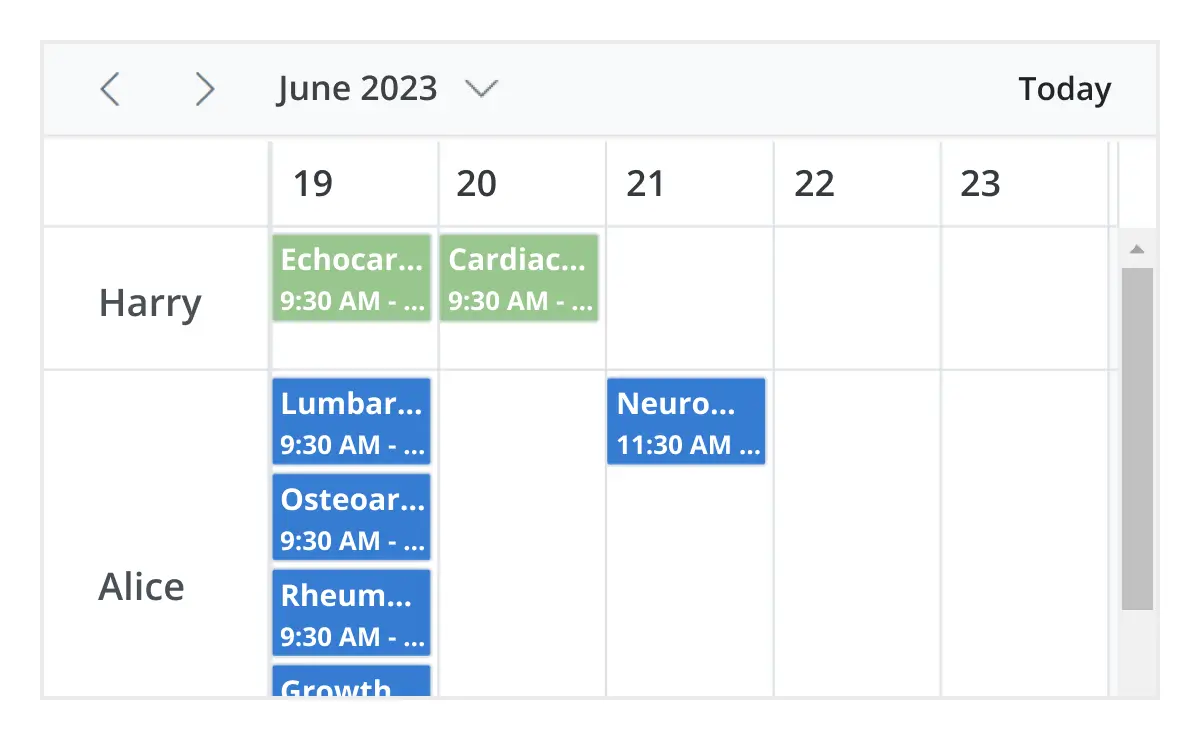
Resource scheduling
Efficiently manage and schedule multiple resources such as meeting rooms, employees, equipment, or service providers. Group events by resource, track availability, and prevent scheduling conflicts. This is essential for resource planning, workforce management, and reservation systems.
Drag-and-drop scheduling
Enable intuitive scheduling with built-in drag-and-drop and resizing capabilities. Users can quickly move appointments, adjust durations, or update schedules directly from the interface. This improves scheduling efficiency and provides a seamless user experience in calendar and scheduling applications.
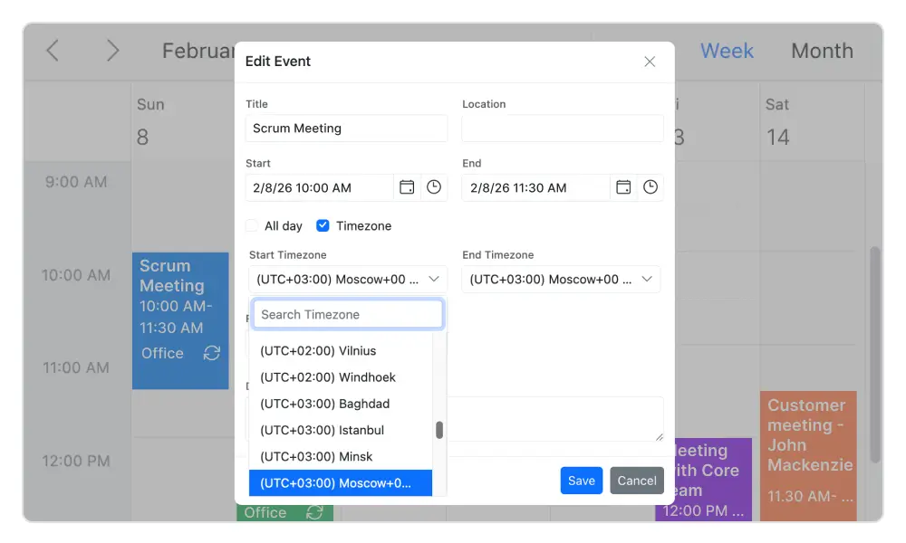
Timezone support
Regardless of the system time zone, the React Event Calendar supports setting the required time zone for the control itself, as well as events.
Real-time data synchronization
Real-time appointment data accurately synchronizes with our React Scheduler.
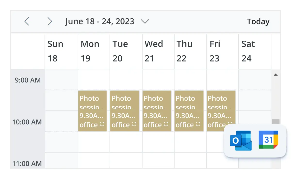
Outlook and Google Calendar integration
Easily synchronize events between our React Event Calendar and Google or Outlook Calendar via the Google Calendar API or Microsoft Outlook’s object library.
Real-time updates
Bidirectional data communication conveys the server-side appointment updates made on Scheduler to all the connected clients through SignalR.
Advanced event-handling options
The React Event Calendar provides clear, vibrant, exact representations of events and appointments across the Scheduler timeline, based on their assigned time duration.

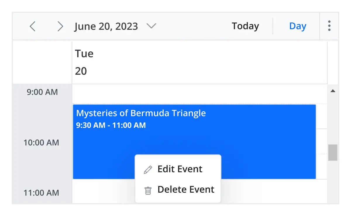
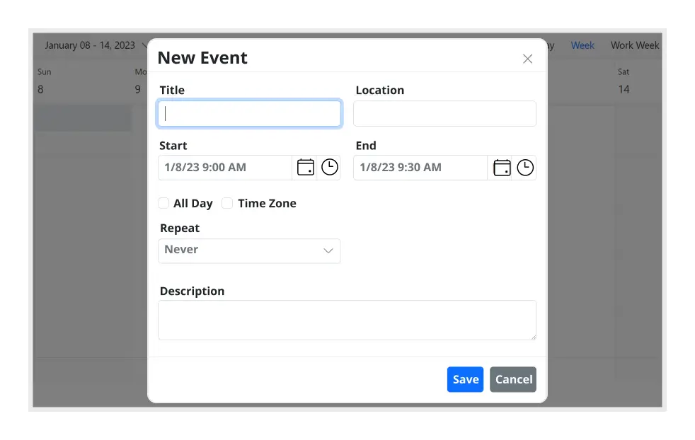
Add and edit capabilities
There is built-in support for better event handling, such as easier appointment creation and editing using the default event editor or through intuitive drag-and-resize actions. In addition, you can also add custom data fields to both the events and resource data source.

Multi-event selection
Easily select multiple events at once by pressing and holding the Ctrl key while clicking on events. On mobile devices, do the same by tapping and holding an event, and continue selecting by single-tapping other events. After successfully selecting events, delete or reposition them simultaneously.

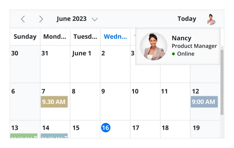
Tooltip
The customizable tooltip displays event information while the mouse pointer is hovering over the event. Do the same on mobile devices by tapping and holding an event.

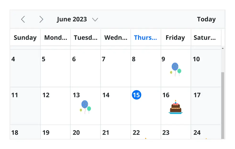
Appearance customization
Change the look and feel of React Scheduler events and appointments by customizing their default appearance and style using any HTML or CSS.

Clipboard
The React Scheduler supports clipboard functionality, allowing users to manage events efficiently. Users can copy selected events using the Ctrl+C shortcut, cut events with Ctrl+X, and paste events into different time slots using Ctrl+V.

Inline appointment
With this feature enabled, users can create or edit appointments inline with a single click on a Scheduler cell or an appointment subject. Pressing Enter after typing the new subject will update and save the appointment.
Customizable scheduler views
Real-time appointment data accurately synchronizes with our React Scheduler.
Unique view configurations
Easily configure each individual view mode with different calendar settings. For example, you can enable the grouping feature in month view and apply event templates in week view.
Extensible view intervals
Display multiple days, weeks, and months by extending each view mode based on the provided interval count.
Block time interval
You can block specific time ranges on React Event Calendar to prevent the creation of events and appointments in that time slot.
Adaptive rows
A built-in option has been added to the React Event Calendar to automatically increase the height of the rows in month and timeline views when new concurrent events or appointments are added.
Context menu
Context menu integrated with React Scheduler opens when a cell or appointment is right-clicked.
Feature-rich calendar options
The React Event Calendar inherits almost all the calendar-specific features, such as first day of the week and timescale.
First day of the week
Customize the first day of the week, which defaults to Sunday, as per the default locale. You can utilize this option for individual views, also.
Custom start and end hours
Display the event scheduler layout with specific time durations by hiding the unwanted hours.
Flexible timescale
Use customizable timescale options to view a timeline of events clearly and set a different duration.
Working time
The active cells of the scheduler (displayed in white) visually represent the work days and working hours.
Highlighting current time
Indicate the current date with a highlighted date header. Mark accurately the current time on all views.
Hiding weekend days
Hiding weekend days from the Scheduler allows you to display only working days across all views.
Week number display
Display the week number of the current date range beside the date header in day, week, and workweek views. Also display the week number in the month view as the first column. The week number is determined by the first day of the week and week rules (first day or first full week, or first four day week).
Time mode
The Scheduler control supports both 12-hour and 24-hour time formats.
Completely customizable UI
Customize the appearance of any part of the Scheduler interface using HTML and CSS styles.
Date header
Change the default appearance of the header bar by adding any kind of CSS, custom text, or image.
Complete Scheduler UI
A built-in client-side event allows the end users to customize any part of the Scheduler user interface.
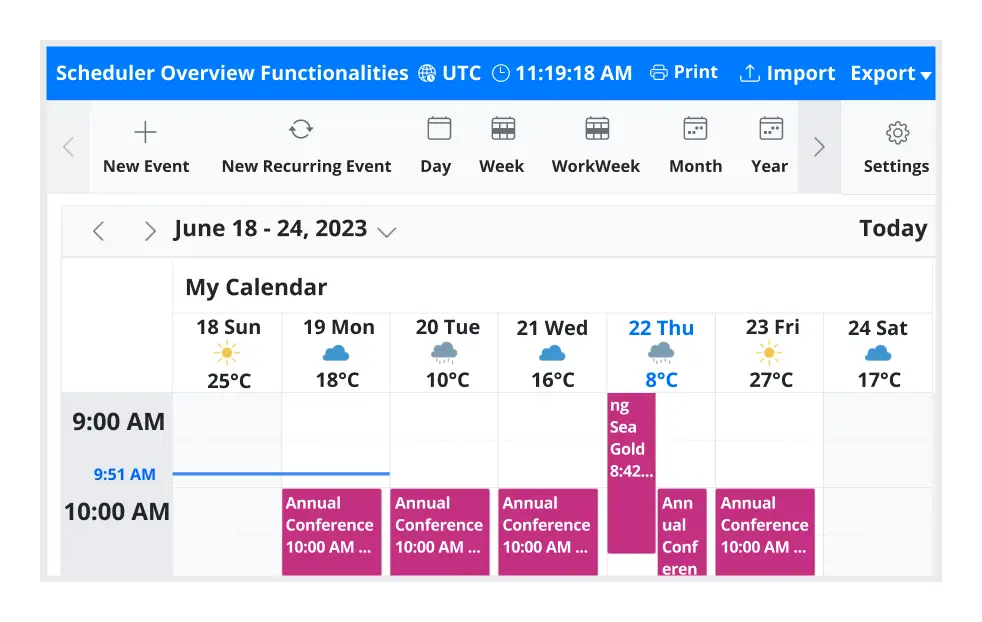
Header bar
Add custom items to the default header bar options. You can hide or show common header bar options.
Scheduler cells
Out-of-the-box template options allow you to easily customize the cells by adding any kind of text, image, or CSS.
Quick pop-ups
Easily customize pop-ups that open when single-clicking on cells, events, or appointments with your own UI or template design.
Open event editor externally
The React Event Calendar offers a built-in method to open the default event editor window programmatically.
User-friendly interactions
The modern and trendy UI design of the React Scheduler makes the user interactions simpler and more efficient.
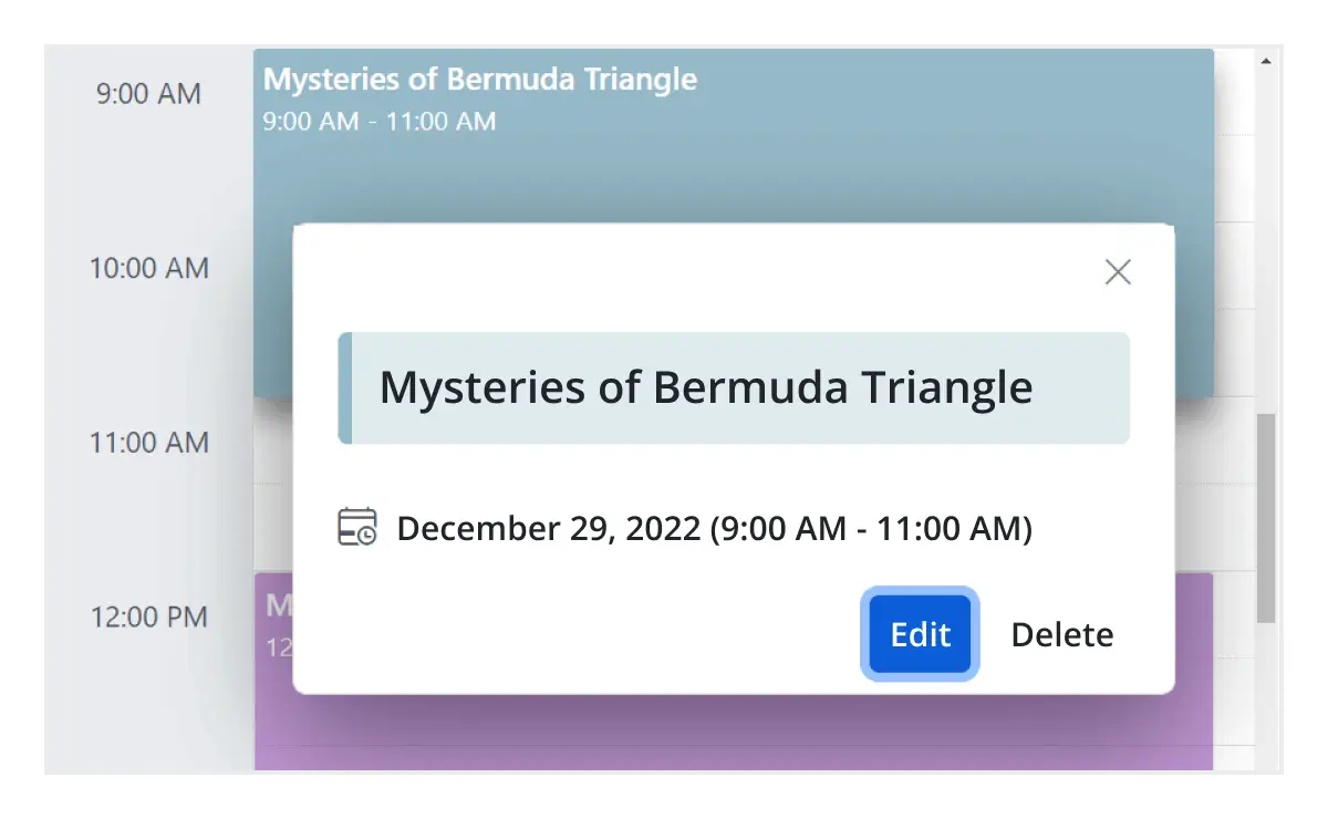
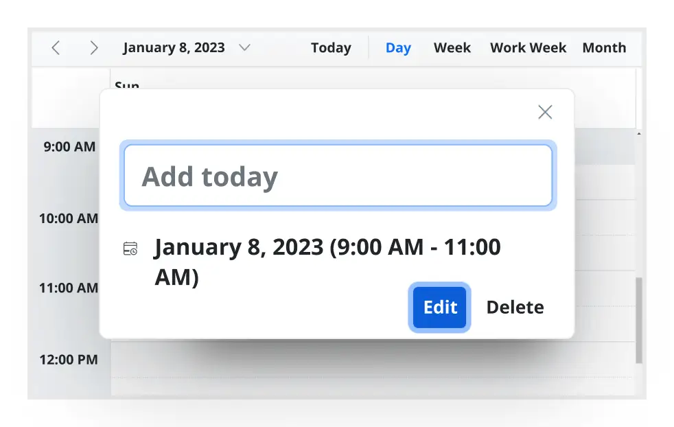
Quick event overview
Clicking or tapping on events displays their important details, such as subject and time, along with edit and delete options.
Cell selection
Click and drag the pointer over the Scheduler cells for multiple-cell selection. You can do the same with keyboard shortcuts.
Event container
Clicking on the text indicator (+n more) in month and timeline views will open an event container listing all the hidden event and appointment details of a day.
Quick navigation
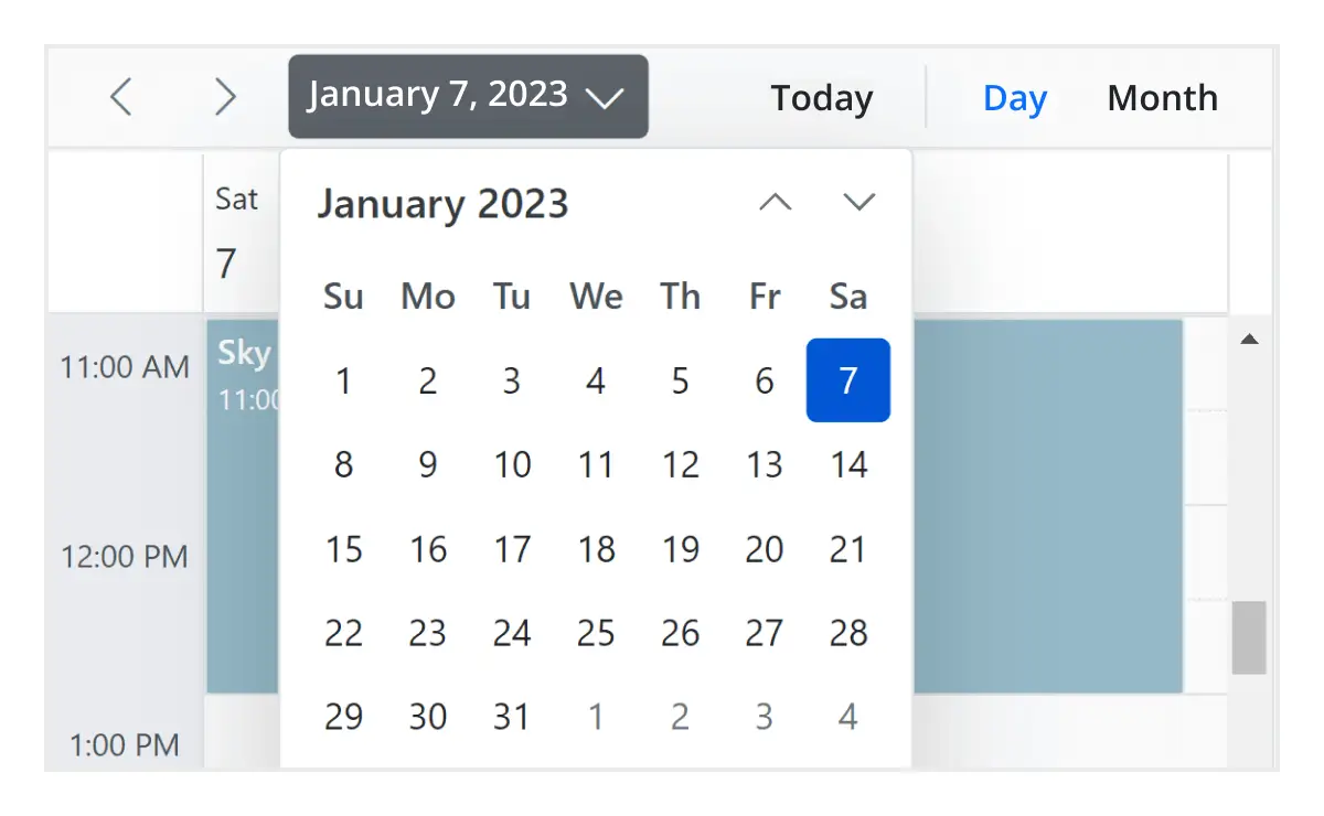
The React Scheduler provides an intuitive way to navigate back and forth among the date ranges using an inline calendar, and also to navigate between different view modes.
Interactive features
The React Scheduler allows users to export its events in two ways: as an Excel file or as an ICS file.

Export to Excel
The React Scheduler allows you to export all its events to an Excel document by default. It also provides additional customization options to export custom event data collections.

Export and import ICS
The React Event Calendar supports exporting all its event data to iCal format, and it supports importing events from an iCal file into the Scheduler.

Developer-friendly APIs
Developers can have full control over the UI and behavior of the event calendar through its built-in, developer-friendly APIs. It allows you to customize even the complex Scheduler functionalities with ease.
Accessibility
The React Scheduler component is easily accessed by screen readers. Complete keyboard interaction support has also been provided.

Completely accessible
The React Scheduler component has complete WAI-ARIA accessibility support. The Scheduler UI includes high-contrast visual elements, giving visually impaired people the best viewing experience. Also, valid UI descriptions are easily accessible through assistive technologies such as screen readers.

Keyboard interactive
Various keyboard shortcuts are available to perform almost all the Scheduler actions, such as multiple cell or event selection and navigating to other views.

Right to left (RTL)
Render the event scheduler following the proper right-to-left conventions.
Not sure how to create your first React Scheduler? Our tutorial videos and documentation can help.
I’d love to watch it now I’d love to read it now


Frequently Asked Questions
Why should you choose Syncfusion React Scheduler?
The Syncfusion React Scheduler provides the following features:
- Highly responsive layout and a finely optimized design for desktops, tablets, and mobile phones.
Different basic views like day, week, workweek, month, and year of calendar mode and timeline mode.
Virtual scrolling allows you to load large numbers of resources and events dynamically.
- Adapts with different time zones instantly.
Multiple resource grouping based on the timeline, horizontal, hierarchical, and date views.
- One of the best React Scheduler in the market that offers feature-rich UI to interact with the software.
- Easy synchronization of events with Google and Outlook Calendars.
Simple configuration and API.
- Supports all modern browsers.
Expansive learning resources such as demos, documentation and videos to learn quickly and get started with React Scheduler.
Where can I find the Syncfusion React Scheduler demo?
You can find our React Scheduler demo, which demonstrates how to render and configure the Scheduler.
How to create a Scheduler in React?
You can create a Scheduler in React using Syncfusion’s React Scheduler component Getting Started. Install the @syncfusion/ej2-react-schedule package, import the ScheduleComponent, and configure views, data sources, and event settings.
What is the best free appointment scheduler?
Syncfusion offers a free community license for individuals and small businesses, making its React Scheduler one of the best free options. It provides enterprise-grade features like multiple views, resource grouping, and event editing without limitations.
How do I add events and appointments to a React Scheduler?
You can programmatically add events to the Syncfusion React Scheduler component using the addEvent() method. This method allows you to add either a single event or a collection of events simultaneously to the schedule. For more information, refer to our detailed documentation on adding, editing, and removing events in React Scheduler.
You can also perform CRUD operations on events using these methods:
- addEvent() - To add new events
- saveEvent() - To update existing events
- deleteEvent() - To remove events
These methods enable you to programmatically manage events in your React Schedule component without directly manipulating the data source.
How do I implement drag-and-drop scheduling in React?
You can reschedule appointments by simply dragging and dropping them. To enable this functionality, inject the DragAndDrop module and set the allowDragAndDrop property to true.
On mobile devices, events can be moved by tapping and holding an appointment, then dragging it to the desired time or location.
To learn more about dragging external items and advanced drag-and-resize capabilities, watch this video. For additional details, refer to our comprehensive documentation on drag-and-drop appointments in the React Scheduler.
How do I handle recurring events in the React Scheduler?
The Syncfusion React Scheduler fully supports recurring appointments, allowing you to easily create events that repeat on a daily, weekly, monthly, or yearly basis with integrated recurrence options.To configure recurring appointments in the React Scheduler component, set the RecurrenceRule property in your event data. The RecurrenceRule follows the iCalendar (RFC 5545) specifications.For additional details, refer to our comprehensive documentation on recurring events in the React Scheduler.
Can a React Scheduler support multiple resources like rooms, people, and equipment?
Resource and grouping support enables the Scheduler to be shared across multiple resources. Appointments associated with each resource are displayed under their corresponding resource.
Resources in the Scheduler are arranged in rows or columns, with dedicated spacing to ensure all related appointments are clearly visible on a single page. The Scheduler also supports multilevel resource grouping, allowing for hierarchical organization of resources.
Depending on the view, resources can be displayed as expandable groups in timeline views or as a vertical hierarchy in calendar views, providing flexible and intuitive scheduling layouts.
For additional details, refer to the comprehensive documentation on resources and grouping in the React Scheduler.
How can I optimize performance for large datasets using virtual scrolling in the React Scheduler?
Virtual scrolling is a powerful feature in the Syncfusion React Schedule component that significantly improves performance when working with large datasets. This feature allows the component to load only visible items in the viewport and load remaining items as you scroll, which is especially beneficial when handling numerous resources and appointments.
To enable virtual scrolling in your React Schedule component, set the allowVirtualScrolling property to true within view-specific settings.
For more information, refer to our detailed documentation available on Virtual scrolling in React Scheduler.
Can I download and utilize the Syncfusion React Scheduler for free?
No, this is a commercial product and requires a paid license. However, a free community license is also available for companies and individuals whose organizations have less than $1 million USD in annual gross revenue, 5 or fewer developers, and 10 or fewer total employees.
How do I get started with Syncfusion React Scheduler?
A good place to start would be our comprehensive getting started documentation.
What is the Schedule component in React?
The ScheduleComponent in Syncfusion React is a fully featured calendar and appointment management component. It allows you to display events, manage resources, enable drag-and-drop, and customize views. It supports recurring events, time zone handling, and integration with external calendars like Google and Outlook.
What is the difference between a Scheduler and a Calendar?
Syncfusion React Calendar is a lightweight date picker for selecting single or multiple dates. It focuses on displaying dates and basic navigation between months and years. Syncfusion React Scheduler is a full-featured appointment manager that supports events, resources, recurring appointments, multiple views (Day, Week, Month, Timeline), drag-and-drop, and integration with external calendars like Google and Outlook.
How do I enable day/week/month views in a React Scheduler?
To configure day, week, and month views in the React Scheduler component, you need to properly import and inject the required modules for each view. For more information, refer to our detailed documentation on module injection in the React Schedule component.
How do I resize appointments in a React Scheduler?
To enable resizing functionality in the React Scheduler, inject the resize module and ensure that the allowResizing property is set to true. For more information, refer to our detailed documentation appointment resizing in the React Scheduler.
How do I manage time zones in React Scheduler?
By default, the React Scheduler component operates using the system’s current timezone. To schedule appointments in a different timezone, set the timezone property in the Scheduler.In addition to configuring a global timezone, you can assign timezones to individual appointments by specifying the startTimezone and endTimezone properties within the event fields collection.For additional details, refer to our comprehensive documentation on timezones in the React Scheduler.
Is it possible to reorder events in the Syncfusion React Scheduler?
Yes, events can be reordered using the sortComparer property. By default, the Scheduler renders overlapping events based on their start and end times. You can customize the display order of overlapping events by defining a custom sorting logic through the sortComparer property within eventSettings, allowing events to be ordered based on custom fields. For more information, refer to our detailed documentation on reordering events in the React Scheduler.
Our Customers Love Us


See Real Success Stories
Developers around the world trust Syncfusion’s Essential Studio to simplify complex projects and speed up delivery. With a vast library of UI controls, powerful SDKs, and reliable support, Essential Studio helps teams build enterprise-ready applications with confidence.
Read Our Customer StoriesIndustry
Software development
75% Cost reduction
50% Faster development
Industry
Utilities (oil and gas)
450+ hours saved
Streamlined processes and hours of development effort saved.
Advanced, flexible features
Empowered users through robust and versatile functionality.
Industry
Software and technology
1000+ of hours saved
Accelerated development with enterprise-ready UI components.
Efficient file management
Streamlined workflows with document libraries without building them from scratch.
Industry
Software and technology
2 Years of delay avoided
Two years of delays prevented with proactive planning.
On-time delivery
Projects delivered on schedule using trusted controls.
Industry
IT services and IT consulting
Improved performance
Large datasets handled with easy customization and quick debugging.
Highly customizable
Plug-and-play controls with quick template integration.
Industry
Professional services
Instant access
Quick availability of features and resources.
Reduced dependencies
Fewer dependencies for faster development.
Rated by users across the globe
Transform your applications today by downloading our free evaluation version
No credit card required | 2.37M+ downloads


 Figma Download
Awards
Greatness—it’s one thing to say you have it, but it means more when others recognize it. Syncfusion® is proud to hold the following industry awards.


Recent activities in React Scheduler blogs and tutorials
The React Scheduler blog and tutorial videos posts will guide you in building your first app with React components. They provide problem-solving strategies, describe features and functionalities, announce new feature releases, explain best practices, and showcase example scenarios. Explore our latest posts on our blog and tutorial video channels for React Scheduler updates.