.NET PowerPoint Library – PowerPoint Charts in C#
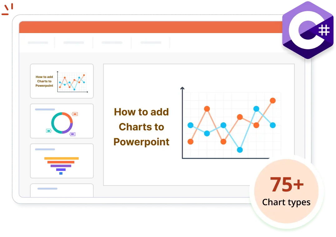
- Create more than 75 chart types in PowerPoint using C#, without Microsoft PowerPoint.
- Customize charts by tailoring every element— title, areas, labels, legends, and axes.
- Easily convert charts into images for seamless integration and sharing.
No credit card required.
Explore ExamplesNo credit card required.
Trusted by the world’s leading companies
Overview
A chart communicates data graphically on a slide. The Syncfusion .NET PowerPoint Library allows you to create, remove, and customize 75+ types of charts in PowerPoint presentations using C#, without Microsoft PowerPoint or interop dependencies.
Create a chart in a PowerPoint presentation using C#
This example code shows how to create a chart in a presentation using the Syncfusion .NET PowerPoint Library with just a few lines of code in C#.
Key features of PowerPoint charts
Chart title
Modify the chart title by changing its text, appearance, size, and more.
Chart area and plot area
Enhance the chart area and plot area by adjusting borders, colors, transparency; adding images; changing positions; and more.
Series
Customize a chart series by adjusting its name, type, color, borders; adding space between bars; and formatting markers.
Data labels
Adjust the chart’s data labels by changing their positions, sizes, and more.
Legend
Customize the chart legend by modifying its position, border, and legend entries.
Horizontal and vertical axes
Customize the horizontal and vertical axes of a chart by modifying their titles, borders, fonts, rotation angles, and more.
Explore chart references
Discover valuable resources from our knowledge base to enhance your use of charts in the PowerPoint Library:


Explore these resources for comprehensive guides, knowledge base articles, insightful blogs, and ebooks.


Product Updates

Technical Support


Frequently Asked Questions
Is it possible to create a chart in a PowerPoint presentation from Excel data without using Microsoft Office?
Yes, apart from creating a chart from scratch, you can also create one from Excel data using the .NET PowerPoint Library, without needing Microsoft Office.
Is there a way to export specific charts within a PowerPoint presentation as individual images using C#?
Yes, you can export specific charts within a PowerPoint presentation as individual images programmatically using the .NET PowerPoint Library in C#.
Can I import data from external sources, such as databases, into a chart using the .NET PowerPoint Library in C#?
Yes, you can import data from various external sources into a chart programmatically using the .NET PowerPoint Library.
Can I customize the appearance of a chart in a PowerPoint presentation using the .NET PowerPoint Library?
Yes, the .NET PowerPoint Library allows you to customize various chart elements such as the title, plot area, series, legends, data labels, and axes.
Is it possible to create advanced charts like funnel or Pareto in C#?
Yes, the .NET PowerPoint Library supports creating advanced charts such as funnel, box and whisker, waterfall, histogram, and Pareto charts programmatically using C#.
How can I integrate chart creation in PowerPoints into my application?
You can access this feature through the Syncfusion.Presentation.Net.Core NuGet package. Detailed code samples and a video tutorial are available in the documentation.
Our Customers Love Us


See Real Success Stories
Developers around the world trust Syncfusion’s Essential Studio to simplify complex projects and speed up delivery. With a vast library of UI controls, powerful SDKs, and reliable support, Essential Studio helps teams build enterprise-ready applications with confidence.
Read Our Customer StoriesIndustry
Software development
75% Cost reduction
50% Faster development
Industry
Utilities (oil and gas)
450+ hours saved
Streamlined processes and hours of development effort saved.
Advanced, flexible features
Empowered users through robust and versatile functionality.
Industry
Software and technology
1000+ of hours saved
Accelerated development with enterprise-ready UI components.
Efficient file management
Streamlined workflows with document libraries without building them from scratch.
Industry
Software and technology
2 Years of delay avoided
Two years of delays prevented with proactive planning.
On-time delivery
Projects delivered on schedule using trusted controls.
Industry
IT services and IT consulting
Improved performance
Large datasets handled with easy customization and quick debugging.
Highly customizable
Plug-and-play controls with quick template integration.
Industry
Professional services
Instant access
Quick availability of features and resources.
Reduced dependencies
Fewer dependencies for faster development.
Rated by users across the globe
Want to create, View, and edit PPT files in C# or VB.NET?
No credit card required.

Awards
Greatness—it’s one thing to say you have it, but it means more when others recognize it. Syncfusion® is proud to hold the following industry awards.