Trusted by the world’s leading companies

Overview
Flutter Range Slider is a highly interactive UI widget for selecting a smaller range from a larger data set. It provides rich features: numeric and date-time ranges, labels, ticks, dividers, and tooltips.
Scale
Select numeric and date ranges. Render intervals with precision for both numeric and date ranges. For dates, from year to second intervals are supported.

Orientation
Render the range slider in both vertical and horizontal orientation.

Labels
Easily customize the labels. Built-in support for numeric and date types. Customize the format, render at specific intervals, and add prefixes and suffixes. You can also visualize data as text assigning values like low, medium, and high.

Dividers
Render dividers in each interval to show the ranges in an intuitive way. Customize the size, shape, and position of the dividers easily.

Ticks
Set both major and minor ticks in the axis. Use major ticks to show the intervals clearly and minor ticks to help choose the values between two intervals easily. You can also customize the positions of tick marks.

Tooltip
Use tooltips to show more info about the current selection of ranges during interaction. Customize the format, whole text, and visibility using the built-in APIs. You can show tooltips in rectangular or paddle shapes.

Discrete support
Select only discrete numeric and date values.

Drag mode
Various drag mode options are available to control thumb dragging. The options are onThumb, betweenThumbs, and both.

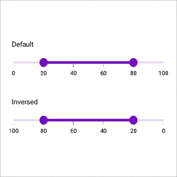
Inversed
Change the minimum and maximum positions of the horizontal and vertical range slider in the reverse direction.
Horizontal

Vertical
Accessibility
The Range Slider is easily accessed by screen readers.
Customization
Customize each element of the Range Slider.
Gradient

Ticks

Thumb

All our Flutter UI & DataViz Widgets
Our Customers Love Us


See Real Success Stories
Developers around the world trust Syncfusion’s Essential Studio to simplify complex projects and speed up delivery. With a vast library of UI controls, powerful SDKs, and reliable support, Essential Studio helps teams build enterprise-ready applications with confidence.
Read Our Customer StoriesIndustry
Software development
75% Cost reduction
50% Faster development
Industry
Utilities (oil and gas)
450+ hours saved
Streamlined processes and hours of development effort saved.
Advanced, flexible features
Empowered users through robust and versatile functionality.
Industry
Software and technology
1000+ of hours saved
Accelerated development with enterprise-ready UI components.
Efficient file management
Streamlined workflows with document libraries without building them from scratch.
Industry
Software and technology
2 Years of delay avoided
Two years of delays prevented with proactive planning.
On-time delivery
Projects delivered on schedule using trusted controls.
Industry
IT services and IT consulting
Improved performance
Large datasets handled with easy customization and quick debugging.
Highly customizable
Plug-and-play controls with quick template integration.
Industry
Professional services
Instant access
Quick availability of features and resources.
Reduced dependencies
Fewer dependencies for faster development.
Rated by users across the globe


Awards
Greatness—it’s one thing to say you have it, but it means more when others recognize it. Syncfusion® is proud to hold the following industry awards.

