React Tree View - High Performance Tree List Component
- Display hierarchical data in a tree-view structure.
- Load a wide range of nodes with optimal performance.
- Drag and drop multiple selected tree nodes anywhere.
- Select multiple nodes using built-in check boxes.
- Edit node text in-line with editable nodes support.
- Easily customize nodes, expand icons, and collapse icons.
Quick Overview Video

Trusted by the world’s leading companies

Overview
The React Tree View (Tree List) is a graphical user interface component that to represents hierarchical data in a tree structure. It provides great performance with its advanced features like load on demand, checkbox support, multiple selection, tree navigation, drag and drop, tree node editing, and template support.
Why choose Syncfusion React Tree View?
High performance
Load on demand (lazy load) is enabled by default to reduce bandwidth usage when consuming large amounts of data. Only first-level nodes are loaded initially, and then child nodes are loaded when their parent node is expanded.
Seamless data binding
Bind data to the Tree View component from any valid data source in JSON format. The tree data can be local or remote and retrieved via various adapters, such as OData, OData V4, URL, JSON, and web API.
Adapts to any resolution
Tree View has a highly responsive layout and an optimized design for desktops, touchscreens, and phones. It works well on all mobile phones that use iOS, Android, or Windows OS.
Admirable feature set
The React Tree View supports load on demand, bound and unbound modes, drag and drop, multiselection, and editing.
AI-Assisted Development
Build hierarchical navigation experiences faster with the Agentic UI Builder and Syncfusion Agent Skills. Generate nested structures, expandable nodes, and interactive tree layouts with minimal manual effort.
Visualize hierarchical data
The React Tree View is a graphic user interface element that displays hierarchical data as a tree structure. It can be populated with nested arrays of JSON objects from a hierarchical data source.
Attractive, customizable themes
Cutting-edge design with several built-in themes, such as Fluent, Tailwind CSS, Bootstrap, Material, and Fabric. Utilize the online Theme Studio tool to customize themes of tree view easily.
Globalization and localization
Enable users from different locales to use the component by formatting dates, currency, and numbering to suit preferences.
React Tree View Code Example
Easily get started with the React Tree View using a few simple lines of TSX code as demonstrated below. Also explore our React Tree View Example that shows you how to render and configure the Tree View in React.
import * as React from 'react';
import * as ReactDOM from 'react-dom';
import { TreeViewComponent } from '@syncfusion/ej2-react-navigations';
function App() {
// define the array of data
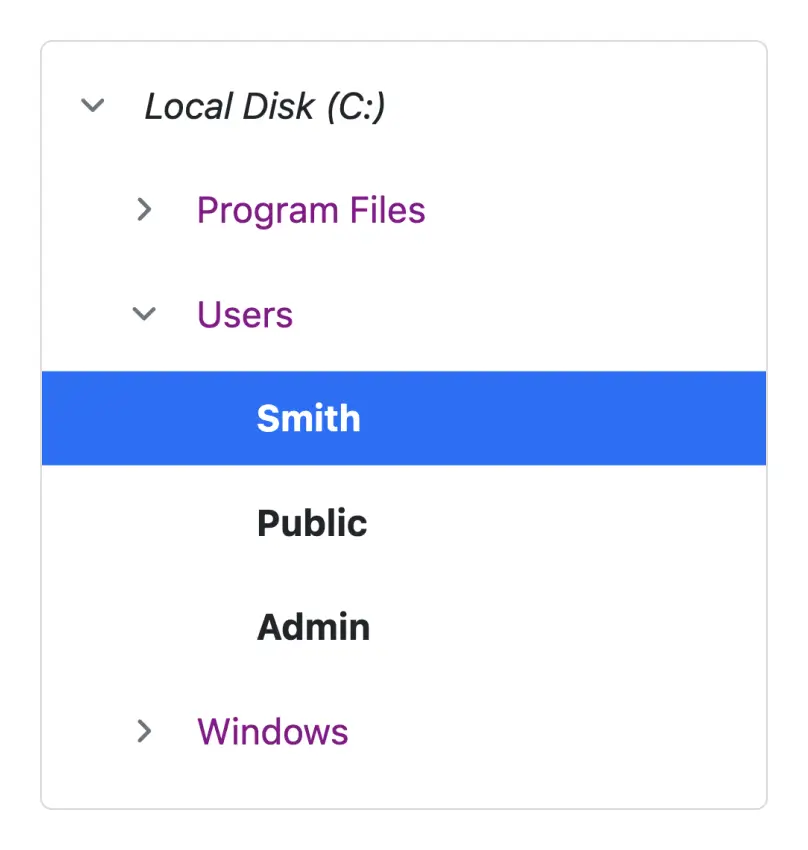
const hierarchicalData: { [key: string]: Object }[] = [
{
id: '01', name: 'Local Disk (C:)', expanded: true,
subChild: [
{
id: '01-01', name: 'Program Files',
subChild: [
{ id: '01-01-01', name: '7-Zip' },
{ id: '01-01-02', name: 'Git' },
{ id: '01-01-03', name: 'IIS Express' },
]
},
{
id: '01-02', name: 'Users', expanded: true,
subChild: [
{ id: '01-02-01', name: 'Smith' },
{ id: '01-02-02', name: 'Public' },
{ id: '01-02-03', name: 'Admin' },
]
},
{
id: '01-03', name: 'Windows',
subChild: [
{ id: '01-03-01', name: 'Boot' },
{ id: '01-03-02', name: 'FileManager' },
{ id: '01-03-03', name: 'System32' },
]
},
]
},
{
id: '02', name: 'Local Disk (D:)',
subChild: [
{
id: '02-01', name: 'Personals',
subChild: [
{ id: '02-01-01', name: 'My photo.png' },
{ id: '02-01-02', name: 'Rental document.docx' },
{ id: '02-01-03', name: 'Pay slip.pdf' },
]
},
{
id: '02-02', name: 'Projects',
subChild: [
{ id: '02-02-01', name: 'ASP Application' },
{ id: '02-02-02', name: 'TypeScript Application' },
{ id: '02-02-03', name: 'React Application' },
]
},
{
id: '02-03', name: 'Office',
subChild: [
{ id: '02-03-01', name: 'Work details.docx' },
{ id: '02-03-02', name: 'Weekly report.docx' },
{ id: '02-03-03', name: 'Wish list.csv' },
]
},
]
},
{
id: '03', name: 'Local Disk (E:)', icon: 'folder',
subChild: [
{
id: '03-01', name: 'Pictures',
subChild: [
{ id: '03-01-01', name: 'Wind.jpg' },
{ id: '03-01-02', name: 'Stone.jpg' },
{ id: '03-01-03', name: 'Home.jpg' },
]
},
{
id: '03-02', name: 'Documents',
subChild: [
{ id: '03-02-01', name: 'Environment Pollution.docx' },
{ id: '03-02-02', name: 'Global Warming.ppt' },
{ id: '03-02-03', name: 'Social Network.pdf' },
]
},
{
id: '03-03', name: 'Study Materials',
subChild: [
{ id: '03-03-01', name: 'UI-Guide.pdf' },
{ id: '03-03-02', name: 'Tutorials.zip' },
{ id: '03-03-03', name: 'TypeScript.7z' },
]
},
]
}
];
const fields: Object = { dataSource: hierarchicalData, id: 'id', text: 'name', child: 'subChild' };
return (
// specifies the tag for render the TreeView component
<TreeViewComponent fields={fields} />
);
}
const root = ReactDOM.createRoot(document.getElementById('root'));
root.render(<App />);AI-assisted development
Build feature-rich React Treeview experiences faster
Accelerate hierarchical navigation development with Syncfusion AI tools that turn requirements into fully configured tree experiences with minimal manual setup.
Agentic UI Builder
Turn prompts into ready-to-use UI screens, layouts, and workflows with Syncfusion React components.
Example Prompt Create a file explorer interface with expandable nodes and drag-and-drop interactions.
Agent Skills
Accelerate development with Syncfusion AI Agent Skills for faster implementation and integration.
Example Prompt Generate a React treeview with checkboxes, drag-and-drop support, and node templates.
AI Coding Assistant
Accelerate development with AI that generates, configures, and troubleshoots component code directly in your IDE.
Example Prompt Show how to enable drag-and-drop node reordering in the Syncfusion React Treeview.
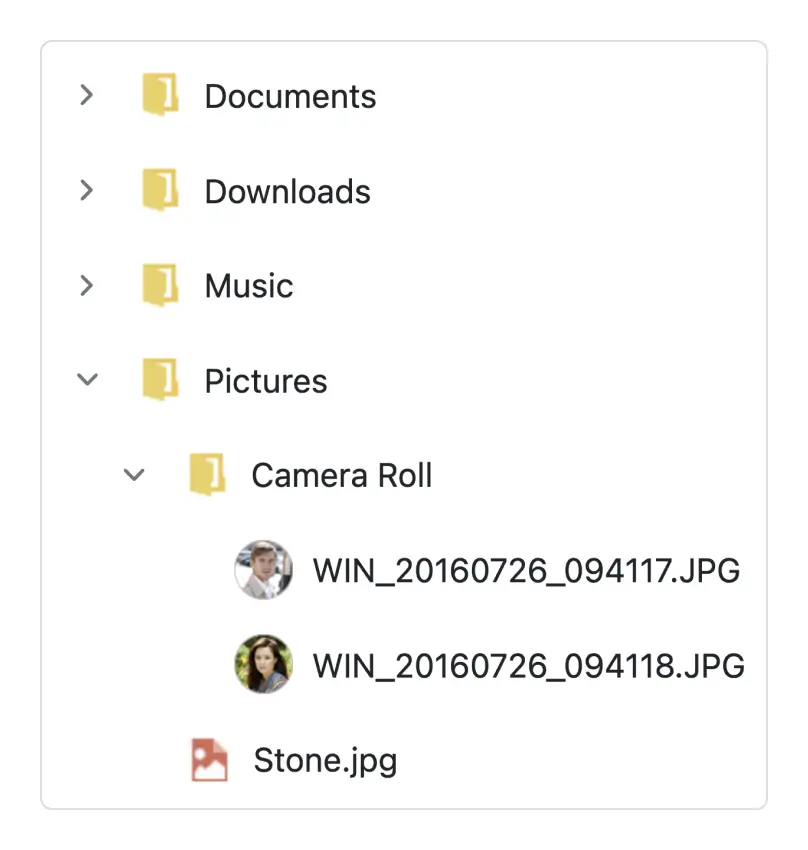
Tree node with icons
Display nodes with labels and icons to present the content in a more readable format. This is helpful in making a typical directory tree and file system.
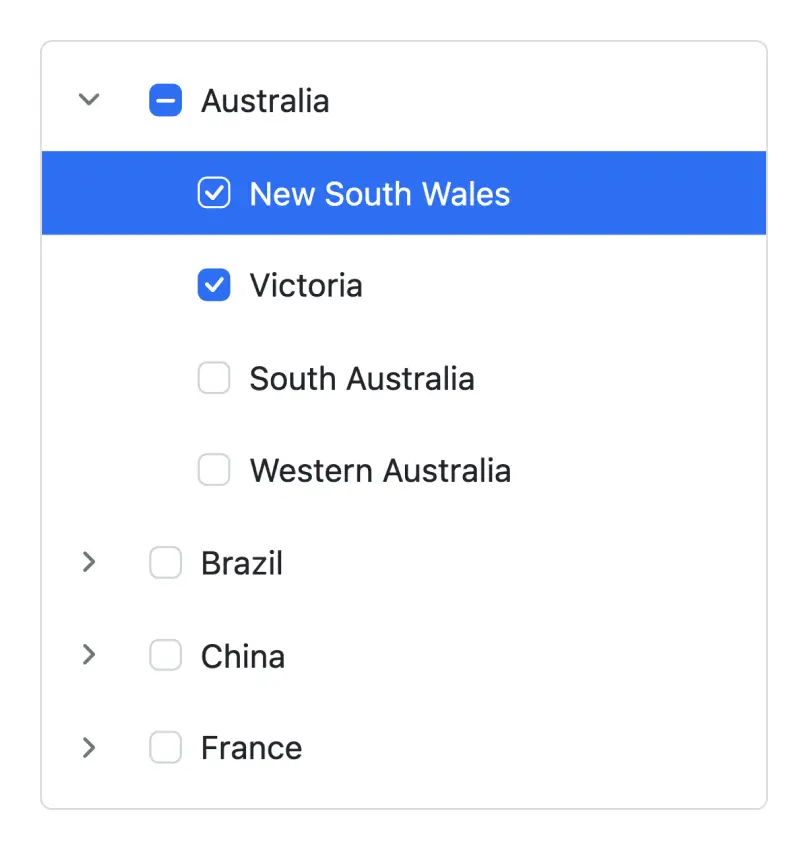
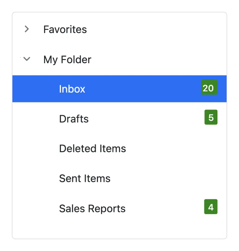
Checkbox
It provides built-in support for checkboxes, allowing users to select more than one item. The Tree View checkbox has a tri-state mode also, which is applicable only for parent nodes. In this mode, the parent node will go into the indeterminate state when the child nodes are partially checked.
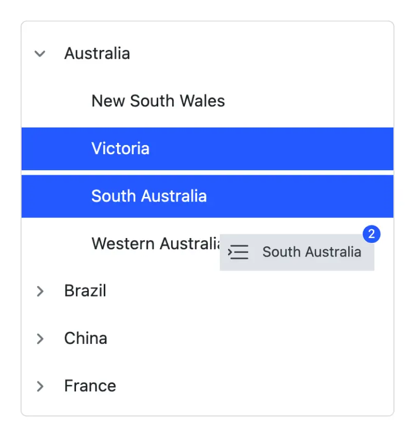
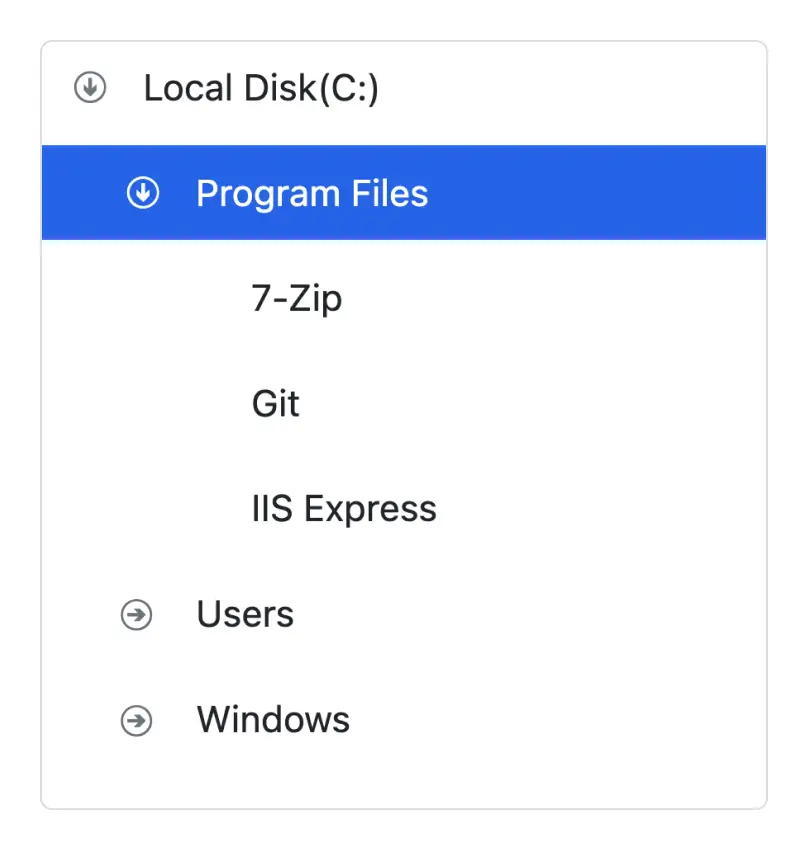
Drag and drop
Nodes can be dragged and dropped at all levels of the same Tree View.
Inside the tree
Tree nodes can be dragged and dropped from one parent node to another within the same level or at different levels.
To an outside tree
Extending the drop behavior allows users to drop tree nodes from one Tree View to another.
External container
Drop tree nodes to any external container or component by extending the Tree View node drop action.
Multiple node selection
Allows users to select multiple nodes. When the drag-and-drop feature is enabled, all the selected nodes can be dragged at the same time.


Editable nodes
Edit the tree nodes’ label text on the client side by double-clicking it. When editing Tree View nodes, the Tree View data source will also be updated with the modified data.
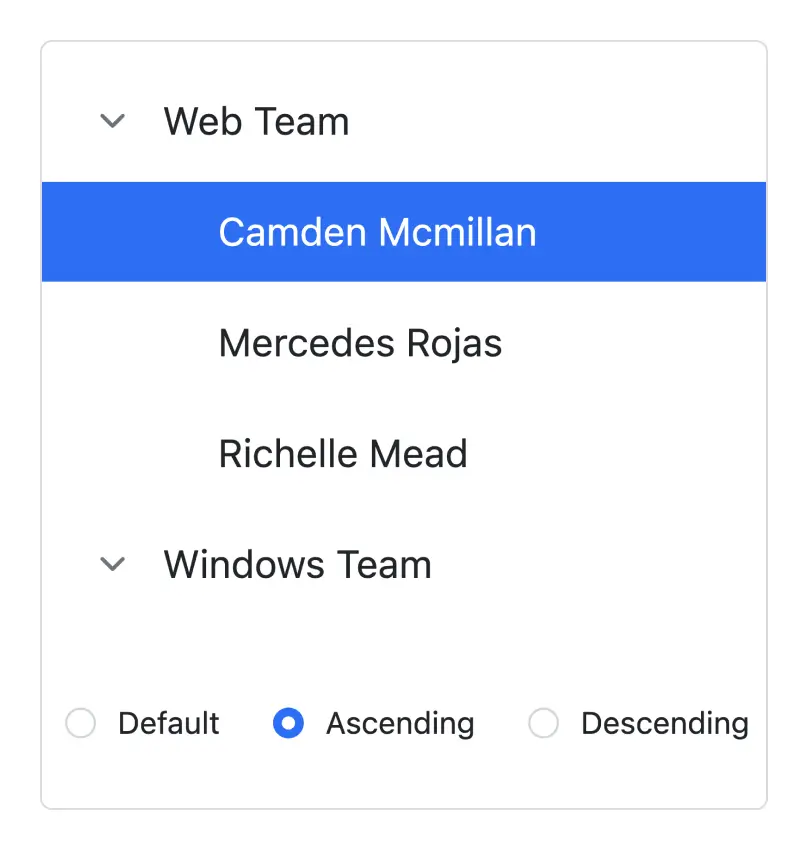
Sorting tree nodes
Render the Tree View nodes in the ascending or descending order based on the label text for improved readability.
Node template
The React Tree View component can be customized through its node template support, which allows defining a custom structure for tree nodes. You can use node templates specifically for parent nodes, child nodes, or both, and include images and any custom element structure.
Expand collapse icons
Easily customize the expand and collapse icons based on the requirement of your application.
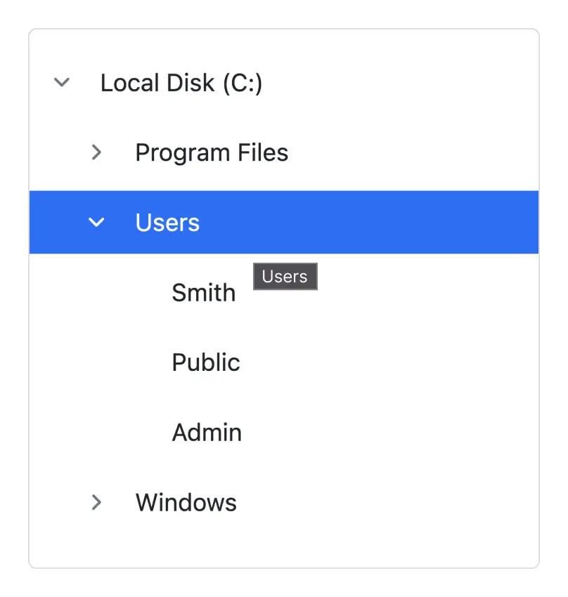
Tooltips for tree nodes
It supports tooltips for tree nodes that display information about the nodes while hovering over them. You can bind a tooltip from a data source along with node fields.
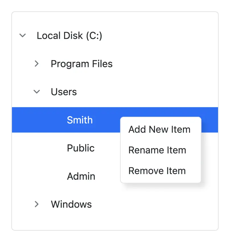
Context menu
A context menu can be integrated with the React Tree View component to open when a node is right-clicked. The menu helps users perform node manipulations such as adding, removing, and renaming nodes.
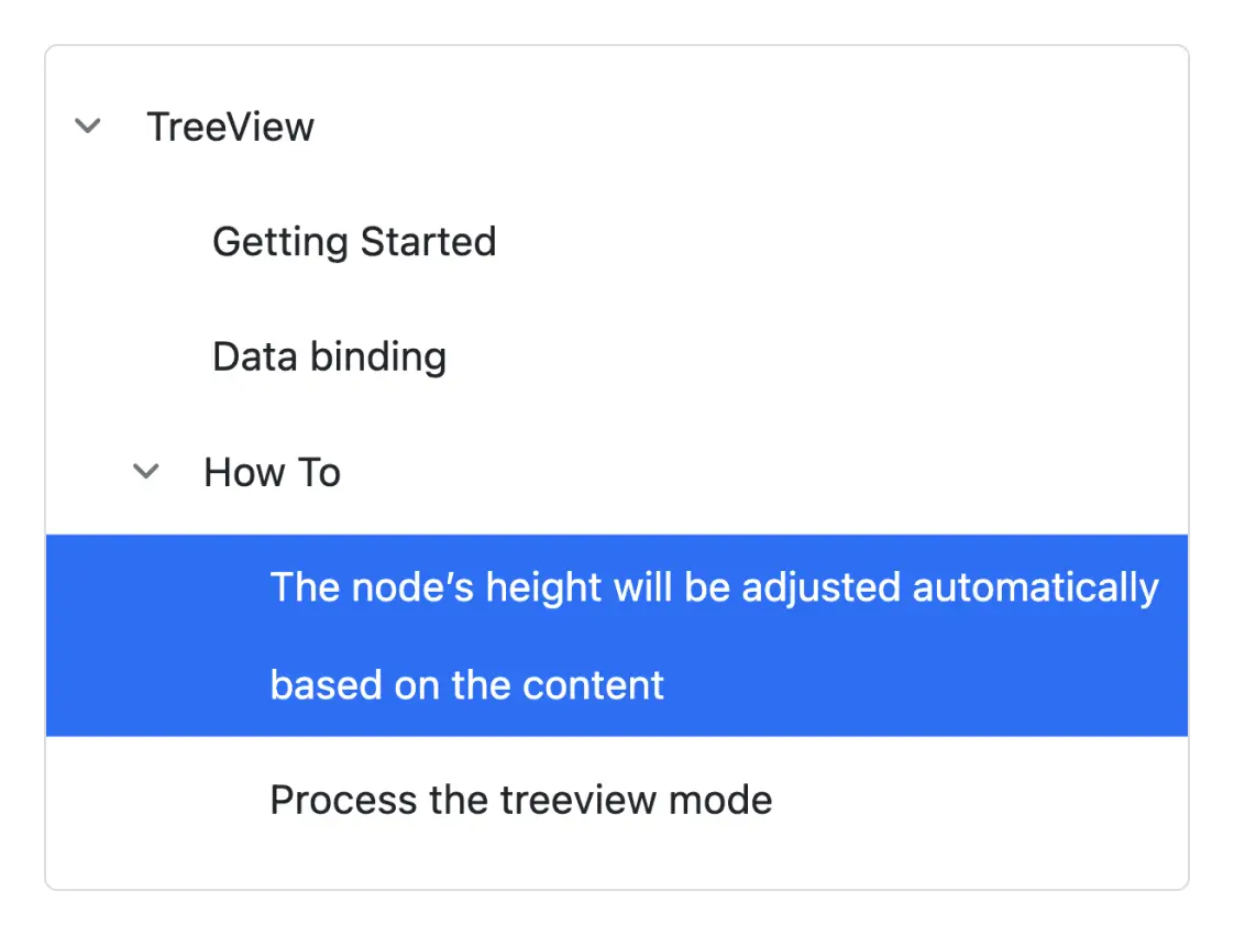
Text wrap
A node’s text wraps when it reaches edge of the Tree View. The node’s height will be adjusted automatically based on the content.
Tree node customization
It allows you to customize the tree nodes by level. For example, apply specific styles to leaf nodes, first child nodes, and second level nodes, etc.
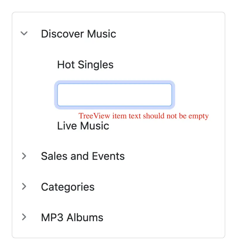
Tree node validation
You can add validation to the tree node’s text on editing like required, a minimum or maximum length, etc.
Accessibility

Keyboard navigation
The React Tree View component ensures that every cell is accessible using the keyboard. Major features like sort, select, and edit can be performed using keyboard commands alone; no mouse interaction is required. This helps in creating highly accessible applications using this component.

Screen reader
The React Tree View has complete WAI-ARIA accessibility support. The Data Grid UI includes high-contrast visual elements that help visually impaired people to have the best viewing experience. Also, valid UI descriptions are easily accessible through assistive technologies such as screen readers.

Right to left (RTL)
Right-to-left rendering allows displaying the text and layout of the Tree View from right to left. This improves the user experience and accessibility for RTL languages.


Not sure how to create your first React Tree View? Our tutorial videos and documentation can help.
I’d love to watch it now I’d love to read it nowDiscover Syncfusion’s Complete React Component Ecosystem
Explore over 140+ React UI components featuring established, production-ready controls and the latest pure React components built natively for modern web app development.
-
React Components
-
Pure React Components
-
SMART COMPONENTSGRIDSDATA VISUALIZATIONDROPDOWNSFILE VIEWERS & EDITORSBUTTONSINTERACTIVE CHATINPUTSNAVIGATIONFORMSNOTIFICATIONS
-
GRIDSDATA VISUALIZATIONNAVIGATION
Standalone UI SDKs
Integrate the DataGrid, Chart, Scheduler, Gantt, Rich Text Editor, File Manager, and Diagram UI components into applications to enable rich interaction and visualization, delivering a seamless user experience.
Document Solutions
Integrate the PDF Viewer, DOCX Editor, Spreadsheet Editor, and document-processing libraries into the React applications to enable a smooth user experience.
Frequently Asked Questions
Why should you choose Syncfusion React Tree View?
The Syncfusion React Tree View component supports the following features:
- Display hierarchical data in a tree-view structure.
- Load a wide range of nodes with optimal performance.
Flexible data binding with support to use local and remote data sources such as JSON, RESTful services, OData services, and WCF services.
Drag and drop multiple selected tree nodes anywhere.
Select multiple nodes using built-in check boxes.
Edit node text in-line with editable nodes support.
Easily customize nodes, expand icons, and collapse icons.
- One of the best React Tree View in the market that offers feature-rich UI to interact with the software.
- Simple configuration and API.
- Supports all modern browsers.
- Mobile-touch friendly and responsive.
Expansive learning resources such as demos and documentation to learn quickly and get started with React Tree View.
Where can I find the Syncfusion React Tree View demo?
You can find our React Tree View demo, which demonstrates how to render and configure Tree View.
Can I download and utilize the Syncfusion React Tree View for free?
No, this is a commercial product and requires a paid license. However, a free community license is also available for companies and individuals whose organizations have less than $1 million USD in annual gross revenue, 5 or fewer developers, and 10 or fewer total employees.
How do I get started with Syncfusion React Tree View?
A good place to start would be our comprehensive getting started documentation.
Our Customers Love Us
Having an excellent set of tools and a great support team, Syncfusion® reduces customers’ development time.Here are some of their experiences.

Aweseome, enough said. really
Easy usability, solving real life problems. easy to implement. most of the cases has the operators and settings possibilities you right away need. never fails to impress

Oliver O,

Geschäftsführung Kreation/Artdirektion, Small-Business
A giant framework with great pricing options
I have loved the components and options that Syncfusion has, besides, its documentation, demos, and Support are excellent.

Alejandro Javier V,
CEO, Small-Business
See Real Success Stories
Developers around the world trust Syncfusion’s Essential Studio to simplify complex projects and speed up delivery. With a vast library of UI controls, powerful SDKs, and reliable support, Essential Studio helps teams build enterprise-ready applications with confidence.
Read Our Customer StoriesIndustry
Software development
75% Cost reduction
50% Faster development
Industry
Utilities (oil and gas)
450+ hours saved
Streamlined processes and hours of development effort saved.
Advanced, flexible features
Empowered users through robust and versatile functionality.
Industry
Software and technology
1000+ of hours saved
Accelerated development with enterprise-ready UI components.
Efficient file management
Streamlined workflows with document libraries without building them from scratch.
Industry
Software and technology
2 Years of delay avoided
Two years of delays prevented with proactive planning.
On-time delivery
Projects delivered on schedule using trusted controls.
Industry
IT services and IT consulting
Improved performance
Large datasets handled with easy customization and quick debugging.
Highly customizable
Plug-and-play controls with quick template integration.
Industry
Professional services
Instant access
Quick availability of features and resources.
Reduced dependencies
Fewer dependencies for faster development.
Rated by users across the globe
Syncfusion React Tree View Resources


UI Kits
 Figma Download
Figma Download
Awards
Greatness—it’s one thing to say you have it, but it means more when others recognize it. Syncfusion® is proud to hold the following industry awards.

