Angular Dashboard Layout - Interactive and Responsive Layout
- A simple and easily configurable layout component for designing interactive and responsive dashboards.
- Allows effortless and dynamic customization of dashboards with draggable and resizable panels.
- Easy to integrate JavaScript UI components to visualize any complex data or key metrics.
Quick Overview Video
Trusted by the world’s leading companies

Overview
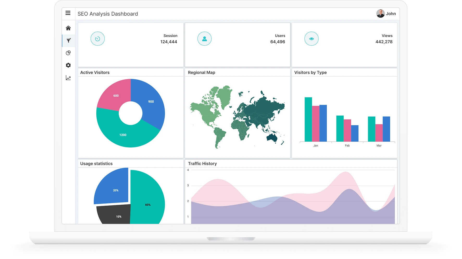
Angular Dashboard Layout is a grid-structured layout component that helps create static and dynamic dashboard layouts with panels. It is also referred as Angular Dashboard Layout Template. Dashboard panels are the basic building blocks of a dashboard and can be added programmatically or dynamically at runtime. The panels hold UI components and allow resizing, reordering, dragging and dropping, removing, and adding. Easily place components at the desired positions within the grid layout.
Why choose Syncfusion Essential Studio® Angular Dashboard Layout?
Grid-structured layout
The Angular Dashboard Layout is a component with a grid-like structure that can easily split content into equal-sized cells.
Easy to interact
The panels allow for resizing, rearranging, dragging, and dropping, removing and adding UI components. Components can be placed conveniently within the grid arrangement in the desired positions.
Insert any UI component
DataGrid, Charts, gauges, Maps, or any HTML content can be placed as panel content inside the layout to present metrics.
Auto arranging panels
With floating support, the panels in the layout will automatically organize themselves by sliding upward to occupy any open spaces. This makes efficient use of the layout for positioning panels.
Adapts to any resolution
The Dashboard Layout is a highly responsive with an optimized design for desktops, touchscreens, and smart phones. It works well on all mobile phones that use iOS, Android, or Windows OS.
Attractive, customizable themes
Cutting-edge design with several built-in themes, such as Fluent, Tailwind CSS, Bootstrap, Material, and Fabric. Utilize the online Theme Studio tool to customize themes easily.
Angular Dashboard Layout Code Example
Easily get started with the Angular Dashboard Layout using a few simple lines of HTML and TS code example as demonstrated below. Also, explore our Angular Dashboard Layout Example, that shows you how to render and configure a Dashboard Layout in Angular.
<div class="control-section">
    <div style="padding:5px;text-align: right;">
        <button id="add" class="e-btn e-info" (click)="addPanel()">Add Panel</button>
    </div>
    <ejs-dashboardlayout id='default_dashboard' columns="5" #default_dashboard [cellSpacing]='cellSpacing'
        [allowResizing]='true'>
        <div id="one" class="e-panel" data-row="0" data-col="0" data-sizeX="1" data-sizeY="1">
            <span id="close" class="e-template-icon e-close-icon" (click)="onCloseIconHandler($event)"></span>
            <div class="e-panel-container">
                <div class="text-align">0</div>
            </div>
        </div>
    </ejs-dashboardlayout>
</div>
import { Component, ViewEncapsulation, Inject, ViewChild } from '@angular/core';
import { DashboardLayoutComponent, PanelModel } from '@syncfusion/ej2-angular-layouts';
/**
* Default component
*/
@Component({
selector: 'app-root',
styleUrls: ['app.component.css'],
templateUrl: 'app.component.html',
encapsulation: ViewEncapsulation.None
})
export class AppComponent {
@ViewChild('default_dashboard')
public dashboard: DashboardLayoutComponent;
constructor() {
}
public count: number = 8;
public cellSpacing: number[] = [10, 10];
addPanel(): void {
let panel: PanelModel[] = [{
'id': this.count.toString(), 'sizeX': 1, 'sizeY': 1, 'row': 0, 'col': 0,
content: '<span id="close" class="e-template-icon e-close-icon"></span><div class="text-align">' + this.count.toString() + '</div>'
}];
this.dashboard.addPanel(panel[0]);
let closeIcon: any = document.getElementById(this.count.toString()).querySelector('.e-close-icon');
closeIcon.addEventListener('click', this.onCloseIconHandler.bind(this));
this.count = this.count + 1;
}
onCloseIconHandler(event: any): void {
if ((<HTMLElement>event.target).offsetParent) {
this.dashboard.removePanel((<HTMLElement>event.target).offsetParent.id);
}
}
}Dynamic layout design
The Angular Dashboard component allows dynamic designing of the layout by adding, removing, resizing, floating, and reordering the panels within the layout.
Drag and Drop
Angular Dashboard with rich UI provides smooth dragging of the panels to replace or re-order at the desired position within the layout.
Resizing
Easy resizing of a panel in all directions enables quick designing of the layout, and fitting small or large-sized content conveniently.
Floating
The panels within the layout will auto arrange by moving in the upward direction to occupy empty spaces available in the layout. This provides effective usage of the layout for panel placement. Angular admin template has all the functionality you’ll need to create beautiful, high-performance admin dashboards. With cool neutral colors and plenty of whitespace, it has a modern minimalist design style.
Placing components as content
Place any HTML content or HTML UI components like Grid, Charts, Gauge, Maps, etc. to represent the metrics or KPI as panel content inside the dashboards.

State persistence
The Angular Dashboard Layout component’s public serialize method allows users to obtain and save the current layout structure of the component in order to construct another dashboard with the same panel structure.
Angular version compatibility
With continuous improvement in Angular versions, the Angular Dashboard Layout is kept up to date to make it compatible with versions starting from 4 to the latest version.

 Grid-structured layout
1.2M+ downloads
Auto-arranging panel
Grid-structured layout
1.2M+ downloads
Auto-arranging panel

Other supported frameworks
The Dashboard Layout is available for the Blazor, React, JavaScript, and Vue frameworks. Explore its platform-specific options through the following links:


Supported browsers
The Angular Dashboard works well with all modern web browsers, including Chrome, Firefox, Edge, Safari, and Opera.

Not sure how to create your first Angular Dashboard Layout? Our documentation can help.
I’d love to read it now140+ ANGULAR UI COMPONENTS
ALL COMPONENTS
SMART COMPONENTS
GRIDS
DATA VISUALIZATION
DROPDOWNS
FILE VIEWERS & EDITORS
BUTTONS
INTERACTIVE CHAT
INPUTS
NAVIGATION
FORMS
NOTIFICATION
Standalone UI SDKs
Integrate the DataGrid, Chart, Scheduler, Gantt, Rich Text Editor, File Manager, and Diagram UI components into applications to enable rich interaction and visualization, delivering a seamless user experience.
Document Solutions
Integrate the PDF Viewer, DOCX Editor, Spreadsheet Editor, and document-processing libraries into the Angular applications to enable a smooth user experience.
Frequently Asked Questions
Why should you choose Syncfusion Essential Studio® Angular Dashboard Layout?
The Syncfusion Angular Dashboard Layout component offers the following features:
A simple and easily configurable layout component for designing interactive and responsive dashboards.
Allows effortless and dynamic customization of dashboards with draggable and resizable panels.
Easy to integrate other UI components like Grid, Charts, Gauge, Maps, and more to visualize any complex data or key metrics.
- One of the best Angular Dashboard Layout in the market that offers feature-rich UI to interact with the software.
- Simple configuration and API.
- Supports all modern browsers.
Expansive learning resources such as demos and documentation to learn quickly and get started with Angular Dashboard Layout.
Where can I find the Syncfusion Angular Dashboard Layout demo?
You can find our Angular Dashboard Layout demo which demonstrates how to render and configure the Dashboard.
Can I download and utilize the Syncfusion Angular Dashboard Layout for free?
No, this is a commercial product and requires a paid license. However, a free community license is also available for companies and individuals whose organizations have less than $1 million USD in annual gross revenue, 5 or fewer developers, and 10 or fewer total employees.
How do I get started with Syncfusion Angular Dashboard Layout?
A good place to start would be our comprehensive getting started documentation.
Our Customers Love Us
Having an excellent set of tools and a great support team, Syncfusion® reduces customers’ development time.Here are some of their experiences.

The best tool to opreate grid like data out there
Good documentation helps you with everything you need to know. What I like the most is that it takes you from configuration to usage. I have mainly used grid and toolbar options along with dashboard.

Ivan G,

Business Application Developer
Comprehensive, Fast moving & Well supported
The product suite is quite complete. There are some very useful components which are otherwise not available. Specifically, very impressed with Dashboard Layout and Gantt Components. The team is always available to get on a call to understand the issue better and provide support.

Ruchik V,

Founder & CEO
See Real Success Stories
Developers around the world trust Syncfusion’s Essential Studio to simplify complex projects and speed up delivery. With a vast library of UI controls, powerful SDKs, and reliable support, Essential Studio helps teams build enterprise-ready applications with confidence.
Read Our Customer StoriesIndustry
Software development
75% Cost reduction
50% Faster development
Industry
Utilities (oil and gas)
450+ hours saved
Streamlined processes and hours of development effort saved.
Advanced, flexible features
Empowered users through robust and versatile functionality.
Industry
Software and technology
1000+ of hours saved
Accelerated development with enterprise-ready UI components.
Efficient file management
Streamlined workflows with document libraries without building them from scratch.
Industry
Software and technology
2 Years of delay avoided
Two years of delays prevented with proactive planning.
On-time delivery
Projects delivered on schedule using trusted controls.
Industry
IT services and IT consulting
Improved performance
Large datasets handled with easy customization and quick debugging.
Highly customizable
Plug-and-play controls with quick template integration.
Industry
Professional services
Instant access
Quick availability of features and resources.
Reduced dependencies
Fewer dependencies for faster development.
Rated by users across the globe
Syncfusion Angular Dashboard Layout Resources


UI Kits
 Figma Download
Figma Download
Awards
Greatness—it’s one thing to say you have it, but it means more when others recognize it. Syncfusion® is proud to hold the following industry awards.

