React Calendar - Elegant and Responsive Calendar Component
- A lightweight and easily configurable Calendar component.
- Next-level features such as multiple-date selection, date-range restriction, week numbers, and a configurable first day of the week.
- Modern themes, including Material Design.

Quick Overview Video
Trusted by the world’s leading companies

Overview
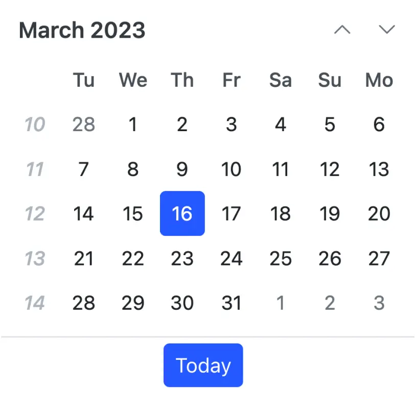
The React Calendar component is used to display the date and days of the week or month. It provides month, year, and decade view options to navigate quickly to the desired date. The React Calendar supports minimum dates, maximum dates, and disabled dates to restrict date selection.
Why choose Syncfusion React Calendar?
Easy to interact
The user can be restricted to choosing a date from a predetermined range of dates. Any date in the React Calendar can be disabled to make it inactive.
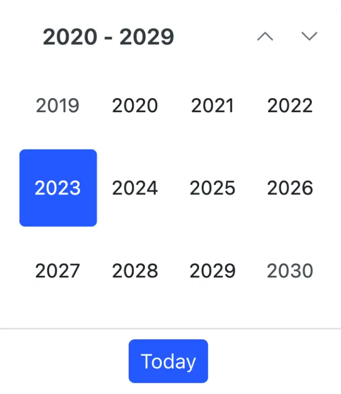
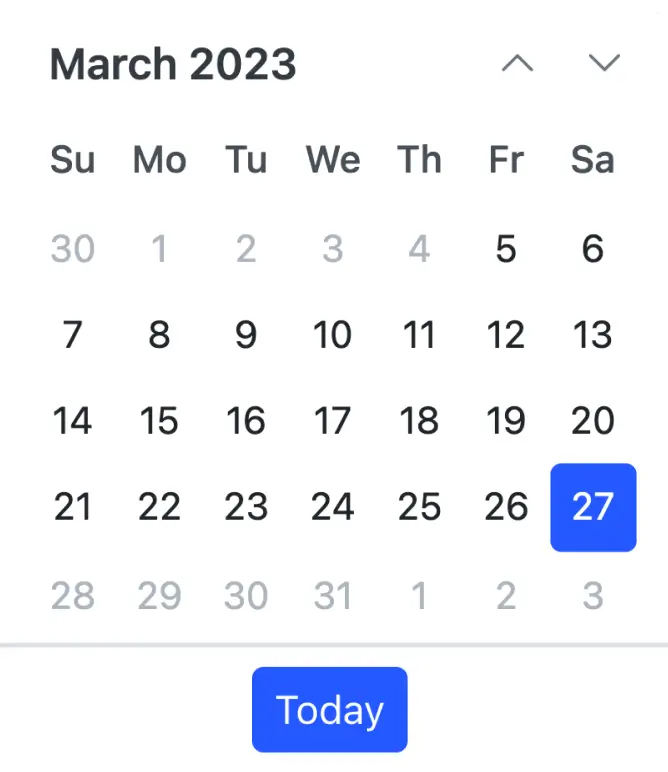
Calendar views
The React Calendar has predefined views that provide a flexible approach to navigate back and forth when selecting dates.
Islamic calendar
The React Calendar component lets users show the Islamic calendar(Hijri calendar) in addition to the Gregorian calendar.
Adapts to any resolution
Calendar has a highly responsive layout and an optimized design for desktops, touchscreens, and smart phones. It works well on all mobile phones that use iOS, Android, or Windows OS.
Attractive, customizable themes
Cutting-edge design with several built-in themes, such as Fluent, Tailwind CSS, Bootstrap, Material, and Fabric. Utilize the online Theme Studio tool to customize themes easily.
Globalization and localization
With built-in globalization options, a culture-specific date format and the first day of the week can be chosen. The text of the month, day, and today button can be translated to any supported language.
React Calendar Code Example
Easily get started with the React Calendar using a few simple lines of TSX code example as demonstrated below. Also explore our React Calendar Example that shows you how to render and configure a Calendar in React.
import * as ReactDOM from 'react-dom';
import * as React from 'react';
import { CalendarComponent, ChangedEventArgs } from '@syncfusion/ej2-react-calendars';
import { SampleBase } from '../common/sample-base';
import './default-style.css';

export class Default extends SampleBase<{}, {}> {
public onchange(args: ChangedEventArgs): void {
        /*Displays selected date in the label*/
        (document.getElementById('date_label') as HTMLElement).textContent = 'Selected Value: ' + args.value.toLocaleDateString();
}
render() {
return (
    <div className='control-pane'>
        <div className='control-section'>
            <div className='calendar-control-section'>
                <CalendarComponent change={this.onchange} ></CalendarComponent>
                <label id='date_label'>Selected Value:</label>
            </div>
        </div>
    </div>
)}
}
Month or year picker
Select only the month or year as a value (month picker or year picker) in the React Calendar Picker.
Date selection within a date range
You can restrict the React Calendar component so that only a date value within a specific range of dates can be entered or selected by specifying the minimum and maximum date options.
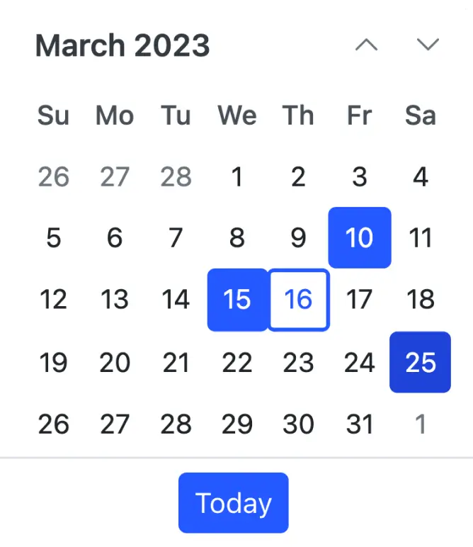
Multiple date selection
Configure the React Calendar to allow users to select single or multiple date values (sequence or random date selection).
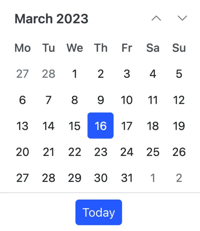
Change first day of week
Automatically update the first day of the week based on the specified culture or change it based on your application requirements.
Week number
Show the week number of a selected date by enabling the week number option in the React Calendar.

Web accessibility
- Fully supports WAI-ARIA accessibility guidelines that allow calendars to be accessed by screen readers and assistive devices.
- Follows WAI-ARIA best practices for implementing keyboard interaction.
- Uses WCAG 2.0-based design for UI element visuals such as foreground color, background color, line spacing, text, and images.
- Supports right-to-left (RTL) direction for users working in right-to-left languages like Hebrew and Arabic.
Accessibility

Keyboard navigation
The React Calendar component ensures that every cell is accessible using the keyboard. Major features like sort, select, and edit can be performed using keyboard commands alone; no mouse interaction is required. This helps in creating highly accessible applications using this component.

Screen reader
The React Calendar view has complete WAI-ARIA accessibility support. The Calendar UI includes high-contrast visual elements that help visually impaired people to have the best viewing experience. Also, valid UI descriptions are easily accessible through assistive technologies such as screen readers.

Right to left (RTL)
Right-to-left rendering allows displaying the text and layout of the Calendar from right to left. This improves the user experience and accessibility for RTL languages.
 Multiple calendar views
1.7M+ downloads
Islamic calendar support
Multiple calendar views
1.7M+ downloads
Islamic calendar support


Not sure how to create your first React Calendar? Our tutorial videos and documentation can help.
I’d love to watch it now I’d love to read it nowDiscover Syncfusion’s Complete React Component Ecosystem
Explore over 140+ React UI components featuring established, production-ready controls and the latest pure React components built natively for modern web app development.
-
React Components
-
Pure React Components
-
SMART COMPONENTSGRIDSDATA VISUALIZATIONDROPDOWNSFILE VIEWERS & EDITORSBUTTONSINTERACTIVE CHATINPUTSNAVIGATIONFORMSNOTIFICATIONS
-
GRIDSDATA VISUALIZATIONNAVIGATION
Standalone UI SDKs
Integrate the DataGrid, Chart, Scheduler, Gantt, Rich Text Editor, File Manager, and Diagram UI components into applications to enable rich interaction and visualization, delivering a seamless user experience.
Document Solutions
Integrate the PDF Viewer, DOCX Editor, Spreadsheet Editor, and document-processing libraries into the React applications to enable a smooth user experience.
Frequently Asked Questions
Why should you choose Syncfusion React Calendar?
Syncfusion React Calendar provides the following features:
A lightweight and easily configurable Calendar component.
- Four different themes, including Material Design.
Next-level features such as multiple date selection, date range restriction, week numbers, and configurable first day of the week.
- Supports standard Syncfusion themes which include Bootstrap v5 and Tailwind CSS.
Multiple calendars, such as Gregorian and Hijri are supported in internationalization, with a fully configurable UI and web accessibility.
Basic views in the Calendar like month, year, and decade.
- One of the best React Calendars in the market that offers a feature-rich UI.
Simple configuration and API.
- Supports all modern browsers.
- Mobile-touch friendly and responsive.
Extensive demos and documentation to learn quickly and get started with Calendar React.
Where can I find the Syncfusion React Calendar demo?
You can find our React Calendar demo here, which demonstrates how to render and configure the Calendar.
Can I customize Calendar views and navigation in React?
How do I disable specific dates like weekends or holidays in React Calendar?
Use the renderDayCell event to customize individual date cells. In this event, you can disable dates conditionally (e.g., weekends) using settingargs.isDisabled = true, preventing users from selecting those dates.
Can I download and utilize the Syncfusion React Calendar for free?
No, this is a commercial product and requires a paid license. However, a free community license is also available for companies and individuals whose organizations have less than $1 million USD in annual gross revenue, 5 or fewer developers, and 10 or fewer total employees.
How do I get started with Syncfusion React Calendar?
A good place to start would be our comprehensive getting started documentation.
How do I set a default selected date or restrict the date range in React Calendar?
How do I handle date selection events in React Calendar?
Use the change event to capture when a user selects a date. The event provides the selected date value, which you can use to update your application state or trigger other actions.
Our Customers Love Us
Having an excellent set of tools and a great support team, Syncfusion® reduces customers’ development time.Here are some of their experiences.

Nice suite of components
A very complete set of components, that has an edge on other major vendors which offer components. A lot less code required to use and code samples for more complete components. Integrates well with other 3rd party components.

John A,

C# Developer
Complete, robust, fully functional web UI
The Syncfusion Grid component is as good or better than any other on the market. It has every feature you could want: paging, sorting, filtering, sizing and reordering columns, exporting to PDF, CSV, or Excel. And they have just about every other rich web component you think of: Calendar, sortable list, embedded rich text/HTML editor, charts, maps, you name it.

Ray W,
Founder/CTO
See Real Success Stories
Developers around the world trust Syncfusion’s Essential Studio to simplify complex projects and speed up delivery. With a vast library of UI controls, powerful SDKs, and reliable support, Essential Studio helps teams build enterprise-ready applications with confidence.
Read Our Customer StoriesIndustry
Software development
75% Cost reduction
50% Faster development
Industry
Utilities (oil and gas)
450+ hours saved
Streamlined processes and hours of development effort saved.
Advanced, flexible features
Empowered users through robust and versatile functionality.
Industry
Software and technology
1000+ of hours saved
Accelerated development with enterprise-ready UI components.
Efficient file management
Streamlined workflows with document libraries without building them from scratch.
Industry
Software and technology
2 Years of delay avoided
Two years of delays prevented with proactive planning.
On-time delivery
Projects delivered on schedule using trusted controls.
Industry
IT services and IT consulting
Improved performance
Large datasets handled with easy customization and quick debugging.
Highly customizable
Plug-and-play controls with quick template integration.
Industry
Professional services
Instant access
Quick availability of features and resources.
Reduced dependencies
Fewer dependencies for faster development.
Rated by users across the globe
Syncfusion React Calendar Resources


UI Kits
 Figma Download
Figma Download
Awards
Greatness—it’s one thing to say you have it, but it means more when others recognize it. Syncfusion® is proud to hold the following industry awards.

