Trusted by the world’s leading companies

Overview
The UWP Calendar control allows users to easily select single or multiple dates like built-in calendar. It provides smooth gestures for navigation between month and year views. The key features include the following:
- Ability to disable date selection for certain dates and within a specific date range.
- Appearance customization.
- Displaying events in inline or agenda view.
- Globalization and localization to meet the needs of various regions.
Month and year views
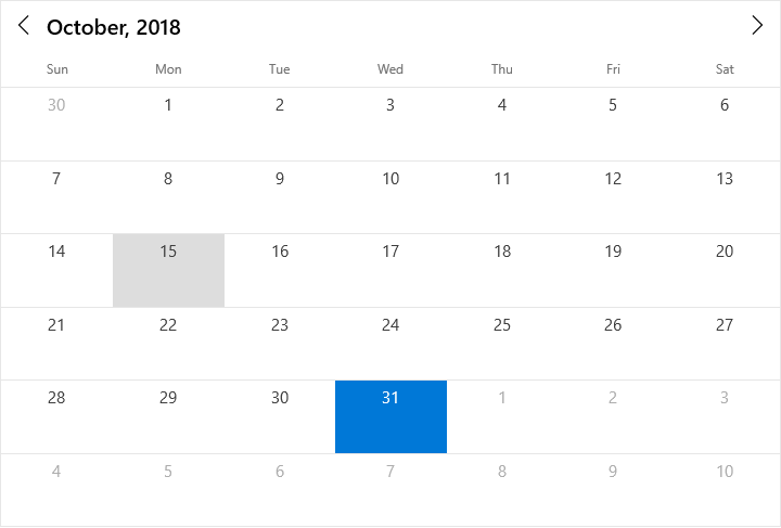
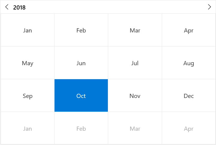
Display and navigate dates with an intuitive user interface using built-in month and year views. Month view displays dates of a month and the year view displays months of a year with horizontal and vertical navigation. It also supports programmatic navigation.
Date selection
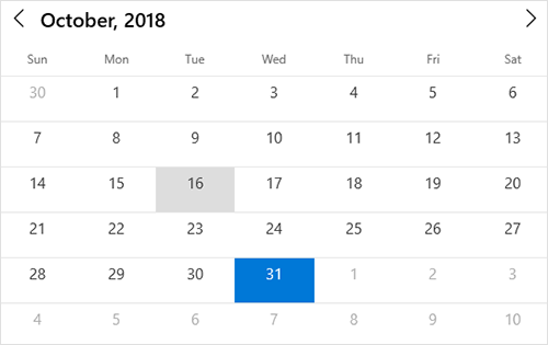
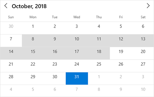
The UWP calendar view supports selecting single, multiple, and range of dates using keyboard, mouse, and touch interaction. It also supports programmatic selection.
Date restriction
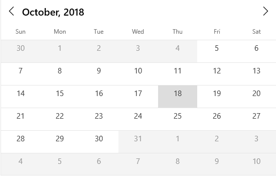
Prevents navigation beyond the specified minimum and maximum dates to restrict the users from selecting certain dates.
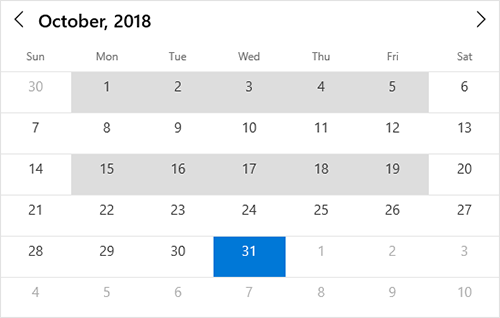
Blackout dates
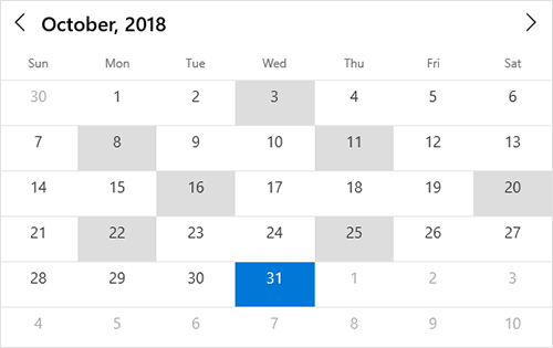
Disables interactions and selections for certain dates. This is useful when you want to block user interaction during holidays or any other special events.
Special dates
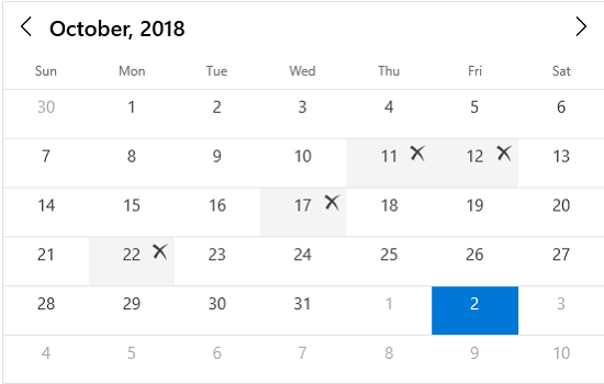
The UWP calendar component provides a flexible way for highlighting special dates using custom templates.

Appearance Customization
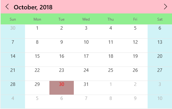
The Calendar control style can be customized in the following aspects to fit the UI with the rest of your application.
- Weekends and week days
- Header and day header
- Current day and selected date
- Month cells and year cells
- Blackout dates
- Inline view
- Navigation buttons
Calendar events
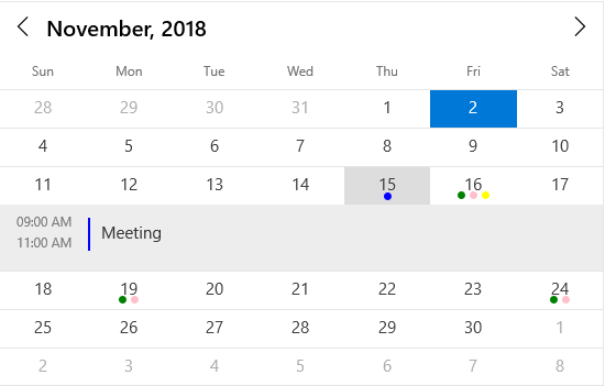
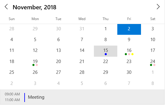
Month calendar supports addition of events for specific dates. It displays indicators in month cells to denote the events. It also shows event details of the selected date in inline or agenda view.
First day of week
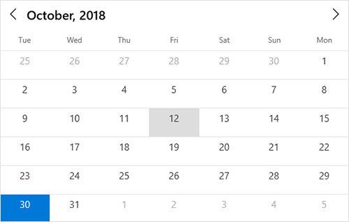
Change the first day of the week based on the application culture. In the month and year views, the days that follow the specified start day will be displayed in the calendar.
Globalization and localization

Globalization
Displays date-time formats and headers in different cultures. Thus, it meets the needs of different regions.

Localization
Localizes all static text in the calendar. It is useful to meet the need of a particular language.
115+ UWP CONTROLS
Our Customers Love Us


 Documentation
Awards
Greatness—it’s one thing to say you have it, but it means more when others recognize it. Syncfusion® is proud to hold the following industry awards.
