Trusted by the world’s leading companies

Overview
The ASP.NET MVC DataGrid is a feature-rich data table control for displaying data in a tabular format. Its wide range of functionalities includes data binding, editing, Excel-like filtering, custom sorting, aggregating rows, data annotation, selection, and support for Excel, CSV, and PDF formats.
Why choose the Syncfusion Essential Studio® ASP.NET MVC DataGrid?
High performance
The control focuses on fast-paced performance to load millions of records in just a second.
Seamless data binding
Bind data with various local and remote data sources such as JSON, OData, WCF, and RESTful web services with the help of a data manager.
Adapts to any resolution
The DataGrid has a highly responsive layout and an optimized design for desktops, tablets, and smartphones. It works well on all mobile phones that use iOS, Android, or Windows OS.
Flexible editing
The ASP.NET MVC DataGrid performs create, read, update, and delete operations (CRUD) with a list of business objects or a remote data service with the help of a data manager.
Create your own template designs
Users can create custom user experiences in the ASP.NET MVC DataGrid using a wide range of template options.
Attractive, customizable themes
Create a cutting-edge design with built-in themes such as Fluent, Tailwind CSS, Bootstrap, Material, Fabric, and more. Utilize the online Theme Studio tool to customize themes easily.
Easy export and printing
Export the DataGrid in Excel, PDF, and CSV file formats. Print all the rows, regardless of the number of pages, as well as just the currently viewed page.
Globalization and localization
Users from different locales can use the control by formatting dates, currency, and numbering to suit preferences.
ASP.NET MVC DataGrid code example
Easily get started with the ASP.NET MVC DataGrid using a few simple lines of CSHTML and C# code, as demonstrated below. Also explore this ASP.NET MVC DataGrid example, which shows you how to render and configure a DataGrid in ASP.NET MVC.
@using Syncfusion.EJ2
@{
    ViewBag.Title = "DefaultFunctionalities";
}

@section ControlsSection{
    <div class="control-section">
        @Html.EJS().Grid("DefaultFunctionalities").DataSource((IEnumerable<object>)ViewBag.dataSource).Columns(col=> {

       col.Field("OrderID").HeaderText("Order ID").TextAlign(Syncfusion.EJ2.Grids.TextAlign.Right).Width("120").Add();
       col.Field("CustomerID").HeaderText("Customer Name").Width("150").Add();
       col.Field("OrderDate").HeaderText("Order Date").TextAlign(Syncfusion.EJ2.Grids.TextAlign.Right).Width("130").Format("yMd").Add();
       col.Field("Freight").HeaderText("Freight").TextAlign(Syncfusion.EJ2.Grids.TextAlign.Right).Width("120").Format("C2").Add();
       col.Field("ShippedDate").HeaderText("Shipped Date").Width("140").Format("yMd").Add();
       col.Field("ShipCountry").HeaderText("Ship Country").Width("150").Add();

       }).AllowPaging().PageSettings(page=>page.PageCount(5)).Render()
    </div>
}
using System;
using System.Collections.Generic;
using System.Linq;
using System.Web;
using System.Web.Mvc;
using EJ2MVCSampleBrowser.Models;
using MVCSampleBrowser.Models;
namespace EJ2MVCSampleBrowser.Controllers.Grid
{
public partial class GridController : Controller
{
// GET: DefaultFunctionalities
public ActionResult DefaultFunctionalities()
{
var order = OrdersDetails.GetAllRecords();
ViewBag.datasource = order;
return View();
}
}
}
Skeleton loading indicator
The DataGrid shows an effect as a loading indicator while fetching the data from server(service) and binding it to the grid during initial rendering, refreshing, or after performing any grid action like sorting. The DataGrid offers two types of loading indicator effects: spinner and shimmer.
Adaptive UI layout
The DataGrid user interface was customized and redesigned for great views and usability on small screens. Its features include filter, sort, search, column chooser, column menu, pager dropdown, and edit dialogs that are adaptive to the screen size and render row elements vertically.

Columns
Columns define the schema of the data source in the DataGrid. The control supports formatting, auto-generating columns, column definitions, freezing rows and columns, column spanning, text wrapping, column chooser, column menu, and other features.
Paging
Paging is used to view a segment of data from the assigned data source. The ASP.NET MVC DataGrid offers a built-in pager UI with options to customize its entire UI. It also has an on-demand paging mode for effective data retrieval from remote web services.


Sorting
Sort rows in either ascending or descending order in a column by simply clicking the header. Sort multiple columns’ data by holding the Ctrl key and clicking the header. In addition, define your own custom sorting logic.
Filtering
Filtering helps users view particular or related records that meet given criteria in a data grid. The DataGrid supports various filter types, including powerful, Excel-like filters. Choose the appropriate filter type, define your own custom filtering logic, and customize the filtering UI. Diacritic characters can also be filtered.


Selection
Select rows or cells using the checkbox or by simply clicking them. Select more than one row or cell by holding Ctrl, Shift, or Command while clicking , or programmatically.
Editing
The ASP.NET MVC DataGrid supports create, read, update, and delete operations (CRUD). In addition to built-in editor components to edit a particular column value, custom editor components can be created using templates. With the help of a data manager, you can perform editing operations with an array collection or a remote data service.


Grouping
Group rows to display the data in an organized, hierarchical structure in ascending or descending order to facilitate easier expansion and collapse of records. There is an option to group records of the desired column by dragging and dropping that column into an interactive drop area.
Aggregation
Easily visualize the aggregates of the DataGrid column values using the summary option. Aggregates can be customized to show their value in individual summary rows, individual group summary rows, or group caption rows.

Frozen rows and columns
Frozen rows and columns are visible at the top and on the left, right, both, or in a fixed position, leaving the remaining grid content scrollable. This feature is mainly used to compare cell values.
Pinned rows
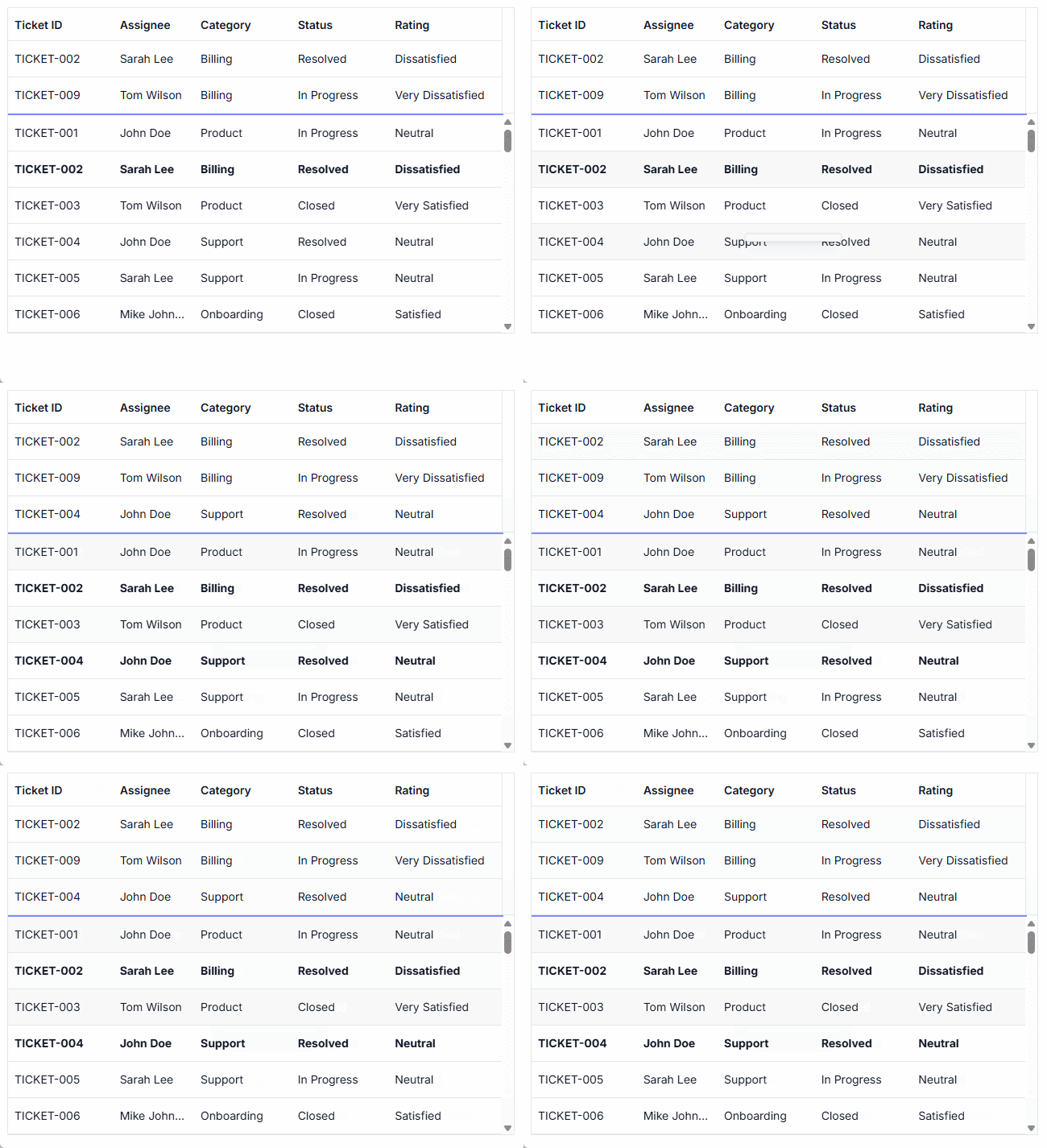
Pinning rows keeps them fixed at the top of the grid. This ensures that key records remain visible during operations such as paging, sorting, and filtering, providing continuous access across all data interactions.

Sticky headers
The ASP.NET MVC DataGrid header can be in a fixed position when scrolling the document vertically to visualize the DataGrid content along with the column header.
Row drag and drop
The ASP.NET MVC DataGrid allows users to drag and drop rows to another DataGrid or custom component. Users can also drag and drop rows within the same DataGrid using the drag icon and transfer rows between different groups.


Master-detail grid
An ASP.NET MVC master-detail grid is a use-case scenario in which a record’s details are viewed in a separate data grid by clicking a particular row.
Charts integrated with DataGrid
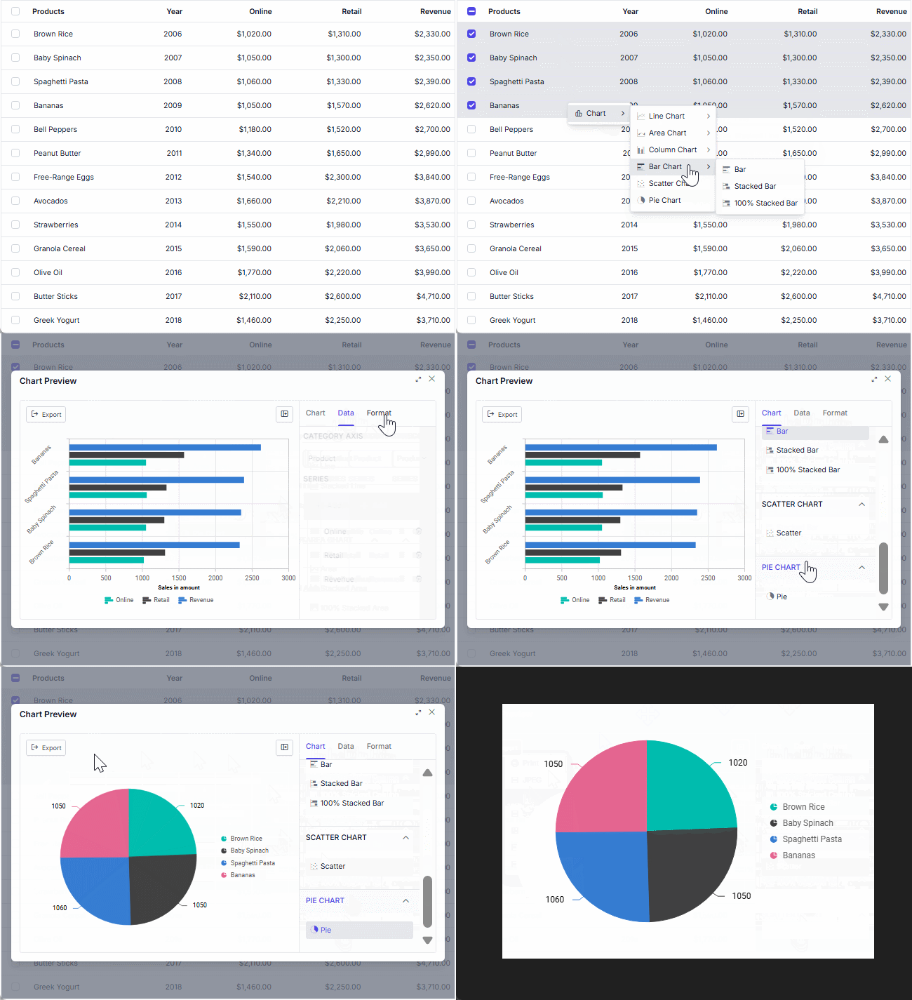
The DataGrid integrates with the Charts component, transforming selected grid data into dynamic, interactive visualizations. This combination of tables and charts empowers users to gain clearer insights at a glance. Customize the chart types, axes, and visuals.

Additional features

Row height
Row height is a major factor when displaying records in the viewport. It is easily customizable and can be set conditionally.

Copy to clipboard
The clipboard allows users to copy data from selected rows or cells into it. The Ctrl+C and Ctrl+Shift+H key combinations copy data with and without headers, respectively.

Context menu
Perform various actions in a DataGrid using the pop-up menu that appears when the cell, header, or pager is right-clicked. In addition to built-in default menu items, custom context menu items can be added.

Width and height
Set the width and height properties to change the size of the data grid. When the content overflows the grid element, horizontal and vertical scrollbars will appear. To fill the data grid’s parent container, simply set the height and width to 100%.

Stacked headers
Stacked headers allow grouping and visualizing column headers in a stacked manner. The number of columns that can be stacked is unlimited. Perform all DataGrid actions even when the columns are stacked.
Accessibility

Keyboard navigation
The DataGrid ensures that every cell is accessible using the keyboard. Major features like sort, select, and edit can be performed using keyboard commands alone; no mouse interaction is required. This helps in creating highly accessible applications using this component.

Screen readers
The ASP.NET MVC DataGrid view has complete WAI-ARIA accessibility support. The DataGrid UI includes high-contrast visual elements that help visually impaired people to have the best viewing experience. Also, valid UI descriptions are easily accessible through assistive technologies such as screen readers.

Right to left (RTL)
Right-to-left rendering allows users to display the text and layout of the DataGrid from right to left. This improves the user experience and accessibility for RTL languages.
Mobile-optimized and touch-friendly
The DataGrid component improves usability and provides an optimized and responsive design for desktops, tablets, and phones across all operating systems, including iOS, Android, and Windows.

Touch support
User-friendly touch gestures and an interactive UI design provide the best user experience. All DataGrid features work on touch devices with zero configuration.

Responsive pager
The DataGrid pager acts intelligently and changes its entire UI responsively based on the dimension. Its optimized design provides the best UI interaction on different devices.
Other supported frameworks
The DataGrid component is also available in Blazor, React, Angular, JavaScript and Vue frameworks. Check out the different DataGrid platforms from the links below:
Supported browsers
The ASP.NET MVC DataGrid works well with all modern web browsers such as Chrome, Firefox, Microsoft Edge, Safari, and Opera.

Not sure how to create your first ASP.NET MVC DataGrid? Our documentation can help.
I’d love to read it now140+ ASP.NET MVC UI CONTROLS
Build Document Workflows in ASP.NET MVC
Integrate a powerful PDF Viewer, rich DOCX Editor, and full‑featured Spreadsheet Editor into your ASP.NET MVC applications, alongside robust document processing libraries, to create smooth document experiences. Empower users to work with documents interactively while developers automate processing behind the scenes.
Frequently Asked Questions
Why should you choose the Syncfusion Essential Studio ASP.NET MVC DataGrid?
Millions of records load in just a second.
- Mobile-first design that adapts to any resolution.
Flexible data binding with support to use local and remote data sources such as JSON, RESTful services, OData services, and WCF services.
Out-of-the-box, Excel-like filtering and grouping options.
Data exporting options like PDF, CSV, and Excel.
- Simple configuration and API.
- Support for all modern browsers.
Expansive learning resources such as demos and documentation let users get started quickly with the ASP.NET MVC DataGrid.
Where can I find the Syncfusion ASP.NET MVC DataGrid demo?
You can find our ASP.NET MVC DataGrid demo here. It demonstrates how to render and configure the DataGrid.
Can I download and utilize the Syncfusion® ASP.NET MVC DataGrid for free?
No, this is a commercial product and requires a paid license. However, a free community license is also available for companies and individuals whose organizations have less than $1 million USD in annual gross revenue, 5 or fewer developers, and 10 or fewer total employees.
How do I get started with the Syncfusion ASP.NET MVC DataGrid?
A good place to start would be our comprehensive getting started documentation.
Our Customers Love Us


 Documentation
Awards
Greatness—it’s one thing to say you have it, but it means more when others recognize it. Syncfusion® is proud to hold the following industry awards.


