
TLDR: Showcasing the new features and controls introduced in Syncfusion’s Blazor platform for the 2024 Volume 1 release with vivid, picturesque illustrations.
The Syncfusion Blazor component library offers responsive and lightweight components for building modern web apps.
This blog will highlight some of the most notable updates in the Syncfusion Blazor suite for the Essential Studio 2024 Volume 1 release.
New component
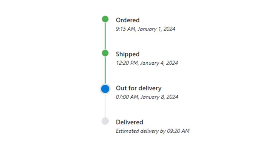
Blazor Timeline
The new Blazor Timeline component enables users to display a series of data chronologically, providing a visually compelling and user-friendly experience. This showcases user activities, tracking progress, narrating historical timelines, and more.
Key features
- Orientation: Display items in a horizontal or vertical orientation.
- Opposite content: Display additional information opposite to the item content.
- Items alignment: Items’ content and opposite content can be aligned in before, after, alternate, or alternate reverse order.
- Reverse timeline: Shows the timeline items in the reverse order.
- Templates: Customize the default appearance, including styling the dot item, templated content, and more.
Refer to the following image.
Note: For more details, refer to the Blazor Timeline component demo.
Preview to production-ready components
The following Blazor components have been developed to meet the industry standards and are now marked production-ready:
WCAG 2.2
Syncfusion Blazor components comply with Web Content Accessibility Guidelines (WCAG) 2.2 standards.
Showcase samples
Floor Planner
Introducing the new Blazor Server and WASM Floor Planner, a showcase web app. It allows you to create a floor planner to visually design and plan the layout of a floor or building, including the placement of walls, doors, windows, furniture, and other objects.
Samples | GitHub | Server Demo | WASM Demo |
Floor Planner | https://github.com/syncfusion/blazor-showcase-floor-planner
| https://blazor.syncfusion.com/showcase/floor-planner/
| https://blazor.syncfusion.com/showcase/wasm/floor-planner/
|
Logic Circuit Designer
Introducing the new Blazor Server and WASM Logic Circuit Designer, a showcase web app. It allows you to create a logic circuit designer to visually design and simulate digital logic circuits using a wide range of logic gates and input and output components to visualize better, understand how it works, and share your design with others.
Samples | GitHub | Server Demo | WASM Demo |
Logic Circuit Designer | https://github.com/syncfusion/blazor-showcase-logic-circuit-designer
| https://blazor.syncfusion.com/showcase/logic-circuit-designer
| https://blazor.syncfusion.com/showcase/wasm/logic-circuit-designer
|
What’s new in our existing Blazor components?
DataGrid
The new features added to the Blazor DataGrid are as follows:
Export the grid with column, caption, and detail templates
You can export the grid with columns containing images, hyperlinks, and customized text to Excel and PDF files. Users can also export the grid with a detail template and caption template containing customized text in the group caption row to Excel and PDF files.
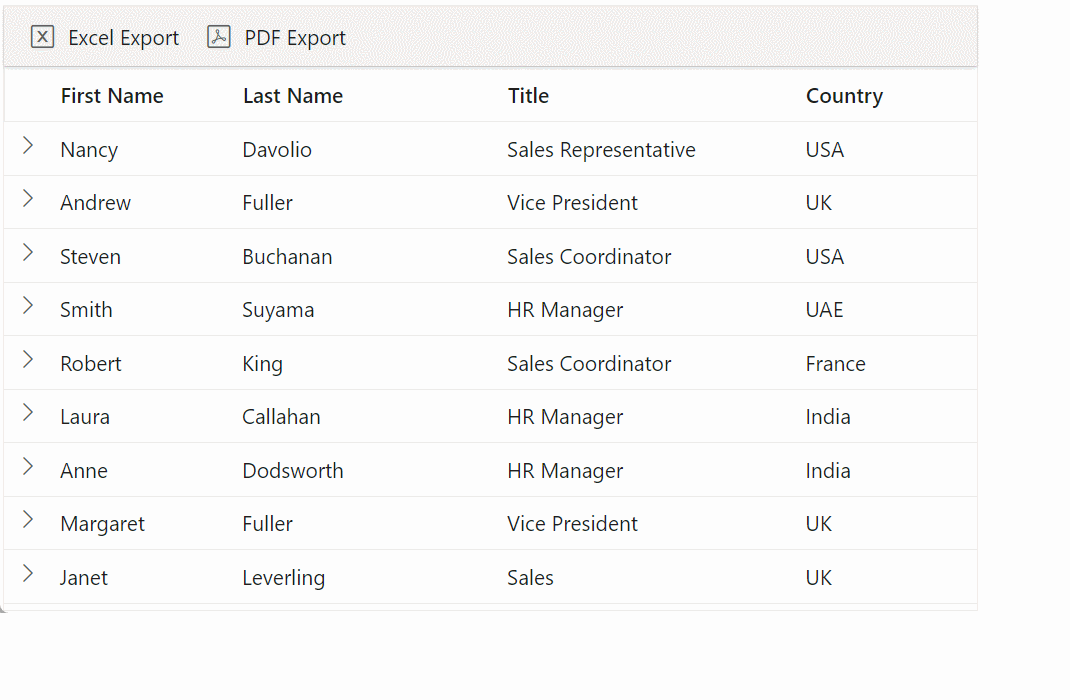
Note: For more details, refer to the Detail Template Exporting in the Blazor DataGrid demo.
Search and filter with new operators
The new operators in the search and filter feature allow users to perform precise and targeted searches on the Blazor Data Grid. The following new operators provide greater flexibility and control over how users can search and filter data.
- Does not contain: Allows users to search for items that do not include certain keywords or phrases.
- Is null and is not null: Allows users to search for items that contain null and non-null values.
- Is like and is not like: Allows users to search for items that match or do not match a specific pattern using wildcards.
- Does not start with and does not end with: Allows users to search for items that do not begin or end with a specific string of characters.
Note: For more details, refer to the search and filter with new operators in the Blazor DataGrid demo.
Add current selection option to filter checkbox
This feature keeps the previously selected checkbox filters when making additional changes. It can be achieved by showing Add current selection to filter as one of the checkbox options in the Excel-like or checkbox filter.

Note: For more details, refer to add current selection option to filter checkbox in the Blazor DataGrid demo.
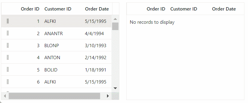
Row drag and drop using the drag icon
This functionality enables users to move multiple rows seamlessly within and between grids using drag icons. This intuitive feature allows users to rearrange data effortlessly, enhancing overall user experience and productivity.
Note: For more details, refer to drag and drop rows using the drag icon in the Blazor DataGrid demo.
Diagram
The new features added in the Blazor Diagram are as follows:
Create swimlane diagrams
This feature lets you create swimlane diagrams programmatically or interactively. A swimlane is a visual element used to group and categorize activities or tasks based on the role or department responsible for their execution. It effectively shows complex processes involving multiple participants or departments in an organization.
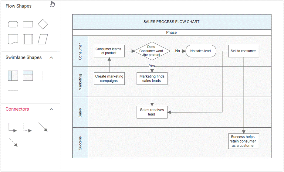
Note: Refer to the swimlane diagrams in the Blazor Diagram demo for more details.
Line routing
This feature ensures that connectors in the diagrams no longer overlap with neighboring nodes when in contact, offering a more streamlined and organized visual representation. Line routing dynamically updates the connector’s geometry. This process eliminates confusion about the path flow of connectors, resulting in a cleaner and more understandable diagram.
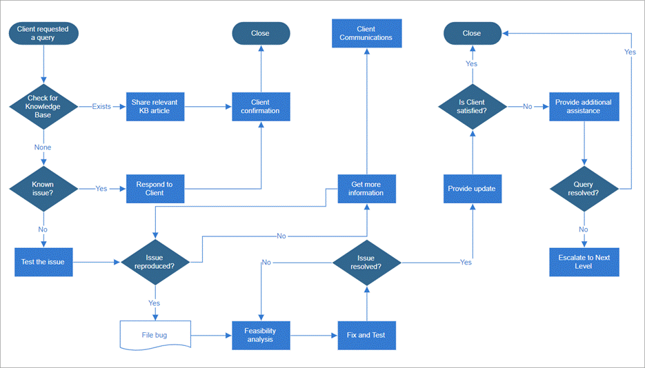
Note: For more details, refer to the line routing in the Blazor Diagram demo.
File Manager
The new features added to the Blazor File Manager are as follows:
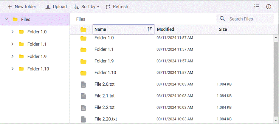
Flat data
The Blazor File Manager now introduces support for rendering flat data objects, removing the need for HTTP client requests and backend URL configuration. This enhancement also eliminates the requirement to define FileManagerAjaxSettings while rendering the component.
Note: For more details, refer to flat data objects rendering in the Blazor File Manager demo.
Custom sorting
We’ve now provided custom sorting support in the Blazor File Manager. This feature allows users to override the standard sorting mechanism, tailoring it to suit specific app requirements.
Gantt Chart
The new features added to the Blazor Gantt Chart are as follows:
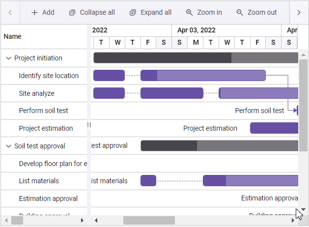
Split tasks in the resource view
Users can split tasks in the resource view of the Blazor Gantt Chart. This functionality allows users to temporarily stop working on a task due to unforeseen circumstances or task reprioritization while indicating that the rest of the work will restart later in the schedule.
Note: For more details, refer to task splitting in the resource view of the Blazor Gantt Chart demo.
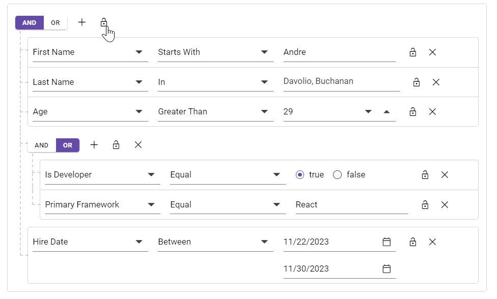
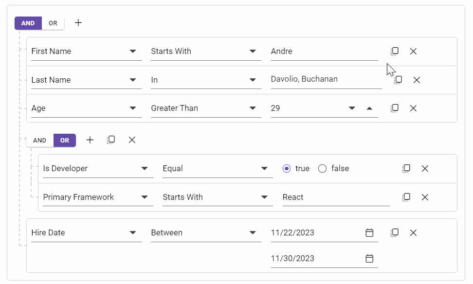
Query Builder
The new features added in the Blazor Query Builder are as follows:
New Query types
To improve the query functionality, the Blazor Query Builder has been expanded to accommodate query types, including Mongo, parameterized SQL, and named parameter SQL. Users can also seamlessly import these queries into the Query Builder for enhanced versatility.
Note: For more details, refer to the Blazor Query Builder demo.
Lock support
The lock option is available for rules as well as groups. When a rule is locked, the field, operator, and value will be disabled. When a group is locked, all the elements within the group will be disabled.
Note: For more details, refer to the lock support in the Blazor Query Builder demo.
Clone support
The clone option is available for rules and groups. It will create a replica of a rule or group next to the original.
Note: For more details, refer to the clone support in the Blazor Query Builder demo.
PDF Viewer
The new features added to the Blazor PDF Viewer are as follows:
Customize primary toolbar
The customizable primary toolbar allows users to tailor it to their needs. You can add new items, hide existing ones, and reposition items for optimal workflow efficiency on desktop and mobile PDF Viewers.
- Integrate custom actions, such as annotation tools, view ratio, or document navigation shortcuts, directly into your primary toolbar for quick and convenient access.
- Customize your PDF Viewer experience by removing unnecessary clutter and focusing only on the tools you use most frequently.
- Organize your toolbar intuitively, placing frequently used tools at the front and center for easy access and improved productivity.
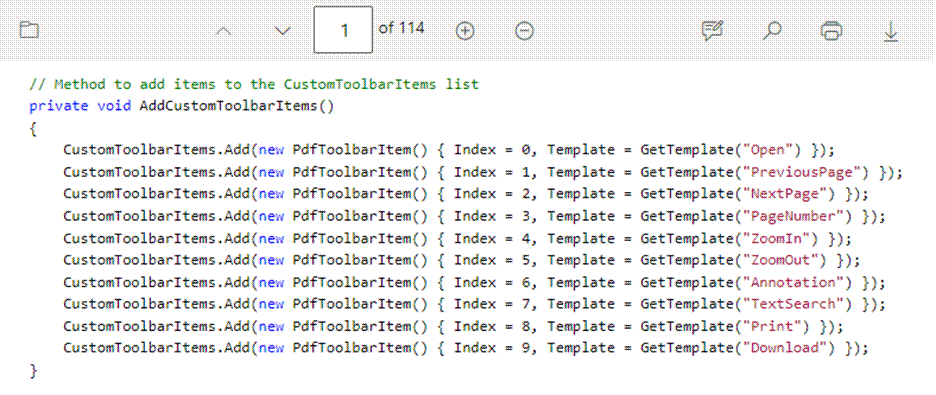
Note: For more details, refer to customizing the primary toolbar in the Blazor PDF Viewer demo.
Shortcut keys
The Blazor PDF Viewer now provides shortcut key support for page navigation, downloading, and panel visibility for comments, bookmarks, and thumbnails.
Data Form
The new features added in the Blazor Data Form are as follows:
Floating label
Now, you can enable floating label functionality in the Blazor Data Form by setting the EnableFloatingLabel property to true. This will dynamically move the label above the input field when the user interacts with the form.
Note: Refer to the floating labels in the Blazor Data Form demo for more details.
Additional data annotations
The Data Form component supports the following data annotation attributes for the model properties.
- DisplayAttribute: To specify the display name for the model property. Now, the ShortName, AutoGenerateField, Name, Prompt, and GroupName properties will also be supported.
- DataType: Determines which editor component should be rendered based on the data type.
- StringLength: Specifies the maximum and minimum length of characters that can be typed.
- Bindable: Specifies whether the field should be auto-generated or not. If Bindable is set to false, the field will not be auto-generated.
- ReadOnly: Specifies whether the field should be read-only or not. If ReadOnly is set to true, the field will be read-only.
Dropdowns
Virtualization
Previously, the Blazor dropdown components (DropDownList, ComboBox, and AutoComplete) had a limitation where virtualization didn’t function properly while grouping the data. Now, the limitations have been overcome, ensuring seamless virtualization alongside grouped data.
Note: For more details, refer to virtualization in the Blazor Dropdown List demo.
Toolbar
Spacer
The new Spacer toolbar item type in the Blazor Toolbar addresses the flickering issue that occurs when toolbar items are aligned using the Align property. The Spacer ensures a smoother user experience during initial loading. By aligning items using CSS flex, the Spacer resolves these glitches and enhances the overall loading performance.
Conclusion
Thanks for reading! This blog explores the new features and components rolled out in the Syncfusion Blazor suite for the 2024 Volume 1 release. Try out these user-friendly updates and provide us feedback in the comments section below.
Remember to visit our Release Notes and the What’s New pages to discover the other available features in the 2024 Volume 1 release.
The latest version is available for existing customers on the License and Downloads page. If you still need to become a Syncfusion customer, use our 30-day free trial to explore our available features.
Feel free to contact us through our support forum, support portal, or feedback portal. We are always happy to assist you!


Comments (2)
Hi,
I enjoy using Syncfusion’s Blazor components. Please add a Download component, an Upload component, and a Print component – preferably without JS backing code, and suitable for Blazor Interactive Server Side Rendering and Blazor WebAssembly.
This is such basic web app functionality, I am surprised it is not already there.
Thanks
Jeff, Thank you for your feedback and for using Syncfusion’s Blazor components. For upload and print functionalities, while there isn’t a specific standalone component since these functionalities depend on the application’s specific UI needs, rest assured that these functionalities are seamlessly integrated into our existing components.
Download Component: The download functionality is incorporated into our File Management Component. You can find more details here.
https://blazor.syncfusion.com/demos/file-manager/overview?theme=fluent
Upload Component: We have a dedicated File Upload Component. You can learn more about it here.
https://www.syncfusion.com/blazor-components/blazor-file-upload
Print Component: The print functionality is available across various components such as Data Grid, TreeGrid, Chart, and more. You can explore the print capabilities in these components here.
https://blazor.syncfusion.com/demos/datagrid/print?theme=fluent
Regards,
Rajendran R.
Comments are closed.