Trusted by the world’s leading companies

Overview
The Syncfusion Blazor Data Form component simplifies form creation in Blazor applications by providing a rich set of features for automatic field generation, layout customization, and seamless data binding. Whether working with simple forms or complex data models, the Data Form component streamlines the development process while offering flexibility for customization.

Editors
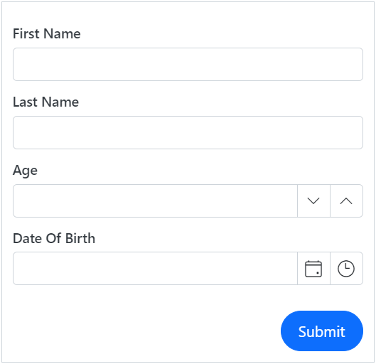
The Blazor Data Form component supports built-in editors for primitive data types such as string, integer, date-time, date-only, time-only, and enumeration. It also provides custom editors to enhance the user experience.
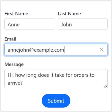
Text box editor

Password editor

Multi-line editor

Numeric editor

Checkbox editor

Switch editor

Autocomplete editor

Dropdown list editor

Date picker
Auto-generation of form fields
Automatically generate form fields based on the properties of the data model. Data Form creates built-in components automatically based on the field type, such as TextBox, NumericTextBox, DatePicker, or TextArea. It saves development time by eliminating the need to define each form field manually.
Data binding
Enable seamless two-way data binding between the form and the data model. This will ensure that users directly set the values of the model and save time. When the form is provided with a data model, it will automatically generate an input field for every property in the model, depending on its type.
Customizable form fields
The form fields can be customized by changing their appearance, data binding model values, adding placeholders, and more.


Form validation and error handling
The Blazor Data Form can be validated in its entirety through the built-in Blazor validation and other validation methods. Users can provide validation rules directly on the model using attributes such as Required, Range, or MaxLength. Additionally, any field that the form contains can be validated individually. The validation error message can be displayed in three ways: as a validation summary, inline, or using tooltip options.
Custom form editor
The Blazor Data Form component offers a straightforward method to modify the default field editors according to the provided data type. Users can select a date picker, date-time picker, or time picker for the DateTime type, and a text box or text area for the string fields.


Column layout
The component offers a straightforward method for organizing form fields into multiple columns with column-spanning options, enhancing the visual layout and user experience.
Form group layout
The Blazor Data Form component provides options for grouping the form fields, allowing the organization of related fields together.


Form template
The Data Form component allows easy customization of the labels, form editor component, and validation messages in any use case.
Right to left (RTL) rendering
The Blazor Data Form component supports right-to-left configuration for users who communicate in a right-to-left language script, such as Arabic and Hebrew.

Styling and theming
The Data Form offers multiple built-in themes: Tailwind CSS, Bootstrap 5, Bootstrap 4, Bootstrap, Material, Fabric, and high contrast. Users can customize these built-in themes or create new ones in order to achieve the desired appearance and style. This can be done by overriding the Sass variables or utilizing the Theme Studio application.
Accessibility
- Fully supports WAI-ARIA accessibility practices to work with screen readers and assistive devices.
- Follows WAI-ARIA best practices for implementing keyboard interaction.
- Uses UI visual elements such as foreground color, background color, line spacing, text, and images designed based on WCAG 2.0 standards.
Data Form code example
Easily get started with the Blazor Data Form using a few simple lines of C# code, as demonstrated below. Also explore our Blazor Data Form example, which shows how to render and configure the component.
@using Syncfusion.Blazor.DataForm
@using System.ComponentModel.DataAnnotations

<SfDataForm ID="MyForm" Model="@EmployeeDetail">
    <FormValidator>
        <DataAnnotationsValidator></DataAnnotationsValidator>
    </FormValidator>
    <FormItems>
        <FormAutoGenerateItems />
    </FormItems>
</SfDataForm>

@code {

    public class EmployeeDetails
    {

        [Required(ErrorMessage = "Please enter first name")]
        [Display(Name = "First Name")]
        public string FirstName { get; set; }

        [Required(ErrorMessage = "Please enter last name.")]
        [Display(Name = "Last Name")]
        public string LastName { get; set; }

        [Required(ErrorMessage = "Please enter email address.")]
        [EmailAddress(ErrorMessage = "Please enter a valid email address.")]
        [Display(Name = "Email")]
        public string Email { get; set; }

        [Display(Name = "Date Of Birth")]
        [Required(ErrorMessage = "Please enter the date of birth.")]
        public DateTime? DOB { get; set; }

    }
    private EmployeeDetails EmployeeDetail = new EmployeeDetails();
} 145+ UI components
1200+ interactive Blazor demos
8.7M+ downloads
145+ UI components
1200+ interactive Blazor demos
8.7M+ downloads

Not sure how to create your first Blazor Data Form? Our documentation can help.
Get started with Blazor server-side Data Form Get started with Blazor web app Data FormBlazor Components – 145+ UI and DataViz Components
ALL COMPONENTS
SMART COMPONENTS
GRIDS
DATA VISUALIZATION
FILE VIEWERS & EDITORS
DROPDOWNS
NAVIGATION
INPUTS
BUTTONS
INTERACTIVE CHAT
Standalone UI SDKs
Integrate the DataGrid, Chart, Scheduler, Gantt, Rich Text Editor, File Manager, and Diagram UI components into applications to enable rich interaction and visualization, delivering a seamless user experience.
Document Solutions
Integrate the PDF Viewer, DOCX Editor, Spreadsheet Editor, and document-processing libraries into the Blazor applications to enable a smooth user experience.
Our Customers Love Us
Having an excellent set of tools and a great support team, Syncfusion® reduces customers’ development time.Here are some of their experiences.

Blazor components
The speed how they adding new Blazor controls and update theirs functionality.
I am using Blazor components. Searching for Blazor components I found that Syncfusion very fast adopted theirs controls for new development platform. Tech support is fast and excellent. The best of best is that they provide free controls for small business.

Igor L,

CEO, Small-Business
Syncfusion objects with a Blazor
I have used some of the Syncfusion objects with a Blazor application. The support group has always been very helpful.

Kris B,
Software Development Consultant, Small-Business
See Real Success Stories
Developers around the world trust Syncfusion’s Essential Studio to simplify complex projects and speed up delivery. With a vast library of UI controls, powerful SDKs, and reliable support, Essential Studio helps teams build enterprise-ready applications with confidence.
Read Our Customer StoriesIndustry
Software development
75% Cost reduction
50% Faster development
Industry
Utilities (oil and gas)
450+ hours saved
Streamlined processes and hours of development effort saved.
Advanced, flexible features
Empowered users through robust and versatile functionality.
Industry
Software and technology
1000+ of hours saved
Accelerated development with enterprise-ready UI components.
Efficient file management
Streamlined workflows with document libraries without building them from scratch.
Industry
Software and technology
2 Years of delay avoided
Two years of delays prevented with proactive planning.
On-time delivery
Projects delivered on schedule using trusted controls.
Industry
IT services and IT consulting
Improved performance
Large datasets handled with easy customization and quick debugging.
Highly customizable
Plug-and-play controls with quick template integration.
Industry
Professional services
Instant access
Quick availability of features and resources.
Reduced dependencies
Fewer dependencies for faster development.
Rated by users across the globe
Syncfusion Blazor Resources
Learning
 Documentation
 Documentation


Awards
Greatness—it’s one thing to say you have it, but it means more when others recognize it. Syncfusion® is proud to hold the following industry awards.

