
 Silambarasan Ilango
The Syncfusion Blazor Media Query component effortlessly adjusts your web applications’ layouts based on browser size, ensuring they look stunning across all devices and screen sizes. In this blog, we’ll uncover the key features of this powerful tool and dive into how you can integrate it seamlessly into your apps. Easily create responsive and adaptive web layouts powered by the Syncfusion Blazor Media Query component.

Key features
The key features of the Blazor Media Query component include:
- Use predefined media breakpoints.
- Customize predefined media breakpoints.
- Add one or more custom media breakpoints.
- Create a responsive design and integrate other components.
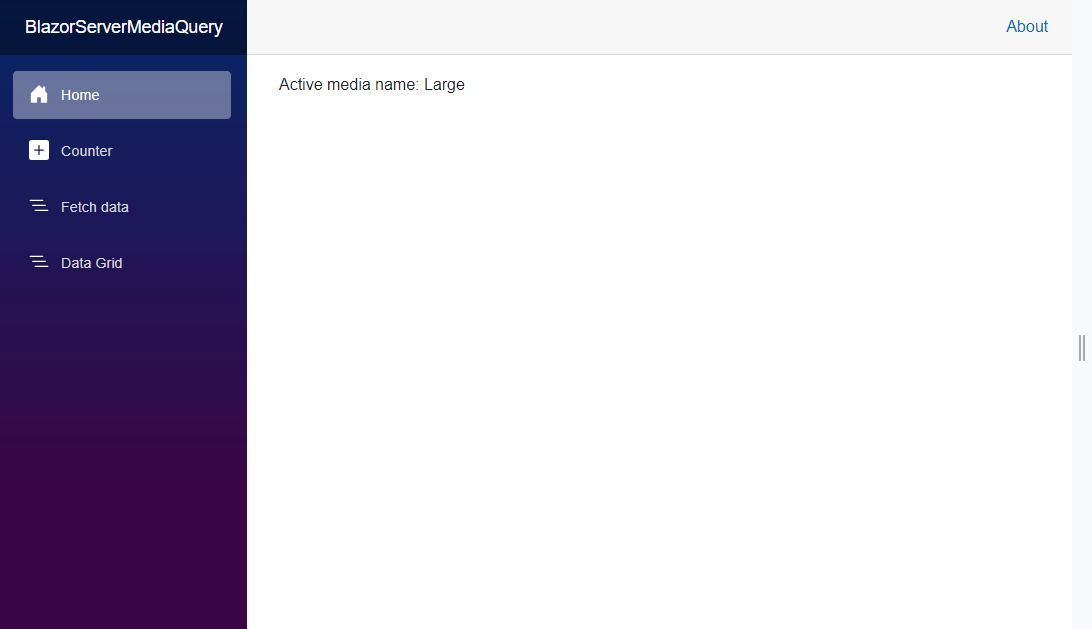
Use predefined media breakpoints
The Blazor Media Query component provides a set of predefined standard media breakpoints, simplifying the process of creating responsive webpages that seamlessly adapt to various devices. These breakpoints are defined based on typical device widths.
By detecting changes in the browser’s size whenever the defined media breakpoints are matched, the component automatically adjusts the layouts, ensuring your apps look great across different devices and screen sizes.
Small | browser width <= 768 pixels |
Medium | browser width between 768 and 1024 pixels |
Large | browser width >= 1024 pixels |
Refer to the following code example.
<SfMediaQuery @bind-ActiveBreakPoint="activeBreakpoint"></SfMediaQuery>

Active media name: @activeBreakpoint


@code {
    private string activeBreakpoint { get; set; }
}
Refer to the following image.
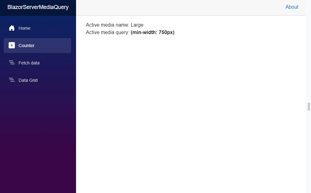
Customize the predefined media breakpoints
You can easily modify the predefined media breakpoints to meet your unique needs. The Media Query component allows you to adjust the static values for the Small, Medium, and Large breakpoints to define exactly when layout adjustments should occur.
<SfMediaQuery @bind-ActiveBreakPoint="activeBreakpoint"></SfMediaQuery>

Active media name: @activeBreakpoint

<br />

Active media query: <b>@GetActiveMediaQuery()</b>


@code {
    private string activeBreakpoint { get; set; }

    protected override void OnInitialized()
    {
        SfMediaQuery.Small.MediaQuery = "(max-width: 500px)";
        SfMediaQuery.Medium.MediaQuery = "(min-width: 500px)";
        SfMediaQuery.Large.MediaQuery = "(min-width: 750px)";
        base.OnInitialized();
    }

    public string GetActiveMediaQuery()
    {
        string mediaQuery = "";

        switch (activeBreakpoint)
        {
            case "Small":
                mediaQuery = SfMediaQuery.Small.MediaQuery;
                break;
            case "Medium":
                mediaQuery = SfMediaQuery.Medium.MediaQuery;
                break;
            case "Large":
                mediaQuery = SfMediaQuery.Large.MediaQuery;
                break;
        }

        return mediaQuery;
    }
}
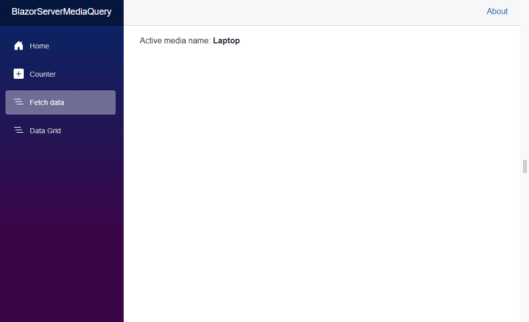
Add one or more custom media breakpoints
Extend the adaptability of your web app by adding one or more custom media breakpoints. Utilize the MediaBreakpoints property to define breakpoints that align with your unique design needs.
<SfMediaQuery MediaBreakpoints="@mediaBreakPoint"  @bind-ActiveBreakPoint="activeBreakpoint"></SfMediaQuery>

Active media name: <b>@activeBreakpoint</b>

@code {
    private string activeBreakpoint;
    private List<MediaBreakpoint> mediaBreakPoint = new List<MediaBreakpoint>();
    protected override void OnInitialized()
    {
        mediaBreakPoint = new List<MediaBreakpoint>()
        {
            new MediaBreakpoint() { Breakpoint = "Mobile", MediaQuery = "(max-width: 600px)" },
            new MediaBreakpoint() { Breakpoint = "Tablet", MediaQuery = "(min-width: 600px) and (max-width: 900px)" },
            new MediaBreakpoint() { Breakpoint = "Laptop", MediaQuery = "(min-width: 900px)" }
        };
        base.OnInitialized();
    }
}
Refer to the following image.
Create a responsive design and integrate other Syncfusion components
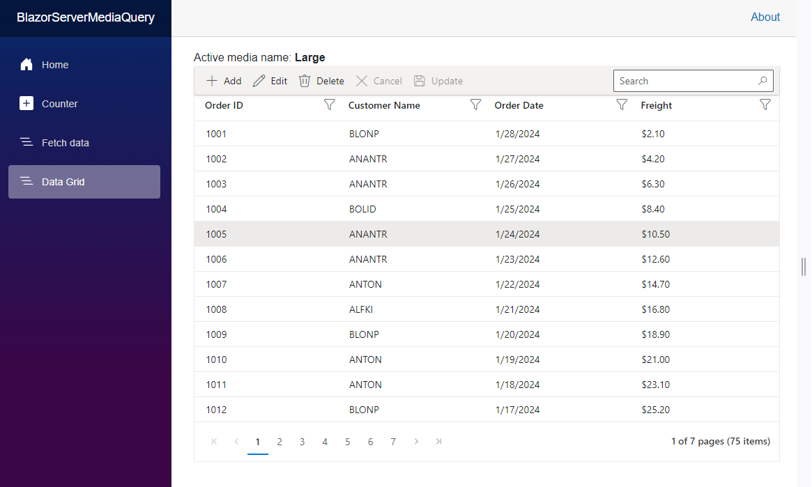
You can create a more responsive web design by seamlessly integrating the Blazor Media Query component with other Syncfusion Blazor components. Doing this allows you to perform conditional rendering for various screen sizes and achieve a dynamic UI with conditional styling.
Refer to the following code example. In it, we integrate the DataGrid with the Media Query component to demonstrate the dynamic updating of adaptive functionalities.
<SfMediaQuery @bind-ActiveBreakPoint="activeBreakpoint"></SfMediaQuery>

Active media name: <b>@activeBreakpoint</b>

@{
    var containerHeight = "100%";

    if (activeBreakpoint == "Small")
    {
        enableAdaptiveUIMode = true;
        renderingMode = RowDirection.Vertical;
        containerHeight = "550px";
    }
    else if (activeBreakpoint == "Medium")
    {
        enableAdaptiveUIMode = true;
    }
    else
    {
        enableAdaptiveUIMode = false;
    }


}

<div style="position:relative; height: @containerHeight;">

    <SfGrid DataSource="@orders" EnableAdaptiveUI="@enableAdaptiveUIMode" RowRenderingMode="@renderingMode" AllowSorting="true" AllowFiltering="true" AllowPaging="true" Toolbar="@(new List<string>() { "Add", "Edit", "Delete", "Cancel", "Update", "Search" })" Height="100%" Width="100%">
        <GridFilterSettings Type="@FilterType.Excel"></GridFilterSettings>
        <GridEditSettings AllowAdding="true" AllowEditing="true" AllowDeleting="true" Mode="EditMode.Dialog"></GridEditSettings>
        <GridColumns>
            <GridColumn Field=@nameof(Order.OrderID) HeaderText="Order ID" IsPrimaryKey="true"></GridColumn>
            <GridColumn Field=@nameof(Order.CustomerID) HeaderText="Customer Name"></GridColumn>
            <GridColumn Field=@nameof(Order.OrderDate) HeaderText=" Order Date" Format="d" Type="ColumnType.Date"></GridColumn>
            <GridColumn Field=@nameof(Order.Freight) HeaderText="Freight" Format="C2"></GridColumn>
        </GridColumns>
    </SfGrid>

</div>


@code {
    private string activeBreakpoint { get; set; }

    private List<Order> orders { get; set; }

    private bool enableAdaptiveUIMode { get; set; }
    private RowDirection renderingMode { get; set; }

    protected override void OnInitialized()
    {
        orders = Enumerable.Range(1, 75).Select(x => new Order()
            {
                OrderID = 1000 + x,
                CustomerID = (new string[] { "ALFKI", "ANANTR", "ANTON", "BLONP", "BOLID" })[new Random().Next(5)],
                Freight = 2.1 * x,
                OrderDate = DateTime.Now.AddDays(-x),
            }).ToList();
    }

    public class Order
    {
        public int? OrderID { get; set; }
        public string CustomerID { get; set; }
        public DateTime? OrderDate { get; set; }
        public double? Freight { get; set; }
    }
}
The output is in the following image.
References
Refer to the Blazor Media Query component demos and documentation for more details.
Conclusion
Thanks for reading! In this blog, we’ve delved into the exciting features of the Syncfusion Blazor Media Query component. Try out this powerful tool and share your feedback in the comments section. Say goodbye to static designs and hello to dynamic responsiveness!
For our existing customers, the newest version of Essential Studio® is available on the License and Downloads page. If you’re new to Syncfusion, we offer a 30-day free trial to experience the vast array of features we provide.
If you have questions, you can reach us through our support forum, support portal, or feedback portal. We’re always happy to assist you!


 No spam, just valuable updates.