Trusted by the world’s leading companies

Overview
The Blazor Timeline is a tool to display a series of data in chronological order, providing a visually compelling and user-friendly experience. This showcases user activities, tracking progress, narrating historical timelines, and more. It includes several built-in features, such as orientation, opposite content, item alignment, reverse timeline, and template customization.

Orientations
The Blazor Timeline component has two orientation modes:
-
Horizontal: Displays items side-by-side. -
Vertical: Default orientation that displays items one below the other.
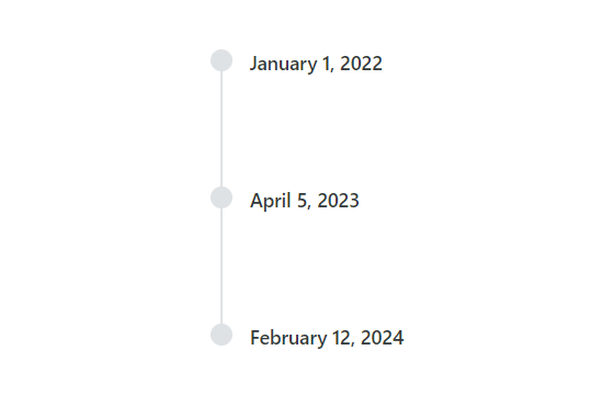

Opposite content
Positioned opposite to the item content, the opposite content provides additional information to each Timeline item.
Items alignment
The Blazor Timeline component supports aligning the items’ content and opposite content as follows:
-
Before: Align the item content to the left (or top for horizontal orientation) and the opposite content to the right (or bottom). -
After: The default alignment aligns the item content to the right (or bottom for horizontal orientation) and the opposite content to the left (or top). -
Alternate: Align the content of the first item to the right and the opposite content to the left, and vice versa for subsequent items. -
AlternateReverse: Align the content of the first item to the left and the opposite content to the right, and vice versa for subsequent items.


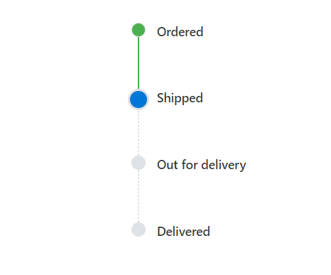
Dot item
Allows you to set icons, background colors, or images to personalize the appearance of dots associated with each timeline item.
Reverse timeline
Display timeline items in reverse order, considering the alignment of items, offering flexibility, and enhancing the user experience.

Templates
The Blazor Timeline component supports templates to customize the default appearance, including styling the dot items, templated content, and more.
Customization
Customize timeline items’ dot sizing, dot outer spacing, connector styling, and more, enabling it to fit the application’s needs.

Dot sizing
Customizing the size of the dot items enhances the Timeline component’s appearance.

Dot outer spacing
Adjust the space between dot items and connectors in the Timeline component.

Connector styling
Customize the size, color, and dashed styling of the connector for each item.
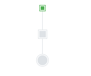
Dot styling
Customizing the shape, outline color, and spacing of the dot items enhances their appearance and makes them stand out.
Built-in themes
The Blazor Timeline supports these built-in themes: Tailwind CSS, Bootstrap 5, Bootstrap 4, Bootstrap, Material, Fabric, Fluent, and high contrast. Users can customize one of these built-in themes or create new themes to achieve their desired look and feel by simply overriding SASS variables or using our Theme Studio application.
Accessibility
- Fully supports WAI-ARIA accessibility practices to work with screen readers and assistive devices.
- Based on WCAG 2.0 standards, UI visual elements such as foreground color, background color, line spacing, text, and images are designed.
- Supports right-to-left (RTL) text direction for users working with RTL languages like Hebrew, Arabic, or Persian.
Developer-friendly APIs
The Blazor Timeline component offers APIs for customizing its appearance and behavior, as well as templates for changing its look and feel. With these APIs, developers can create a unique and highly customized timeline that fits seamlessly into their applications.
Blazor Timeline Code example
Easily get started with the Blazor Timeline using a few simple lines of C# code, as demonstrated below. Also, explore our Blazor Timeline Example, which shows you how to include the Blazor Timeline component with highlight customization.
@using Syncfusion.Blazor.Layouts

<div class="container" style="height: 350px">
    <SfTimeline>
        <TimelineItems>
            @foreach (var item in timelineItems)
            {
                <TimelineItem>
                    <Content> @item.Content </Content>
                </TimelineItem>
            }
        </TimelineItems>
    </SfTimeline>
</div>

@code {
    public class TimelineItemModel
    {
        public string Content { get; set; }
    }
    private List<TimelineItemModel> timelineItems = new List<TimelineItemModel>()
    {
        new TimelineItemModel() { Content = "Shipped" },
        new TimelineItemModel() { Content = "Departed" },
        new TimelineItemModel() { Content = "Arrived" },
        new TimelineItemModel() { Content = "Out for Delivery" }
    };
} 145+ UI components
1200+ interactive Blazor demos
8.7M+ downloads
145+ UI components
1200+ interactive Blazor demos
8.7M+ downloads

Blazor Components – 145+ UI and DataViz Components
ALL COMPONENTS
SMART COMPONENTS
GRIDS
DATA VISUALIZATION
FILE VIEWERS & EDITORS
DROPDOWNS
NAVIGATION
INPUTS
BUTTONS
INTERACTIVE CHAT
Standalone UI SDKs
Integrate the DataGrid, Chart, Scheduler, Gantt, Rich Text Editor, File Manager, and Diagram UI components into applications to enable rich interaction and visualization, delivering a seamless user experience.
Document Solutions
Integrate the PDF Viewer, DOCX Editor, Spreadsheet Editor, and document-processing libraries into the Blazor applications to enable a smooth user experience.
Our Customers Love Us
Having an excellent set of tools and a great support team, Syncfusion® reduces customers’ development time.Here are some of their experiences.

Blazor components
The speed how they adding new Blazor controls and update theirs functionality.
I am using Blazor components. Searching for Blazor components I found that Syncfusion very fast adopted theirs controls for new development platform. Tech support is fast and excellent. The best of best is that they provide free controls for small business.

Igor L,

CEO, Small-Business
Syncfusion objects with a Blazor
I have used some of the Syncfusion objects with a Blazor application. The support group has always been very helpful.

Kris B,
Software Development Consultant, Small-Business
See Real Success Stories
Developers around the world trust Syncfusion’s Essential Studio to simplify complex projects and speed up delivery. With a vast library of UI controls, powerful SDKs, and reliable support, Essential Studio helps teams build enterprise-ready applications with confidence.
Read Our Customer StoriesIndustry
Software development
75% Cost reduction
50% Faster development
Industry
Utilities (oil and gas)
450+ hours saved
Streamlined processes and hours of development effort saved.
Advanced, flexible features
Empowered users through robust and versatile functionality.
Industry
Software and technology
1000+ of hours saved
Accelerated development with enterprise-ready UI components.
Efficient file management
Streamlined workflows with document libraries without building them from scratch.
Industry
Software and technology
2 Years of delay avoided
Two years of delays prevented with proactive planning.
On-time delivery
Projects delivered on schedule using trusted controls.
Industry
IT services and IT consulting
Improved performance
Large datasets handled with easy customization and quick debugging.
Highly customizable
Plug-and-play controls with quick template integration.
Industry
Professional services
Instant access
Quick availability of features and resources.
Reduced dependencies
Fewer dependencies for faster development.
Rated by users across the globe
Syncfusion Blazor Resources
Learning
 Documentation
 Documentation


Awards
Greatness—it’s one thing to say you have it, but it means more when others recognize it. Syncfusion® is proud to hold the following industry awards.

