Trusted by the world’s leading companies

Overview
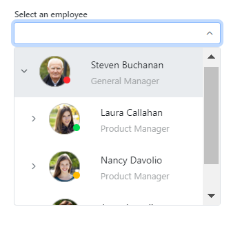
The Dropdown Tree component allows users to select a single value or multiple values in an input box from hierarchical data in a tree-like structure. It has several out-of-the-box features, such as data binding, checkboxes, templates, UI customization, accessibility, and preselected values.

Dropdown Tree code example
Easily get started with the Blazor Dropdown Tree using a few simple lines of C# code, as demonstrated below. Also explore our Blazor Dropdown Tree example, which shows how to render and configure the Blazor Dropdown Tree.
@using Syncfusion.Blazor.Navigations
<SfDropDownTree TItem="ProductCategory" TValue="int?" ID="list" Placeholder="Select a Category" PopupHeight="200px">
    <DropDownTreeField TItem="ProductCategory" DataSource="@Categories" ID="Id" ParentID="ParentId" Text="Name" HasChildren="HasChild" Expanded="Expanded"></DropDownTreeField>
</SfDropDownTree>
@code{
    List<ProductCategory> Categories = new List<ProductCategory>
    {
        new ProductCategory { Id = 1, Name = "Electronics", HasChild=true, Expanded = true },
        new ProductCategory { Id = 2, Name = "Smartphones", ParentId = 1 },
        new ProductCategory { Id = 3, Name = "Laptops", ParentId = 1 },
        new ProductCategory { Id = 6, Name = "Clothing", HasChild=true  },
        new ProductCategory { Id = 7, Name = "Men's Clothing", ParentId = 6 },
        new ProductCategory { Id = 8, Name = "Women's Clothing", ParentId = 6 },
        new ProductCategory { Id = 11, Name = "Home & Furniture", HasChild=true },
        new ProductCategory { Id = 12, Name = "Living Room", ParentId = 11 },
        new ProductCategory { Id = 13, Name = "Bedroom", ParentId = 11 },
        new ProductCategory { Id = 16, Name = "Sports & Fitness", HasChild=true, Expanded=true },
        new ProductCategory { Id = 17, Name = "Exercise Equipment", ParentId = 16 },
        new ProductCategory { Id = 19, Name = "Team Sports", ParentId = 16 },
        new ProductCategory { Id = 20, Name = "Books & Media", HasChild=true },
        new ProductCategory { Id = 21, Name = "Books", ParentId = 20 },
        new ProductCategory { Id = 24, Name = "Toys & Games", HasChild = true },
        new ProductCategory { Id = 25, Name = "Board Games", ParentId = 24 },
        new ProductCategory { Id = 26, Name = "Outdoor Games", ParentId = 24 }
    };
    class ProductCategory
    {
        public int? Id { get; set; }
        public string Name { get; set; }
        public int? ParentId { get; set; }
        public bool HasChild { get; set; }
        public bool Expanded { get; set; }
    }
}
Data binding
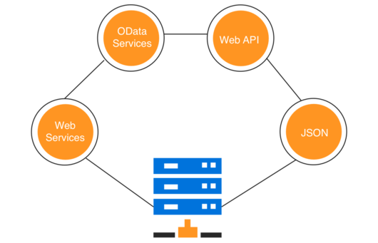
Bind data to the Dropdown Tree component from different data sources, either self-referential data that contains a list of objects with ParentID mapping or heirarchical data that contains a nested list of objects. Data can be local or in any remote service and fetched using different kinds of adapters like OData, OData V4, URL, and web API.
Render modes
The Dropdown Tree component has different render modes to visualize selected items.
Box mode
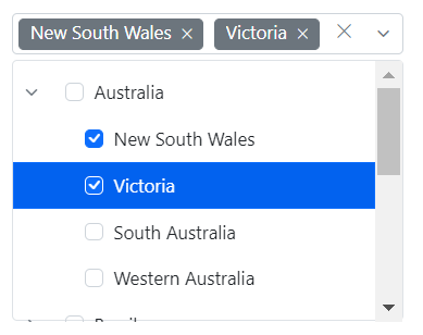
The selected items are displayed as chips (boxes) with removable icons in the Dropdown Tree input box.

Delimiter mode
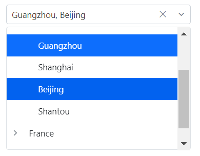
The selected items are displayed with the delimiter character in the Dropdown Tree input box.
Default mode
When the component is in focus, selections are displayed as chips. When not in focus, selections are displayed with delimiters.

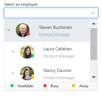
Checkboxes
The Blazor Dropdown Tree component provides built-in support for checkboxes, allowing users to select more than one item. Enabling the checkboxes and autocheck functionality makes the parent and child items dependent on each other.
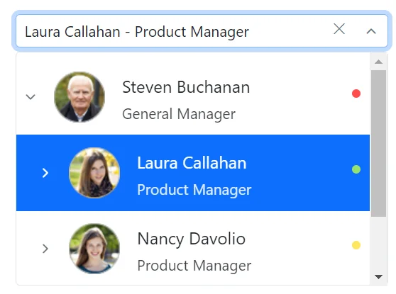
Multiple selection
The Dropdown Tree component allows users to select more than one item in the pop-up using the multiselection functionality. Ctrl and Shift key combinations can be used for node selection.

UI customization with templates
Use templates to change the appearance of the selection pop-up for tree items,the header and footer of the pop-up tree.
Header template
Design your own header for the pop-up tree using the header template.
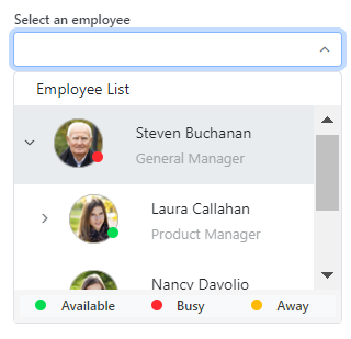
Item template
Define the custom appearance of each tree item using the item template.
Value template
Define the custom appearance of selected values in the Dropdown Tree input using the value template. Control the presentation of the selected items, such as adding custom HTML, text formatting, or icons to match your application’s design.
Footer template
Design your own custom footer for the pop-up tree using the footer template.This allows you to fully customize the footer content according to your requirements, offering flexibility in design and functionality.
Filtering
The Blazor Dropdown Tree component supports in-built filtering through which users can filter the required items based on the characters searched in the search box.
Built-in and customizable themes
The Blazor Dropdown Tree component supports built-in themes: Material, Material 3, Bootstrap, Fabric (Office 365), Tailwind CSS, Fluent, and high contrast. Users can customize these built-in themes or create new themes to achieve their desired look and feel by either overriding Sass variables or using our Theme Studio application.
Web accessibility
- Fully supports WAI-ARIA accessibility to make the Dropdown Tree accessible to screen readers and assistive devices.
- Follows WAI-ARIA best practices for implementing keyboard interaction.
- Uses WCAG 2.0-based design for UI visual elements such as foreground color, background color, line spacing, text, and images.
- Supports right-to-left (RTL) direction for users working with RTL languages like Hebrew and Arabic.
Developer-friendly APIs
Developers can customize all UI elements and component their behaviors according to the end user’s requirements using the component’s rich set of client-side APIs.
 145+ UI components
1200+ interactive Blazor demos
8.7M+ downloads
145+ UI components
1200+ interactive Blazor demos
8.7M+ downloads

Other supported frameworks
The Dropdown Tree is available for the React, Angular, JavaScript, and Vue frameworks. Explore its platform-specific options through the following links:


Supported browsers
The Blazor Dropdown Tree works well with all modern web browsers, including Chrome, Firefox, Edge, Safari, and Opera.
Not sure how to create your first Blazor Dropdown Tree? Our tutorial videos and documentation can help.
I’d love to watch it now I’d love to read it nowBlazor Components – 145+ UI and DataViz Components
ALL COMPONENTS
SMART COMPONENTS
GRIDS
DATA VISUALIZATION
FILE VIEWERS & EDITORS
DROPDOWNS
NAVIGATION
INPUTS
BUTTONS
INTERACTIVE CHAT
Standalone UI SDKs
Integrate the DataGrid, Chart, Scheduler, Gantt, Rich Text Editor, File Manager, and Diagram UI components into applications to enable rich interaction and visualization, delivering a seamless user experience.
Document Solutions
Integrate the PDF Viewer, DOCX Editor, Spreadsheet Editor, and document-processing libraries into the Blazor applications to enable a smooth user experience.
Frequently Asked Questions
Why should you choose the Syncfusion Blazor Dropdown Tree?
The Syncfusion Blazor Dropdown Tree component supports the following features:
- Easily present a list of selectable hierarchical data in a tree-like structure.
Use built-in features like data binding, load on demand (lazy loading), multiselection, checkbox selection, filtering, and more.
Customize the selection pop-up and tree items with different template options.
- One of the best Blazor Dropdown Tree in the market that offers feature-rich UI to interact with the software.
Simple configuration and API.
- Supports all modern browsers.
- Mobile-touch friendly and responsive.
Extensive demos, documentation and videos to learn quickly and get started with Blazor Dropdown Tree.
Where can I find the Syncfusion Blazor Dropdown Tree demo?
You can find our Blazor Dropdown Tree demo, which demonstrates how to render and configure the Dropdown Tree.
Can I download and utilize the Syncfusion Blazor Dropdown Tree for free?
No, this is a commercial product and requires a paid license. However, a free community license is also available for companies and individuals whose organizations have less than $1 million USD in annual gross revenue, 5 or fewer developers, and 10 or fewer total employees.
How do I get started with Syncfusion Blazor Dropdown Tree?
A good place to start would be our comprehensive getting started documentation.
Our Customers Love Us
Having an excellent set of tools and a great support team, Syncfusion® reduces customers’ development time.Here are some of their experiences.

Blazor components
The speed how they adding new Blazor controls and update theirs functionality.
I am using Blazor components. Searching for Blazor components I found that Syncfusion very fast adopted theirs controls for new development platform. Tech support is fast and excellent. The best of best is that they provide free controls for small business.

Igor L,

CEO, Small-Business
Syncfusion objects with a Blazor
I have used some of the Syncfusion objects with a Blazor application. The support group has always been very helpful.

Kris B,
Software Development Consultant, Small-Business
See Real Success Stories
Developers around the world trust Syncfusion’s Essential Studio to simplify complex projects and speed up delivery. With a vast library of UI controls, powerful SDKs, and reliable support, Essential Studio helps teams build enterprise-ready applications with confidence.
Read Our Customer StoriesIndustry
Software development
75% Cost reduction
50% Faster development
Industry
Utilities (oil and gas)
450+ hours saved
Streamlined processes and hours of development effort saved.
Advanced, flexible features
Empowered users through robust and versatile functionality.
Industry
Software and technology
1000+ of hours saved
Accelerated development with enterprise-ready UI components.
Efficient file management
Streamlined workflows with document libraries without building them from scratch.
Industry
Software and technology
2 Years of delay avoided
Two years of delays prevented with proactive planning.
On-time delivery
Projects delivered on schedule using trusted controls.
Industry
IT services and IT consulting
Improved performance
Large datasets handled with easy customization and quick debugging.
Highly customizable
Plug-and-play controls with quick template integration.
Industry
Professional services
Instant access
Quick availability of features and resources.
Reduced dependencies
Fewer dependencies for faster development.
Rated by users across the globe
Syncfusion Blazor Dropdown Tree Resources


UI Kits
 Figma Download
Figma Download
Awards
Greatness—it’s one thing to say you have it, but it means more when others recognize it. Syncfusion® is proud to hold the following industry awards.


Recent activities in Blazor Dropdown Tree tutorials and blogs
The Blazor Dropdown Tree tutorial videos and blog posts will guide you in building your first app with this Blazor components. They provide problem-solving strategies, describe features and functionalities, announce new feature releases, explain best practices, and showcase example scenarios. Explore our latest posts on our blog and tutorial video channels for Blazor Dropdown Tree updates.