Trusted by the world’s leading companies

Overview
The Blazor Toolbar is a feature-rich component that provides an interface for selecting a command from a collection of commands. Its rich set of features include different orientations, responsive modes (scrollable and pop-up), templating, and button alignment based on priority.
Rendering
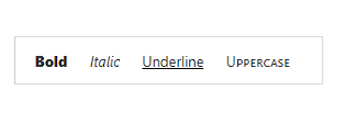
Template rendering
The Blazor Toolbar component allows you to customize the appearance with HTML elements like images, text buttons, toggle buttons, select boxes, text boxes, and autocomplete. This helps you make toolbar search boxes and toolbar menu-like applications.
Item rendering
The Blazor Toolbar component with a rich UI provides data-binding support, rendered based on text, type, and alignment properties.
Responsive
The Blazor Toolbar component adapts to the available space with scrollable and pop-up display modes, in modern web and mobile applications.

Scrollable
Scrollable display mode displays toolbar commands in a single line with horizontal scrolling enabled when the items overflow the visible space. You can swipe over the toolbar commands to scroll.
Pop-up menu
The pop-up menu is another type of overflow mode in which the toolbar container holds the items that can be placed within the available space. Items that do not fit the viewing area moves to the overflow pop-up container. You can view the overflow tab headers by clicking the pop-up icon.
Commands display priority
You can prioritize the commands to be displayed in the pop-up or toolbar when minimum space is available to view them.
Pin items in pop-up
You can set specific items to be displayed in the pop-up always regardless of the available space on the toolbar.
Multiple rows
Display the overflow toolbar items as an inline of a Blazor toolbar.

Extended toolbar
Hide the overflowing toolbar items in the next row and display them when you click the expand icons. If the pop-up content overflows the height of the page, the rest of the elements will be hidden.

Commands alignment
The Blazor toolbar commands are aligned to the left, right, or center in the toolbar area.
Buttons
The Blazor Toolbar component’s default command is a button type, and it can be rendered with the given text input.
Icons and images support
You can add icons or images with or without text to the buttons. The icons can be positioned to the left or right.
Text mode
You can add button text when necessary. You can decide to show text in the pop-up alone, toolbar alone, or in both.
Integration with other components
The Blazor Toolbar can be easily integrated with other components such as DataGrid, Scheduler, and Rich Text Editor.
Tooltip
To describe the actions of the command, a tooltip can be added. By default, HTML is supported, but the Blazor Tooltip component can also be used.
Command customization
The Blazor Toolbar provides customizable commands with styles such as CSS classes and HTML attributes like ID, class, and styles.
Accessibility
- Fully supports WAI-ARIA accessibility, which makes the toolbar accessible to on-screen readers and assistive devices.
- Follows WAI-ARIA best practices for implementing keyboard interaction.
- Follows WCG 2.0 standard in design of UI element visuals such as foreground color, background color, line spacing, text, and images.
Developer-friendly API
Developers can control the appearance and behavior of the Blazor toolbar using a rich set of APIs.
Built-in themes
The Blazor Toolbar component is shipped with several built-in themes such as Tailwind CSS, Bootstrap 5, Bootstrap 4, Bootstrap, Material, Fabric, and High Contrast.
Users can customize these built-in themes or create new themes by simply overriding SASS variables or using the Theme Studio application.
Blazor Toolbar Code Example
Easily get started with the Blazor Toolbar using a few simple lines of C# code example as demonstrated below. Also explore our Blazor Toolbar Example that shows you how to render and configure the Toolbar in Blazor.
@using Syncfusion.Blazor
@using Syncfusion.Blazor.Navigations

<SfToolbar>
    <ToolbarItems>
        <ToolbarItem Text="Cut"></ToolbarItem>
        <ToolbarItem Text="Copy"></ToolbarItem>
        <ToolbarItem Text="Paste"></ToolbarItem>
        //To separate the Toolbar items
        <ToolbarItem></ToolbarItem>
        <ToolbarItem Text="Bold"></ToolbarItem>
        <ToolbarItem Text="Underline"></ToolbarItem>
        <ToolbarItem Text="Italic"></ToolbarItem>
        <ToolbarItem Text="Color-Picker"></ToolbarItem>
    </ToolbarItems>
</SfToolbar>
Other supported frameworks
Toolbar is also available in JavaScript, Angular, React and Vue frameworks that are built from their own TypeScript libraries. Check out the different Toolbar platforms from the below links,
 145+ UI components
1200+ interactive Blazor demos
8.7M+ downloads
145+ UI components
1200+ interactive Blazor demos
8.7M+ downloads

Not sure how to create your first Blazor Toolbar? Our tutorial videos and documentation can help.
I’d love to watch it now I’d love to read it nowBlazor Components – 145+ UI and DataViz Components
ALL COMPONENTS
SMART COMPONENTS
GRIDS
DATA VISUALIZATION
FILE VIEWERS & EDITORS
DROPDOWNS
NAVIGATION
INPUTS
BUTTONS
INTERACTIVE CHAT
Standalone UI SDKs
Integrate the DataGrid, Chart, Scheduler, Gantt, Rich Text Editor, File Manager, and Diagram UI components into applications to enable rich interaction and visualization, delivering a seamless user experience.
Document Solutions
Integrate the PDF Viewer, DOCX Editor, Spreadsheet Editor, and document-processing libraries into the Blazor applications to enable a smooth user experience.
Frequently Asked Questions
Why should you choose Syncfusion Blazor Toolbar?
Responsive Blazor Toolbar with scrollable and pop-up modes for accommodating many commands.
- Better user experience for navigating through standard toolbar commands.
- Built-in features for aligning commands with different priorities, templating, orientation, and more.
- Display the overflow toolbar items as an inline of a Blazor toolbar.
- Simple configuration and developer friendly API.
- Mobile-touch friendly and responsive.
- Supports all modern browsers.
- One of the best Blazor Toolbar components in the market that offers a feature-rich UI to interact with the software.
Extensive demos, documentation and videos to learn quickly and get started with the Blazor Toolbar component.
Where can I find the Syncfusion Blazor Toolbar demo?
You can find our Blazor Toolbar demo here.
Can I download and utilize the Syncfusion Blazor Toolbar for free?
No, this is a commercial product and requires a paid license. However, a free community license is also available for companies and individuals whose organizations have less than $1 million USD in annual gross revenue, 5 or fewer developers, and 10 or fewer total employees.
How do I get started with Syncfusion Blazor Toolbar?
A good place to start would be our comprehensive getting started documentation.
Our Customers Love Us
Having an excellent set of tools and a great support team, Syncfusion® reduces customers’ development time.Here are some of their experiences.

Blazor components
The speed how they adding new Blazor controls and update theirs functionality.
I am using Blazor components. Searching for Blazor components I found that Syncfusion very fast adopted theirs controls for new development platform. Tech support is fast and excellent. The best of best is that they provide free controls for small business.

Igor L,

CEO, Small-Business
Syncfusion objects with a Blazor
I have used some of the Syncfusion objects with a Blazor application. The support group has always been very helpful.

Kris B,
Software Development Consultant, Small-Business
See Real Success Stories
Developers around the world trust Syncfusion’s Essential Studio to simplify complex projects and speed up delivery. With a vast library of UI controls, powerful SDKs, and reliable support, Essential Studio helps teams build enterprise-ready applications with confidence.
Read Our Customer StoriesIndustry
Software development
75% Cost reduction
50% Faster development
Industry
Utilities (oil and gas)
450+ hours saved
Streamlined processes and hours of development effort saved.
Advanced, flexible features
Empowered users through robust and versatile functionality.
Industry
Software and technology
1000+ of hours saved
Accelerated development with enterprise-ready UI components.
Efficient file management
Streamlined workflows with document libraries without building them from scratch.
Industry
Software and technology
2 Years of delay avoided
Two years of delays prevented with proactive planning.
On-time delivery
Projects delivered on schedule using trusted controls.
Industry
IT services and IT consulting
Improved performance
Large datasets handled with easy customization and quick debugging.
Highly customizable
Plug-and-play controls with quick template integration.
Industry
Professional services
Instant access
Quick availability of features and resources.
Reduced dependencies
Fewer dependencies for faster development.
Rated by users across the globe
Syncfusion Blazor Resources
Learning
 Documentation
 Documentation


Awards
Greatness—it’s one thing to say you have it, but it means more when others recognize it. Syncfusion® is proud to hold the following industry awards.

