We’re thrilled to unveil the latest addition to our toolkit: the Syncfusion Blazor Data Form component, a highlight of our 2023 Volume 4 release. This eagerly anticipated feature has garnered significant attention and support in our feedback portal.
Let’s delve into the features of this new component, exploring its functionalities, UI design, and practical implementations through code examples.
Blazor Data Form: an overview
The Syncfusion Blazor Data Form component is a powerful tool that simplifies the process of form creation within Blazor apps. It offers a comprehensive suite of features that allow for automatic field generation, layout customization, and seamless data binding. Whether you’re dealing with simple forms or complex data models, this component is designed to streamline your development process while providing ample room for customization.
With the built-in options, you can effortlessly design the appearance, positioning, and behavior of individual form components. Standard functionalities such as accessibility, keyboard interactions, and events are supported. Additionally, Data Form incorporates industry-standard themes such as Material, Fabric, and Bootstrap, allowing you to maintain a consistent look and feel across your app.
Ease of use
The Blazor Data Form allows you to create various forms, such as registration or login forms. They can be automatically generated from your data model using other Blazor components. You can customize the component through various properties, use default or custom editors, and organize the form fields in groups and columns.
Note: Refer to our Getting Started with Blazor Data Form documentation for more in-depth guidance.
Key features
The Blazor Data Form component boasts several key features.
Let’s explore them with code examples.
Auto generation
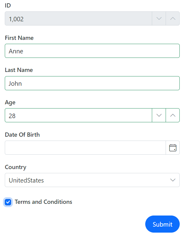
To auto-generate an entire form based on the provided model class or EditContext, the Data Form component utilizes built-in Syncfusion form components like TextBox, Numeric Textbox, DatePicker, and Checkbox. You can use data annotation attributes to validate the field values and customize the auto-generated form fields.
Refer to the following code example.
<SfDataForm ID="MyForm" Model="@FieldTypeModel" Width="50%">

    <FormItems>
      <FormAutoGenerateItems />
    </FormItems>

</SfDataForm>

@code {

    private FieldTypes FieldTypeModel = new FieldTypes();
}
Refer to the following image.
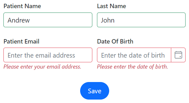
Form validation
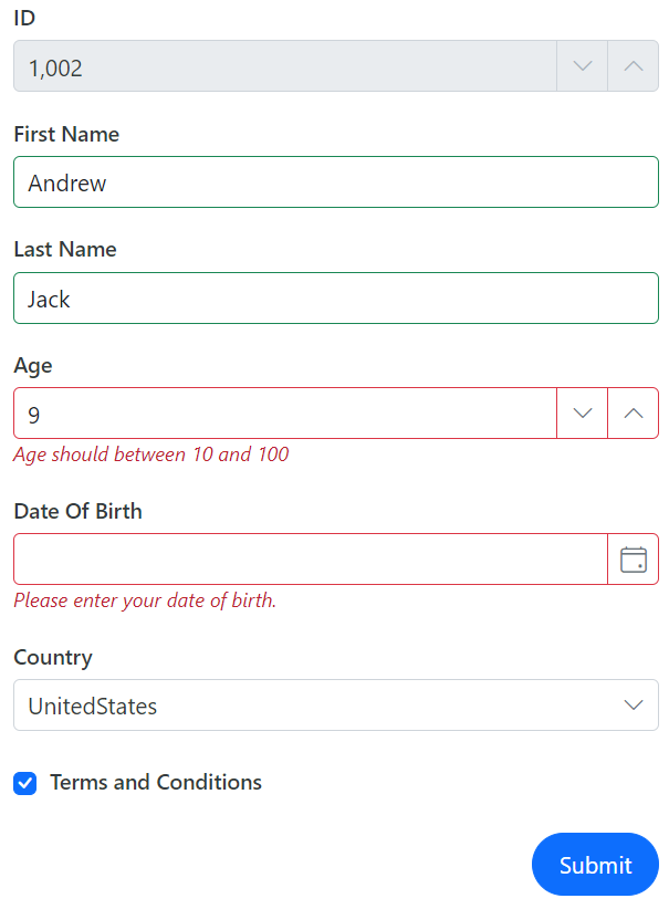
The Blazor Data Form can be validated entirely through built-in Blazor edit form validation. Users can provide validation rules directly on the model using attributes such as Required, Range, or MaxLength. Additionally, any field that the form contains can also be validated individually.
@using Syncfusion.Blazor.DataForm
@using System.ComponentModel.DataAnnotations
@using System.ComponentModel

<SfDataForm ID="MyForm" Model="@FieldTypeModel" Width="50%">

    <FormValidator>
       <DataAnnotationsValidator></DataAnnotationsValidator>
    </FormValidator>

    <FormItems>
       <FormAutoGenerateItems />
    </FormItems>

</SfDataForm>

@code {

    public class FieldTypes
    {
        [Display(Name = "ID")]
        [Editable(false)]
        public int IntField { get; set; } = 1002;

        [Required(ErrorMessage = "Please enter your name.")]
        [Display(Name = "First Name")]
        public string FirstName { get; set; }

        [Required(ErrorMessage = "Please enter your last name.")]
        [Display(Name = "Last Name")]
        public string LastName { get; set; }

        [Required(ErrorMessage = "Please enter your age.")]
        [Range(10, 100, ErrorMessage = "Age should between 10 and 100")]
        [Display(Name = "Age")]
        public int? Age { get; set; }

        [Required(ErrorMessage = "Please enter your date of birth.")]
        [Display(Name = "Date Of Birth")]
        public DateOnly? DOB { get; set; }

        [Required(ErrorMessage = "Please choose the country.")]
        public Country Country { get; set; }

        [Required(ErrorMessage = "Please agree with the terms.")]
        [Display(Name = "Terms and Conditions")]
        [Range(typeof(bool), "true", "true", ErrorMessage = "Please agree with the terms.")]
        public bool AcceptTerms { get; set; }
    }
    private FieldTypes FieldTypeModel = new FieldTypes();
}
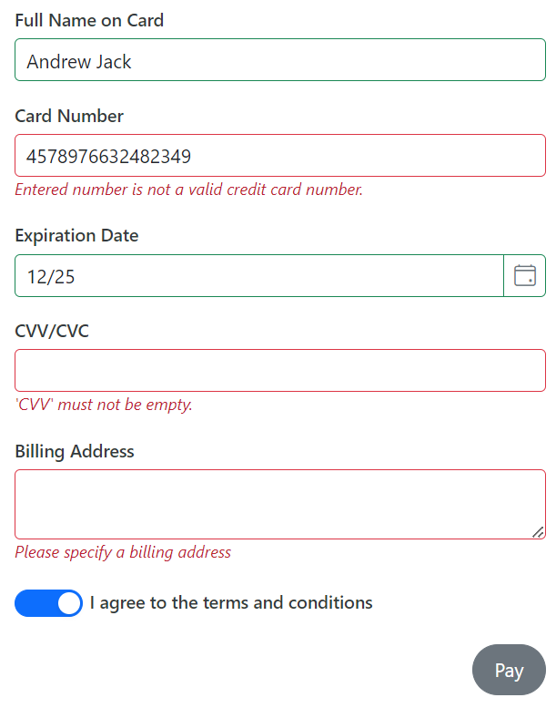
Fluent validation
The Blazor Data Form supports third-party validation libraries integrating with the standard EditContext, such as FluentValidation.
Refer to the following code example.
@using Syncfusion.Blazor.DataForm
@using System.ComponentModel.DataAnnotations
@using Microsoft.AspNetCore.Components.Forms
@using Syncfusion.Blazor.Inputs
@using Syncfusion.Blazor.Buttons
@using Syncfusion.Blazor.Calendars
@using FluentValidation
@using Blazored.FluentValidation
<SfDataForm ID="MyForm"
Model="@PaymentDetailsModel"
Width="50%">
<FormValidator>
<FluentValidationValidator Validator="PaymentDetailsValidation" />
</FormValidator>
<FormItems>
<FormItem Field="@nameof(PaymentDetailsModel.Name)" LabelText="Full Name on Card"></FormItem>
<FormItem Field="@nameof(PaymentDetailsModel.CardNumber)" LabelText="Card Number"></FormItem>
<FormItem Field="@nameof(PaymentDetailsModel.ExpirationDate)" LabelText="Expiration Date">
<Template>
<label class="e-form-label">Expiration Date</label>
<SfDatePicker EnableMask="true" Format="MM/yy" @bind-Value="@PaymentDetailsModel.ExpirationDate">
</SfDatePicker>
</Template>
</FormItem>
<FormItem Field="@nameof(PaymentDetailsModel.CVV)">
<Template>
<label class="e-form-label">CVV/CVC</label>
<SfMaskedTextBox Mask="000" PromptChar="@PromptCharacter" @bind-Value="@PaymentDetailsModel.CVV"></SfMaskedTextBox>
</Template>
</FormItem>
<FormItem Field="@nameof(PaymentDetailsModel.BillingAddress)" LabelText="Billing Address" EditorType="FormEditorType.TextArea">
</FormItem>
<FormItem Field="@nameof(PaymentDetailsModel.Accept)" EditorType="FormEditorType.Switch" LabelText="I agree to the terms and conditions"></FormItem>
</FormItems>
<FormButtons>
<SfButton>Pay</SfButton>
</FormButtons>
</SfDataForm>
@code {
char PromptCharacter { get; set; } = ' ';
public class PaymentDetails
{
[Required(ErrorMessage = "Enter Name on the card")]
public string Name { get; set; }
[Required(ErrorMessage = "Enter Billing Address")]
public string BillingAddress { get; set; }
[Required(ErrorMessage = "Enter Card number")]
public string CardNumber { get; set; }
[Required(ErrorMessage = "Enter Count here")]
public DateTime? ExpirationDate { get; set; }
[Required(ErrorMessage = "Enter CVV/CVC")]
public string CVV { get; set; }
[Required(ErrorMessage = "You need to agree to the Terms and Conditions")]
[Range(typeof(bool), "true", "true", ErrorMessage = "You need to agree to the Terms and Conditions")]
public bool Accept { get; set; }
}
private PaymentDetails PaymentDetailsModel = new PaymentDetails();
PaymentDetailsValidator PaymentDetailsValidation = new PaymentDetailsValidator();
public class PaymentDetailsValidator : AbstractValidator<PaymentDetails>
{
public PaymentDetailsValidator()
{
RuleFor(customer => customer.Name).NotEmpty().MinimumLength(3).WithMessage("Name should greater than 3 characters ").MaximumLength(50).WithMessage("Name should not contains more than 50 characters");
RuleFor(customer => customer.CardNumber).NotEmpty().WithMessage("Please enter credit card number").CreditCard().WithMessage("Entered number is not a valid credit card number.");
RuleFor(customer => customer.ExpirationDate).NotEmpty().WithMessage("Please enter expiration date");
RuleFor(customer => customer.CVV).NotEmpty().Length(3);
RuleFor(customer => customer.BillingAddress).NotEmpty().WithMessage("Please specify a billing address");
RuleFor(customer => customer.Accept).Equal(true).WithMessage("You must accept the terms and conditions to proceed further");
}
}
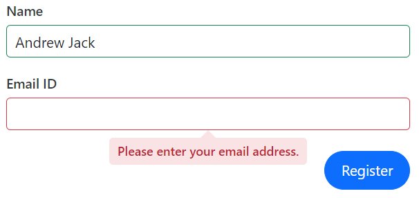
}Refer to the following image.
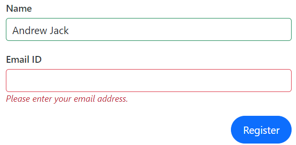
Validation display
Customize the appearance of validation messages, displaying them inline as tooltips or hiding them altogether by setting the ValidationDisplayMode property.
<SfDataForm ID="MyForm" Width="50%"
            Model="@RegistrationModel"
            ValidationDisplayMode="FormValidationDisplay.Tooltip">
</SfDataForm>
Refer to the following image.
Form group
The Blazor Data Form offers options for grouping form fields, allowing the organization of related fields. This feature enables the use of descriptive headings and a columnar structure, enhancing your forms’ clarity and organization. Refer to the following code example.
<SfDataForm ID="MyForm"
            Model="@EmployeeDetails">
    <FormItems>
        <FormGroup LabelText="Employee Information">
            <FormItem Field="@nameof(EmployeeDetails.FirstName)" LabelText="First Name" />
            <FormItem Field="@nameof(EmployeeDetails.LastName)" LabelText="Last Name" />
            <FormItem Field="@nameof(EmployeeDetails.Designation)" LabelText="Designation" />
        </FormGroup>
        <FormGroup LabelText="Personal Data">
            <FormItem Field="@nameof(EmployeeDetails.DateOfBirth)" EditorType="FormEditorType.DatePicker" LabelText="Date of birth" />
            <FormItem Field="@nameof(EmployeeDetails.PersonalMailId)" LabelText="Personal Mail" Placeholder="someone@example.com" />
            <FormItem Field="@nameof(EmployeeDetails.AddressLine)" EditorType="FormEditorType.TextArea" LabelText="Address" />
        </FormGroup>
    </FormItems>
</SfDataForm>

@code {
    private EmployeeDetail EmployeeDetails = new EmployeeDetail();

 }
Refer to the following image.
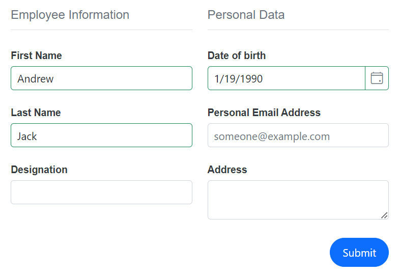
Columns
Enhance the visual layout and user experience by customizing form fields into single or multiple columns. Specify the ColumnCount in SfDataForm and ColumnSpan in individual form fields.
 <SfDataForm ID="MyForm"
                Model="@EmployeeDetail" ColumnCount="2" ColumnSpacing="10px" ButtonsAlignment="FormButtonsAlignment.Center" Width="40%">

  </SfDataForm>
Refer to the following image.
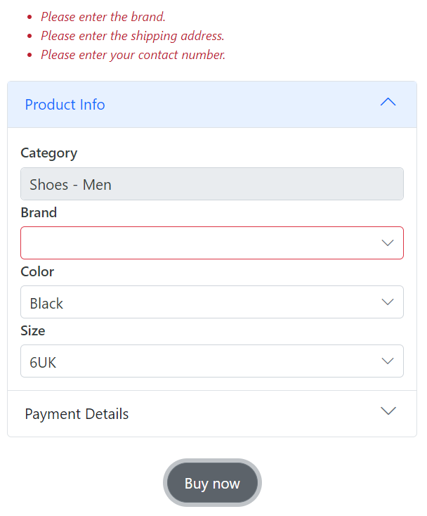
Templates
Customize the entire form UI appearance using HTML elements or other Syncfusion components via the FormTemplate property. Refer to the following code example.
<SfDataForm ID="MyForm"
                Model="ProductDetailsModel">
        <FormTemplate>
            <SfAccordion ExpandMode="ExpandMode.Single">
                <AccordionItems>
                    <AccordionItem Expanded="true">
                        <HeaderTemplate>Product Info</HeaderTemplate>
                        <ContentTemplate>
                            <div class="product-details">
                                <div class="form-group">
                                    <label class="e-form-label">Category</label>
                                    <SfTextBox @bind-Value="ProductDetailsModel.Category" Readonly="true" />
                                </div>
                            </div>
                        </ContentTemplate>
                    </AccordionItem>
                    <AccordionItem Expanded="false">
                        <HeaderTemplate>Payment Details</HeaderTemplate>
                        <ContentTemplate>
                            <div class="payment-info">
                                <div class="form-group">
                                    <label class="e-form-label">Contact Number</label>
                                    <SfMaskedTextBox Mask="+(00) 0000000000"     @bind-Value="ProductDetailsModel.ContactNumber" />
                                </div>
                            </div>
                        </ContentTemplate>
                    </AccordionItem>
                </AccordionItems>
            </SfAccordion>
        </FormTemplate>
    </SfDataForm>
Refer to the following image.
References
For more details, refer to the Blazor Data Form documentation and demos.
Conclusion
Thanks for reading! We’ve explored the new Blazor Data Form component, a remarkable addition to our 2023 Volume 4 release. This powerful control is designed to improve your app development process, and we’re eager to hear your thoughts on it. Your feedback is invaluable to us, so don’t hesitate to share your insights in the comments section.
For a detailed overview of all the exciting updates in this release, we invite you to visit our Release Notes and What’s New pages.
For our existing customers, the new version of Essential Studio is now available on the License and Downloads page. If you’re new to Syncfusion, sign up for a 30-day free trial to try our controls for yourself.
If you have any questions, you can reach us through our support forum, support portal, or feedback portal. We’re always happy to assist you.