Common
Production-ready component
The below component has been developed to meet industry standards and are now marked as production-ready for Blazor:
- Chart Wizard: A guide that simplifies end‑to‑end chart creation. It analyzes data sources to auto‑detect fields, recommends the most suitable chart types, and applies optimized default configurations for layout, styling, and performance. With its intuitive step‑by‑step workflow and real‑time preview, it enables developers to quickly build consistent, high‑quality visualizations with minimal manual setup, ensuring faster development and reliable production outcomes.
New component
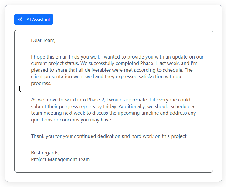
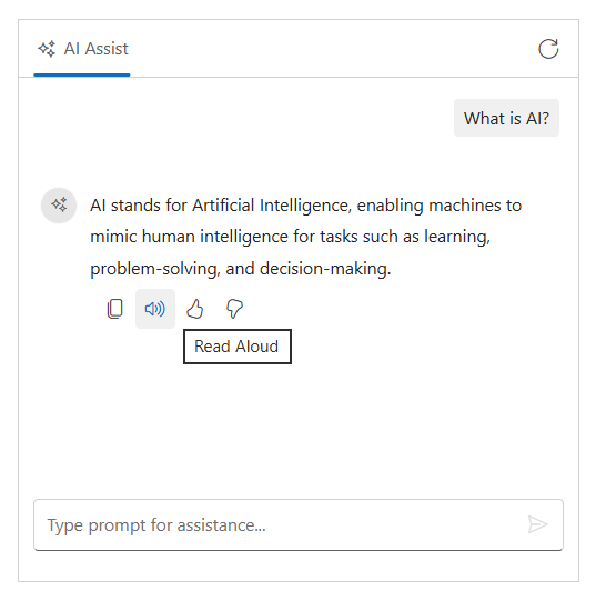
- The
Inline AI Assistcomponent has been added to Blazor.
Inline AI Assist (preview)
The Inline AI Assist component is a versatile, integrated AI-powered assistant for modern web applications. It lets users prompt AI services and receive intelligent responses directly in their interface, with flexible display modes and extensive customization options.
This component supports both inline and pop-up response modes, command-driven interactions, and streaming responses, providing a seamless experience for AI-assisted content generation and editing. Whether for code completion, content suggestions, or interactive assistance, it delivers powerful AI integration with minimal friction.
Key features
- Dual response modes: Display AI responses inline at the cursor or in a pop-up overlay for flexible UI integration.
- Command actions: Display predefined commands and quick-action suggestions in mention-style popups with customizable grouping and icons.
- Response actions: Configurable actions such as (accept, discard, and custom items) for managing and acting on AI-generated content.
- Action toolbar: The toolbar in the prompt input area that includes the send button and other custom actions.
- Markdown: Automatic conversion of Markdown responses to HTML for rich-content rendering.
- Streaming responses: Support for word-by-word or chunked streaming of AI responses with real-time visual feedback and stop controls.
- Indicators: Visual indicators for
thinkingoreditingstates during AI processing in the inline mode, and skeleton loading in the popup mode. - Customization: Allows customization of the default appearance, including responses, to suit users’ needs.
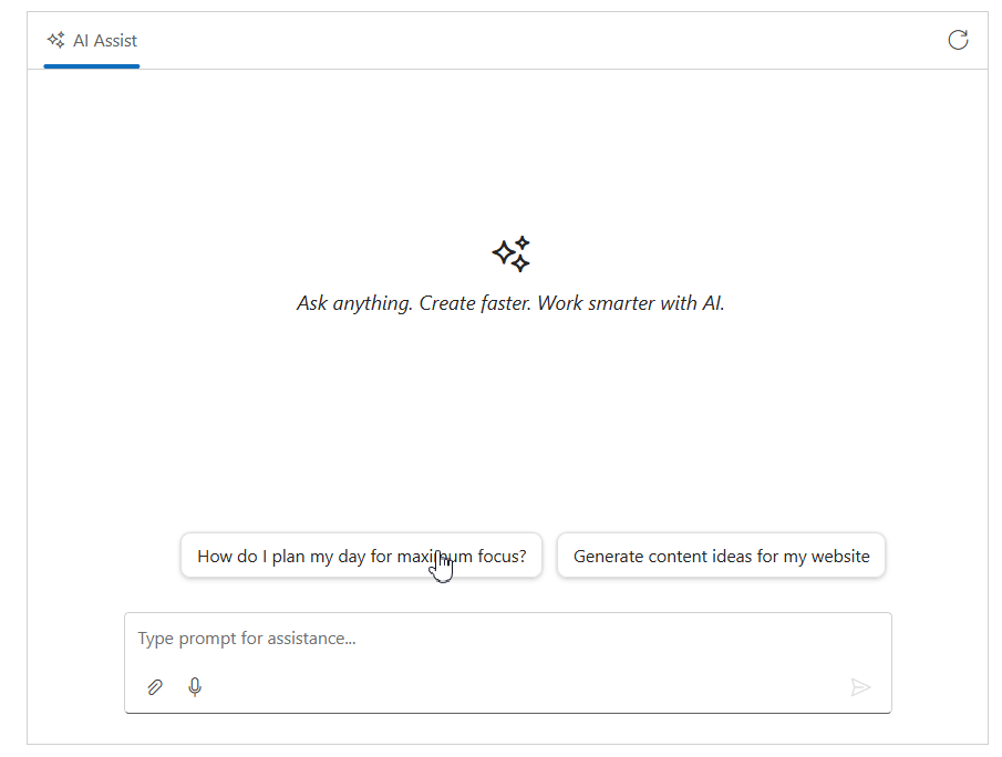
AI AssistView
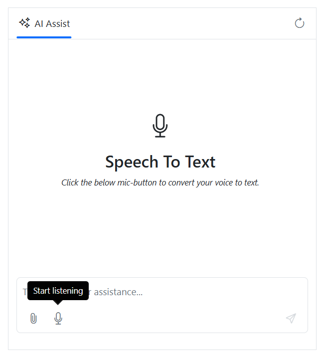
Speech-to-text conversion in the input text area
The Blazor AssistView component integrates speech-to-text conversion, enabling users to compose messages via voice input. This accessibility feature broadens input options and streamlines workflows for those who prefer voice interaction or need hands-free input.
Regenerate responses with navigation
Response regeneration enables users to generate multiple alternative responses to a single prompt. Navigation arrows allow seamless browsing between generated responses without re-entering the prompt, enhancing exploration of different AI-generated solutions by reducing redundant prompt submissions.
Text-to-speech for responses
The integrated text-to-speech functionality reads AI-generated responses hands-free, enabling developers to utilize AI-generated content while multitasking.
Chart
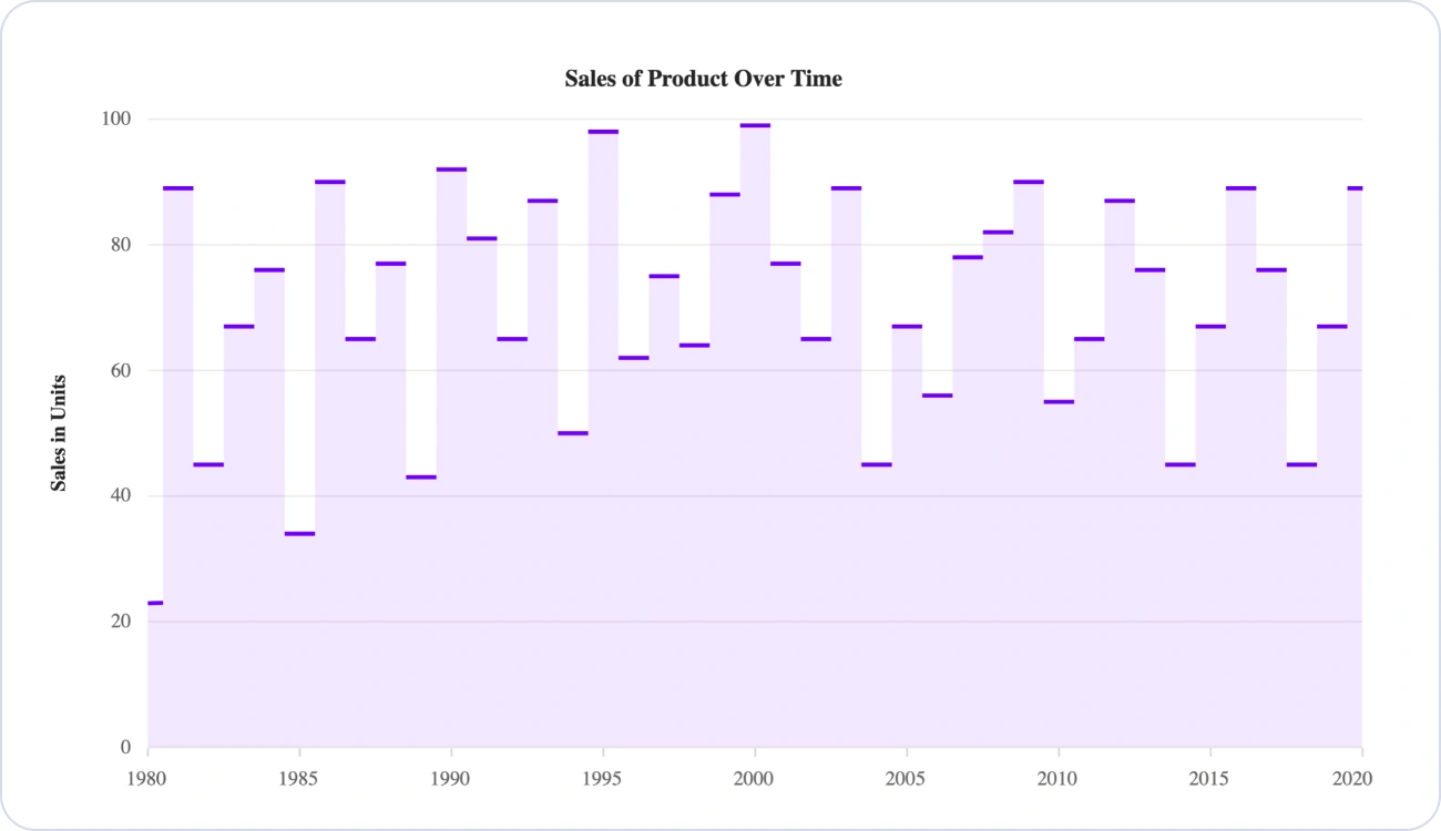
Series label
Series-level labels can now be displayed directly on charts with configurable position and appearance options. This feature enhances chart readability and data clarity by enabling developers to annotate series without relying on separate legend elements. Labels support customization for alignment, formatting, and visibility control per series. Find the demo link here.

No riser for step line and step area series
Introduces the no-riser option, which removes vertical transitions in step charts to display only horizontal segments. This improves readability, emphasizes value continuity, and reduces visual clutter while supporting all step positions (left, right, center). Find the demo link here.
DataGrid
Enhanced filter bar
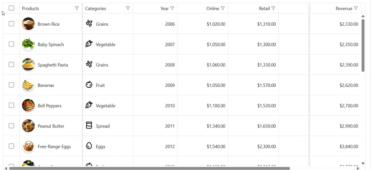
Operator selection is available directly in the improved filter bar, with additional options for more detailed filtering. The filter automatically adjusts to the column type and displays the appropriate controls, such as text boxes or time pickers. This design makes filtering more accurate, simple, and efficient for different data types.
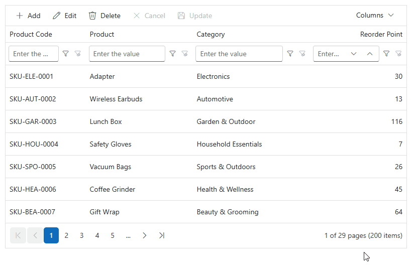
Single-click batch edit
Batch editing is now faster and smoother in grids. Cells enter edit mode with a single click, eliminating the need for double-clicks and saving time during data entry and updates.
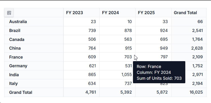
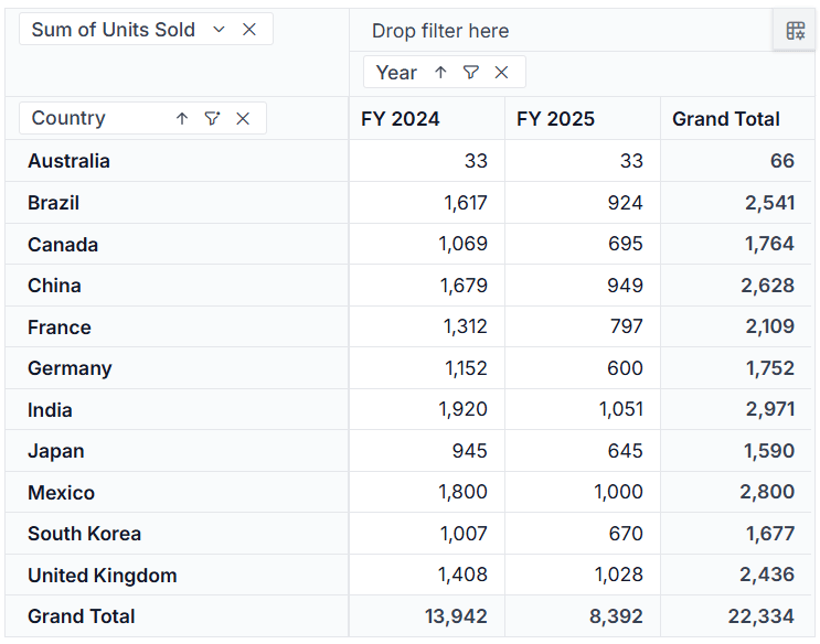
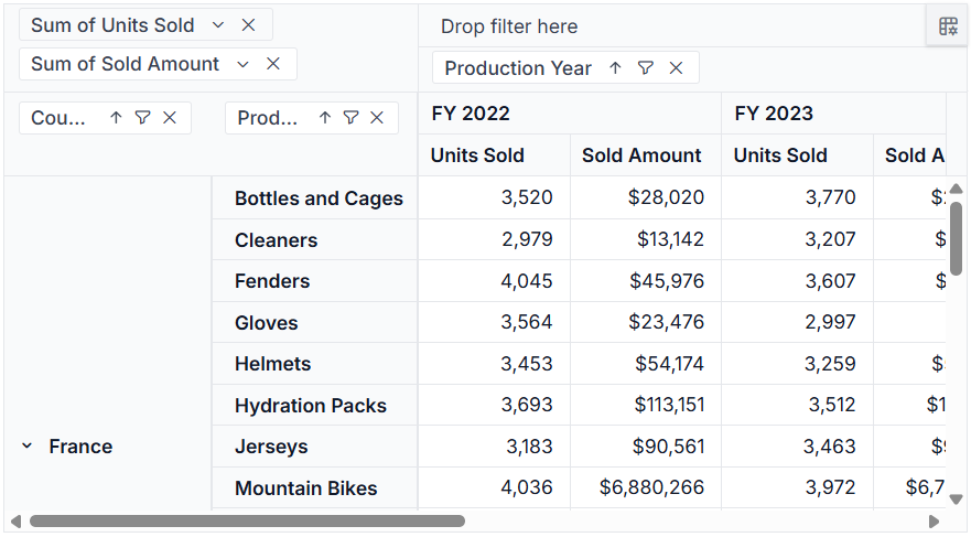
Pivot Table
Built-in CRUD operations for seamless data management
The Syncfusion Pivot Table now supports native create, read, update, and delete (CRUD) operations with configurable, server-side controller endpoints. This enables efficient data editing directly within a pivot table, simplifies back-end integration, and eliminates the need for custom CRUD implementations. It is ideal for applications that require dynamic data updates and real-time synchronization.
Percentage of running totals aggregation type
The Pivot Table now supports percentage of running totals as an aggregation type. This allows users to view cumulative values as percentages, making it easier to analyze trends, measure contribution over time, and understand data progression.
Classic layout in server-side engine
This feature enables efficient processing of large-scale data operations in a traditional tabular format. This ensures improved scalability, consistent results, and high-performance reporting for enterprise-grade applications.
Do you have a feature request? Post the details in the feedback portal.