
 Rajendran R
We are happy to announce the release of Essential Studio® 2023 Volume 4. This release brings a lot of exciting new components and features to our Syncfusion Blazor platform.
This blog will highlight the major updates in our Blazor suite for this last release of the year.
New Blazor components
In this release, keenly awaited new components arrived in our Blazor suite. The following new components were released in preview mode:
Blazor Data Form (preview)
The Blazor Data Form component streamlines the process of entering and modifying data, providing an intuitive user experience. This tool allows for easy management and submission of information, thereby improving overall ease of use.
Key features
The key features of the Blazor Data Form component are:
- Auto-generated items: Generates appropriate editing fields corresponding to the property types specified within the model.
- Form groups: Organize editing fields into categorized sections with descriptive headings and a columnar structure.
- Validators: Apply various types of validators, including built-in and custom validators.
- Validation display: Display validation messages directly inline or as tooltips.
- Templates: Implement tailor-made editor designs to suit users’ unique requirements.
Note: For more details, refer to the Blazor Data Form demo and documentation.
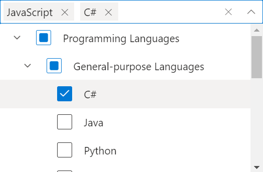
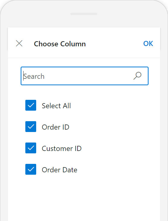
Blazor Dropdown Tree (Preview)
The Blazor Dropdown Tree component allows you to select single or multiple values from hierarchical and self-referential data in a tree-like structure. It has many out-of-the-box features.
Key features
The key features of the Blazor Dropdown Tree are:
- Data binding: Bind and access a hierarchical and self-referential list of items from a local or server-side data source.
- Checkboxes: Select more than one item in the Dropdown Tree component without affecting the UI appearance.
- Display modes: Display selected values in box mode or delimiter mode. Box mode is the default on selecting values, and it changes to delimiter mode when out of focus.
- Filtering: Quickly filter tree items based on characters entered in the search box. This feature supports both local and remote data sources.
- Sorting: Display the Dropdown Tree items in ascending or descending order.
- Templates: Customize the Dropdown Tree items, header, footer, action failure content, and no records content.
- Accessibility: Provide access to all the Dropdown Tree component features through keyboard interaction, on-screen readers, and other assistive technology devices.
Refer to the following image.
Note: For more details, refer to the Blazor Dropdown Tree demo and documentation.
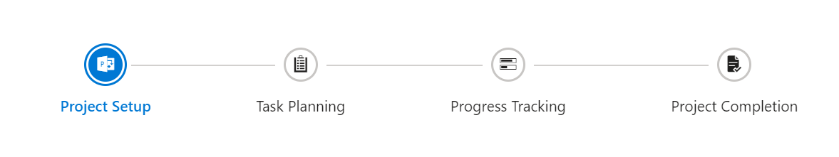
Blazor Stepper (preview)
The Blazor Stepper component enables users to navigate through a series of steps or stages in a process within a web app. Steppers display a list of steps, with the current step highlighted, and allow users to move between steps.
Key features
The key features of the Blazor Stepper component are:
- Step types: Display steps with indicators and labels, only indicators, or only labels.
- Orientation: Display steps horizontally or vertically.
- Linear flow: Enable a step-by-step progression, completing one step before moving on to the next.
- Label positioning: Show labels at the top, bottom, left, or right position.
- Tooltip: Show additional information, such as a label or customized text, when users hover over a step.
- Templates: Customize the default appearance and content of each step using templates.
Refer to the following image.
Note: For more details, refer to the Blazor Stepper demo and documentation.
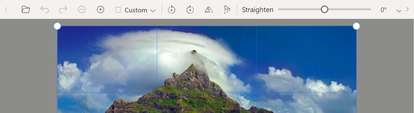
Blazor Image Editor is now a production-ready component
The Blazor Image Editor component has been developed to meet industry standards and is now marked production-ready.
Users can also take advantage of a new image straightening feature. It allows users to adjust an image by rotating it clockwise or counterclockwise. The rotated degree value should be within the range of -45 to +45 degrees for accurate straightening. Positive values indicate clockwise rotation, while negative values indicate counterclockwise rotation.
Note: For more details, refer to the Blazor Image Editor demo.
New Blazor showcase/dashboard samples
Hotel Booking App
Introducing the new Blazor Hotel Booking App, a showcase web app that allows you to view hotel room details.
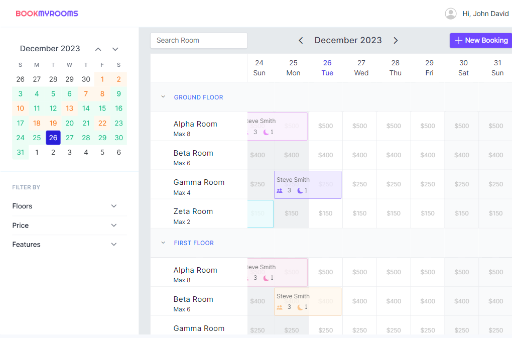
Note: For more details, refer to the demos on the website and GitHub.
Stock Market Dashboard App
Introducing the new Blazor Stock Market Dashboard App, a showcase web app that allows you to present dynamic prices for various stocks. This app provides comprehensive details, including key statistics, overall performance, and technical information.
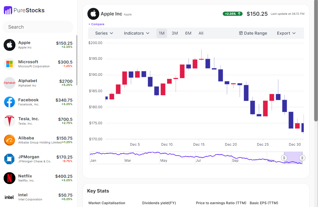
Note: For more details, refer to the Blazor Stock Market Dashboard app demos on the website and GitHub.
New web app sample browser
The Syncfusion Blazor components are fully supported in .NET version 8 from the 2023 Volume 3 Service pack release. The Blazor web app sample browser has been shipped along with the existing .NET 6 sample browser. They are live.
Refer to the .NET 6 server app and WASM app for more details.
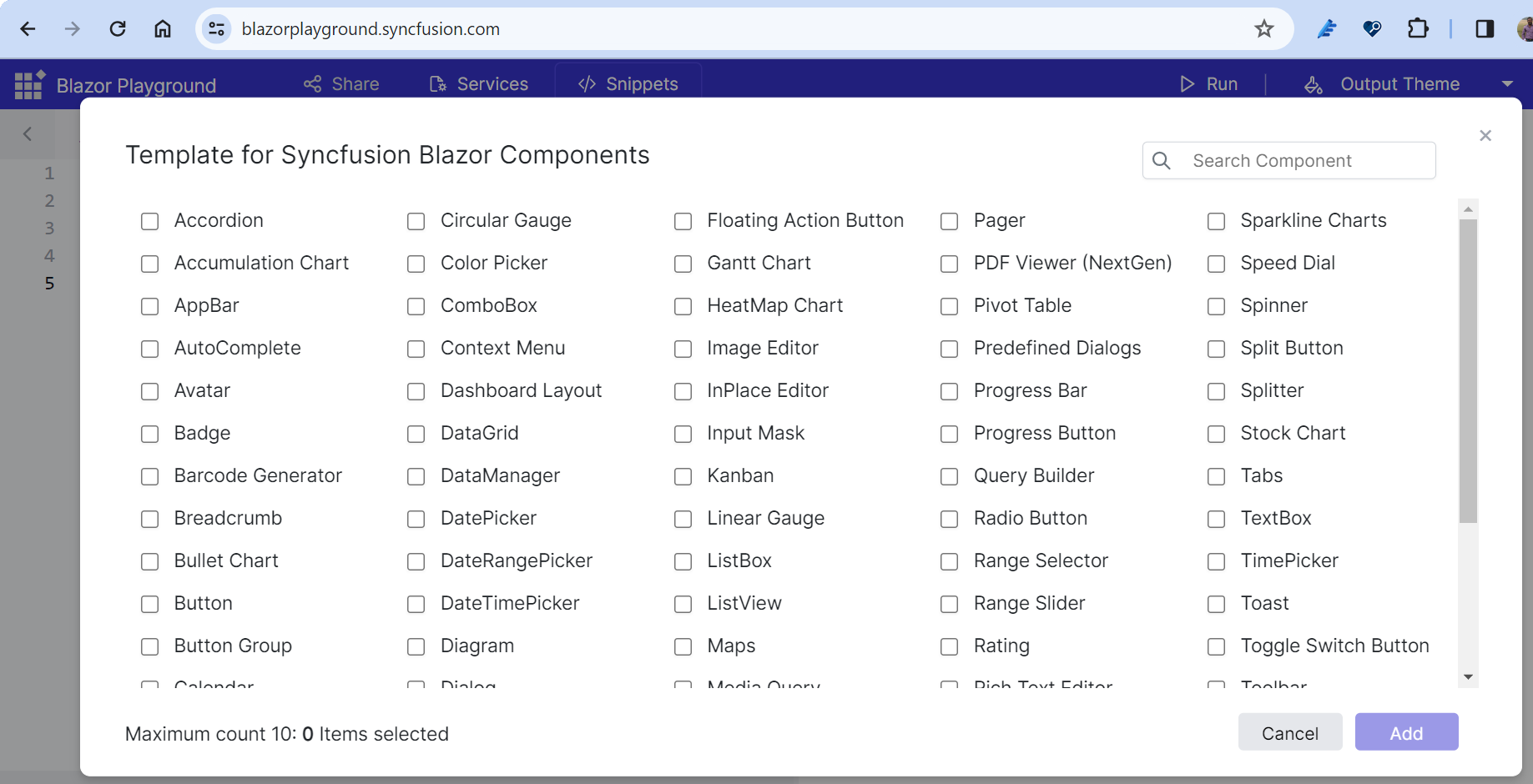
Enhanced Playground app
The Blazor Playground app has enhanced flexibility with individual NuGet support for Syncfusion Blazor components. This allows you to include only the components you need.
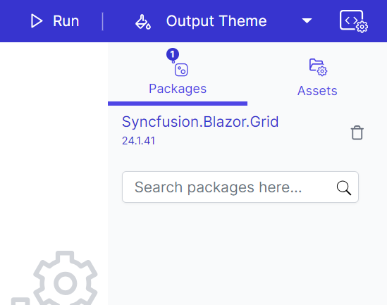
We’ve added default code snippet support to make it easier to get started with Syncfusion Blazor components.
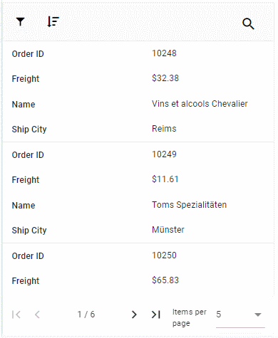
DataGrid with advanced features
The Blazor DataGrid receives the following features in this release.
Enhanced adaptive UI
Render an adaptive UI layout for the column chooser as well as context and column menus in the DataGrid.
Freeze as fixed
We have introduced a new column freezing mode known as Fixed, in addition to the existing Left and Right modes, within the column settings using the freeze property. This Fixed mode locks columns in place, ensuring their visibility during horizontal scrolling.
Drag and drop between groups
We have added functionality to drag and drop grid rows between different groups within the DataGrid.
DataTable binding
This feature enables the binding of a DataTable directly as a data source to the Blazor DataGrid. It also facilitates the execution of various data operations, including sorting, filtering, paging, aggregations, grouping, and searching, in addition to offering support for CRUD actions.
Pager improvements
The Pager dropdown now has adaptive support, letting it dynamically render on mobile and tablet devices alongside the Pager component. The Pager message element now adjusts its rendering based on the screen size, ensuring a more responsive and user-friendly experience.
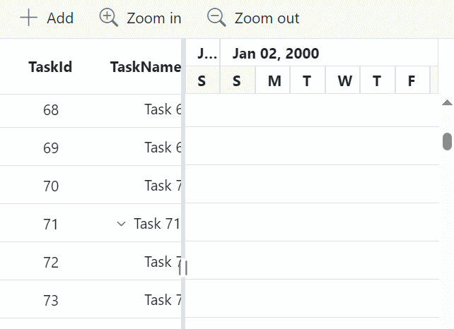
Gantt Chart
The new features included in the Blazor Gantt Chart are as follows.
Virtualization using overscan count
Now, you can use the OverscanCount property to reduce the frequency of rendering while scrolling in the Gantt Chart. This property is used to render additional items in the DOM before and after the visible items (based on the page size) during virtual scrolling and initial rendering.
Action begin and complete events
New event support was introduced for actions performed within the Gantt Chart. These new events expand your ability to tailor and enhance your interactions within the Gantt Chart, providing you with more control and flexibility:
- Sorting: The event callback is invoked before a sorting action is performed, a column is removed from sorting in the Gantt Chart, or when the sort column direction changes from ascending to descending or vice versa.
- Sorted: The event callback is raised after the sorting action is performed in the Gantt Chart.
PDF Viewer
The Blazor PDF Viewer supports new, user-friendly features.
Mobile annotation toolbar
We’ve added support for an annotation toolbar on mobile devices. With this feature, users can perform various actions, such as adding, modifying, removing, and commenting on annotations within PDF documents directly from their mobile devices.
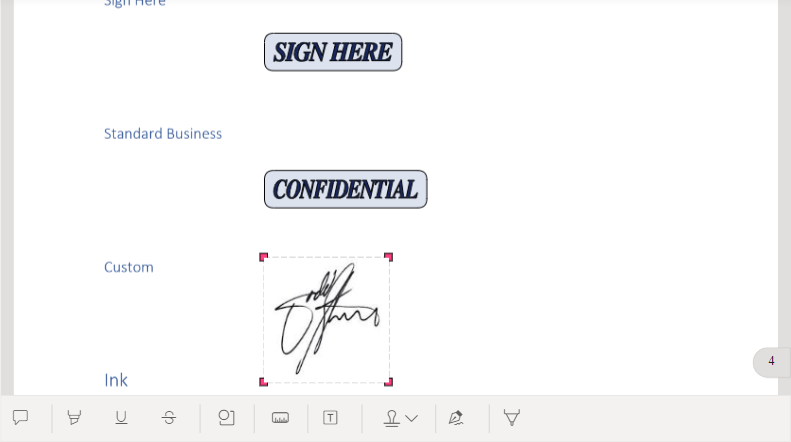
Note: For more details, refer to the Blazor PDF Viewer mobile annotation toolbar demo and documentation.
Keyboard support enhancements
We implemented keyboard-based navigation options to enhance the user experience, enabling individuals to navigate through the PDF Viewer more efficiently.
TreeGrid
The Blazor TreeGrid has the following updates.
Virtualization with overscan count
Like the Blazor Gantt Chart, TreeGrid also supports the OverscanCount property to reduce the frequency of rendering during scrolling. This property is used to render additional items in the DOM before and after the visible items (based on the page size) during virtual scrolling and initial rendering.
Action begin and complete events
New events are supported for actions performed within the TreeGrid. These new events significantly expand your ability to tailor and enhance your interactions within the tree grid, providing you with more control and flexibility:
- Sorting: An event that is invoked before a sorting action is performed, a column is removed from sorting in the TreeGrid, or when the sort column direction changes from ascending to descending or vice versa for the same column.
- Sorted: An event callback that is raised after a sorting action is performed in the TreeGrid.
Synchronizing charts
We’ve provided support for synchronizing the tooltips, zooming and panning, crosshairs, highlights, and selection features across numerous charts.
Refer to the following code example. In it, we display a synchronized tooltip using the ShowTooltip and HideTooltip methods.
@code
{
     public SfChart Chart;
     void ShowTooltip()
     {
         Chart.ShowTooltip("Gold", 40);
     }
     void HideTooltip()
     {
         Chart.HideTooltip();
     }
}
Blazor radial tree diagram
The Blazor Diagram component now has radial tree layout support. A radial tree layout is a diagram that presents information in a hierarchical structure, with a central node at the core of the diagram. The central node represents the main concept or topic, and branches extend outward in a radial fashion, creating a tree-like structure.
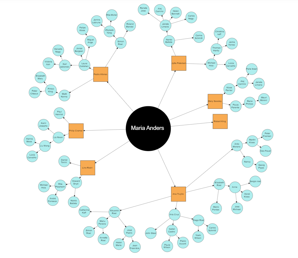
Note: For more details, refer to the Blazor Radial Tree Diagram demo and documentation.
Conclusion
Thanks for reading! In this blog, we have seen the new components and features added to the Syncfusion Blazor suite for the Essential Studio® 2023 Volume 4 release. Details about these updates are available in our Release Notes and What’s New pages. Try the new features out and leave your feedback in the comments section below!
The new version of Essential Studio® is available for existing customers on the License and Downloads page. If you are not a Syncfusion customer, sign up for our 30-day free trial to try out our features.
If you have any questions, you can reach us through our support forum, support portal, or feedback portal. We are always happy to assist you!


 No spam, just valuable updates.