
 Sivakumar R
Syncfusion WPF controls are some of the most popular for desktop applications. The suite has beautiful templates, styles, and versatile features. We at Syncfusion are working on yet another exciting release, 2020 Volume 2. This release has some exciting new updates for the WPF controls. So, you can expect the main release of volume 2 at the first week of July 2020.
In this blog, we are going to see the new features and controls that we’re planning to include in our Syncfusion WPF 2020 Volume 2 release.
Common update
.NET 5 Preview Support
Recently, Microsoft announced the release of .NET 5 Preview 3 in the Build Conference. All the Syncfusion WPF and WinForms controls will support .NET 5 Preview with this release.
New Office 2019 Themes
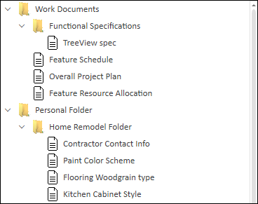
TreeView (new control)
The new WPF TreeView will be a data-oriented control. It will display data in hierarchical structure with expanding and collapsing nodes. It has been developed as an alternate to our Tree View control. The new TreeView control will provide top-notch performance with the following key features:
- Optimized view reuse strategy: To enhance the performance.
- Bound and unbound modes: To bind hierarchical data or add unbound tree nodes.
- On-demand loading: To load the nodes on demand when the end user expands the node.
- Selection: To select the nodes with different selection modes and keyboard navigation.
- Drag and drop: To reorder the nodes by dragging and dropping them.
- Templating: To provide complete UI customization using a template and template selectors.
- Root lines: To show the lines between tree nodes.
Scheduler (new control)
The new WPF Scheduler will offer five types of built-in configurable view modes that will provide the basic functionalities for scheduling, managing, and representing appointments. This control will include the following features:
- Multiple scheduler views: To provide a wide range of built-in view modes: day, week, workweek, month, and timeline views.
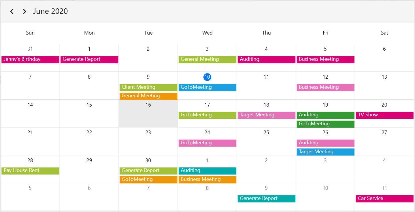
Month view in the Scheduler 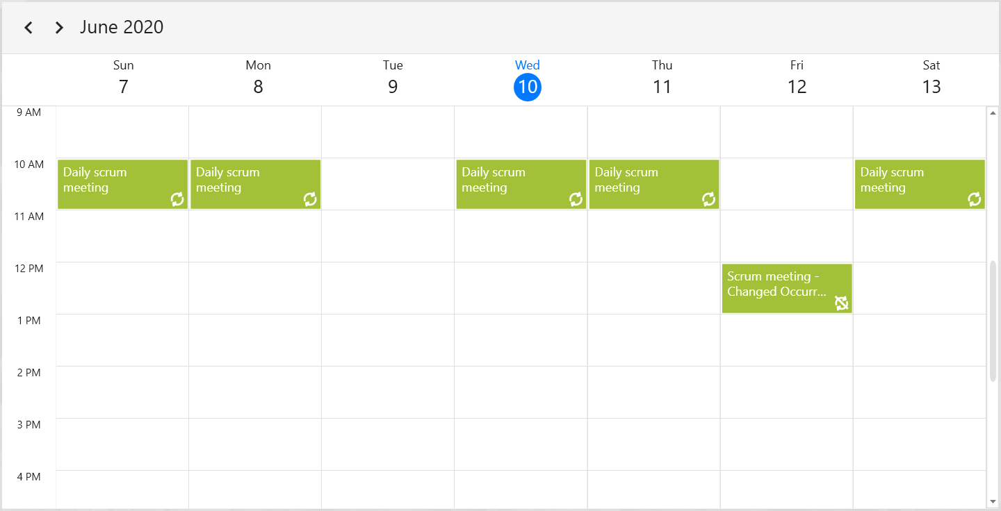
Week view in the Scheduler
- Appointments and events: To render recurring, all-day, and spanned appointments to visualize your schedules and events easily.
- Data-binding: To bind any business object to a Scheduler appointment. This can be done by mapping the data object fields such as start time, end time, subject, notes, and recurrence.
- Recurring appointments and events:To easily configure the recurring events that are to be repeated on a daily, weekly, monthly, or yearly basis.
- Recursive exception dates: To remove or modify the details of any occurrence appointment that is an exception to the recurrence pattern. This can be done by adding exception dates to a scheduler appointment.
- Time zone:To set the required time zone for the control itself, as well as the events, regardless of the time zone in your system.
- Flexible working days: To customize and display the working days in a work week with your desired days. The remaining days will be hidden.
- Built-in appointment editor: To create and edit various types of appointments. It will allow users to reschedule appointments by editing their start and end times. Users can edit an occurrence or whole recurrence pattern of an appointment through the appointment e
- Appointment drag, drop, and resize: To easily drag appointments from one timeslot to another timeslot and to resize appointments to reschedule them.
- Month agenda view:To display the appointments in a list below the month view by clicking a day.
- Appearance customization:To customize the Scheduler appearance and formats to provide a uniform and consistent look for the user.
Ribbon
The Ribbon control will have the following features.
Simplified mode
The WPF Ribbon control will be available in simplified mode, similar to the most recent Office products. The simplified ribbon will fit into less space (on a single line) with frequently used commands displayed. Other commands will be placed under the overflow button for the best user experience.

Ribbon button – icon template
The Ribbon button will let you customize its icon using templates. So, now any content can be loaded in the icon part of the Ribbon button.
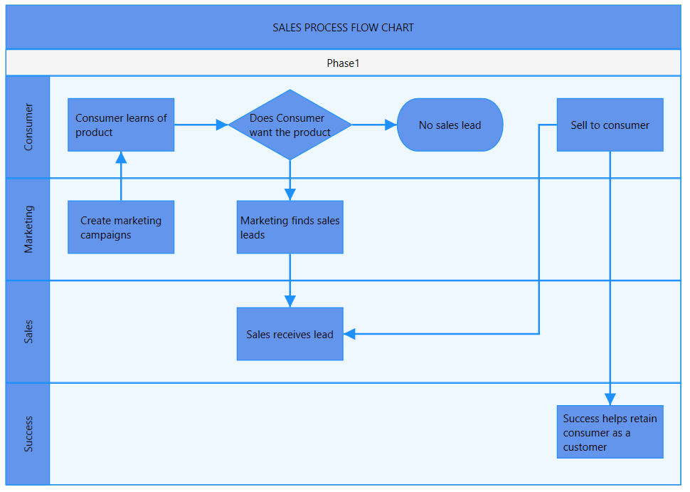
Diagram
Swim lane diagram
The WPF Diagram will have support for swim lane diagrams. The swim lane diagram will reveal who does what and when in a grid-like diagram organized into sections. It will go beyond a basic flowchart to show the relationships between functions (such as a stakeholder or department) and phases (such as milestones) in a process. Swim lane diagrams will have support for these additional features:
- Create a swimlane diagram from code or a visual interface.
- Add node or group as lane child from code or a visual interface.
- Add, delete, or resize the lane or phase dynamically.
- Swap the lane order interactively.
- Use built-in swim lane shapes.
- Drag and drop a lane or phase from stencil to diagram page to create a new swim lane like in Microsoft Visio.
- Use clipboard operations.
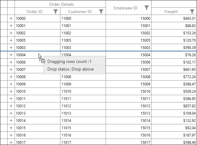
DataGrid
Line indicator on drag and drop
The WPF DataGrid control will have a line indicator for the drag-and-drop feature to show the location where the rows will be placed.
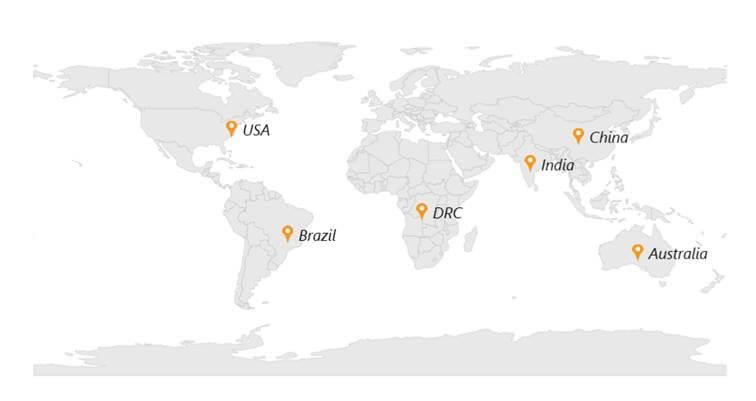
Maps
The WPF Maps control will have the following new features.
Marker customization
This feature will enable customization of the marker icon’s size and color. You can also customize the default marker icons with predefined icons such as circles, squares, diamonds, rectangles, and images. You can customize the marker label styles in the maps, too.
Marker selected event
This feature will provide the information about the selected marker using the MarkerSelected event. Using this event, you can track the details of multiple selected markers.
Marker alignment
Place the marker at the exact geo-point location with alignment support.
Marker virtualization
Virtualize a large number of markers while zooming and panning maps to achieve better performance.
Charts
Data marker performance
The data marker performance in the Charts control is greatly enhanced, with twice the loading performance and 10x faster zooming and panning interactions when using data markers.
Radial Gauge
The WPF Radial Gauge will have the following new features.
Gradient color support for ranges
Add gradient colors to ranges in radial gauges.
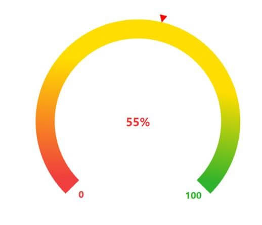
Dragging support for pointers
Interactively drag the pointer from one location to another in runtime.
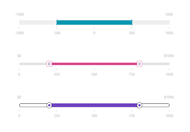
Range Slider
Thumb and track customizations
The WPF Range Slider will now allow you to customize the thumb, track and active track, ticks, and tools to create a more customized, modern user interface.
Carousel
The WPF Carousel control will have the following new features.
Looping items continuously
Loop the items in the Carousel control. After the last item, the navigation will continue back from the first item.
Navigate items
Navigate to the previous item, next item, previous page, and next page using the keyboard, mouse wheel, or commands.
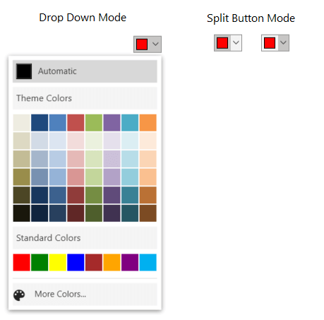
Color Picker Palette
Split button mode
Color Picker Palette will have an optional split button mode similar to the one in MS Excel. The color change notification will be triggered even when tapping the button.
Docking Manager
Serialization enhancement
The WPF Docking Manager will let you load a saved state even when the state of the children is mismatched.
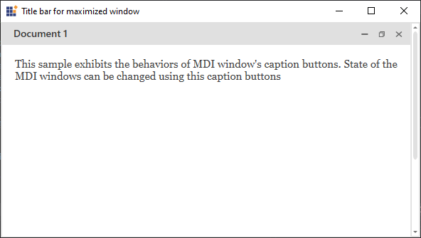
Tabbed MDI Form
Title bar for maximized window
The Tabbed MDI Form will display a new, built-in title with options to minimize, normalize, or close the window when the window is maximized.
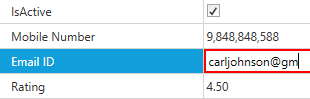
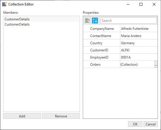
Property Grid
The WPF Property Grid will have the following new features.
Disable nested properties
Enable or disable nested properties of selected objects using events and attributes.
Masked editor support
Add new attributes to the masked editor to edit emails, phone numbers, zip codes, currency, and so on.
Collection editing
View, edit, add, and remove items in a collection.
 Spell Checker
The WPF SpellChecker control will have the following new features.
Hunspell, Ispell, and OpenOffice dictionary support
Use standard dictionary file formats such as Hunspell, Ispell, and OpenOffice.
Dictionary enhancements
- Use built-in support to load dictionaries based on culture.
- Use a custom dictionary and a standard dictionary at the same time.
- Share the same dictionary file across multiple spelling-check instances.
Tab Control
The WPF TabControl will have the following new features.
Different tab sizing modes
The tab items can be stretched along the available size in single-line and multiple-line modes.
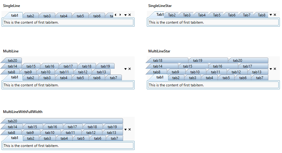
Enhancements
- Enable or disable editing for the individual tab items.
- Customizethe date template to customize theAdd New tab button.
- Scroll tab header items using the mouse wheel when there are many items.
- Show hidden tab items in the tab list context menu.
TimeSpan Editor
Step intervals
The WPF TimeSpan Editor control will have support to increase or decrease values by multiples of the interval value.
Conclusion
In this blog, we have talked about the new controls and features that we plan to make available in the upcoming 2020 Volume 2 release for the WPF platform. There are also other exciting features on the way to surprise you.
So, please stay tuned to our official Twitter, Facebook, and LinkedIn pages for the announcement about the release. We will have a detailed blog post for each new control after the release to guide you in working with them in WPF applications.
If you wish to send us feedback or would like to submit any questions, please feel free to post them in the comments section of this blog post. You can also contact us through our support forum, feedback portal, or Direct-Trac support system. We are always happy to assist you!


 No spam, just valuable updates.