WPF Diagram - Powerful and Feature-rich Control
- Automatic layout algorithm for org chart, hierarchical trees, radial trees and flowcharts.
- A flowchart maker, BPMN editor, floor planner app, and visualization of a diagram with an external data source are easy.
- Seamless interaction and editing capabilities
.NET 10 support now available
Trusted by the world’s leading companies

Overview
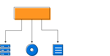
The WPF Diagram control allows users to quickly create and edit flowcharts, organizational charts, UML diagrams, swim lane charts, mind maps, floor plans, and more within their applications.
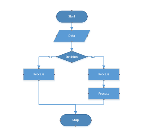
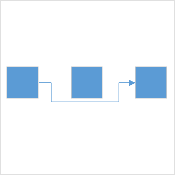
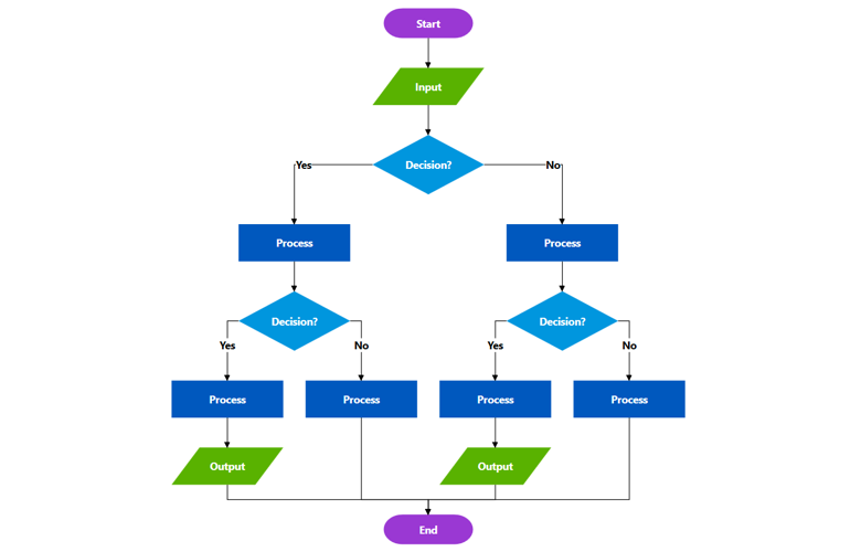
Flowchart
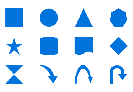
The WPF Diagram control provides all the standard flowchart shapes as ready-made objects to build flowcharts, making it is easy to add them to a diagram surface in a single call. A built-in automatic layout algorithm has been specifically made for flowchart to arrange each flowchart shapes automatically without specifying the co-ordinates.
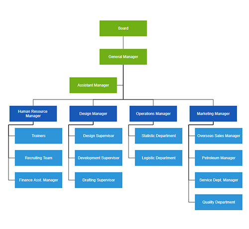
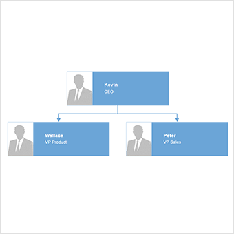
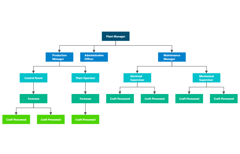
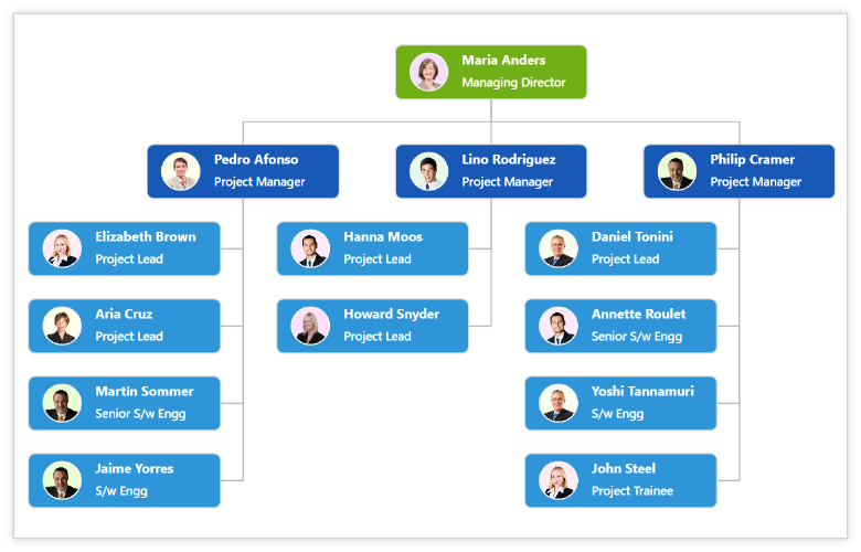
Organizational chart
Built-in automatic layout algorithm specifically made for organizational charts to arrange parent and child node positions automatically.
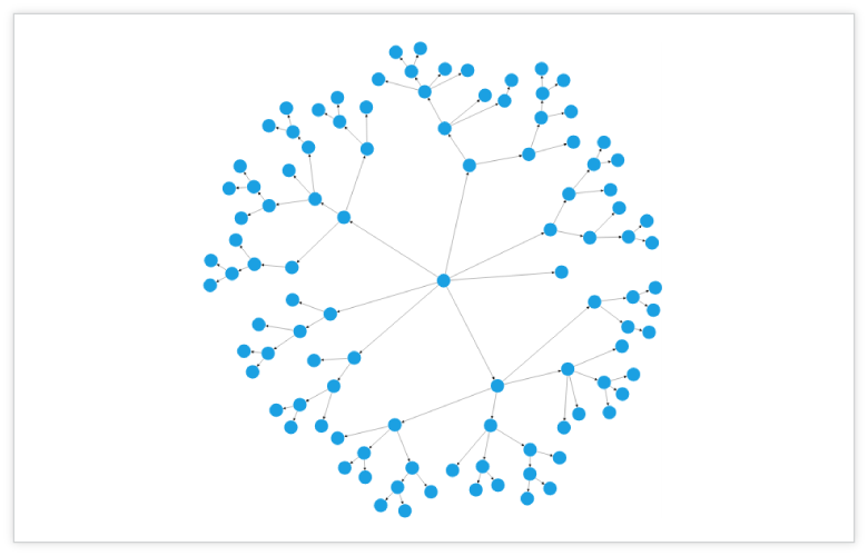
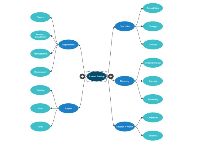
Mind map
Create mind map diagrams with a built-in, automatic layout algorithm to define a central node that represents an idea or a concept and other nodes to be placed around it.
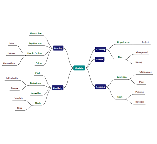
Diagram Ribbon
- The diagram ribbon control contains UI elements that allow end-users to load and save diagrams, add diagram items to the canvas, format text within the diagram items, rearrange and recolor shapes, change the canvas size and orientation, and perform clipboard operations.
- The ribbon can easily be customized to add new ribbon items/tabs and remove the existing ribbon items/tabs.
High Performance
Quickly load large diagrams using UI-virtualization techniques, which selectively loads the objects that lie within the viewport area. Smooth scrolling performance is achieved using a built-in spatial search algorithm that builds an index based on the element position.

Nodes
Visualize any graphical object using nodes that can also be arranged and manipulated on a diagram page.
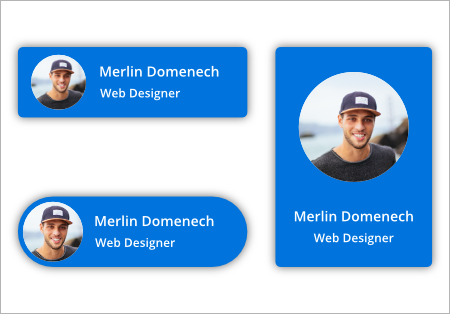
Template
You can use text, image, controls, panels, or any UIElement or template to visualize a node. It can also be bound to any of your business objects.
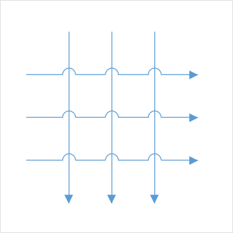
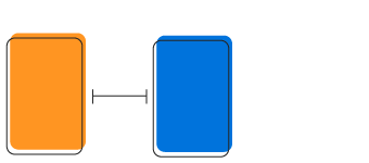
Connector
A connector is used to represent a relationship between two nodes. Some of the key features are listed below.
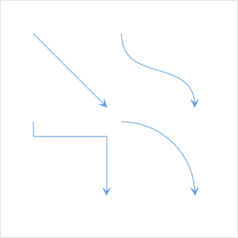
Types
The types of connectors are straight, orthogonal, and curved. Choose any of these based on the type of diagram or relationship between the connected notes.
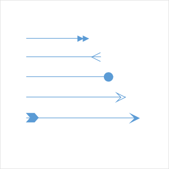
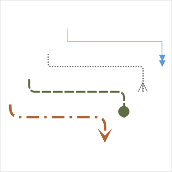
Arrowheads
Use arrowheads (decorator) to indicate the flow direction in a flowchart or state diagram. Also build custom arrowheads based on the type of diagram.
Routing
Orthogonal connectors take the shortest and smartest path to avoid overlapping neighboring nodes.
Bridging (line jumps)
Bridging (line jumps) clearly indicates connector’s route and makes it easier to read where connectors overlap in a dense diagram.
Appearance
Customize the look and feel of a connector. A rich set of properties is available to customize color, thickness, dash dots, rounded corners, and decorators.
Port (connection point)
Connect to the desired location of a node using different types of ports or connecting points available.
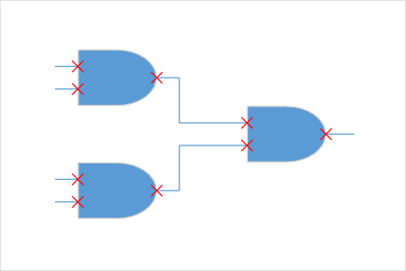
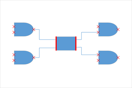
Node port
Build logic gates or a circuit diagram with dedicated pins and restrict in or out connections using node ports.
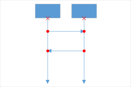
Connector port
Use connector ports to indicate message flows between objects or lifelines in a sequence diagram.
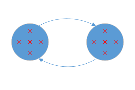
Dynamic port
Make parallel connections to a block diagram by connecting anywhere on the side of a block. They are automatically created or destroyed.
Dock port
Control dynamic connections to specific sides or in a specific direction using dock ports.
Annotation
Show additional information by adding text or labels on nodes and connectors.
Edit
Add and edit text at runtime. Also, mark it read-only if it should not be edited.
Multiple annotation
Add any number of annotations and align them individually.
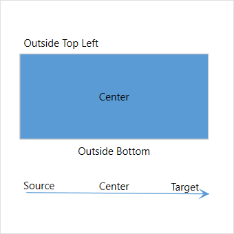
Alignment
The WPF Diagram has sophisticated alignment options where annotations can be placed:
- Inside or outside a node.
- At the source or target end of a connector.
- Automatically when the node or connector is moved.
Interactive features
Use interactive features to improve the editing experience of a diagram at runtime. Furthermore, easily edit a diagram with mouse, touchscreen, or keyboard interfaces.
Select and drag
Select one or more nodes, connectors, or annotations and edit them using thumbs or handlers.

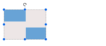
Resize
Resize a node in eight different directions. Lock the aspect ratio to maintain the shape after resizing. Resize multiple objects at the same time.

Rotate
Rotate a selected node 360 degrees.

Snapping
Align nodes, connectors, and annotations when dragging precisely, just by snapping to the nearest gridlines or objects.


Clipboard
Cut, copy, paste, or duplicate selected objects within and across diagrams.

Z-Order
When multiple objects overlap, the Z-order controls which object needs to be at the top or bottom.
Grouping
Combine multiple nodes together and interact with them as a single object called a group. Nodes can belong to more than one group.

Quick command
Frequently used commands like delete, connect, and duplicate can be shown as buttons near selectors. This helps in quick operations, instead of finding buttons in a toolbox.
Alignment
The WPF Diagram control has predefined alignment commands to align the selected objects nodes and connectors to the selection boundary.
Spacing commands
Place selected objects on a diagram at equal intervals.

Sizing commands
Use sizing commands to size of the application nodes to meet your performance requirement.

Align commands
Align nodes or connectors in the selection list to the left, right, or center horizontally, or at the top, bottom, or middle vertically to the selection boundary.
Automatic layout algorithm
WPF Diagram control provides an automatic layout algorithm, which is used to arrange nodes automatically based on a predefined layout logic. There is built-in support for organization chart layout, hierarchical tree layout, flowchart layout, mind map layout and radial tree layout.
Drawing Tool
Draw nodes and link them interactively, just by clicking and dragging on a diagram surface.

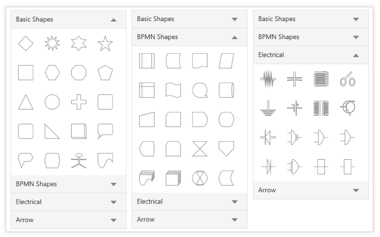
Stencil
The stencil control is a gallery of reusable symbols and nodes. Drag and drop these symbols onto the surface of a diagram any number of times.
Zoom, pan, fit to page
When a diagram is large, see it closer or wider by zooming in and out of the diagram. Also, navigate from one region to another by panning through the diagram.
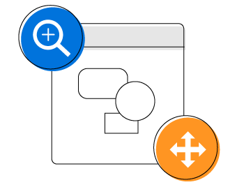
Overview control
Improve the navigation experience when exploring large diagrams using the overview control. It displays a small preview of the full diagram page. It also allows users to perform operations such as zooming and panning within it.
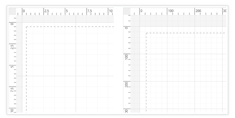
Rulers and Measurement Unit
Measure the distance of nodes and connectors from the origin of the page using rulers. In addition, specify the size and position of objects in different units like pixels, inches, and centimeters.
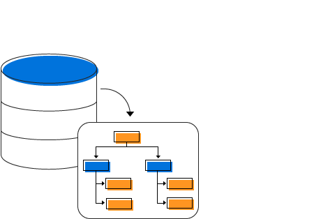
Data Source
Populate diagrams with nodes and connectors based on data from data sources. Data in any format can be easily converted, mapped, and consumed in the diagram by setting a few properties, without having to write any code.
Miscellaneous
There are several other features available to enhance the diagramming experience.

Printing
The WPF Diagram control supports printing with a print preview option. Customize the page size, orientation, page margins, and fit to a single page.
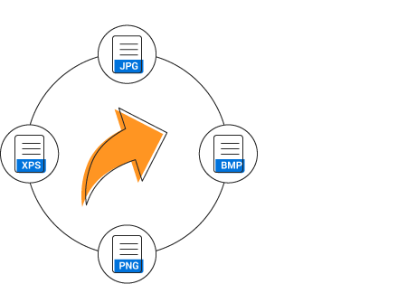
Exporting
Share your diagrams with others by easily exporting them as .xps, .png, .jpeg and .bmp file formats.

MVVM-friendly
The WPF Diagram control is MVVM-friendly and seamlessly works with popular MVVM frameworks like Prism and MVVM light.
Serialization
You can save your diagram state as an XML file and load it back for editing again.
Localization
Localize every static text in the control to any supported language.
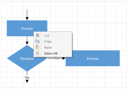
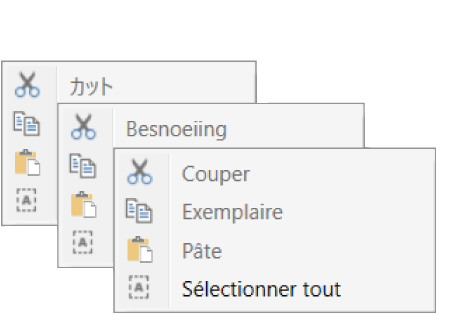
Context Menu
Map frequently used commands to the context menu.
Gridlines
Gridlines provide guidance when trying to align objects.
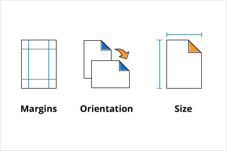
Page Layout
The WPF Diagram control provides a page-like appearance to a drawing surface using page size, orientation, and margins.
WPF Diagram Code Example
Easily get started with the WPF Diagram using a few simple lines of XAML or C# code example as demonstrated below. Also explore our WPF Diagram Example that shows you how to render and configure the diagram in WPF.
<Window.Resources>
    <ResourceDictionary>
        <ResourceDictionary.MergedDictionaries>
            <ResourceDictionary Source="/Syncfusion.SfDiagram.Wpf;component/Resources/BasicShapes.xaml"/>
        </ResourceDictionary.MergedDictionaries>
        <DataTemplate x:Key="NodeContentTemplate">
            <TextBlock HorizontalAlignment="Center" VerticalAlignment="Center" Text="{Binding}"/>
        </DataTemplate>
    </ResourceDictionary>
</Window.Resources>
<Grid>
    <!--Initializing the SfDiagram control-->
    <syncfusion:SfDiagram x:Name="diagram">
        <syncfusion:SfDiagram.Theme>
            <syncfusion:OfficeTheme/>
        </syncfusion:SfDiagram.Theme>
        <!--Initializing the Nodes collection-->
        <syncfusion:SfDiagram.Nodes>
            <syncfusion:NodeCollection>
                <syncfusion:NodeViewModel ID="Start" OffsetX="300" OffsetY="100" UnitWidth="100" UnitHeight="40"
                                          Shape="{StaticResource Terminator}"
                                          Content="Start" ContentTemplate="{StaticResource NodeContentTemplate}"/>
                <syncfusion:NodeViewModel ID="Input" OffsetX="300" OffsetY="180" UnitWidth="100" UnitHeight="40"
                                          Shape="{StaticResource Process}"
                                          Content="Get Input" ContentTemplate="{StaticResource NodeContentTemplate}"/>
                <syncfusion:NodeViewModel ID="Decision" OffsetX="300" OffsetY="280" UnitWidth="100" UnitHeight="80"
                                          Shape="{StaticResource Decision}"
                                          Content="Make Decision" ContentTemplate="{StaticResource NodeContentTemplate}">
                    <syncfusion:NodeViewModel.Ports>
                        <syncfusion:PortCollection>
                            <syncfusion:NodePortViewModel ID="Decision_YesPort" NodeOffsetX="0" NodeOffsetY="0.5" />
                            <syncfusion:NodePortViewModel ID="Decision_NoPort" NodeOffsetX="1" NodeOffsetY="0.5" />
                        </syncfusion:PortCollection>
                    </syncfusion:NodeViewModel.Ports>
                </syncfusion:NodeViewModel>
                <syncfusion:NodeViewModel ID="Output1" OffsetX="210" OffsetY="360" UnitWidth="100" UnitHeight="40"
                                          Shape="{StaticResource Process}"
                                          Content="Output 1" ContentTemplate="{StaticResource NodeContentTemplate}"/>
                <syncfusion:NodeViewModel ID="Output2" OffsetX="390" OffsetY="360" UnitWidth="100" UnitHeight="40"
                                          Shape="{StaticResource Process}"
                                          Content="Output 2" ContentTemplate="{StaticResource NodeContentTemplate}"/>
                <syncfusion:NodeViewModel ID="End" OffsetX="300" OffsetY="440" UnitWidth="100" UnitHeight="40"
                                          Shape="{StaticResource Terminator}"
                                          Content="End" ContentTemplate="{StaticResource NodeContentTemplate}"/>
            </syncfusion:NodeCollection>
        </syncfusion:SfDiagram.Nodes>
        <!--Initializing the Connectors collection-->
        <syncfusion:SfDiagram.Connectors>
            <syncfusion:ConnectorCollection>
                <syncfusion:ConnectorViewModel SourceNodeID="Start" TargetNodeID="Input"/>
                <syncfusion:ConnectorViewModel SourceNodeID="Input" TargetNodeID="Decision"/>
                <syncfusion:ConnectorViewModel SourceNodeID="Decision" TargetNodeID="Output1" SourcePortID="Decision_YesPort">
                    <syncfusion:ConnectorViewModel.Annotations>
                        <syncfusion:AnnotationCollection>
                            <syncfusion:AnnotationEditorViewModel Content="Yes" RotationReference="Page"/>
                        </syncfusion:AnnotationCollection>
                    </syncfusion:ConnectorViewModel.Annotations>
                </syncfusion:ConnectorViewModel>
                <syncfusion:ConnectorViewModel SourceNodeID="Decision" TargetNodeID="Output2" SourcePortID="Decision_NoPort">
                    <syncfusion:ConnectorViewModel.Annotations>
                        <syncfusion:AnnotationCollection>
                            <syncfusion:AnnotationEditorViewModel Content="No" RotationReference="Page"/>
                        </syncfusion:AnnotationCollection>
                    </syncfusion:ConnectorViewModel.Annotations>
                </syncfusion:ConnectorViewModel>
                <syncfusion:ConnectorViewModel SourceNodeID="Output1" TargetNodeID="End"/>
                <syncfusion:ConnectorViewModel SourceNodeID="Output2" TargetNodeID="End"/>
            </syncfusion:ConnectorCollection>
        </syncfusion:SfDiagram.Connectors>
    </syncfusion:SfDiagram>
</Grid>
using Syncfusion.UI.Xaml.Diagram;
using Syncfusion.UI.Xaml.Diagram.Theming;
using System.Windows;
namespace SyncfusionWpfApp1
{
public partial class MainWindow : Window
{
SfDiagram diagram;
public MainWindow()
{
InitializeComponent();
// Create a diagram instance
diagram = new SfDiagram();
// Initializing the Nodes collection
diagram.Nodes = new NodeCollection();
CreateNode("Start", 300, 100, 40, "Terminator", "Start");
CreateNode("Input", 300, 180, 40, "Process", "Get Input");
CreateNode("Decision", 300, 280, 80, "Decision", "Make Decision");
CreateNode("Output1", 210, 360, 40, "Process", "Output 1");
CreateNode("Output2", 390, 360, 40, "Process", "Output 2");
CreateNode("End", 300, 440, 40, "Terminator", "End");
// Initializing the Connectors collection
diagram.Connectors = new ConnectorCollection();
CreateConnector("Start", "Input");
CreateConnector("Input", "Decision");
CreateConnector("Decision", "Output1", "Decision_YesPort", "Yes");
CreateConnector("Decision", "Output2", "Decision_NoPort", "No");
CreateConnector("Output1", "End");
CreateConnector("Output2", "End");
diagram.Theme = new OfficeTheme();
// Add the Diagram control to the Window
this.Content = diagram;
}
private void CreateNode(string id, double offsetX, double offsetY, double height, string shape, string content)
{
NodeViewModel node = new NodeViewModel()
{
ID = id,
OffsetX = offsetX,
OffsetY = offsetY,
UnitWidth = 100,
UnitHeight = height,
Shape = App.Current.MainWindow.Resources[shape] as string,
};
node.Annotations = new AnnotationCollection()
{
new AnnotationEditorViewModel() { Content = content }
};
if (shape == "Decision")
{
node.Ports = new PortCollection()
{
new NodePortViewModel() { ID="Decision_YesPort", NodeOffsetX=0, NodeOffsetY=0.5 },
new NodePortViewModel() { ID="Decision_NoPort", NodeOffsetX=1, NodeOffsetY=0.5 },
};
}
(diagram.Nodes as NodeCollection).Add(node);
}
private void CreateConnector(string sourceId, string targetId, string sourcePortID = default(string), string content = default(string))
{
ConnectorViewModel connector = new ConnectorViewModel()
{
SourceNodeID = sourceId,
TargetNodeID = targetId,
};
if (!string.IsNullOrEmpty(sourcePortID))
{
connector.SourcePortID = sourcePortID;
}
if (!string.IsNullOrEmpty(content))
{
connector.Annotations = new AnnotationCollection()
{
new AnnotationEditorViewModel() { Content = content, RotationReference = RotationReference.Page }
};
}
(diagram.Connectors as ConnectorCollection).Add(connector);
}
}
}Not sure how to create your first WPF Diagram? Our documentation can help.
I’d love to read it nowFrequently Asked Questions
Why should you choose Syncfusion WPF Diagram?
- Visualize, create, and edit interactive diagrams.
Blazing fast load time, rich UI interactions and keyboard navigation.
Load a wide range of nodes with optimum performance.
Flowchart diagram support, many of built-in shapes, and flexible data binding.
Easily arrange diagram components in layout such as Organization Chart, Mind map, Radial tree, and Hierarchical Tree.
- One of the best WPF Diagram in the market that offers feature-rich UI to interact with the software.
- Simple configuration and API.
Expansive learning resources such as demos and documentation to learn quickly and get started with WPF Diagram.
Can I download and utilize the Syncfusion WPF Diagram for free?
No, this is a commercial product and requires a paid license. However, a free community license is also available for companies and individuals whose organizations have less than $1 million USD in annual gross revenue, 5 or fewer developers, and 10 or fewer total employees.
How do I get started with Syncfusion Diagram?
A good place to start would be our comprehensive getting started documentation.
Our Customers Love Us
Having an excellent set of tools and a great support team, Syncfusion® reduces customers’ development time.Here are some of their experiences.

It has more tools and support than its competitors
Syncfusion essential studio samples are really helpfull. Docking Manager, Diagram, Undo-Redo, Mapping, Themes

HALİT A,

Software Developer
Nice suite of components
A very complete set of components, that has an edge on other major vendors which offer components. A lot less code required to use and code samples for more complete components. Integrates well with other 3rd party components.

John A.
C# Developer (Contract)
See Real Success Stories
Developers around the world trust Syncfusion’s Essential Studio to simplify complex projects and speed up delivery. With a vast library of UI controls, powerful SDKs, and reliable support, Essential Studio helps teams build enterprise-ready applications with confidence.
Read Our Customer StoriesIndustry
Software development
75% Cost reduction
50% Faster development
Industry
Utilities (oil and gas)
450+ hours saved
Streamlined processes and hours of development effort saved.
Advanced, flexible features
Empowered users through robust and versatile functionality.
Industry
Software and technology
1000+ of hours saved
Accelerated development with enterprise-ready UI components.
Efficient file management
Streamlined workflows with document libraries without building them from scratch.
Industry
Software and technology
2 Years of delay avoided
Two years of delays prevented with proactive planning.
On-time delivery
Projects delivered on schedule using trusted controls.
Industry
IT services and IT consulting
Improved performance
Large datasets handled with easy customization and quick debugging.
Highly customizable
Plug-and-play controls with quick template integration.
Industry
Professional services
Instant access
Quick availability of features and resources.
Reduced dependencies
Fewer dependencies for faster development.
Rated by users across the globe
Awards
Greatness—it’s one thing to say you have it, but it means more when others recognize it. Syncfusion® is proud to hold the following industry awards.

