WPF Ribbon Control: Inspired by Microsoft Office
- An Office-like ribbon that enriches an application’s UI with the MVVM framework.
- Contextual tabs are displayed on demand based on their context, such as images or tables.
- The control provides additional features like serialization, keyboard accessibility, ribbon customization, and a mini-toolbar.
.NET 10 support now available
Trusted by the world’s leading companies

Overview
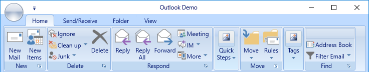
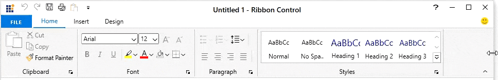
The WPF Ribbon control (ribbon menu) accommodates all the tools required for an application in a single, easy-to-navigate user interface similar to Microsoft Office. Its dynamic resizing, keyboard accessibility, and complete customization options help organize an application.
Create an application with an Office-like Ribbon
The WPF Ribbon control provides an application UI similar to Microsoft Office with a 2007 style that contains an application menu and a 2016 style that contains a backstage view.

Simplified ribbon
The simplified ribbon acts as a mode for viewing the most commonly used commands in a single line and therefore offers more screen space in a compact view of a document. End users can quickly navigate to other commonly used commands in the overflow menu. They can switch to normal mode using the built-in toggle button.

Office 2016 UI
The Office 2016 UI provides a backstage view. Available color schemes are white, colorful, dark gray, and black.

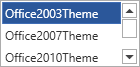
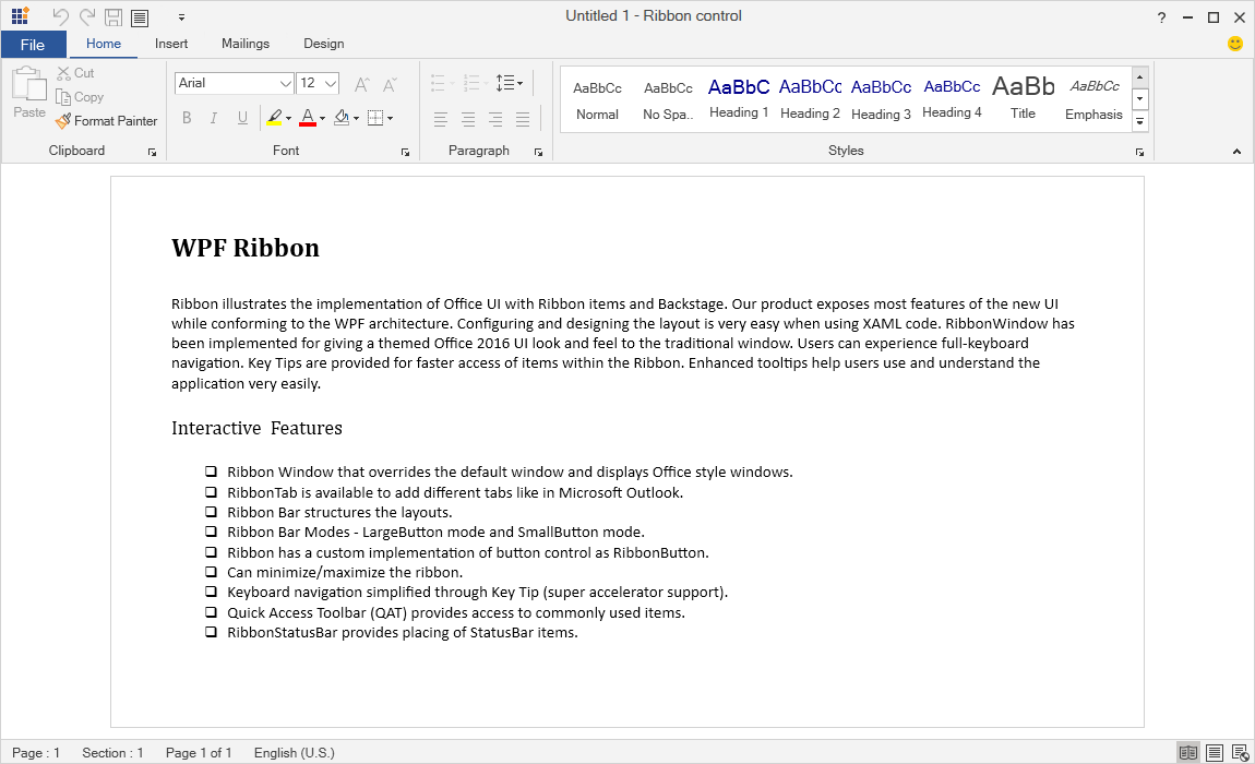
Office 2010 UI
The Office 2010 UI supports gradient colors and color schemes that include blue, black, and silver.
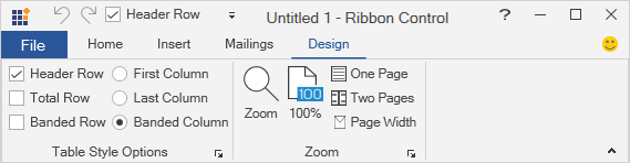
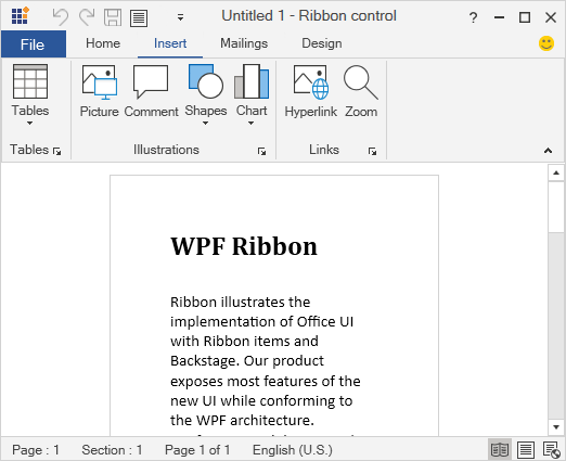
Office 2007 UI
The Office 2007 UI is a classic interface that contains three color schemes: blue, silver, and black.

Ribbon touch UI
The WPF Ribbon control supports a touch UI with plenty of interaction space.
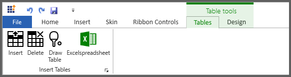
A wide variety of Ribbon items
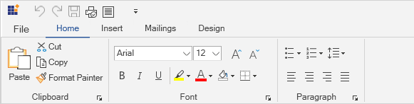
The WPF Ribbon control comes with a variety of ribbon items. Button items like the ribbon button, drop-down button, and split button can be included in any of their three different states. The Ribbon control can also include the following controls, making it comprehensive yet flexible: check box, combobox, radio button, ribbon gallery, text box, and list box. All these controls can be separated using the ribbon separator.

Ribbon button
A button with three different sizes to display content with images.

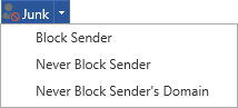
Split button
The split button performs like a normal button as well as a drop-down button to select a command directly or from a list.
Ribbon gallery
Display items in a row- or column-based view by category. Items can be represented with any type of content: Text, images, etc.
Icon template for Ribbon items
The WPF Ribbon control allows you to add any form of image, like path data or font icons, as a template to the Ribbon items.
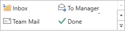
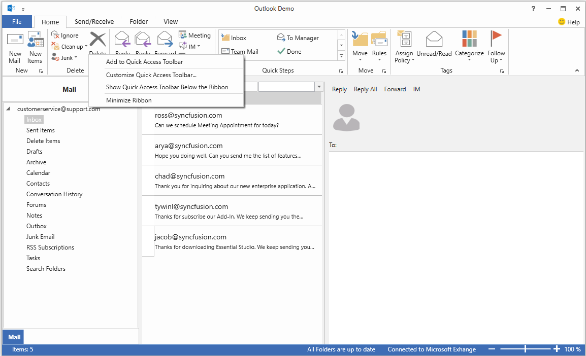
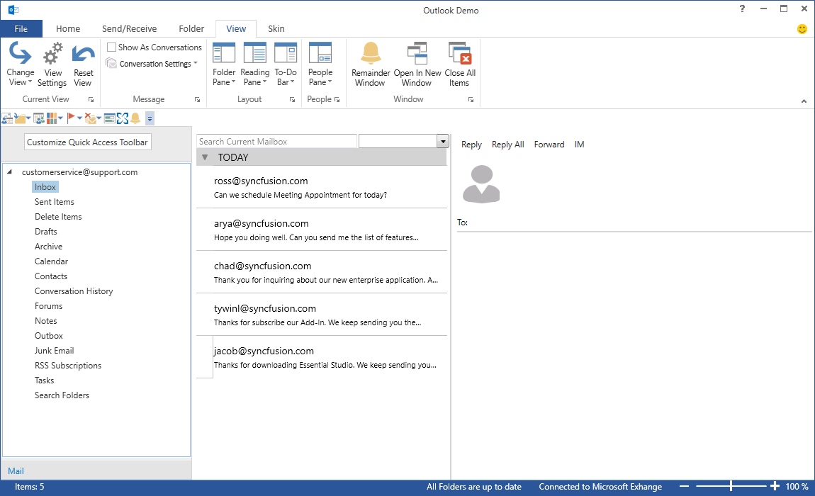
Quick access toolbar
The quick access toolbar (QAT) is used to render a set of ribbon items that are commonly used in applications. It renders at the top-left corner of a window to make it more accessible. Users can choose to place it above or below the ribbon, remove certain commands from it, or add commands to it.
QAT support for custom items
Display any kind of custom control, such as combo box, text box, radio button, check box, and more on the ribbon bar and QAT.
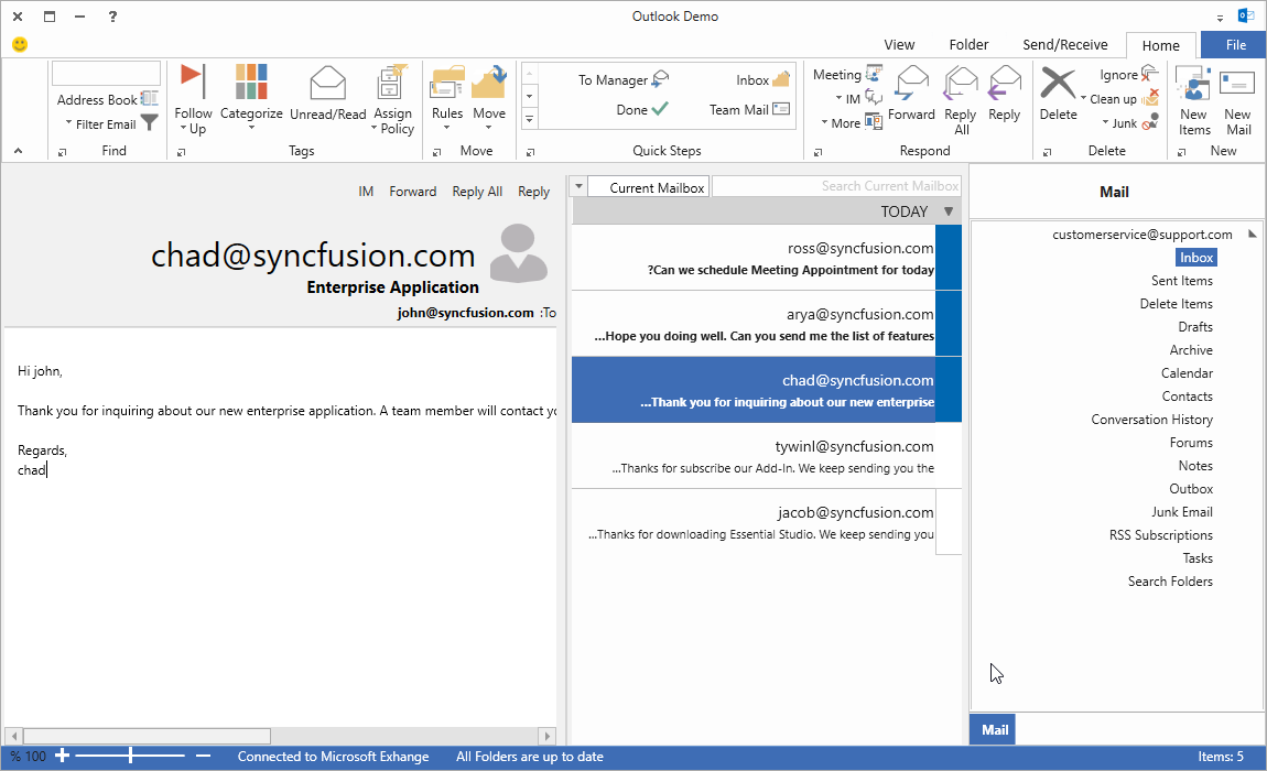
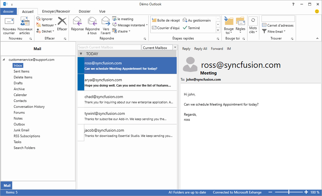
Tabs with contextual groups
The WPF Ribbon control supports any number of contextual tab groups, which can be hidden or shown in certain contexts.
Ribbon bar positioning
Ribbon bars can be placed to either the left or right side of the ribbon.

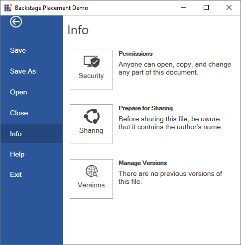
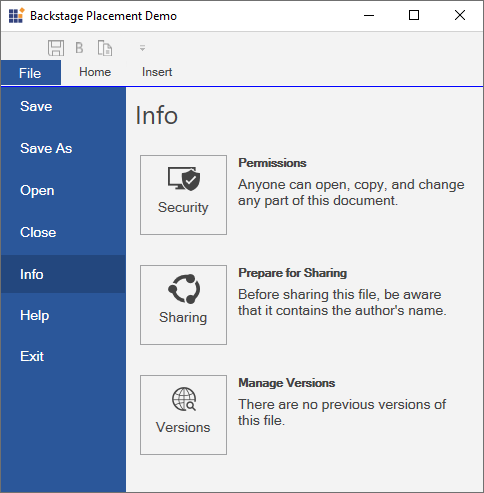
Backstage header
The backstage header is fully customizable. Users can rename the ‘File’ label and adjust its appearance to suit their needs. The header supports text, icons, or a combination of both, providing complete flexibility in how it is presented.
Office 2010, 2016 backstage view
Backstage is a separate view containing tabs and buttons that can show an application’s information and basic settings. The backstage items can be arranged at either the top or bottom. It provides different types of animations such as fade, scale, and zoom, as well as support to customize the animation duration.
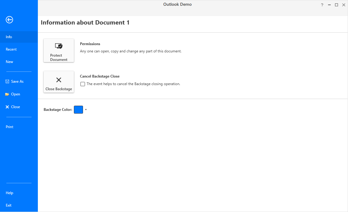
Placement support for backstage
Backstage can be opened or closed within any window or placement target specified by the users. Backstage also opens under the Ribbon tab or occupies the window or placement target’s entire client area.
Application menu
The application menu contains standard commands like the Windows Explorer. This menu appears when a user clicks the file or backstage button.

Ribbon resizing
The WPF Ribbon will resize its controls to fit within the space available in the ribbon window.

Resize based on specified order
Ribbon bars are resized according to the order specified in the ribbon tab.
Ribbon modal tabs
Modal tabs in the Ribbon control are used to temporarily display a collection of commands other than those found in the core tabs. When shown, all other core tabs will be invisible. In Microsoft Office, modal tabs are used to display print-preview commands when printing a document.

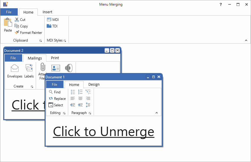
MDI merging
In the multiple document interface (MDI), parent and child forms can have their own ribbon menus and items specific to their requirements. Normally in the Ribbon, the parent form holds general commands like File, Home, Help, etc., whereas the child form holds specific and exclusive functionalities like Insert, Review, View, etc. Users can either switch between forms to operate these functionalities or merge both parent and child MDI forms to combine the ribbon menus and items within the parent form, if needed.
Load user control
Load any user control at the right side of the title bar in the ribbon window.

User customization
The WPF Ribbon control lets users customize the QAT as well as the ribbon window, its appearance, and its tabs.
QAT positioning
Place the quick access toolbar either above or below the Ribbon.
Add items to the QAT
Users can add frequently accessed commands to the QAT.

Custom QAT
Customize the QAT in a customization window by adding, removing, or reordering items.

Custom ribbon tab
Users can create a new ribbon tab by adding commands.
State persistence for user convenience
The WPF Ribbon control allows users to customize a control’s state, such as the quick access toolbar, the minimize-maximize state of the ribbon, the ribbon tab, etc. This requires the customized state to persist across application instances and when the app closes. Upon restarting, the app will again apply the state.
More Office Ribbon UI controls

Mini-toolbar
The mini-toolbar is a lightweight, floating toolbar that can be dynamically displayed and hidden in certain contexts. A good example is text editing. When users select text in the editor, you can display a mini-toolbar next to the text to quickly let users bold, italicize, or underline it.
Ribbon status bar
Display the current status of an application or document, similar to Microsoft Office.

Launcher button
The launcher button allows users to execute an action they define.
Tab-panel item
Display controls under the close button using a ribbon’s tab-panel item.
Complete keyboard accessibility
The WPF Ribbon control supports key tips for ribbon items, letting users quickly access a command in a few keystrokes. When a user presses the Alt key, key tips for commands in the current tab are displayed. Pressing a key indicated in the key tip invokes the corresponding command.

Appearance
The WPF Ribbon control supports a traditional look with Office 2007 and Office 2010 styles, and a flat look with Office 2013 and Office 2016 styles.
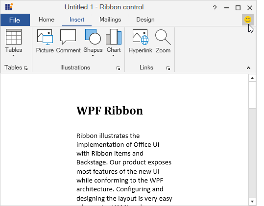
Tooltips
The WPF Ribbon control supports super tooltips, which are used to customize the default look and feel of all tooltips.
Right-to-left rendering
Right-to-left (RTL) orientation allows users to work in right-to-left languages like Hebrew, Arabic, or Persian.
Localization
Content in the Ribbon control can be formatted according to the culture.
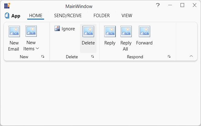
WPF Ribbon code example
Easily get started with the WPF Ribbon using a few simple lines of XAML and C# code, as demonstrated below. Also explore our WPF Ribbon example, which shows you how to render and configure the Ribbon in WPF.
<syncfusion:RibbonWindow  xmlns:syncfusion="http://schemas.syncfusion.com/wpf"
                          x:Class="RibbonDemo.MainWindow"
        xmlns="http://schemas.microsoft.com/winfx/2006/xaml/presentation"
        xmlns:x="http://schemas.microsoft.com/winfx/2006/xaml"
        xmlns:local="clr-namespace:RibbonDemo"
        mc:Ignorable="d"
        xmlns:syncfusionskin ="clr-namespace:Syncfusion.SfSkinManager;assembly=Syncfusion.SfSkinManager.WPF"
        Title="MainWindow" Height="450" Width="800"
      syncfusion:SfSkinManager.Theme="{syncfusionskin:SkinManagerExtension ThemeName=Office2013White}">
<Grid>
<syncfusion:Ribbon x:Name="_ribbon" VerticalAlignment="Top">
<syncfusion:RibbonTab Caption="HOME"  IsChecked="True">
<syncfusion:RibbonBar Name="New" Width="90"  Header="New">
<syncfusion:RibbonButton SizeForm="Large" Label="New Email"/>
</syncfusion:RibbonBar>
</syncfusion:RibbonTab>
<syncfusion:RibbonTab Caption="SEND/RCEIVE"  IsChecked="False"/>
<syncfusion:RibbonTab Caption="FOLDER"  IsChecked="False"/>
<syncfusion:RibbonTab Caption="VIEW"  IsChecked="False"/>
</syncfusion:Ribbon>
</Grid>
</syncfusion:RibbonWindow>
using Syncfusion.SfSkinManager;
using Syncfusion.Windows.Tools;
using Syncfusion.Windows.Tools.Controls;
public partial class MainWindow : RibbonWindow
{
public MainWindow()
{
InitializeComponent();
SfSkinManager.SetTheme(this, new Theme() { ThemeName = "Office2013White" });
Ribbon ribbon = new Ribbon();
ribbon.VerticalAlignment = VerticalAlignment.Top;
RibbonTab homeTab = new RibbonTab();
homeTab.Caption = "Home";
RibbonTab homeTab1 = new RibbonTab();
homeTab1.Caption = "SEND/RCEIVE";
RibbonTab homeTab2 = new RibbonTab();
homeTab2.Caption = "FOLDER";
RibbonTab homeTab3 = new RibbonTab();
homeTab3.Caption = "VIEW";
RibbonBar bar = new RibbonBar();
bar.Width = 90;
bar.Header = "New";
RibbonButton button = new RibbonButton();
button.Label = "NewEmail";
button.SizeForm = SizeForm.Large;
homeTab.Items.Add(bar);
bar.Items.Add(button);
ribbon.Items.Add(homeTab);
ribbon.Items.Add(homeTab1);
ribbon.Items.Add(homeTab2);
ribbon.Items.Add(homeTab3);
this.Content = ribbon;
}
}Not sure how to create your first WPF Ribbon? Our documentation can help.
I’d love to read it now140+ WPF CONTROLS
ALL CONTROLS
SMART COMPONENTS
DATA VISUALIZATION
MODERN THEMES
LAYOUT
NAVIGATION
INPUT CONTROLS
BUTTON
BUSINESS INTELLIGENCE
MISCELLANEOUS
LISTS & DROPDOWNS
FILE VIEWERS & EDITORS
CONVERSATIONAL UI
Standalone UI SDKs
Integrate the DataGrid, Chart, Scheduler, Gantt, Rich Text Editor, File Manager, and Diagram UI components into applications to enable rich interaction and visualization, delivering a seamless user experience.
Document Solutions
Integrate the PDF Viewer, DOCX Editor, Spreadsheet Editor, and document-processing libraries into the WPF applications to enable a smooth user experience.
Frequently Asked Questions
Why should you choose the Syncfusion WPF Ribbon?
The Syncfusion WPF Ribbon lets users:
- Choose from normal and simplified layouts.
Place frequently used items on the quick access toolbar.
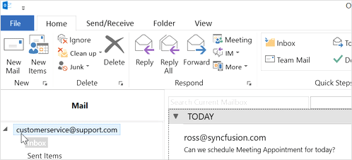
Add different tabs with the ribbon tab, like in Microsoft Outlook.
- Use the ribbon bar to structure the layouts.
- Experience the Ribbon’s improved version of the button control.
- Minimize and maximize the ribbon.
- Utilize key tips for easy keyboard navigation.
- Place status bar items on the Ribbon status bar.
- Enjoy simple configuration and API.
- Use a touch-friendly and responsive UI.
Take advantage of extensive demos and documentation to get started quickly with the WPF Ribbon.
Where can I find the Syncfusion WPF Ribbon demo?
Can I download and utilize the Syncfusion WPF Ribbon for free?
No, this is a commercial product and requires a paid license. However, a free community license is also available for companies and individuals whose organizations have less than $1 million USD in annual gross revenue, 5 or fewer developers, and 10 or fewer total employees.
How do I get started with Syncfusion WPF Ribbon?
A good place to start would be our comprehensive getting started documentation.
Our Customers Love Us
Having an excellent set of tools and a great support team, Syncfusion® reduces customers’ development time.Here are some of their experiences.

Excellent experience with Syncfusion!
Syncfusion is a product that makes life easier! I use it to create Blazor applications (server side and webassembly) and the controls speed up development a lot. Furthermore, if needed, it is possible to ask for direct support that is never long in coming!

Andrea Scarpante,

Sydea srl
The complete component set
It is the most complete component set available. Also very handy is the fact that there is a community edition, this gives me the opportunity to test thing at home without buying a separate license.

Johan Visser,

H and T Pawnbrokers
See Real Success Stories
Developers around the world trust Syncfusion’s Essential Studio to simplify complex projects and speed up delivery. With a vast library of UI controls, powerful SDKs, and reliable support, Essential Studio helps teams build enterprise-ready applications with confidence.
Read Our Customer StoriesIndustry
Software development
75% Cost reduction
50% Faster development
Industry
Utilities (oil and gas)
450+ hours saved
Streamlined processes and hours of development effort saved.
Advanced, flexible features
Empowered users through robust and versatile functionality.
Industry
Software and technology
1000+ of hours saved
Accelerated development with enterprise-ready UI components.
Efficient file management
Streamlined workflows with document libraries without building them from scratch.
Industry
Software and technology
2 Years of delay avoided
Two years of delays prevented with proactive planning.
On-time delivery
Projects delivered on schedule using trusted controls.
Industry
IT services and IT consulting
Improved performance
Large datasets handled with easy customization and quick debugging.
Highly customizable
Plug-and-play controls with quick template integration.
Industry
Professional services
Instant access
Quick availability of features and resources.
Reduced dependencies
Fewer dependencies for faster development.
Rated by users across the globe
Syncfusion WPF Resources
Learning
 Documentation
 Documentation


Awards
Greatness—it’s one thing to say you have it, but it means more when others recognize it. Syncfusion® is proud to hold the following industry awards.

