WPF Tab Control - Displaying Multiple Tabs
- Organize your content in tab pages with horizontal or vertical orientation.
- Powerful data-binding support for tab header and content.
- Users can interactively add, hide, and delete tabs.
.NET 10 support now available
Trusted by the world’s leading companies

Overview
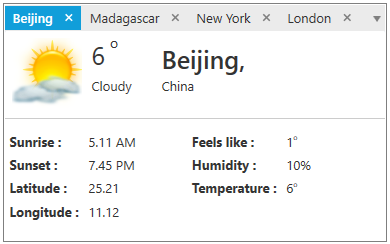
The WPF Tab Control provides an efficient interface for displaying multiple tabs and helps arrange content in a compact and organized form in less space. It provides powerful data-binding support for tab headers and content. It also provides different tab orientations, text alignment, options to hide or create new tabs, editable headers, and complete customization options.
Data binding
WPF TabControl provides powerful data binding to display tab headers and content. It allows you to design the application in an MVVM pattern such as binding selected items.

Orientation
Position the tabs horizontally at the top or bottom and vertically at the left or right. Rotate the header text in a vertical TabControl.

Closable tabs
Close tabs interactively in the UI. Display a close button for each tab like Visual Studio document tabs and also a common close button.
Pinnable tabs
Supports pinning favorite tabs for quick access and allows users to interactively pin and unpin the tabs.

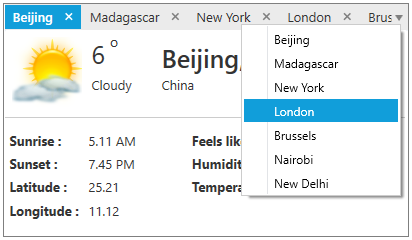
Selection
Select tabs quickly through keyboard and mouse interaction. Display all the tabs in the drop-down, like in Visual Studio, for switching among the tabs quickly when the tabs overflow the available space.
Scrollable tabs
Bring the overflow tabs into view through scroll options in the UI and swipe in a touch environment. Also scroll to the next, previous, first, and last tabs.

Style
Customize the style of each individual part of the WPF TabControl, such as its header style. Provides a rich set of built-in themes inspired by popular interfaces such as Visual Studio, Microsoft Office, and Expression Blend.

Reordering
Reorder tabs by dragging and dropping headers.

Editable header
Edit tab headers interactively in the UI by pressing the F2 function key or double-clicking on a tab header.

Multiple rows
WPF TabControl allows to arrange tab items in single or multiple rows.

Context menu
Built-in context menu options allow you to close the current tab, close other tabs except selected, and close all the tabs, similarly to the context menu options in Visual Studio.

Add tab
Add new tabs dynamically like adding new sheets in Microsoft Excel. Allows users to arrange new button in the UI at first or last position.

Localization
The WPF TabControl supports localization to translate the static text in the context menu to any desired language.

Right-to-left
WPF TabControl’s right-to-left support helps you develop applications for worldwide audiences.

WPF TabControl Code Example
Easily get started with the WPF TabControl using a few simple lines of XAML and C# code example as demonstrated below. Also explore our WPF TabControl Example that shows you how to render and configure the TabControl in WPF.
<syncfusion:TabControlExt Name="tabControlExt">
    <syncfusion:TabItemExt Header="tabItem1">
        <TextBlock Name="textBlock" Text="This is the first tab item." />
    </syncfusion:TabItemExt>
    <syncfusion:TabItemExt Header="tabItem2">
        <TextBlock Name="textBlock1" Text="This is the second tab item." />
    </syncfusion:TabItemExt>
    <syncfusion:TabItemExt Header="tabItem3">
        <TextBlock Name="textBlock2" Text="This is the third tab item." />
    </syncfusion:TabItemExt>
</syncfusion:TabControlExt>
public partial class MainWindow : Window
{
public MainWindow()
{
InitializeComponent();
// Creating an instances of tabitems and adding header & content
TabItemExt tabItemExt1 = new TabItemExt()
{
Header = "tabItem1",
Content = new TextBlock() { Text = "This is the first tab item" }
};
TabItemExt tabItemExt2 = new TabItemExt()
{
Header = "tabItem2",
Content = new TextBlock() { Text = "This is the second tab item" }
};
TabItemExt tabItemExt3 = new TabItemExt()
{
Header = "tabItem3",
Content = new TextBlock() { Text = "This is the third tab item" }
};
// Creating an instances of TabControl and adding the tabitems into the TabControl
TabControlExt tabControlExt = new TabControlExt();
tabControlExt.Items.Add(tabItemExt1);
tabControlExt.Items.Add(tabItemExt2);
tabControlExt.Items.Add(tabItemExt3);
this.Content = tabControlExt;
}
}Not sure how to create your first WPF TabControl? Our documentation can help.
I’d love to read it now140+ WPF CONTROLS
ALL CONTROLS
SMART COMPONENTS
DATA VISUALIZATION
MODERN THEMES
LAYOUT
NAVIGATION
INPUT CONTROLS
BUTTON
BUSINESS INTELLIGENCE
MISCELLANEOUS
LISTS & DROPDOWNS
FILE VIEWERS & EDITORS
CONVERSATIONAL UI
Standalone UI SDKs
Integrate the DataGrid, Chart, Scheduler, Gantt, and Diagram UI components into applications to enable rich interaction and visualization, delivering a seamless user experience.
Document Solutions
Integrate the PDF Viewer, DOCX Editor, Spreadsheet Editor, and document-processing libraries into the WPF applications to enable a smooth user experience.
Frequently Asked Questions
Why should you choose Syncfusion WPF TabControl?
Syncfusion WPF TabControl provides the following:
- Vertical and horizontal stacking of tab items with a single line of code.
Inline tab header editing with state persistence support.
- Multiline tab items arrangement.
- Disposing of items while changing tabs can be restricted.
- Inbuilt support to add new tabs dynamically with event support.
- Full MVVM support.
Pinning and unpinning of tab items.
- Smooth dragging and dropping with re-arrange support.
- A bunch of features with customization options suitable for building complex, large-scale applications.
- Rich UI interaction and keyboard navigation.
- Has a simple configuration and APIs.
- Is touch-friendly and responsive.
Learn quickly and get started with WPF TabControl using its extensive demos and documentation.
Can I download and utilize the Syncfusion WPF TabControl for free?
No, this is a commercial product and requires a paid license. However, a free community license is also available for companies and individuals whose organizations have less than $1 million USD in annual gross revenue, 5 or fewer developers, and 10 or fewer total employees.
How do I get started with Syncfusion WPF TabControl?
A good place to start would be our comprehensive getting started documentation.
Our Customers Love Us
Having an excellent set of tools and a great support team, Syncfusion® reduces customers’ development time.Here are some of their experiences.

Excellent experience with Syncfusion!
Syncfusion is a product that makes life easier! I use it to create Blazor applications (server side and webassembly) and the controls speed up development a lot. Furthermore, if needed, it is possible to ask for direct support that is never long in coming!

Andrea Scarpante,

Sydea srl
The complete component set
It is the most complete component set available. Also very handy is the fact that there is a community edition, this gives me the opportunity to test thing at home without buying a separate license.

Johan Visser,

H and T Pawnbrokers
See Real Success Stories
Developers around the world trust Syncfusion’s Essential Studio to simplify complex projects and speed up delivery. With a vast library of UI controls, powerful SDKs, and reliable support, Essential Studio helps teams build enterprise-ready applications with confidence.
Read Our Customer StoriesIndustry
Software development
75% Cost reduction
50% Faster development
Industry
Utilities (oil and gas)
450+ hours saved
Streamlined processes and hours of development effort saved.
Advanced, flexible features
Empowered users through robust and versatile functionality.
Industry
Software and technology
1000+ of hours saved
Accelerated development with enterprise-ready UI components.
Efficient file management
Streamlined workflows with document libraries without building them from scratch.
Industry
Software and technology
2 Years of delay avoided
Two years of delays prevented with proactive planning.
On-time delivery
Projects delivered on schedule using trusted controls.
Industry
IT services and IT consulting
Improved performance
Large datasets handled with easy customization and quick debugging.
Highly customizable
Plug-and-play controls with quick template integration.
Industry
Professional services
Instant access
Quick availability of features and resources.
Reduced dependencies
Fewer dependencies for faster development.
Rated by users across the globe
Syncfusion WPF Resources
Learning
 Documentation
 Documentation


Awards
Greatness—it’s one thing to say you have it, but it means more when others recognize it. Syncfusion® is proud to hold the following industry awards.

