
 Indrajith Srinivasan
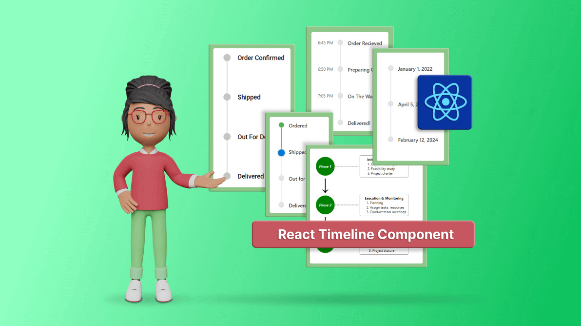
TLDR: Exploring the robust features of the new Syncfusion React Timeline, highlighting its orientation, items alignment, and customization of displaying items using templates. You can also find the steps to integrate it into your React app.
We’re delighted to introduce the new Syncfusion React Timeline component in the Essential Studio 2024 Volume 1 release.
The React Timeline component offers a visually compelling and user-friendly way to display a series of data in chronological order. It is ideal for showcasing user activities, tracking progress, narrating historical timelines, and more.
Like a roadmap infographic, a timeline displays a sequence of data that makes it easier to understand the order of events and get a clear picture of what happened and when enabling users to grasp the flow of time-related information in a web application.
In this blog, we’ll explore the key features of the React Timeline component and the steps to get started!
Use Case
The React Timeline component is perfect for a variety of scenarios, including:
- Historical Events: Showcase historical moments or company milestones with a clear, chronological display of events over different years.
- Project Progress Tracking: Effortlessly track project milestones, deadlines, and achievements, providing teams with a visual representation of progress throughout the project lifecycle.
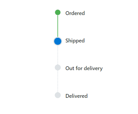
- E-commerce Journey: Guide users seamlessly through the stages of an e-commerce experience, from adding items to the cart, selecting delivery options, and completing payment to finalizing the order confirmation.
Key Features
The key features of the Timeline component are as follows:
- Orientations
- Display Additional Information
- Items alignment
- Reverse Timeline
- Customization of displaying items using templates
Orientations
The React Timeline component has two orientation modes:
- Horizontal: Displays items side-by-side.
- Vertical: Default orientation that displays items one below the other.
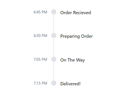
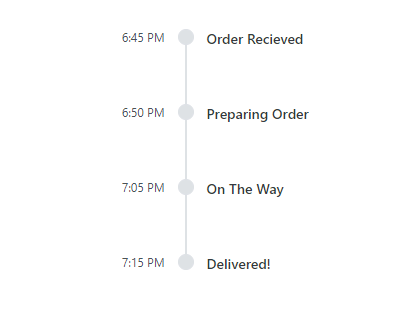
Display Additional Information
The Timeline component supports enhancing each item with supplementary information alongside the main content. Placed opposite to the main content, this additional information enriches the context of every item, making it a valuable addition to the user experience.
Items alignment
The React Timeline component supports aligning the items’ content and opposite content as follows:
- Before: Align the item content to the left (or top for horizontal orientation) and the opposite content to the right (or bottom).
- After: The default alignment aligns the item content to the right (or bottom for horizontal orientation) and the opposite content to the left (or top).
- Alternate: Align the content of the first item to the right and the opposite content to the left, and vice versa for subsequent items.
- AlternateReverse: Align the content of the first item to the left and the opposite content to the right, and vice versa for subsequent items.
Reverse Timeline
Display timeline items in reverse order, considering the alignment of items, offering flexibility and enhancing the user experience.
Customization of displaying items using templates
The React Timeline component allows you to customize the default appearance, including styling dot items and templating content, providing high flexibility and control over the timeline’s presentation.
Getting started with the React Timeline component.
Let’s create a React application and configure the Syncfusion React Timeline component.
Step 1: Create a new React application
First, ensure you have all the prerequisites to run a React app. Then, create a React app using the below command.
npx create-react-app my-app
Step 2: Adding Syncfusion packages
Syncfusion React packages are available in the NPM registry. To install the packages required for the Timeline component, use the following command.
npm install @syncfusion/ej2-react-layouts --save
Step 3: Adding CSS reference
Now, import the required CSS styles for the Timeline component and dependency styles in the src/App.css file. Refer to the following code.
@import '../node_modules/@syncfusion/ej2-base/styles/material3.css';
@import '../node_modules/@syncfusion/ej2-layouts/styles/material3.css';
Step 4: Adding Timeline component to the application
We have completed all the necessary configurations for rendering the Syncfusion React components. Now, let’s add the Timeline component by following these steps:
- Import the TimelineComponent from the ej2-react-layouts package and add the TimelineComponent tag in the App.js file.
- To define each item, you can use the ItemDirective tag inside the ItemsDirective, as shown in the following code.
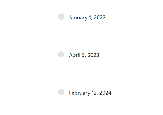
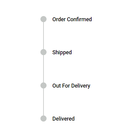
import { TimelineComponent, ItemsDirective, ItemDirective } from '@syncfusion/ej2-react-layouts';
import './App.css';

function App() {
  return (
    <div id='timeline' style={{ height: "350px" }}>
      <TimelineComponent>
          <ItemsDirective>
              <ItemDirective content='Order Confirmed' />
              <ItemDirective content='Shipped' />
              <ItemDirective content='Out For Delivery' />
              <ItemDirective content='Delivered' />
          </ItemsDirective>
      </TimelineComponent>
    </div>
  );
}

export default App;
Step 5: Running the application
Finally, run the application in the browser using the following command.
npm start
Once the web server is loaded, you can find the following output by opening the React app in the browser at port localhost:3000.
After executing the above code examples, we will get the following output.
References
For more details, refer to the React Timeline component demos and documentation.
Supported Platforms
The Timeline component is also available on the following platforms.
Platform | Live Demo | Documentation |

Conclusion
Thanks for reading! This blog shows the features of the new Syncfusion React Timeline component that rolled out in our 2024 Volume 1 release. These features are also listed on our Release Notes and the What’s New pages. Try out the component and share your feedback as comments on this blog.
You can also reach us through our support forums, support portal, or feedback portal. We’re here to assist you every step of the way!
 No spam, just valuable updates.