In every release, we work on including value-adding features to our WPF controls. In this blog, I am going to walk you through the new controls and features we intend to publish for the WPF platform in the 2019 Volume 4 release.
Text Input Layout control
We intend to put out a new control, Text Input Layout, to add decorative elements to the WPF TextBox, such as floating labels, icons, and assistive labels. The control will include the following features:
- Displays floating labels when the input view is focused on.
- Displays error labels.
- Supports none, filled, and outlined container types.
- Displays leading and trailing icons.
- Displays helper labels.
- Displays maximum character count.

DataGrid
In the DataGrid control for the upcoming release, improvements were made in providing summaries:
- Calculate the summary for selected records.
- Display the summary for columns with titles.
- Use a template for summary rows.
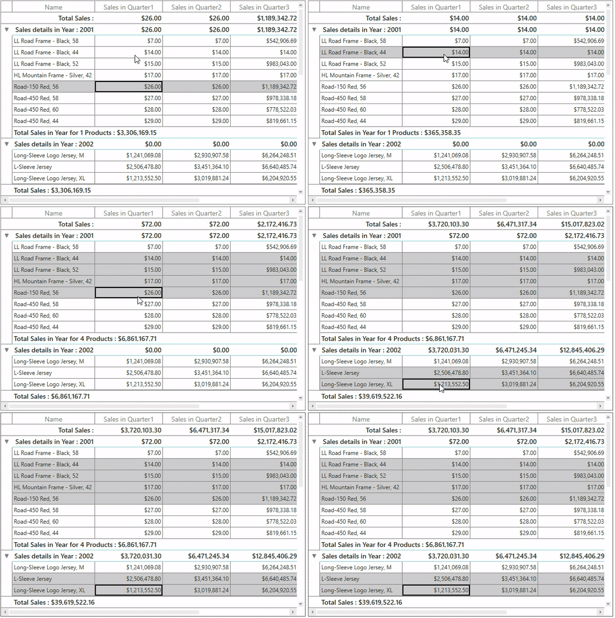
Calculate the summary for selected records
We expect to release a feature allowing you to calculate summary rows for selected records.
Display the summary for columns with titles
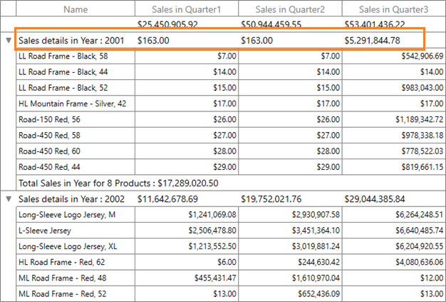
One of the most requested features for DataGrid was to show the title summary and column summary at the same time. This feature should be available for the upcoming release.
Use a template for summary rows
We intend to release a feature allowing you to use any custom view in summary rows by setting a template to any summary row (group, caption, or table summary).
Property Grid
In the Property Grid control, we intend to add the following features:
- Nested properties
- Built-in editor support
- Nullable value support
Nested properties
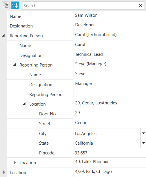
You will be able to explore the nested properties of a selected object to any level.
Built-in editor support
A built-in editor to be used for unsigned int, short, long, and TimeSpan types.
Nullable value support
A null value can be given to nullable primitive types.
Multi Column Dropdown control
We’re planning for the Multi Column Dropdown control to come out with the following features:
- Multiple row selection
- Improvement in filtering performance
Multiple row selection
Select multiple rows by interacting with check boxes in a column or within the rows. You can also select all the rows using an intuitive check box in the header.

Improvement in filtering performance
You can delay filtering or searching records in a drop-down when typing each character in the editor, so that filtering won’t be applied for each character when you type quickly.
Image editor
We expect to release the following features for Image Editor:
- Freehand drawing
- Text rotation
- Localization
- Z-index support for selected shapes and text
Freehand drawing
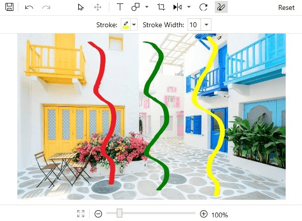
Freehand draw over an image.
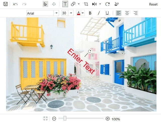
Text rotation
Rotate text added over an image.
TextBox
Performance improvement
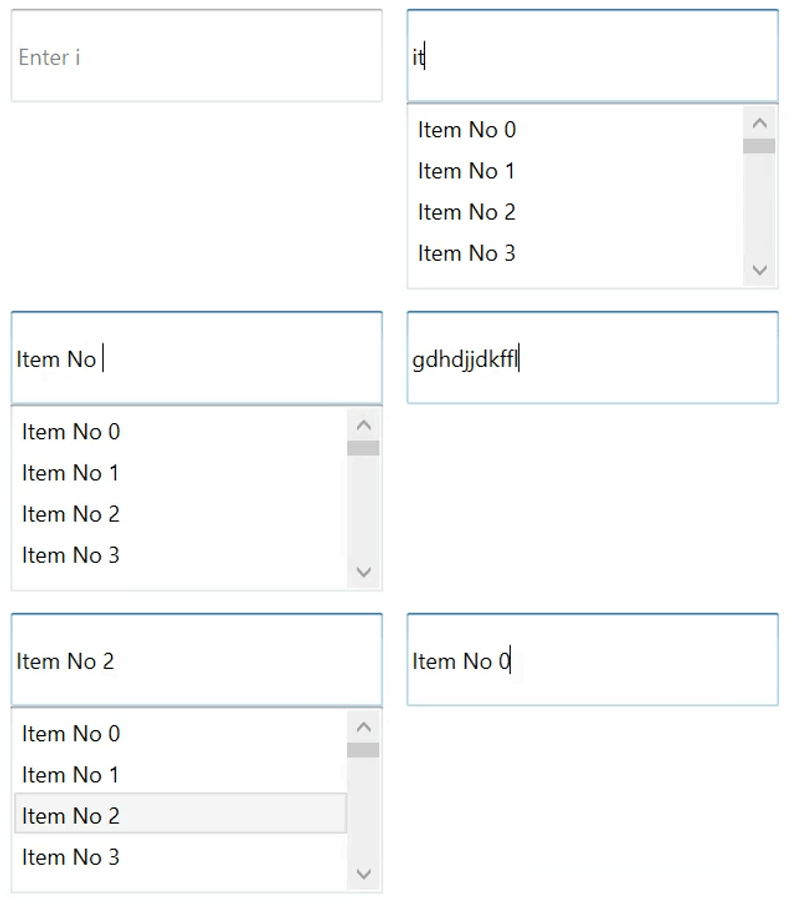
We intend to update TextBox performance while you search for text. You can expect a seamless searching experience even with more than a million items populated.
Syntax Editor
We are hoping to make the Syntax Editor available with the following features:
- Single-line mode
- SaveAs option
Single-line mode
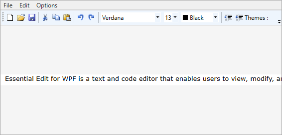
Use edit mode support that provides a single-line text box with the full functionality of the Syntax Editor and its languages.
SaveAs option
The SaveAs option allows the content to be saved as a new file or a copy of an existing file. Users can define the file name and location when saving the file.
Charts
Stacked line and 100% stacked line charts
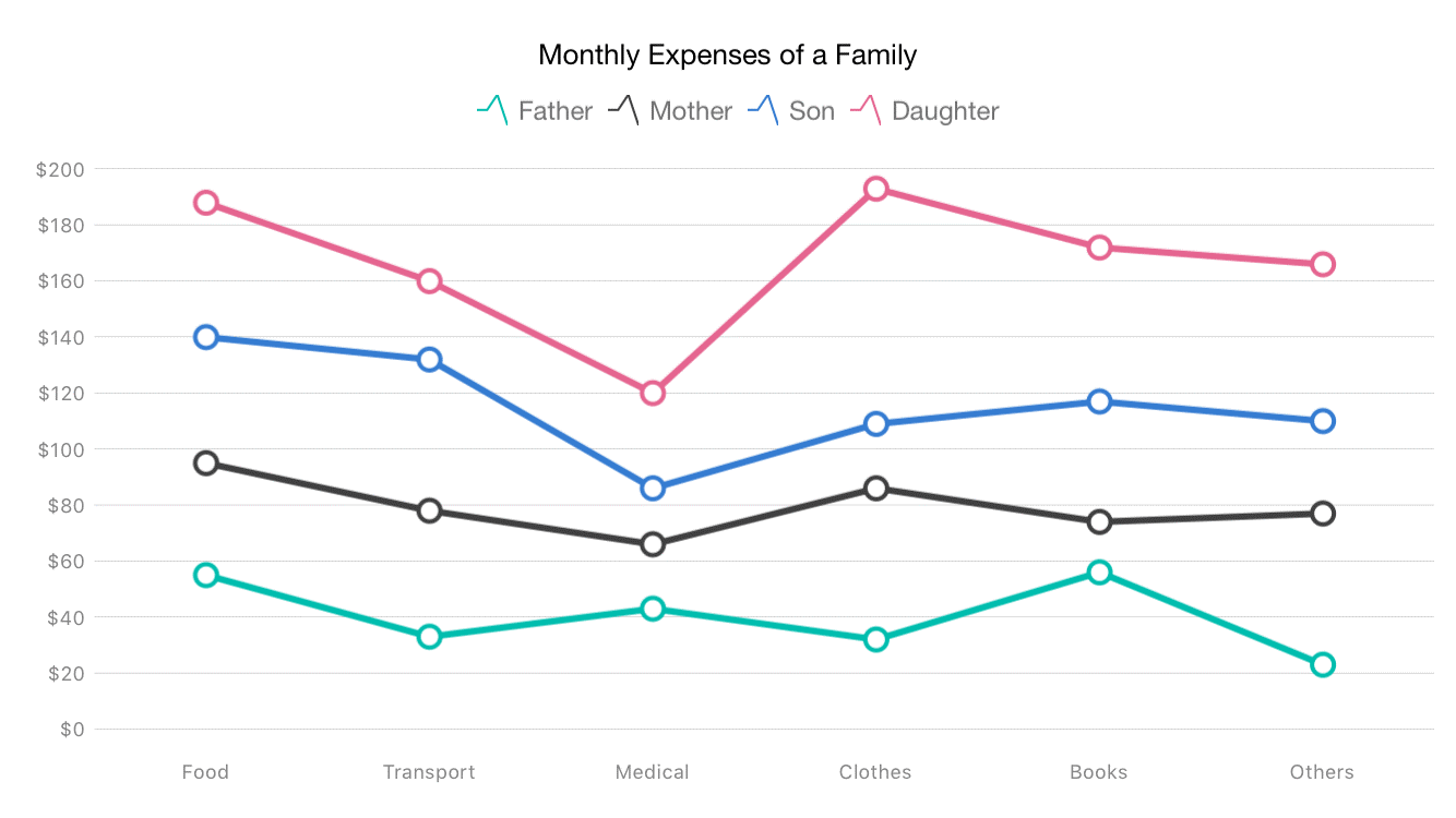
We’re planning to release new stacked line and 100% stacked line series in WPF charts. They allow users to visualize different series stacked together to show a cumulative value.
Maps
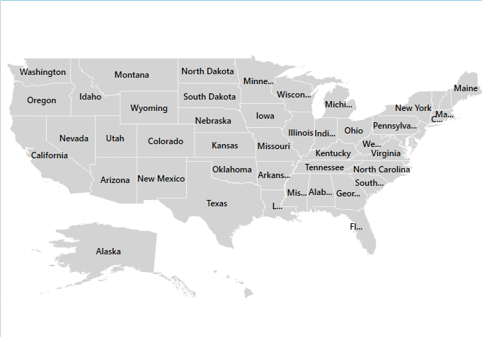
Align data labels smartly
In Maps, you can align labels smartly within shape boundaries to avoid overlapping.
Chromeless Window
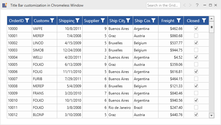
Add controls to the title bar
A new feature we intend to publish lets you add custom controls to the left and right sides of the title bar in Chromeless Window.
Conclusion
The list of new features we’re planning to release for WPF controls doesn’t stop here. We’re leaving the rest for you to explore in the official release of 2019 Volume 4, which can be expected in the third week of December.
Stay tuned to our Twitter, Facebook, and LinkedIn pages for an official announcement about the availability of the 2019 Volume 4 release. Also, we will publish detailed blog posts for each new control and major features after the release to guide you through working with them.


