
 Keerthana Rajendran
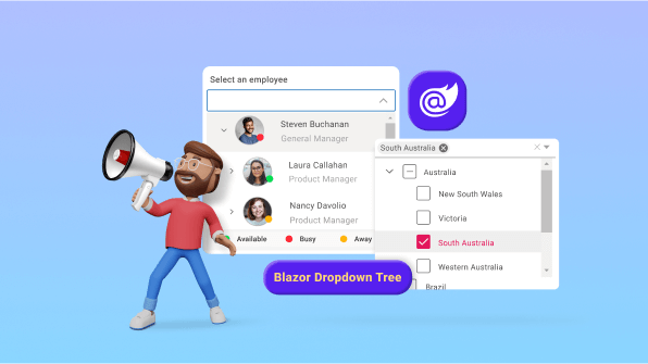
We are happy to introduce the new Blazor Dropdown Tree component in the Essential Studio® 2023 Volume 4 release in preview mode. With this control, you can render hierarchical or self-referential data in a tree-like structure. It supports keyboard interactions, and events, and provides a user-friendly interface optimized for touch interactions.
This blog will provide a walk-through of the new Blazor Dropdown Tree component, its UI designs, and its available features.
Key features
The following is the list of key features available in the Blazor Dropdown Tree component:
- Data binding
- Checkboxes
- Multi-selection
- Filtering
- Templates
- Visual mode
- Load on demand
- Preselected value and text
- Float label type
- Customization
- Form Validation
Data binding
You can bind hierarchical or self-referential data from local or remote data services and fetch the data using different kinds of adapters like Odata, Odata V4, URL, and Web API.
Note: Refer to this documentation and demo for more details on data binding.
Self-referential data binding
The Dropdown Tree can be populated from a self-referential data structure that contains a list of objects with ParentID mapping. The self-referential data can be directly assigned to the DataSource property. It will map all the field members with corresponding keys from self-referential data to the Fields property.
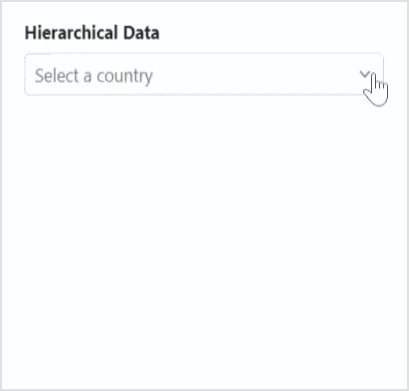
Hierarchical data binding
The Dropdown Tree can be populated with a hierarchical data source that contains a nested list of objects. Hierarchical data can be directly assigned to the DataSource property. It will map all the field members with corresponding keys from the hierarchical data to the Fields property.
Checkboxes
The Dropdown Tree component allows you to check more than one item from the tree without affecting the UI’s appearance by enabling the ShowCheckBox property. When this property is enabled, a checkbox appears before each item text in the popup.
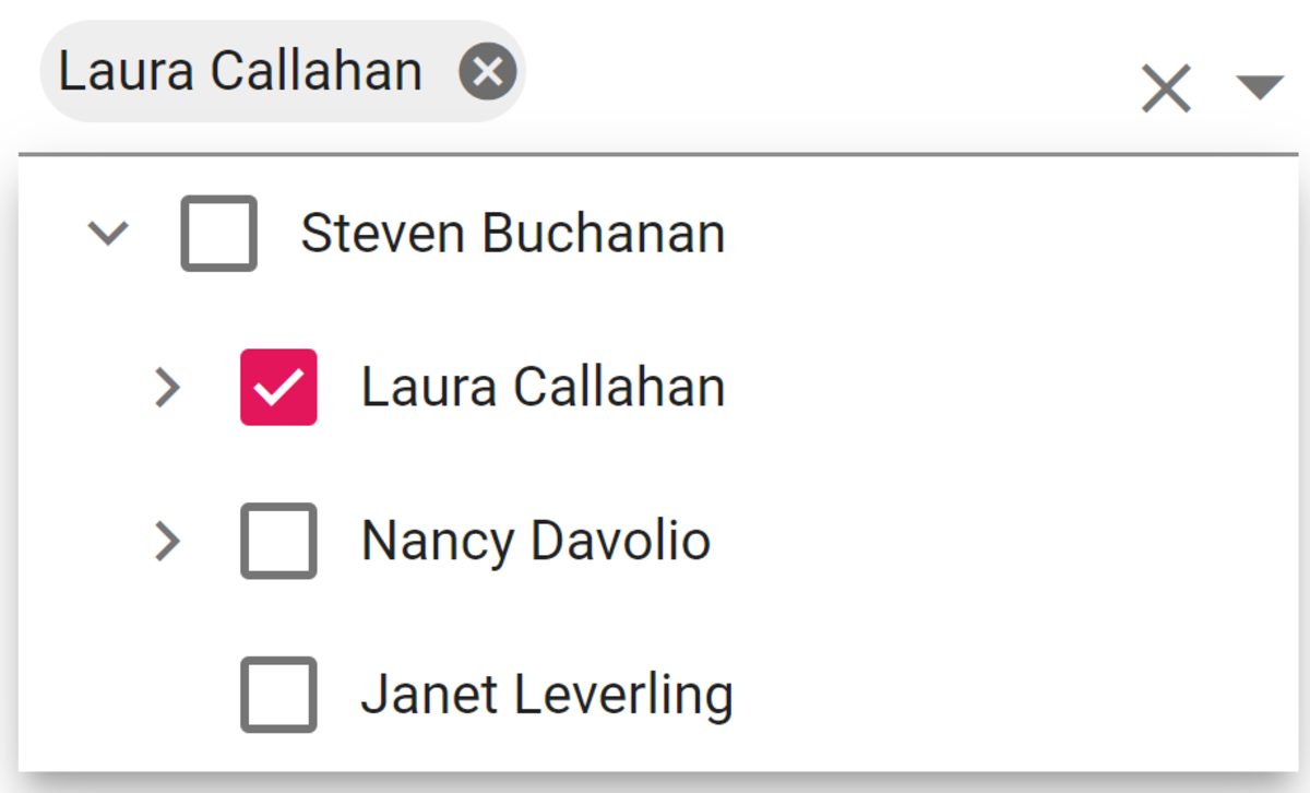
Auto check
By default, the checkbox state of the parent and child items in the Dropdown Tree will not be dependent on each other. If you need a dependent checked state, then enable the AutoUpdateCheckState property.
Note that:
- If one or more child items are not in the checked state, then the parent item will be in the intermediate state.
- If all the child items are checked, then the parent item will also be in the checked state.
- If a parent item is checked, then all the child items will also be changed to the checked state.
Multiple selection
The Dropdown Tree also supports the selection of multiple nodes by setting AllowMultiSelection to true. To perform a multi-select action, press and hold the CTRL key and click the desired nodes. To select a range of nodes, press and hold the SHIFT key and click the nodes. To select a node using the keyboard, press the component key and Enter/Space key.
Note: For more details, refer to the Multi-selection in Blazor Dropdown Tree demo and documentation.
Filtering
The Dropdown Tree has built-in support to filter data items when AllowFiltering is enabled. The filter operation starts as soon as you start typing characters in the search box. By default, the filtering is disabled.
Filter type
You can use the FilterType property to specify which filter type needs to be considered in the search action of the component. The available FilterTypes and their supported data types are:
FilterType | Description |
Checks whether an item begins with the specified value. | |
Checks whether an item ends with the specified value. | |
Checks whether an item contains the specified value. |
The Data items can be filtered with or without case sensitivity using the IgnoreCase property. Filtering with diacritic characters or accents is handled using the IgnoreAccent property. By default, the IgnoreAccent and IgnoreCase property are set to true.
Refer to the following code example.
@using Syncfusion.Blazor.Navigations
@using Syncfusion.Blazor.DropDowns
<SfDropDownTree TItem="EmployeeData" TValue="string" Placeholder="Select an employee" Width="500px"
                AllowFiltering="true" FilterType="FilterType.Contains" IgnoreCase="false" IgnoreAccent="true"
                FilterBarPlaceholder="Find a Employee">
 <DropDownTreeField TItem="EmployeeData" DataSource="Data" ID="Id" Text="Name" HasChildren="HasChild" ParentID="PId">
 </DropDownTreeField>
</SfDropDownTree>
Refer to the following image.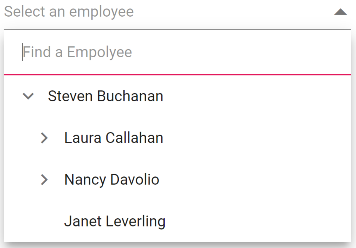
Note: For more details, refer to Filtering in Blazor Dropdown Tree demo and documentation.
Templates
The Dropdown Tree lets you customize each list item, header, footer, action, and no records template. Let’s see how to achieve this.
Header template
The header element is shown statically at the top of the pop-up list of items within the Dropdown Tree, and any custom element can be placed as a header element using the HeaderTemplate property.
Footer template
The Dropdown Tree has options to show a footer element at the bottom of the list of items in the popup list. In it, you can place any custom element as a footer element using the FooterTemplate property.
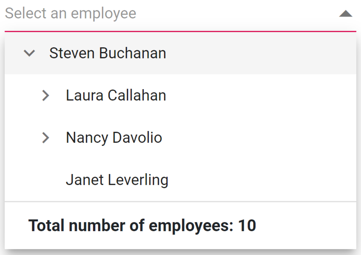
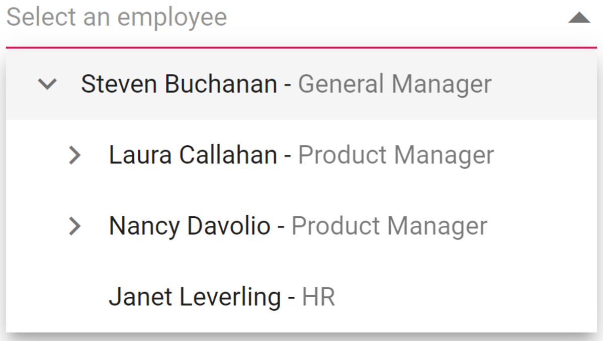
In the following code example, ItemTemplate, HeaderTemplate, and FooterTemplate properties are used.
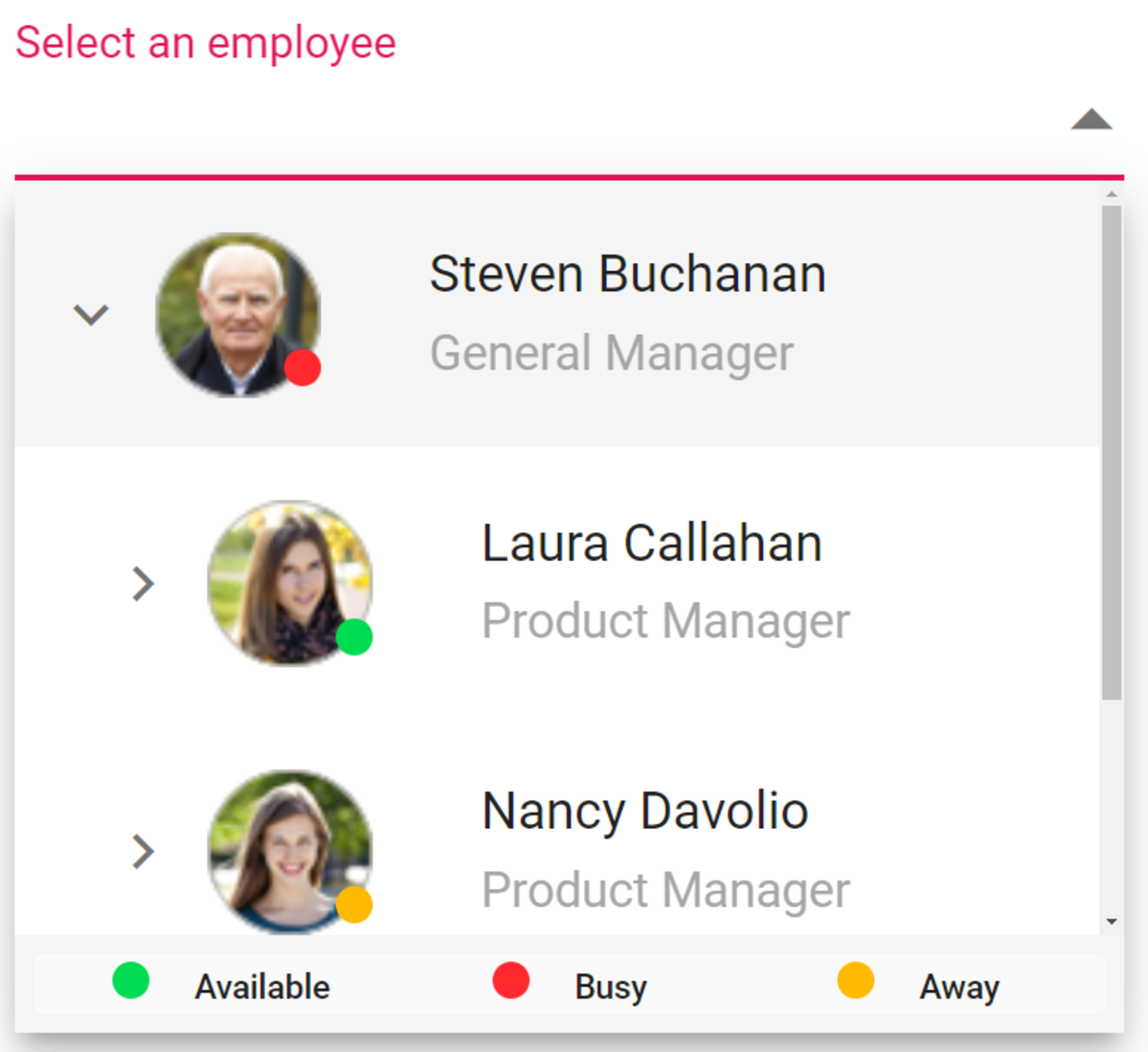
Item template
The content of each list item within the Dropdown Tree can be customized with the help of the ItemTemplate property.
In the following code example, the Dropdown Tree list items are customized with employee information such as name and job using the ItemTemplate property. The variable context holds the data of the current node.
@using Syncfusion.Blazor.Navigations
<SfDropDownTree TItem="EmployeeData" TValue="string" Placeholder="Select an employee" Width="500px" CssClass="custom">
 <ChildContent>
  <DropDownTreeField TItem="EmployeeData" DataSource="Data" ID="Id" Text="Name" HasChildren="HasChild" ParentID="PId"></DropDownTreeField>
 </ChildContent>
 <HeaderTemplate>
  <div class="head"> Employee List </div>
 </HeaderTemplate>
 <ItemTemplate>
  <div>
   <span class="ename">@((context as EmployeeData).Name) - </span>
   <span class="ejob" style="opacity: .60">@((context as EmployeeData).Job)</span>
  </div>
 </ItemTemplate>
 <FooterTemplate>
  <span class='foot'> Total number of employees:  @Data?.Count.ToString()</span>
 </FooterTemplate>
</SfDropDownTree>
@code {
    List<EmployeeData> Data = new List<EmployeeData>
    {
        new EmployeeData() { Id = "1", Name = "Steven Buchanan", Job = "General Manager", HasChild = true, Expanded = true },
        new EmployeeData() { Id = "2", PId = "1", Name = "Laura Callahan", Job = "Product Manager", HasChild = true },
        new EmployeeData() { Id = "3", PId = "2", Name = "Andrew Fuller", Job = "Team Lead", HasChild = true },
        new EmployeeData() { Id = "4", PId = "3", Name = "Anne Dodsworth", Job = "Developer" },
        new EmployeeData() { Id = "10", PId = "3", Name = "Lilly", Job = "Developer" },
        new EmployeeData() { Id = "5", PId = "1", Name = "Nancy Davolio", Job = "Product Manager", HasChild = true },
        new EmployeeData() { Id = "6", PId = "5", Name = "Michael Suyama", Job = "Team Lead", HasChild = true },
        new EmployeeData() { Id = "7", PId = "6", Name = "Robert King", Job = "Developer" },
        new EmployeeData() { Id = "11", PId = "6", Name = "Mary", Job = "Developer" },
        new EmployeeData() { Id = "9", PId = "1", Name = "Janet Leverling", Job = "HR"}
    };
    class EmployeeData
    {
        public string Id { get; set; }
        public string Name { get; set; }
        public string Job { get; set; }
        public bool HasChild { get; set; }
        public bool Expanded { get; set; }
        public string PId { get; set; }
    }
}
<style>
    .custom .head {
        height: 40px;
        line-height: 40px;
        font-size: 14px;
        margin: 0 auto;
        width: 100%;
        padding: 0 20px;
        font-weight: bold;
        border-bottom: 1px solid #e0e0e0;
    }
    .custom .foot {
        line-height: 40px;
        font-size: 14px;
        margin: 0 auto;
        padding: 0 20px;
        font-weight: bold;
    }
    .custom .e-ddt-footer {
        border-top: 1px solid #e0e0e0;
    }
</style>
Refer to the following image.
No records and action failure template
You can customize the design of the popup list content when no data is found on search with the help of the NoRecordsTemplate property. The ActionFailureTemplate property is used to customize the design of the popup list content when the data fetch request fails at the remote server.
Note: For more details, refer to Templates in Blazor Dropdown Tree demo and documentation.
Visual modes
You can change the visual mode of selected items in the text box when ShowCheckBox or AllowMultiSelection property is enabled. There are three types of visual modes.
Mode | Description |
Selected items will be visualized in chip format. | |
Selected items will be visualized in the text content. | |
When focused on, the component will act in the box mode. When blurred, the component will act in delimiter mode. |
Refer to the following code example.
@using Syncfusion.Blazor.Navigations
<SfDropDownTree TItem="EmployeeData" TValue="string" Placeholder="Select an employee" Width="500px" ShowCheckBox="true" Mode="DdtVisualMode.Box">
 <DropDownTreeField TItem="EmployeeData" DataSource="Data" ID="Id" Text="Name" HasChildren="HasChild" ParentID="PId"></DropDownTreeField>
</SfDropDownTree>
Refer to the following image.
Load on demand
The Blazor Dropdown Tree supports the load-on-demand (Lazy load) feature. It reduces the bandwidth size when consuming a huge amount of data. It loads first-level nodes initially, and when the parent node is expanded, it loads the child nodes based on the ParentID/Child member. By default, the LoadOnDemand is set to false.
Preselected value and text
You set the preselected value using the Value and Text properties.
Value
It is a two-way binding property. You can set the value in the List<TValue> type. You can also add multiple values using this property.
@using Syncfusion.Blazor.Navigations
<SfDropDownTree TItem="EmployeeData" TValue="string" Placeholder="Select an employee" Width="500px" ShowCheckBox="true" Value="@(new List<string>(){"1"})">
 <DropDownTreeField TItem="EmployeeData" DataSource="Data" ID="Id" Text="Name" HasChildren="HasChild" ParentID="PId"></DropDownTreeField>
</SfDropDownTree>
Text
You can set the value in string type. To select multiple items, use commas between them.
@using Syncfusion.Blazor.Navigations
<SfDropDownTree TItem="EmployeeData" TValue="string" Placeholder="Select an employee" Width="500px" ShowCheckBox="true" Text="Steven Buchanan, Nancy Davolio">
 <DropDownTreeField TItem="EmployeeData" DataSource="Data" ID="Id" Text="Name" HasChildren="HasChild" ParentID="PId"></DropDownTreeField>
</SfDropDownTree>
Float label types
You can set the behavior of the placeholder using the FloatLabelType property. By default, FloatLabelType is Never.
There are three types of float labels.
Type | Description |
The floating label will always float above the input. | |
The floating label will float above the input after focusing or entering a value in the input. | |
The label will never float in the input when the placeholder is available. |
Refer to the following code example.
@using Syncfusion.Blazor.Navigations
@using Syncfusion.Blazor.Inputs
<SfDropDownTree TItem="EmployeeData" TValue="string" Placeholder="Select an employee" Width="500px" FloatLabelType="FloatLabelType.Auto">
 <DropDownTreeField TItem="EmployeeData" DataSource="Data" ID="Id" Text="Name" HasChildren="HasChild" ParentID="PId"></DropDownTreeField>
</SfDropDownTree>
Refer to the following image.
Customization
You can customize the popup height and width using PopupHeight and PopupWidth properties. The default value of PopupHeight is 300px, and PopupWidth is 100%. You can set the width of the component using the Width property. The default value is 100%. You can also add additional attributes to the container element using the HtmlAttributes property.
Refer to the following code example.
@using Syncfusion.Blazor.Navigations
<SfDropDownTree TItem="EmployeeData" TValue="string" Placeholder="Select an employee" Width="500px" HtmlAttributes="@htmlAttribute">
 <DropDownTreeField TItem="EmployeeData" DataSource="Data" ID="Id" Text="Name" HasChildren="HasChild" ParentID="PId"></DropDownTreeField>
</SfDropDownTree>
@code {
    List<EmployeeData> Data = new List<EmployeeData>
    {
        new EmployeeData() { Id = "1", Name = "Steven Buchanan", Job = "General Manager", HasChild = true, Expanded = true },
        new EmployeeData() { Id = "2", PId = "1", Name = "Laura Callahan", Job = "Product Manager", HasChild = true },
        new EmployeeData() { Id = "3", PId = "2", Name = "Andrew Fuller", Job = "Team Lead", HasChild = true },
        new EmployeeData() { Id = "4", PId = "3", Name = "Anne Dodsworth", Job = "Developer" },
        new EmployeeData() { Id = "10", PId = "3", Name = "Lilly", Job = "Developer" },
        new EmployeeData() { Id = "5", PId = "1", Name = "Nancy Davolio", Job = "Product Manager", HasChild = true },
        new EmployeeData() { Id = "6", PId = "5", Name = "Michael Suyama", Job = "Team Lead", HasChild = true },
        new EmployeeData() { Id = "7", PId = "6", Name = "Robert King", Job = "Developer" },
        new EmployeeData() { Id = "11", PId = "6", Name = "Mary", Job = "Developer" },
        new EmployeeData() { Id = "9", PId = "1", Name = "Janet Leverling", Job = "HR"}
    };
     Dictionary<string, object> htmlAttribute = new Dictionary<string, object>()
    {
        {"class", "e-employee" },
        {"style", "background-color: #0bebd6; text-align: right" },
        {"title", "Syncfusion DropDownTree" }
    };
    class EmployeeData
    {
        public string Id { get; set; }
        public string Name { get; set; }
        public string Job { get; set; }
        public bool HasChild { get; set; }
        public bool Expanded { get; set; }
        public string PId { get; set; }
    }
}
Form validations
The Dropdown Tree component can be used inside an EditForm to create a form that includes a list for selecting an option. The edit form component validates all data annotation rules using the data annotations validator component. If the Dropdown Tree input is valid, the form is ready to be submitted. If the input is invalid, an error message will be displayed until a valid value is chosen.
Note: For more details, refer to the Form validation in Blazor Dropdown Tree demo and documentation.
Use cases
Let’s see some of the use cases of this new component!
E-commerce category navigation
An online retail store can implement the Dropdown Tree to organize and display products based on categories and subcategories. This helps users easily navigate through the store’s offerings, finding the products they are interested in efficiently.
Filtering in e-commerce or search platforms
Online marketplaces or search platforms can use the Dropdown Tree to allow users to filter search results based on various criteria. For example, a travel website might use a dropdown tree to filter destinations by continent, country, and city.
Upcoming features
The Blazor Dropdown Tree component is now available in preview mode, and we plan to include the following features in our future releases:
- Custom template: Customize the selected values.
- Wrap text: To wrap multiple lines in a single node.
- Get tree view data: To get the complete data of the component.
- Refresh: To refresh the component whenever any re-rendering is required.
How to use it
To integrate the Blazor Dropdown Tree component into your Blazor app, follow the instructions in the getting started documentation. Check out our live demos for more guidance.
Conclusion
Thanks for reading! We hope you enjoyed this quick introduction to the design and available features of the new Blazor Dropdown Tree component available in the 2023 Volume 4 release. Give it a try, and provide your valuable feedback.
Check out our Release Notes and What’s New pages to see other controls and features available with this release. For existing Syncfusion customers, the new version is available on the License and Downloads page. If you’re not yet our customer, you can sign up for a 30-day free trial to evaluate these features.
For questions, you can reach us through our support forums, support portal, or feedback portal.


 No spam, just valuable updates.
Comments (1)
Thanks for sharing!