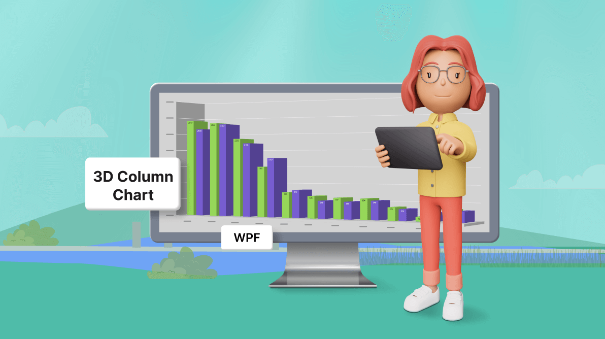
TLDR: Gathering and visualizing the data on Panama Canal shipment traffic using the Syncfusion WPF 3D Column Chart, customizing the chart’s title, axis, position, data labels, and other elements for enhanced insights.
Welcome to our Chart of the Week blog series!
Today, we will visually compare the number of Panama Canal transits in 2022 and 2023 using the Syncfusion WPF 3D Chart control.
The Panama Canal, a crucial waterway that connects the Atlantic and Pacific Oceans, acts as a vital route for global trade. It facilitates the passage of ships carrying various goods and commodities. Understanding the traffic flow through the Panama Canal is crucial for stakeholders in the shipping industry, policymakers, and economists. It helps them monitor trends, plan logistics, and make informed decisions.
We’ll dive into leveraging the Syncfusion WPF 3D Column Chart control capabilities to illustrate and analyze the trends in Panama Canal transits effectively.
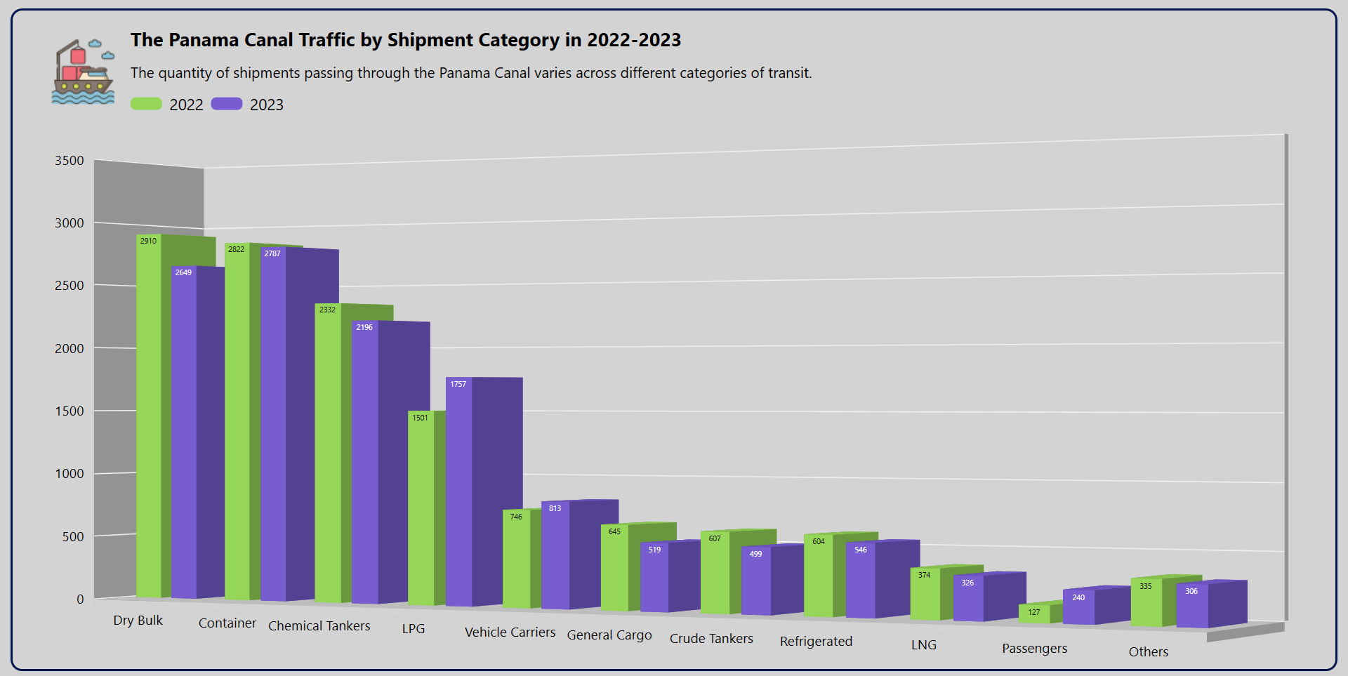
Refer to the following image.
Step 1: Gathering the transit data
Before creating the chart, we need to gather data from the Panama Canal Authority’s report. This is a crucial step, laying the foundation for the subsequent analysis and visualization of the data using the Syncfusion WPF 3D Charts control.
Step 2: Populate data for the chart
Let’s define a data model to organize our data efficiently.
Create a TransitModel class to represent each data point and a ViewModel class to handle the entire dataset.
Refer to the following code example.
public class TransitModel
{
    public string? Category { get; set; }
    public double NumberOfCrossing2022 {  get; set; }
    public double NumberOfCrossing2023 { get; set; }

    public TransitModel(string category, double numberOfCrossing2023,
double numberOfCrossing2022)
    {
        Category = category;
        NumberOfCrossing2023 = numberOfCrossing2023;
        NumberOfCrossing2022 = numberOfCrossing2022;
    }
}
The ViewModel class uses an ObservableCollection of TransitModel instance to store yearly transit data.
Refer to the following code example.
public class ViewModel
{
    public ObservableCollection<TransitModel> TransitData {  get; set; }

    public ViewModel()
    {
        TransitData = new ObservableCollection<TransitModel>();
        TransitData.Add(new TransitModel("Dry Bulk", 2649, 2910));
        TransitData.Add(new TransitModel("Container", 2787, 2822));
        TransitData.Add(new TransitModel("Chemical Tankers", 2196, 2332));
        TransitData.Add(new TransitModel("LPG", 1757, 1501));
        TransitData.Add(new TransitModel("Vehicle Carriers", 813, 746));
        TransitData.Add(new TransitModel("General Cargo", 519, 645));
        TransitData.Add(new TransitModel("Crude Tankers", 499, 607));
        TransitData.Add(new TransitModel("Refrigerated", 546, 604));
        TransitData.Add(new TransitModel("LNG", 326 ,374));
        TransitData.Add(new TransitModel("Passengers", 240, 127));
        TransitData.Add(new TransitModel("Others", 306, 335));
    }
}
These classes facilitate the organization and management of transit data.
Step 3: Configuring Syncfusion WPF 3D Chart
Let’s configure the Syncfusion WPF 3D Chart control using this documentation.
Refer to the following code example.
<chart:SfChart3D>
 <chart:SfChart3D.PrimaryAxis>
  <chart:CategoryAxis3D>
 </chart:CategoryAxis3D>
</chart:SfChart3D.PrimaryAxis>

<chart:SfChart3D.SecondaryAxis>
 <chart:NumericalAxis3D>
  </chart:NumericalAxis3D>
 </chart:SfChart3D.SecondaryAxis>
</chart:SfChart3D>
Step 4: Binding data to the WPF 3D Column Chart
Let’s bind the Panama Canal’s yearly transit data using the Syncfusion WPF ColumnSeries3D instance.
In this example, we’ll generate two instances of ColumnSeries3D to depict the data for the years 2022 and 2023.
<chart:ColumnSeries3D ItemsSource="{Binding TransitData}"
                      XBindingPath="Category"
                      YBindingPath="NumberOfCrossing2022">
</chart:ColumnSeries3D>

<chart:ColumnSeries3D ItemsSource="{Binding TransitData}"
                      XBindingPath="Category"
                      YBindingPath="NumberOfCrossing2023">
</chart:ColumnSeries3D>
In the previous code example, we’ve bound the TransitData property to the ItemsSource property. The XBindingPath and YBindingPath properties are bound to the Category, NumberOfCrossing2022, and NumberOfCrossing2023 properties, respectively.
Step 5: Customizing the chart’s appearance
To further refine the visual aesthetics of our chart, we can enhance the chart elements, such as including a chart title, positioning the chart, enabling a legend, and customizing various aspects like series, axis, and chart elements.
Chart positioning
Let’s customize the 3D Column Chart’s appearance using the following properties:
- Depth: To control the depth of field in the 3D view of the chart. It determines the distance over which objects in the chart are rendered with clarity and sharpness, influencing the perception of depth in the visualization.
- EnableRotation: To turn on or off the ability to rotate the 3D chart interactively. When enabled, users can manipulate the chart’s rotation using input devices such as a mouse or touch screen.
- PerspectiveAngle: To control the perspective view of the chart. The perspective angle determines how much this effect needs to be applied to the chart.
- Rotation: To control the rotation angle of the 3D chart. It allows users to adjust the chart’s orientation along the specified axis, providing a different data visualization perspective.
Refer to the following code example.
<chart:SfChart3D Margin="-25,0,5,5"
                 Depth="200"
                 EnableRotation="True"
                 PerspectiveAngle="50"
                 Rotation="29"
                 SideBySideSeriesPlacement="True"
                 Background="Transparent">
</chart:SfChart3D>
Chart title customization
Adding a title to the chart can help users understand the data being visualized. Here’s how we can customize the chart title.
Refer to the following code example.
<chart:SfChart3D.Header>
 <Grid Margin="-100,0,0,3" x:Name="header" Grid.Column="0" HorizontalAlignment="Left">
  <Grid.ColumnDefinitions>
   <ColumnDefinition Width="70"/>
   <ColumnDefinition Width="*"/>
  </Grid.ColumnDefinitions>

  <ContentPresenter  Grid.Column="0">
   <ContentPresenter.Content>
    <Image Source="Resources\ship.png"></Image>
   </ContentPresenter.Content>
  </ContentPresenter>

  <Grid Grid.Column="1" >
   <Grid.RowDefinitions>
    <RowDefinition></RowDefinition>
    <RowDefinition></RowDefinition>
   </Grid.RowDefinitions>
   <StackPanel Grid.Row="0" Margin="5,0,0,0" HorizontalAlignment="Left" Orientation="Vertical">
    <Label Content="The Panama Canal Traffic by Shipment Category in 2022-2023" FontSize="18" FontFamily="AntaRegular" FontWeight="Bold"/>
    <Label Content="The quantity of shipments passing through the Panama Canal varies across different categories of transit." FontSize="14" Margin="0,2,0,0" FontFamily="AntaRegular"/>
   </StackPanel>

   <StackPanel Grid.Row="1"  Orientation="Horizontal" Margin="10,5,0,5">
    <Rectangle Height="12" Width="30" RadiusX="5" RadiusY="5" Fill="#96D759" />
    <TextBlock Text="2022" FontSize="15" Margin="7,0,0,0" />
    <Rectangle Height="12" Width="30" RadiusX="5" RadiusY="5" Fill="#775DD0" Margin="7,0,0,0" />
    <TextBlock Text="2023" Margin="7,0,0,0" FontSize="15"/>
   </StackPanel>
  </Grid>
 </Grid>
</chart:SfChart3D.Header>
Chart axis customization
Here, we will enhance the appearance of the chart axis by employing the following properties:
- ShowGridLines: To customize the visibility of the major grid lines.
- LabelStyle: To adjust the style of the axis labels.
- TickLineSize: To adjust the size of the axis tick lines.
Refer to the following code example.
<chart:SfChart3D.PrimaryAxis>
 <chart:CategoryAxis3D TickLineSize="0" ShowGridLines="False">
  <chart:CategoryAxis3D.LabelStyle>
   <chart:LabelStyle FontSize="12.8"/>
  </chart:CategoryAxis3D.LabelStyle>
 </chart:CategoryAxis3D>
</chart:SfChart3D.PrimaryAxis>

<chart:SfChart3D.SecondaryAxis >
 <chart:NumericalAxis3D TickLineSize="0" Interval="500" Maximum="3500">
  <chart:NumericalAxis3D.LabelStyle>
   <chart:LabelStyle FontSize="12.9"/>
  </chart:NumericalAxis3D.LabelStyle>
 </chart:NumericalAxis3D>
</chart:SfChart3D.SecondaryAxis>
Customizing the 3D Column series appearance
Elevate the series’ visual appeal by assigning distinct interior colors to each series and configuring segment spacing for better visualization.
<chart:ColumnSeries3D Interior="#96D759"
                       SegmentSpacing="0.3">
</chart:ColumnSeries3D>

<chart:ColumnSeries3D Interior="#775DD0"
                       SegmentSpacing="0.3" >
</chart:ColumnSeries3D>
Step 6: Adding data labels to the chart
We can customize the chart segments’ data label using the ChartAdornmentsInfo3D property of the ColumnSeries3D class.
<chart:ColumnSeries3D>
 <chart:ColumnSeries3D.AdornmentsInfo>
  <chart:ChartAdornmentInfo3D ShowLabel="True" FontSize="7" Margin="0,0.1,0,0" LabelPosition="Inner"/>
 </chart:ColumnSeries3D>
By implementing these customizations, we can transform the 3D column chart into a visually striking representation of Panama Canal traffic, enriched with insightful details and clarity.
After executing the previous code examples, we’ll get an output like the one in the following image.
GitHub reference
For more details, refer to the project on GitHub.
Conclusion
Thanks for reading! In this blog, we’ve visualized and compared the Panama Canal shipment transit data for 2022 and 2023 using the Syncfusion WPF 3D Column Chart. Please follow the steps outlined in this blog and share your feedback in the comments section below.
The existing customers can download the new version of Essential Studio on the License and Downloads page. If you are not a Syncfusion customer, try our 30-day free trial to check out our incredible features.
If you need assistance, please do not hesitate to contact us through our support forum, support portal, or feedback portal. We are always ready and willing to help you!
Related blog
- Chart of the Week: Creating a WPF Chart Dashboard to Visualize the 2023 World Billionaires List
- Harmonizing Powerhouses: Syncfusion WPF Controls Are Now Compatible with Avalonia XPF
- Streamline Your WPF Development with Syncfusion: Introducing the WPF Template Studio for Visual Studio
- Visualize JSON Data Quickly Using WPF Charts