

Welcome to our Chart of the Week blog series.
This time, we’ll visualize the global distribution of cloud provider data centers using the Syncfusion WinUI 100% stacked column chart control.
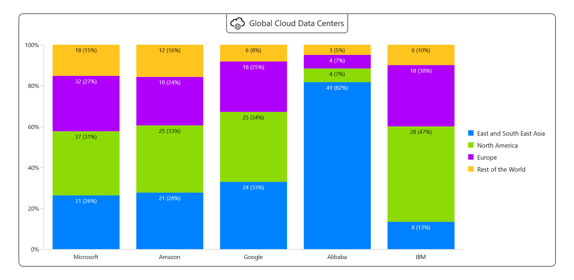
Microsoft, Amazon, Google, Alibaba, and IBM have spread their global cloud data centers across Asia, North America, and Europe. Refer to the following chart image.
 Let’s see the steps to recreate this chart using the Syncfusion 100% stacked column chart.
Step 1: Gather the data
Let’s gather the data on data center providers from Cloud Myths. Specifically, we are using page 16.
Step 2: Prepare the data for the chart
Next, define the CloudDataCenter class with the Cloud, South-East Asia, North America, Europe, and other properties to store the count for cloud providers.
public class CloudDataCenter
{
   public string Cloud { get; set; }
   public double SoutheastAsia { get; set; }
   public double NorthAmerica { get; set; }
   public double Europe { get; set; }
   public double Others { get; set; }
}
Generate the data collection demonstrating the data providers’ source using the DataCenterPercentage class.
public class DataCenterPercentage
{
   public ObservableCollection<CloudDataCenter> CloudData { get; set; }
   public DataCenterPercentage()
   {
       CloudData = new ObservableCollection<CloudDataCenter>()
       {
             new CloudDataCenter() { Cloud = "Microsoft", SoutheastAsia = 31,NorthAmerica = 37,Europe = 32, Others = 18},
             new CloudDataCenter() { Cloud = "Amazon", SoutheastAsia = 21, NorthAmerica = 25,Europe = 18, Others = 12},
             new CloudDataCenter() { Cloud = "Google", SoutheastAsia = 24, NorthAmerica = 25, Europe = 18, Others = 6 },
             new CloudDataCenter() { Cloud = "Alibaba", SoutheastAsia = 49, NorthAmerica = 4, Europe = 4, Others = 3},
             new CloudDataCenter() { Cloud = "IBM", SoutheastAsia = 8, NorthAmerica = 28, Europe = 18, Others = 6 },
        };
   }
}
Step 3: Configure the Syncfusion WinUI Cartesian Charts control
Let’s configure the Syncfusion WinUI Cartesian Charts control using this documentation.
Refer to the following code example.
<chart:SfCartesianChart>
 <chart:SfCartesianChart.XAxes>
  <chart:CategoryAxis/>
 </chart:SfCartesianChart.XAxes>

 <chart:SfCartesianChart.YAxes>
  <chart:NumericalAxis/>
 </chart:SfCartesianChart.YAxes>
</chart:SfCartesianChart>
Step 4: Bind the data to WinUI 100% stacked column chart
Create multiple 100 % stacked column series to display the number and percentage for the distribution of data centers.
The following code example demonstrates how to bind the cloud data to our chart.
<!--Series 1 -->
<chart:StackedColumn100Series ItemsSource="{Binding CloudData}" XBindingPath="Cloud" YBindingPath="SoutheastAsia" Label="East and South East Asia">
</chart:StackedColumn100Series>

<!--Series 2 -->
<chart:StackedColumn100Series ItemsSource="{Binding CloudData}" XBindingPath="Cloud" YBindingPath="NorthAmerica" Label="North America">
</chart:StackedColumn100Series>

<!--Series 3 -->
<chart:StackedColumn100Series ItemsSource="{Binding CloudData}" XBindingPath="Cloud" YBindingPath="Europe" Label="Europe">
</chart:StackedColumn100Series>

<!--Series 4 -->
<chart:StackedColumn100Series ItemsSource="{Binding CloudData}" XBindingPath="Cloud" YBindingPath="Others" Label="Rest of the World">
</chart:StackedColumn100Series>
Step 5: Customize the chart appearance
We can enhance the appearance of our chart by customizing its features, such as the title, axis elements, column colors, legend, and data labels.
We can more easily understand the data plotted on the chart by adding a title. Refer to the following code example.
<chart:SfCartesianChart.Header>
 <Border Margin="0,-10,0,20" Padding="7" BorderThickness="2,0,2,2" CornerRadius="0,0,7,7" Border-Brush="#79747E">
  <StackPanel Orientation="Horizontal">
   <Path Data="{StaticResource PathData}" Fill="Black" VerticalAlignment="Center" HorizontalAlign-ment="Center"/>
   <TextBlock Text="Global Cloud Data Centers" Margin="10,0,0,0"/>
  </StackPanel>
 </Border>
</chart:SfCartesianChart.Header>
Let’s customize the axis label style and set the interval type, font size, and other properties.
<chart:SfCartesianChart.XAxes>
 <chart:CategoryAxis LabelPlacement="BetweenTicks" ShowMajorGridLines="False" TickLineSize="0">
  <chart:CategoryAxis.LabelStyle>
   <chart:LabelStyle FontSize="13"/>
  </chart:CategoryAxis.LabelStyle>
 </chart:CategoryAxis>
</chart:SfCartesianChart.XAxes>

<chart:SfCartesianChart.YAxes>
 <chart:NumericalAxis Interval="20" ShowMajorGridLines="False">
  <chart:NumericalAxis.LabelStyle>
   <chart:LabelStyle LabelFormat="0'%" FontSize="13"/>
  </chart:NumericalAxis.LabelStyle>
 </chart:NumericalAxis>
</chart:SfCartesianChart.YAxes>
Refer to the following code example to configure the 100% stacked column chart color.
XML
<chart:SfCartesianChart PaletteBrushes="{Binding CustomBrushes}">
</chart:SfCartesianChart>
C#
public class DataCenterPercentage
{
   public List<Brush> CustomBrushes{ get; set; }

   public DataCenterPercentage ()
   {
      CustomBrushes = new List<Brush>()
      {
         new SolidColorBrush(Color.FromArgb(0xFF, 0x00, 0x81, 0xFF)),
         new SolidColorBrush(Color.FromArgb(0xFF, 0x8C, 0xDB, 0x07)),
         new SolidColorBrush(Color.FromArgb(0xFF, 0xAF, 0x00, 0xFB)),
         new SolidColorBrush(Color.FromArgb(0xFF, 0xFF, 0xC5, 0x1E)),
      };
   }
}
Refer to the following code example to enable and customize the legend, which indicates the region of the data centers.
<chart:SfCartesianChart.Legend>
 <chart:ChartLegend Placement="Right" ItemMargin="4"/>
</chart:SfCartesianChart.Legend>
Then, enable and customize the data labels for each series in the chart, as shown in the following code example.
<!--Series 1 -->
<chart:StackedColumn100Series ShowDataLabels="True">
 <chart:StackedColumn100Series.DataLabelSettings>
  <chart:CartesianDataLabelSettings Position="Inner" Context="DataLabelItem">
   <chart:CartesianDataLabelSettings.ContentTemplate>
    <DataTemplate>
     <TextBlock Text="{Binding Item.SoutheastAsiaValue}" FontSize="12.5" Foreground="{Binding Converter={StaticResource contrastColorConverter}}"/>
    </DataTemplate>
   </chart:CartesianDataLabelSettings.ContentTemplate>
  </chart:CartesianDataLabelSettings>
 </chart:StackedColumn100Series.DataLabelSettings>
</chart:StackedColumn100Series>

<!--Series 2 -->
<chart:StackedColumn100Series ShowDataLabels="True">
 <chart:StackedColumn100Series.DataLabelSettings>
  <chart:CartesianDataLabelSettings Position="Inner" Context="DataLabelItem">
   <chart:CartesianDataLabelSettings.ContentTemplate>
    <DataTemplate>
     <TextBlock Text="{Binding Item.NorthAmericaValue}" FontSize="12.5" Foreground="{Binding Converter={StaticResource contrastColorConverter}}"/>
    </DataTemplate>
   </chart:CartesianDataLabelSettings.ContentTemplate>
  </chart:CartesianDataLabelSettings>
 </chart:StackedColumn100Series.DataLabelSettings>
</chart:StackedColumn100Series>

<!--Series 3 -->
<chart:StackedColumn100Series ShowDataLabels="True">
 <chart:StackedColumn100Series.DataLabelSettings>
  <chart:CartesianDataLabelSettings Position="Inner" Context="DataLabelItem">
   <chart:CartesianDataLabelSettings.ContentTemplate>
    <DataTemplate>
     <TextBlock Text="{Binding Item.EuropeValue}" FontSize="12.5" Foreground="{Binding Converter={StaticResource contrastColorConverter}}"/>
    </DataTemplate>
   </chart:CartesianDataLabelSettings.ContentTemplate>
  </chart:CartesianDataLabelSettings>
 </chart:StackedColumn100Series.DataLabelSettings>
</chart:StackedColumn100Series>

<!--Series 4 -->
<chart:StackedColumn100Series ShowDataLabels="True">
 <chart:StackedColumn100Series.DataLabelSettings>
  <chart:CartesianDataLabelSettings Position="Inner" Context="DataLabelItem">
   <chart:CartesianDataLabelSettings.ContentTemplate>
    <DataTemplate>
     <TextBlock Text="{Binding Item.OthersValue}" FontSize="12.5" Foreground="{Binding Converter={StaticResource contrastColorConverter}}"/>
    </DataTemplate>
   </chart:CartesianDataLabelSettings.ContentTemplate>
  </chart:CartesianDataLabelSettings>
 </chart:StackedColumn100Series.DataLabelSettings>
</chart:StackedColumn100Series>
Here, we have created the SoutheastAsiaValue, NorthAmericaValue, EuropeValue, and OthersValue properties to store the number of cloud providers with their respective percentage values.
public class CloudDataCenter
{
    private double Total => SoutheastAsia + NorthAmerica + Europe + Others;
    public string SoutheastAsiaValue => $"{SoutheastAsia} ({((SoutheastAsia / Total) * 100):F0}%)";
    public string NorthAmericaValue => $"{NorthAmerica} ({((NorthAmerica / Total) * 100):F0}%)";
    public string EuropeValue => $"{Europe} ({((Europe / Total) * 100):F0}%)";
    public string OthersValue => $"{Others} ({((Others / Total) * 100):F0}%)";     }
After executing these code examples, we’ll get output like in the following image.
GitHub reference
For more details, refer to the demo on GitHub.
Conclusion
Thanks for reading! In this blog, we have shown how to visualize the global distribution of cloud provider data centers using the Syncfusion WinUI 100 % stacked column chart. We encourage you to follow the steps outlined in this blog and share your valuable feedback in the comments section below.
If you have questions, please contact us via our support forum, support portal, or feedback portal. We are always eager to help you!
 No spam, just valuable updates.