
 Manivannan Elangovan
We at Syncfusion are excited to introduce the new WinUI AvatarView control in our 2023 Volume 1 release.
The WinUI AvatarView control provides a graphical representation of a user’s image. This versatile control offers a wide range of customization options, including adding images, background colors, icons, and text, allowing you to create personalized and visually engaging user views.
In this blog, we will explore the features of this new WinUI AvatarView control and the steps to get started with it.
Key features
The key features of the WinUI AvatarView control are:
Content types
With the WinUI AvatarView control, you can show various content types, including initials, custom images, avatar characters, and group views.
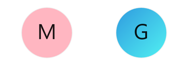
Initials
The initials content type displays the first letter of the user’s name or names in the AvatarView. The initials will be formatted depending on the following InitialsType:
- Single character: Used to display a single character in the avatar.
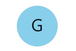
- Double character: Used to display two characters in the avatar.

Custom image
You can set any custom image as the avatar for a user in the WinUI AvatarView control.
Avatar characters
The WinUI AvatarView control supports 25 predefined avatar character images users can set as their avatars.
Group view
The group content type allows you to display up to three images or initials within a single avatar view.
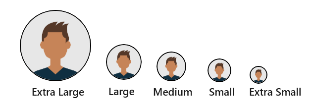
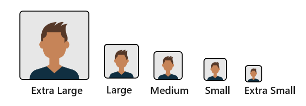
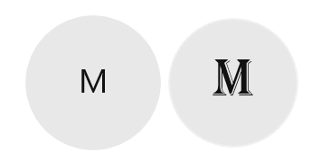
Visual styles
The WinUI AvatarView control comes with various predefined styles following modern design guidelines. It offers a range of sizing specifications for both square- and circle-shaped avatars: extra-large, large, medium, small, and extra-small.
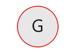
Customization
We can easily customize AvatarView’s border, background, gradient background, font, and more.
Getting started with the WinUI AvatarView control
We have explored the key features of the WinUI AvatarView control. Let’s see how to seamlessly integrate the double-character initial type avatar into your application.
Step 1: Create a WinUI application.
First, create a simple WinUI project using the instructions in the Create an App with the Windows App SDK documentation.
Step 2: Add the Syncfusion.Core.WinUI NuGet package.
Then, install the latest Syncfusion.Core.WinUI NuGet package in the application from NuGet Gallery or the installed location, C:\Program Files (x86)\Syncfusion\Essential Studio®\WinUI\xx.x.x.xx\NuGetPackages.
Note: The xx.x.xx denotes the version of the installed Syncfusion WinUI Core package.
Step 3: Add the namespace.
Include the Syncfusion.UI.Xaml.Core namespace in your XAML file. Refer to the following code.
xmlns:syncfusion="using:Syncfusion.UI.Xaml.Core"
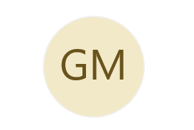
Step 4: Initialize the AvatarView control.
Now, initialize the WinUI AvatarView control with the double-character initial type. Refer to the following code example.
<Page
    x:Class="GettingStarted.MainPage"
    xmlns="http://schemas.microsoft.com/winfx/2006/xaml/presentation"
    xmlns:x="http://schemas.microsoft.com/winfx/2006/xaml"
    xmlns:local="using:GettingStarted"
    xmlns:d="http://schemas.microsoft.com/expression/blend/2008"
    xmlns:mc="http://schemas.openxmlformats.org/markup-compatibility/2006"
    xmlns:syncfusion="using:Syncfusion.UI.Xaml.Core"
    mc:Ignorable="d"
    Background="{ThemeResource ApplicationPageBackgroundThemeBrush}">

 <Grid>
  <syncfusion:SfAvatarView AvatarSize="ExtraLarge"
                           AvatarName="Glenn McGrath"
                           Background="#FFF2E9C8"
                           InitialsType="DoubleCharacter"
                           Foreground="#FF69531C"/>
 </Grid>

</Page>
After executing the code example, we will get the double-character initials avatar like in the following image.
Conclusion
Thanks for reading! In this blog, we explored the features of the new Syncfusion WinUI AvatarView control. This control is available in our 2023 Volume 1 release. Check out our Release Notes and What’s New pages to see all the new updates in this release.
The new version of Essential Studio® is available for the current customers from the license and downloads page. If you are not a Syncfusion customer, try our 30-day free trial to check out our newest features. Try them out and leave your feedback in the comments section below!
You can also download and check out our demo app in the Microsoft Store.
For questions, you can contact us through our support forums, support portal, or feedback portal. We are always happy to assist you!
 No spam, just valuable updates.