
 Sumankumar G
TLDR: Explore the exciting new controls and features added in the Syncfusion Essential JS 2 platforms, namely, JavaScript, Angular, React, Vue, and ASP.NET (Core and MVC) as part of the 2024 Volume 1 release for enhanced app development.
In our 2024 Volume 1 release, we’ve rolled out many new features and components for our Syncfusion Essential JS 2 platforms.
This blog explores those key enhancements, empowering developers to build more interactive and informative apps.
New components
We’ve introduced the following new components in this 2024 Volume 1 release:
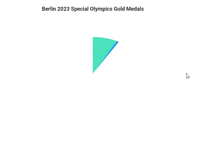
3D Circular Charts (Preview)
The new 3D Circular Charts component provides a graphical representation of data in three dimensions, with each slice’s size indicating its proportion relative to the entire dataset. Unlike traditional 2D charts, 3D charts add depth to visualization, providing a better understanding of data patterns.
Key features
The key features of the 3D Circular Charts are as follows:
- Series: Supports pie and donut types.
- Data binding: Bind with an array of JSON objects or a data manager. In addition to chart series, data labels, and tooltips can also be bound to the data.
- Data labels: Annotate points with labels to improve the readability of data.
- Legends: Provide additional information about points in a customizable and interactive legend.
- User interaction: Add interactive features such as tooltips, rotation, tilt data point, highlight, and selection.
- Print and export: Print directly from the browser and export it in JPEG and PNG formats.
- RTL: Supports right-to-left rendering mode to align tooltips, legends, and data.
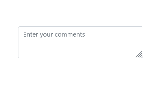
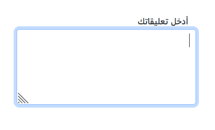
TextArea (Preview)
The new TextArea is a fundamental input element in web development that allows users to input multiple lines of text within a designated area, such as comments, messages, or other lengthy content. This control is an extended version of the HTML text area element, featuring clear icons, a floating label, various sizing options, validation states, and more.
Key features
Let’s explore the key features of the TextArea component!
Floating label
Our floating label feature improves the user experience. When users start typing, the label transitions elegantly above the text area.
Resizing
Dynamically resize the text area according to your needs. With support for resizing handles, users can effortlessly adjust the height and width of the text area, enhancing comfort and usability.
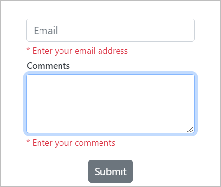
Form support
Seamlessly integrate our TextArea control into any HTML forms for easy data submission and processing. Allow user input within forms and access native form validation mechanisms for enhanced data integrity and user feedback.
Right-to-left (RTL) rendering
The TextArea component now supports right-to-left (RTL) rendering. With this, users can change the text direction and layout from right to left. This improvement enhances user experience and accessibility for users of RTL languages.
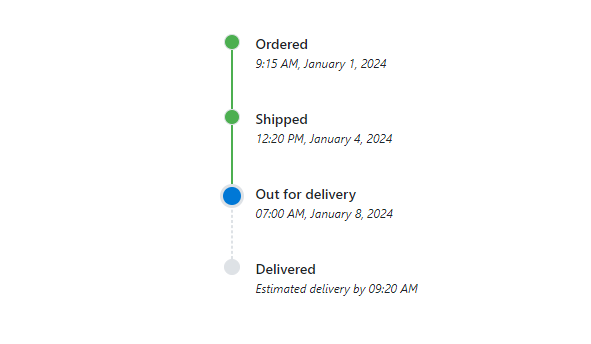
Timeline (Preview)
The new Timeline component enables users to display a series of data chronologically, providing a visually compelling and user-friendly experience. This showcases user activities, tracking progress, narrating historical timelines, and more.
Key features
The key features of the Timeline component are as follows:
- Orientation: Display items in a horizontal or vertical orientation.
- Opposite content: Display additional information opposite to the item content.
- Items alignment: Items’ content and opposite content can be aligned: before, after, alternate, or alternate reverse order.
- Reverse timeline: Show the timeline items in reverse order.
- Templates: Customize the default appearance, including styling the dot item, templated content, and more.
Production-ready components
The following Essential JS 2 components have been developed to meet the industry standards and are marked as production-ready with this 2024 volume 1 release:
What’s new in our existing components?
Let’s look at the new features added to our existing Essential JS 2 components!
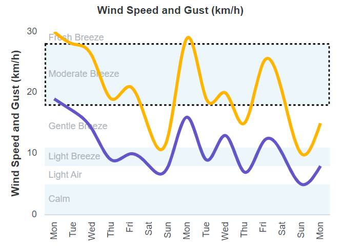
Charts
The Charts component delivers the following new data visualization features:
Strip line dash array
This feature lets users specify the dash array in the charts for all types of strip lines’ borders, including vertical, horizontal, and segmented.
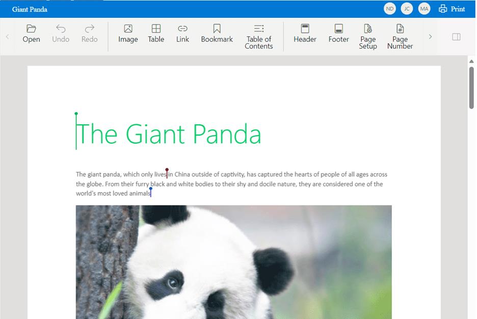
Word Processor
We have rolled out the following new features in the Word Processor component:
Collaborative editing(Preview to production)
With Collaborative editing, multiple users can work on the same document simultaneously. This can be done in real time so that collaborators can see the changes as they are made. Collaborative editing can be a great way to improve efficiency, as it allows team members to work together on a document without waiting for others to finish their changes.
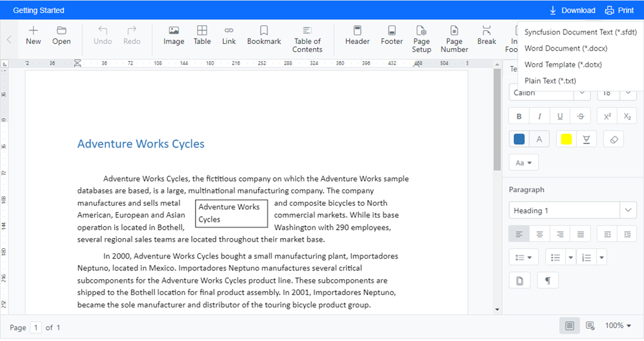
dotx export
The Word Processor now supports saving documents in Word Template (dotx) format. Template files are used in Microsoft Word to create documents with pre-defined formatting and styles. They serve as valuable tools for maintaining consistency, efficiency, and branding in document creation. They provide users with a standardized framework for creating professional-looking documents while saving time and effort.
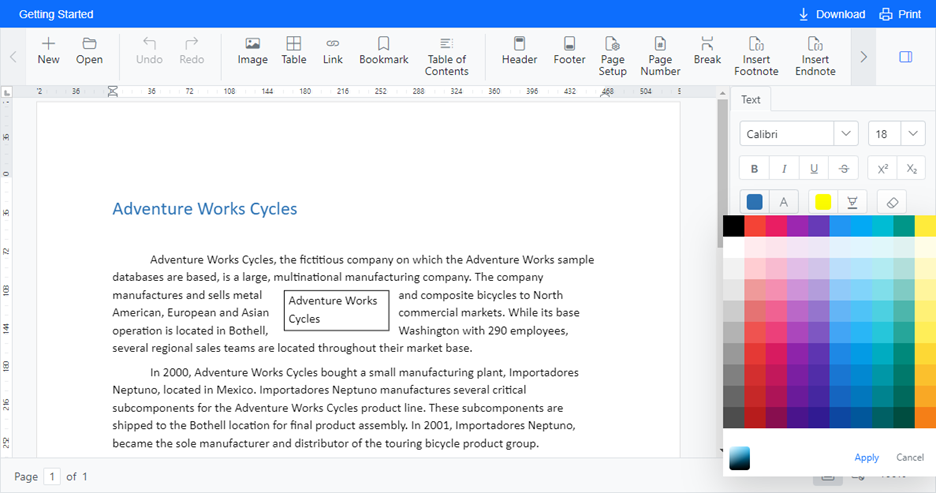
Color picker customization
The color picker used in the Word Processor can now be customized to its default appearance or palette mode, or it can show a mode switcher between the picker and palette.
Mention
Users can now mention other users using the @ character in a Word document, enabling them to easily collaborate, enhance communication, effectively draw attention, seek input, and acknowledge contributors.

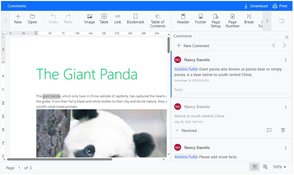
Comments enhancement
The comment resolved state has undergone enhancements to improve user interaction and comprehension within the interface. These improvements entail implementing visual markers that signify the resolution status of comments.
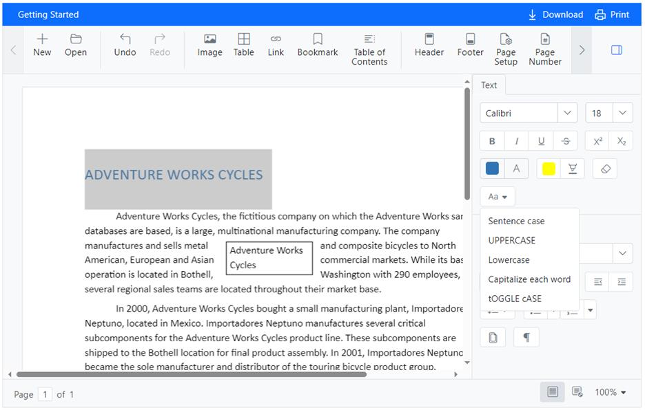
Change case
You can quickly change the capitalization of the selected text without having to retype it. This feature is handy for conforming text to specific style requirements.
- Sentence case: Capitalizes the first letter of the selected text and converts the rest of the text to lowercase.
- Lowercase: Converts all letters in the selected text to lowercase.
- Capitalize each word: Capitalizes the first letter of each word in the selected text.
- Toggle case: Toggles the capitalization of each letter in the selected text. Uppercase letters become lowercase, and lowercase letters become uppercase.
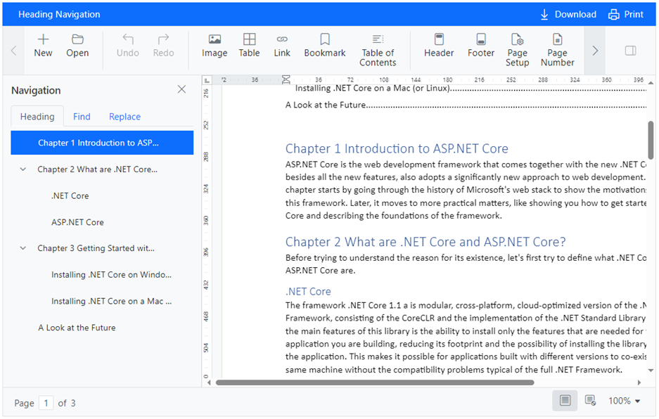
Navigate headings
The Word Processor component now supports navigating the document using headings. If heading styles are applied to the document, those headings will appear in the navigation pane.
Dropdowns
Value as object binding
When AutoComplete, ComboBox, DropDown List, and MultiSelect Dropdown components are bound to a dataset of objects, their values will be objects of the same type.
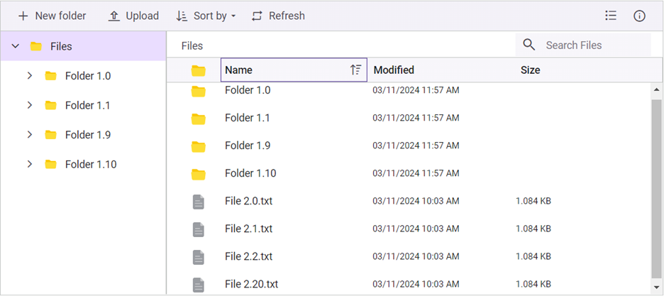
File Manager
Custom sorting
The File Manager provides custom sorting support to override the standard sorting mechanism and tailor it to suit specific app requirements.
Gantt Chart
The new features added to the Gantt Chart are:
Undo and redo support
Users can easily revert or reapply changes made to the Gantt Chart. This feature tracks changes in task scheduling, resource allocation, and other modifications, allowing quick correction of mistakes and refinement of project plans.
Note: For more details, refer to the undo and redo actions in the Gantt Chart component GitHub demos.
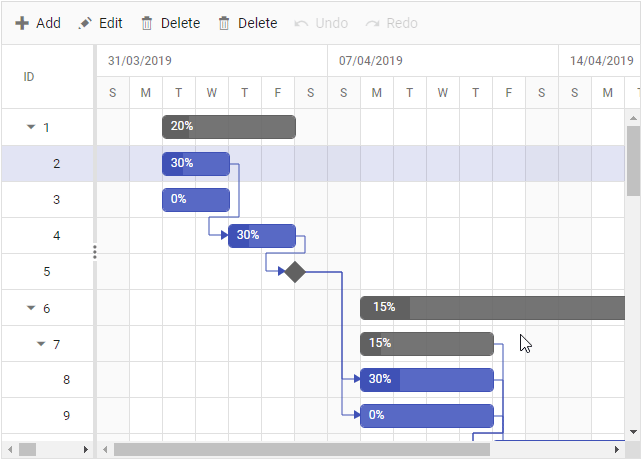
Multi-taskbars in the project view
Visualize multiple child tasks within the parent rows, even when records are collapsed, streamlining navigation and enhancing project understanding.
Note: For more details, refer to the Timeline feature in Gantt Chart GitHub demos.
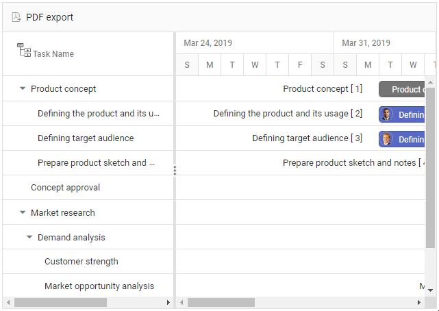
Template support in PDF export
We have enhanced the PDF exporting feature to support various templates, including header, taskbar, and label templates for left and right labels. This enhancement will enable users to customize the appearance and layout of the exported PDF.
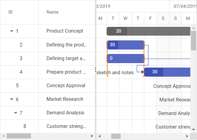
Grid
The new user-friendly features added to the Grid are:
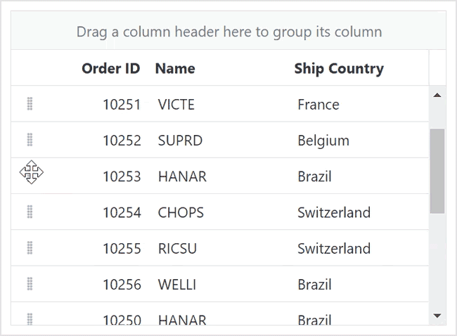
Spanning rows and columns with frozen rows and columns
You can horizontally merge adjacent cells (column spanning) and extend this merging capability across multiple rows (row spanning) even when the Grid’s frozen rows and columns feature is enabled. This enables the creation of a visually appealing and informative layout.
Note: For more details, refer to the column and row spanning in the Grid GitHub demos.
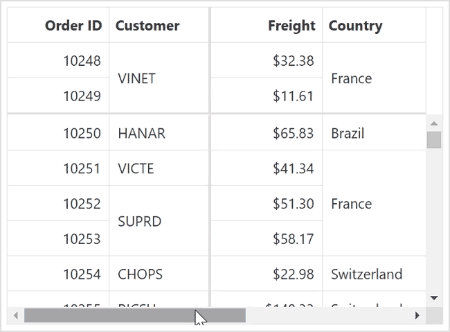
Enhancements in infinite scrolling
Along with the traditional infinite scrolling feature, the new enhancements include compatibility with row drag and drop and column virtualization.
Note: For more details, refer to the infinite scrolling in the Grid GitHub demos.
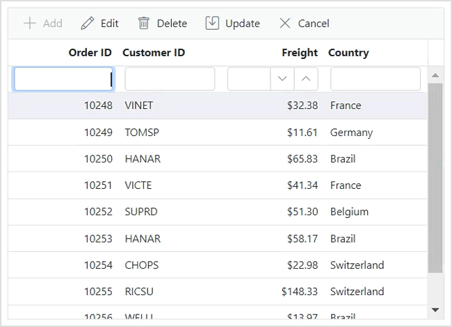
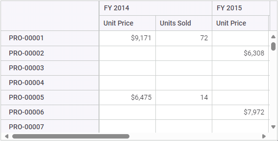
Add new row
The Grid content presents an empty Add New Row edit form during initialization, simplifying adding a new record. We can display the Add New Row option at the Grid’s top or bottom. After completing the form, press the Enter key to add the record, facilitating a seamless process to add successive records.
Note: For more details, refer to the Editing in Grid GitHub demos.
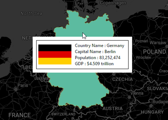
Maps
Tooltip support for polygons
In Maps, tooltips and tooltip templates can be displayed for polygon shapes. Tooltip templates can include custom items like images, text, and HTML elements.
Multiselect Dropdown
Virtual scrolling
The MultiSelect Dropdown component’s virtual scrolling support enables users to navigate vast lists of options efficiently without loading all the items at once, enhancing the user experience.
PDF Viewer
The new features added to the PDF Viewer component are as follows:
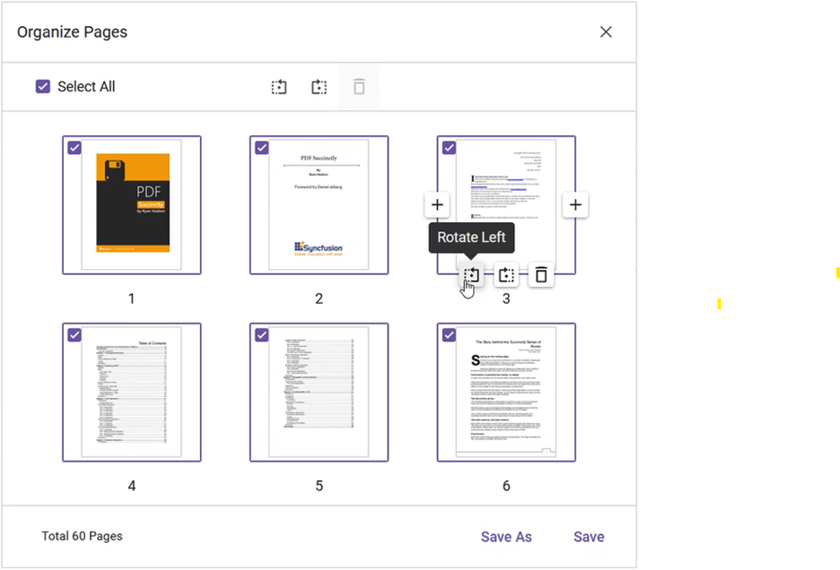
Organize pages
Managing PDF documents is now easier and more intuitive than ever with the new organize pages feature. Here’s what this powerful new feature can do:
- Rotate pages: You can rotate pages clockwise and counterclockwise directions, ensuring your document looks exactly the way you want.
- Insert new pages: Seamlessly integrate additional content into your PDF document by adding new pages wherever needed. Whether adding a new section or including supplementary material, inserting pages has never been easier.
- Delete pages: Streamline the document management process by removing unnecessary pages easily. Select the pages to be deleted, and with a click, they are gone, helping you keep PDFs tidy and organized.
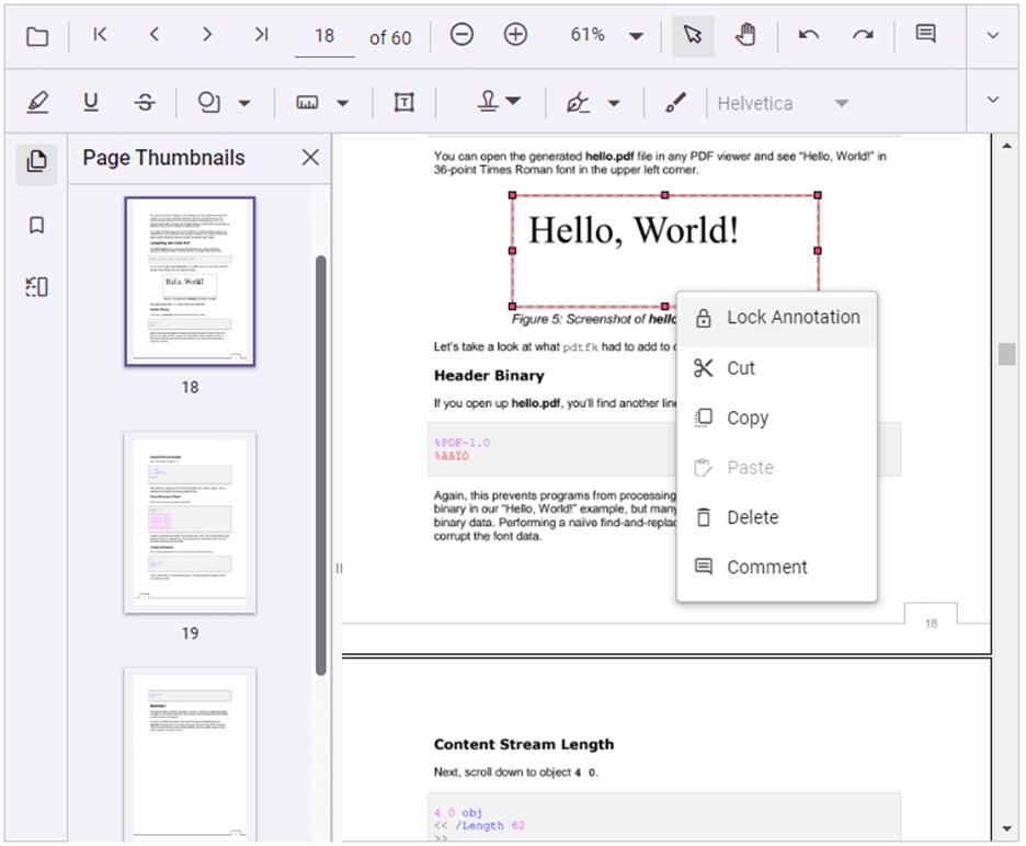
Customize context menu
Users can personalize the context menus on PDF pages, annotations, and form fields. This feature allows users to add new menus above or below the existing ones while also providing the option to hide the default menus.
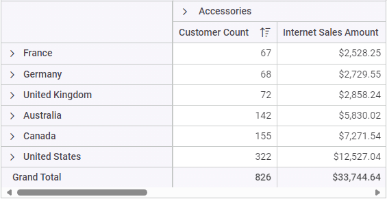
Pivot Table
We have rolled out the following new features for the Pivot Table component:
Single-page mode
This support allows the Pivot Table to render only the rows and columns relevant to the current view page when virtual scrolling is enabled. This optimization significantly improves the performance of the Pivot Table during initial rendering and when performing UI actions, such as, drilling up/down, sorting, filtering, and more.
Value sorting (OLAP)
This feature enables users to sort individual measures and their aggregated values in the OLAP cube-linked Pivot Table in ascending and descending order. It can be performed through code-behind or UI action by directly clicking the value header present on the Pivot Table’s row or column axis.
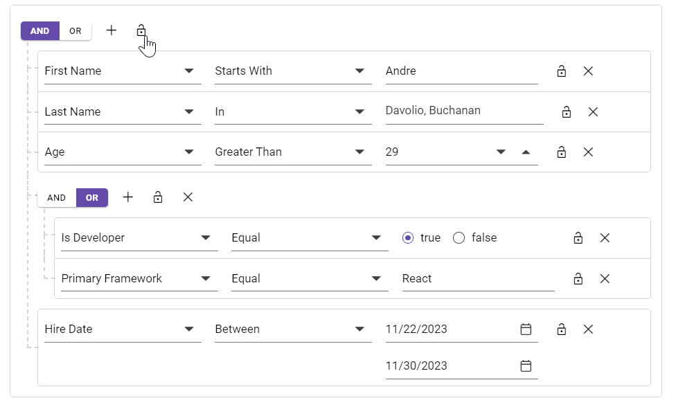
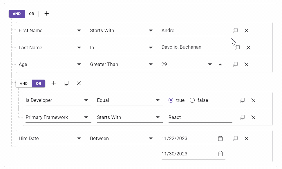
Query Builder
The Query Builder component delivers the following new features:
Advanced query types
The Query Builder has been expanded to accommodate new query types, including Mongo, parameterized SQL, and named parameter SQL, to improve query functionality.
Lock support
The lock option is available for rules and groups. When a rule is locked, the field, operator, and value are disabled. When a group is locked, all the elements within the group are disabled.
Clone support
The clone option is available for rules and groups. It will create a replica of a rule or group next to the original.
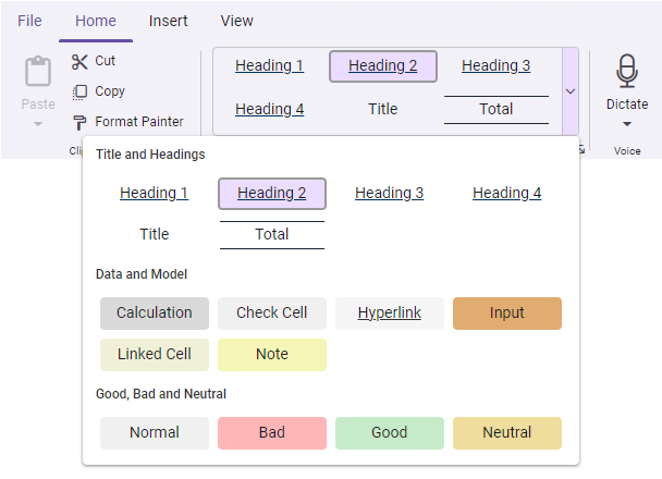
Ribbon
The new vivid features added to the Ribbon are as follows:
New built-in gallery item
In addition to the existing built-in items, a new gallery item has been added to the Ribbon control. It allows users to perform specific actions by displaying a collection of related items, including icons, content, or images.
Contextual tabs
This feature allows users to display the ribbon tabs on demand based on their needs. Like the regular ribbon tabs, it supports adding all built-in and custom ribbon items to execute specific actions.
KeyTips support
This feature lets users quickly access the tabs or ribbon items using the defined unique key tips (up to 3 characters). To show the KeyTips, press Alt + Windows/Command keys, and close or traverse back by pressing the Esc key.
Spreadsheet
The new features added to the Spreadsheet are:
Culture-based argument separator
The Spreadsheet now recognizes the culture-based argument separator in the formulas. For example, Excel files use semicolons (;) as argument separators for formulas instead of commas (,) in the German culture.
Culture-based formatted numeric
Now, Spreadsheet allows users to pass numeric values with culture-based decimal separators as arguments to formulas.
Conclusion
Thanks for reading! This article highlights the latest enhancements and additions in the Syncfusion Essential JS 2 platforms for the 2024 Volume 1 release. We encourage you to try these user-friendly updates and provide your valuable feedback in the comments below.
To discover more about the features available in this release, please visit our Release Notes and What’s New pages.
If you are an existing customer, you can access the new version of Essential Studio® from the License and Downloads page. For new customers, we offer a 30-day free trial so you can experience the full range of available features.
If you have questions, you can contact us through our support forum, support portal, or feedback portal. We are always happy to assist you!
 No spam, just valuable updates.