
 Sivakumar R
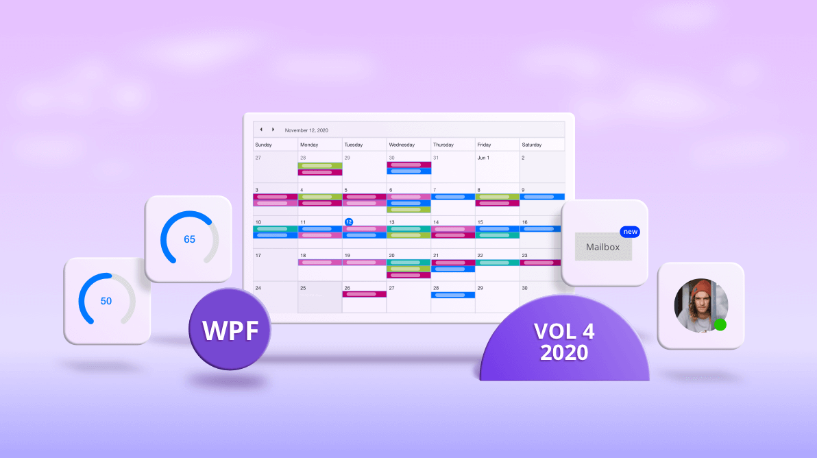
In the Essential Studio® 2020 Volume 4 release, Syncfusion has exciting new controls and updates in almost all its supported platforms. In this blog, we are going to look at the updates to the WPF controls.
.NET 5 support
Syncfusion WPF controls are now compatible with .NET 5.0. You can check out .NET 5.0 demos from the app center.
New Badge control (preview)
The new Badge control is a notification control that can be used anywhere with other controls like Button, Ribbon, and ListView. The Badge control can be used to notify users of messages via a simple, elegant badge view over any control. The Badge control ships with predefined shapes, contextual color variants, custom positioning, and more customization options. Check out the Badge control documentation for more details.
Themes
With the 2020 Vol. 4 release, a new Office2019 high contrast white theme can be used for both framework and Syncfusion controls. You can customize this theme using Theme Studio like the other themes. There’s also a new system theme in Theme Studio for customization.
Scheduler
With this release, Scheduler is marked production-ready and the following new features and enhancements have been added.
Load on demand
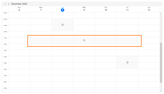
WPF Scheduler now lets you load appointments on demand for just the visible date range with a built-in loading indicator, all in MVVM standard. Loading appointments on demand improves loading performance when loading millions of appointments ranging multiple years. Check out our documentation for more details.

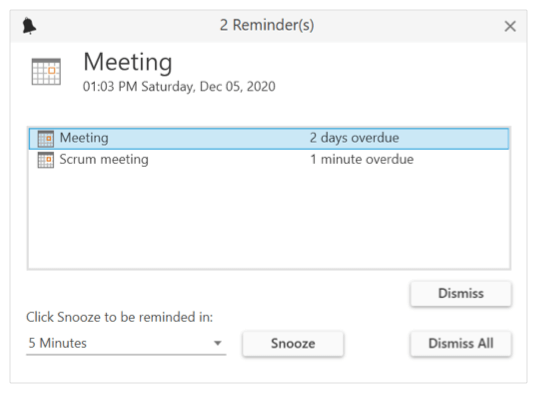
Reminders
Now, you can configure reminders for each appointment where alerts will be displayed before the appointment’s start time.
Timeline week, workweek, and month views
Now, WPF Scheduler has support for the following new views:
- Timeline week view
- Timeline workweek view
- Timeline month view
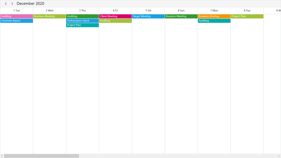
Check out our documentation for more details.
Merge adjacent special time regions
Merge adjacent special time regions and show them as a single region instead of separately for each day in week and workweek views.
Diagram
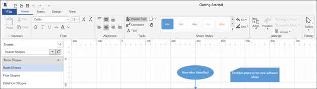
New Diagram ribbon
The new Diagram ribbon is a predefined, fully customizable, and ready-to-use ribbon control that provides commands and tools to the WPF Diagram control and its elements. These commands and tools include saving and loading diagrams, printing, and exporting to an image, formatting text within diagram shapes, and customizing the appearance of diagram shapes.
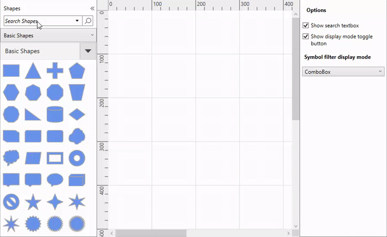
Stencil improvements
Stencil plays an important part for the end-users when creating diagrams. We have improved its user experience with the following enhancements:
- Search for symbols from the collection of symbol groups and categories.
- Specify a title for the stencil.
- Switch the symbol filter display mode to either combo box or list view.
- Use compact and expanded stencil display modes.
Navigation Drawer
With this release, we have added built-in UI elements and following enhancements to design modern navigation views using WPF Navigation Drawer:
- Compact and extended display modes.
- Built-in toggle button, items, and footer items.
- Tab, button, header, and separator types of items can be added into items and footer items. Also, you can add subitems like tree view.
Ribbon
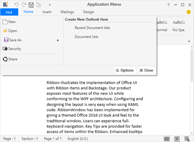
Application menu
The WPF Ribbon control provides an application menu in all themes that contains standard commands based on Windows Explorer. The menu appears when the user clicks the file or backstage button.
Backstage: placement support
Previously, the backstage opened and closed only when the Ribbon was placed within the RibbonWindow. Now, it opens or closes within any window or placement target specified by the users. Backstage also opens under the Ribbon tab or occupies the window or placement target’s entire client area. With this enhancement, now you can host the Ribbon anywhere in an application seamlessly.
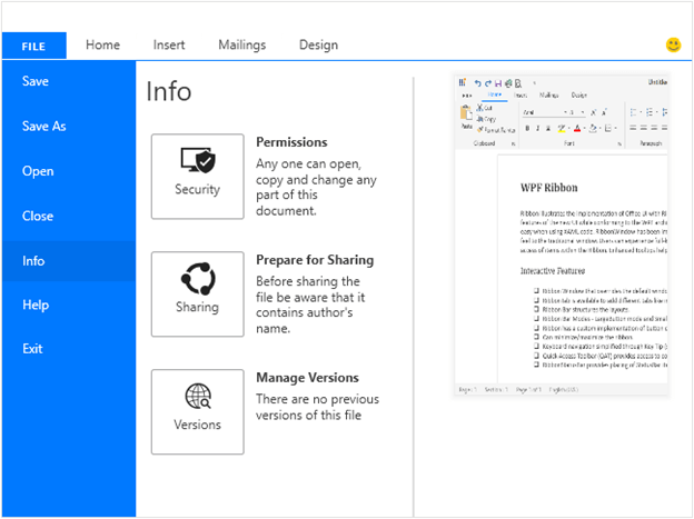
Backstage: animation support
Previously, the backstage opened and closed with scale transition only. Now, you can choose from different types of animations such as fade, scale, and zoom. You can also customize the animation duration.
RichTextBox
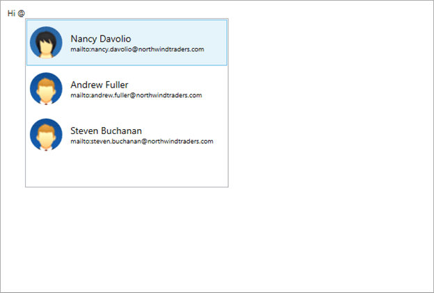
Auto suggestion support
The WPF RichTextBox (a.k.a. word editor) now supports showing word suggestions when typing special symbols. For example, now you can select a person from suggestions shown automatically by typing the @ symbol.
StepProgressBar
Secondary content
Secondary content support has been provided for the StepProgressBar.

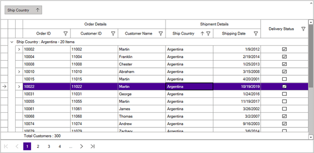
DataGrid
Synchronize data operations with ICollectionView
Now, DataGrid allows you to synchronize data operations, such as filtering, sorting, and grouping, of an ICollectionView bound to the ItemsSource.
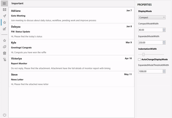
TreeView
Delete selected nodes
Now, users can delete one or more selected nodes by pressing the Delete key on the keyboard.
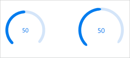
ProgressBar
Corner radius
Corner radius support has been provided for the active track of the circular progress bar.
Breaking changes
The SkinStorage-based themes have been moved from Syncfusion.Shared.WPF and Syncfusion.Tools.WPF to Syncfusion.Shared.WPF.Classic and Syncfusion.Tools.WPF.Classic assemblies, respectively. From this release, add Syncfusion.Shared.WPF.Classic and Syncfusion.Tools.WPF.Classic assembly references to the application references if you are applying themes using SkinStorage. It’s recommended to use skin manager-based themes.
If you have directly imported the themes .xaml files in your application, refer to the xaml file path changes link for those changes.
For more details, please refer to the release notes.
Conclusion
I hope you enjoyed learning about the new controls and features in our WPF platform that are available in the 2020 Volume 4 release. You can explore working samples of our WPF controls from this GitHub location. In addition, our demos are available in Microsoft Store and .NET Core demos are available in the app center.
For current customers, the new version is available for download from the License and Downloads page. If you are not yet a Syncfusion customer, you can try our 30-day free trial to check out our newest features.
If you need new features in our WPF controls, please let us know in the comments section below. You can also contact us through our support forums, Direct-Trac, or feedback portal. We are always happy to assist you!


 No spam, just valuable updates.