
 Selva Ganapathy Kathiresan
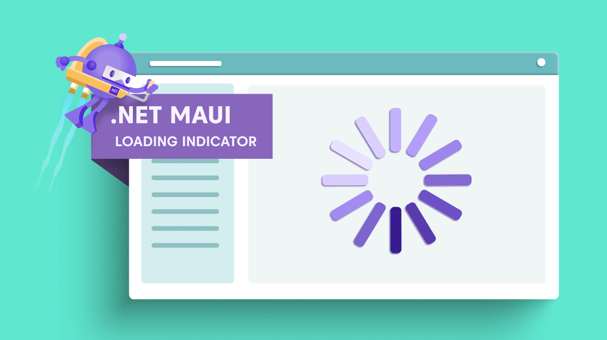
Almost all mobile apps contain a complex user interface that loads a huge amount of data and usually needs a loading indicator.
We at Syncfusion understand the requirement for this simple but essential function and now delivered the lightweight .NET MAUI Busy Indicator ( Loading Indicator) control. This control is available in our 2022 Volume 2 release.
In this article, we’ll summarize the key features of the .NET MAUI Busy Indicator control.
Getting Started with .NET MAUI Busy Indicator control
Let’s see the steps to configure the .NET MAUI Busy Indicator (SfBusyIndicator) control in a real-time scenario and some of the customization features available in it.
Step 1: Add the .NET MAUI Busy Indicator reference.
The Syncfusion .NET MAUI controls are available in NuGet Gallery. To add SfBusyIndicator to your project, open the NuGet package manager in Visual Studio, and search for Syncfusion.Maui.Core and then install it.
Step 2: Handler registration.
In the MauiProgram.cs file, register the handler for Syncfusion core.
using Microsoft.Maui;
using Microsoft.Maui.Hosting;
using Microsoft.Maui.Controls.Compatibility;
using Microsoft.Maui.Controls.Hosting;
using Microsoft.Maui.Controls.Xaml;`using Syncfusion.Maui.Core.Hosting;`namespace MauiSample
{
  public static class MauiProgram
  {
    public static MauiApp CreateMauiApp()
    {
       var builder = MauiApp.CreateBuilder();
       builder
       .UseMauiApp<App>()
       .`ConfigureSyncfusionCore()`.ConfigureFonts(fonts =>
       {
          fonts.AddFont("OpenSans-Regular.ttf", "OpenSansRegular");
       });return builder.Build();
}}}
Step 3: Add the namespace.
Now, add the following namespace in your XAML page.
xmlns:core="clr-namespace:Syncfusion.Maui.Core;assembly=Syncfusion.Maui.Core"
Step 4: Initialize the SfBusyIndicator
Then, create an instance for the SfBusyIndicator, and add it as content as per your requirement.
<core:SfBusyIndicator></core:SfBusyIndicator>
Step 5: Add content.
Now, you can add an image, button, label, or any view to the SfBusyIndicator using the Content property.
<core:SfBusyIndicator >
  <Button Text="Load" WidthRequest="120" HeightRequest="60"/>
</core:SfBusyIndicator>
Step 6: Show Busy Indicator.
Finally, set the IsRunning property to show or hide the loading indicator control.
<core:SfBusyIndicator IsRunning="True">
  <Button Text="Load" WidthRequest="120" HeightRequest="60"/>
</core:SfBusyIndicator>
Thus, we have configured the .NET MAUI Busy Indicator control. Let’s look at the features available in it.
Animation types
Currently, the .NET MAUI Busy Indicator supports three built-in animations that can be shown in your applications. We will provide more animation types in our upcoming releases.
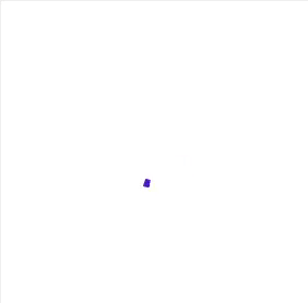
Circular Material loading indicator
The .NET MAUI Busy Indicator control provides support for circular Material-like animation. Refer to the following code example.
<core:SfBusyIndicator AnimationType="CircularMaterial" IsRunning="True"/>
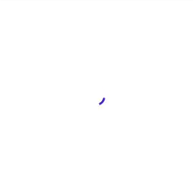
Linear Material loading indicator
You can also use linear Material line animation.
<core:SfBusyIndicator AnimationType="LinearMaterial" IsRunning="True"/>
Cupertino loading indicator
You can also enjoy Cupertino-like animation.
<core:SfBusyIndicator AnimationType="Cupertino" IsRunning="True"/>

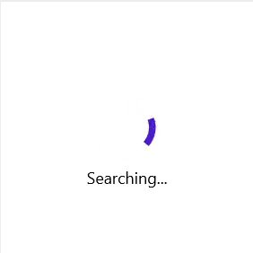
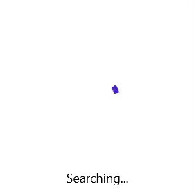
.NET MAUI Busy Indicator Title
You can also show additional information by showing a title. Refer to the following code example.
<core:SfBusyIndicator Title="Searching..." IsRunning="True"/>
Customization
You can customize the .NET MAUI Busy Indicator control in the following ways:
Indicator animation speed customization
You can customize the indicator speed by setting the factor values from 0 to 1.
<core:SfBusyIndicator DurationFactor="1" IsRunning="True"/>
Indicator size customization
The Indicator size can also be customized by setting the factor values from 0 to 1.
<core:SfBusyIndicator SizeFactor="0.2" IsRunning="True"/>
Title customization
You can customize the position, space, and fonts of the title in the loading indicator.
Position
We can place the title either at the top or bottom of the indicator animation.
<core:SfBusyIndicator Title="Searching..." TitlePlacement="Top" IsRunning="True"/>

Spacing
Customize the space between the title and the indicator animation.
<core:SfBusyIndicator Title="Searching..." TitleSpacing="50" IsRunning="True"/>
Fonts
You can customize the font family, attributes, and size of the title.
<core:SfBusyIndicator Title="Searching..." FontSize="18" FontAttributes="Italic" IsRunning="True"/>

Color customization
You can perform the following color customizations in the .NET MAUI Busy Indicator control.
Indicator color
The indicator color can be customized. Refer to the following code example.
<core:SfBusyIndicator Title="Searching..." IsRunning="True" IndicatorColor="Red" />

Title color
You can set a required color to the title, too.

Overlay color
Either solid or gradient color can be set to the overlay of the .NET MAUI Busy Indicator control.
Solid
Refer to the following code example to set a solid color as an overlay color.
<core:SfBusyIndicator Title="Searching..." IsRunning="True" IndicatorColor="White" OverlayFill="#512BD4" TextColor="White"/>

Gradient
Refer to the following code example to set a gradient color as an overlay color.
<core:SfBusyIndicator Title="Searching..." IsRunning="True" IndicatorColor="#e64c93">
 <core:SfBusyIndicator.OverlayFill>
  <RadialGradientBrush>
   <GradientStop Color="#44e64c93"
                 Offset="0.1" />
   <GradientStop Color="#AA9d40db"
                 Offset="1.0" />
  </RadialGradientBrush>
 </core:SfBusyIndicator.OverlayFill>
</core:SfBusyIndicator>
GitHub reference
Also, you can check out the examples for .NET MAUI Busy Indicator (Loading Indicator) control on GitHub.
Conclusion
Thanks for reading! In this blog, we have seen the vivid features of the new .NET MAUI Busy Indicator (Loading Indicator) control available in our 2022 Volume 2. You can also download our free evaluation to see all these controls in action.
If you have any questions or require clarification about these controls, please let us know in the comments below. You can also contact us through our support forum, support portal, or Feedback Portal. We are always happy to assist you!


 No spam, just valuable updates.
Comments (1)
very good!