
Charts are wonderful data visualizing tools. They can easily show even a huge volume of complex data within a single window. Still, to make a chart appealing, it is necessary to customize the appearance of its elements.
Syncfusion Flutter Charts is a well-crafted charting widget for visualizing data. It contains a rich gallery of 30+ charts and graphs, ranging from line to financial charts, that cater to all charting scenarios. It provides options to customize each element in it so that we can easily design our charts as desired.
An axis is a significant element in a chart. Typically, there are two axes: x and y. We can plot the values (x-axis) for the corresponding categories (y-axis). Well-designed axes clearly convey data meaning, thus enhancing the readability and appearance of the chart.
In this blog, I am going to walk you through all the major features and customizing options available for the axes in the Syncfusion Flutter Charts widget.
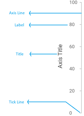
Axis elements
First, let’s have a look at the axis elements in the Flutter Charts widget:
- Axis line
- Axis title
- Major and minor grid lines
- Major and minor tick lines
- Axis labels
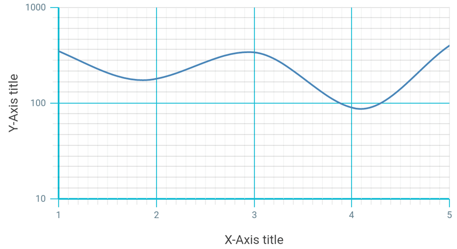
In the following code example, we are customizing the axes elements in the Flutter Charts.
SfCartesianChart(

            // X-axis customization.
            primaryXAxis: NumericAxis(
                    //Customize the axis line.
                    axisLine: AxisLine(color: Colors.cyan, width: 2),

                    //Grid line customization.
                    majorGridLines:
                        MajorGridLines(color: Colors.cyan, width: 1),

                    //Minor grid line customization.
                    minorGridLines:
                        MinorGridLines(color: Colors.black12, width: 1),

                    //Major tick line customization.
                    majorTickLines:
                        MajorTickLines(color: Colors.cyan, size: 10),

                    //Minor tick line customization.
                    minorTickLines:
                        MinorTickLines(color: Colors.black12, size: 7),


                    //Axis title customization.
                    title: AxisTitle(text: 'X-Axis title'),

                    //Axis label customization.
                    labelStyle: TextStyle(color: Colors.blueGrey, fontSize: 11),
               ),

               // Y-axis customization.
               primaryYAxis: LogarithmicAxis(

                    //Customize the axis line.
                    axisLine: AxisLine(color: Colors.cyan, width: 2),

                    //Major grid line customization.
                    majorGridLines:
                        MajorGridLines(color: Colors.cyan, width: 1),

                    //Minor grid line customization.
                    minorGridLines:
                        MinorGridLines(color: Colors.black12, width: 1),

                    //Major tick line customization.
                    majorTickLines:
                        MajorTickLines(color: Colors.cyan, size: 10),

                    //Minor tick line customization.
                    minorTickLines:
                        MinorTickLines(color: Colors.black12, size: 7),

                    //Axis title customization.
                    title: AxisTitle(text: 'Y-Axis title'),

                    //Axis label customization.
                    labelStyle:
                        TextStyle(color: Colors.blueGrey, fontSize: 11)
                ),
)
Axes customization features
Opposed axis
By default, the horizontal and vertical axes are at the bottom and left sides of a chart, respectively. If you wish to put the axes in the opposite positions, then you can do so using the opposedPosition property of the respective axes. If you set this property to true, then the horizontal axis will be positioned at the top and the vertical axis will be positioned on the right side of the chart.
Refer to the following code example.
SfCartesianChart(
                primaryXAxis: NumericAxis(
                          opposedPosition: true
                ),
                primaryYAxis: NumericAxis(
                       opposedPosition: true,
                )
)
Note: For more details, refer to the Opposed axes in the Flutter Charts demo.
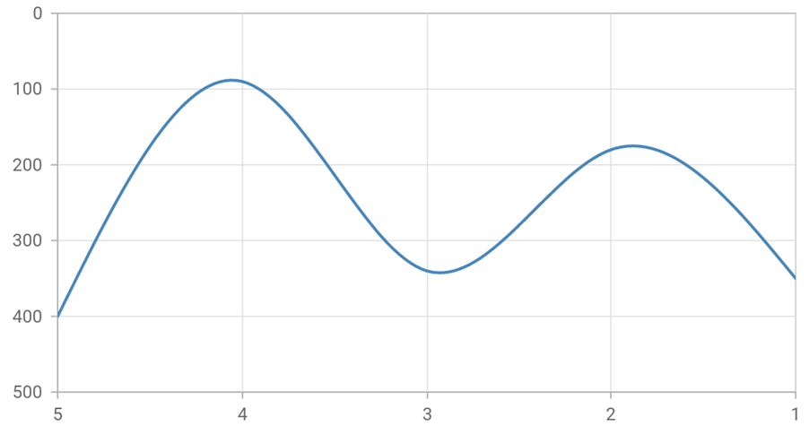
Inversed axis
Also, we can easily invert an axis using the isInversed property. This property enables us to render the horizontal axis from right to left and the vertical axis from top to bottom.
By default, the Flutter Charts renders the horizontal axis from left to right and the vertical axis from bottom to top.
Refer to the following code example.
SfCartesianChart(
                primaryXAxis: NumericAxis(
                          isInversed: true
                ),
                primaryYAxis: NumericAxis(
                       isInversed: true,
                )
)
Axis crossing
You can place the axis wherever in the plot area using the crossesAt property. This is used to place the axis crossing on another axis based on the value.
Refer to the following code example.
SfCartesianChart(
                primaryXAxis: NumericAxis(
                         crossesAt: 250
                ),
                primaryYAxis: NumericAxis(
                       crossesAt: 3
                )
)
Also, you can position the axis labels out of the plot area by setting the placeLabelsNearAxisLine property to false.
Note: For more details, refer to the Axis crossing in the Flutter Charts demo.
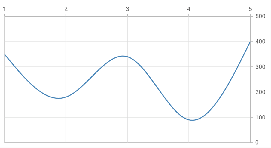
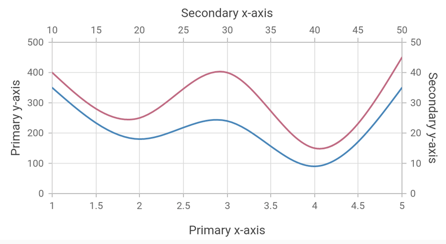
Multiple axes
You can add n number of additional axes to the Flutter Charts using the axes property. Then, associate them with a series by specifying the name of the axis in the xAxisName for the horizontal axis and yAxisName for the vertical axis in the series.
Refer to the following code example.
SfCartesianChart(
                primaryXAxis: NumericAxis(
                  title: AxisTitle(text:'Primary x-axis')
                ),

                primaryYAxis: NumericAxis(
                  title: AxisTitle(text:'Primary y-axis')
                ),

                axes: [
                  NumericAxis(
                    name:'xAxis',
                    title: AxisTitle(text:'Secondary x-axis'),
                    opposedPosition: true
                  ),
                   NumericAxis(
                    name:'yAxis',
                    title: AxisTitle(text:'Secondary y-axis'),
                    opposedPosition: true
                  )
                ],
                series: <ChartSeries<_ChartData, dynamic>>[
                  SplineSeries<_ ChartData, dynamic>(
                    dataSource: chartData,
                    xValueMapper: (_ChartData data, _) => data.x,
                    yValueMapper: (_ChartData data, _) => data.y,
                  ),

                  SplineSeries<_ ChartData, dynamic>(
                    dataSource: chartData2,
                    xValueMapper: (_ChartData data, _) => data.x,
                    yValueMapper: (_ChartData data, _) => data.y,

                    //Bind the x-axis to secondary x-axis.
                    xAxisName: 'xAxis',

                    //Bind the y-axis to secondary y-axis.
                    yAxisName: 'yAxis'
                  )]
            )
Note: For more details, refer to the Multiple axes in the Flutter charts demo.
Axis Animation
Flutter Charts allow you to animate the axis element using the enableAxisAnimation property. If you enable this property, all the axis elements will be animated when the axis’s visible range is changed dynamically. The visible range of the axis will change while zooming, panning, or updating the data points.
Refer to the following code.
SfCartesianChart(
      enableAxisAnimation: true
)
Note: For more details, refer to the Axis animation in the Flutter Charts demo.
Axis label customization features
Handling label collision
Flutter Charts smartly handles axis label collision, when they overlap with each other. Using the labelIntersectAction property, you can hide, wrap, and rotate the labels to 45 or 90 degrees. This can be useful in space constraint scenarios.
Refer to the following code example.
SfCartesianChart(
                primaryXAxis: NumericAxis(
         labelIntersectAction: AxisLabelIntersectAction.rotate45
                )
)
Note: For more details, refer to the Handling label collision in the Flutter Chart demo.
Edge label placement
Labels near the borders of an axis with extended text may appear partially outside the chart. To avoid partial labels appearing at the corners, utilize the edgelabelPlacement property. With this, you can easily hide or shift the edge labels.
SfCartesianChart(
                primaryXAxis: NumericAxis(
                       edgeLabelPlacement: EdgeLabelPlacement.shift
                ),
                primaryYAxis: NumericAxis(
                       edgeLabelPlacement: EdgeLabelPlacement.shift
                )
)
Note: For more details, refer to the Edge label placement in the Flutter Charts demo.
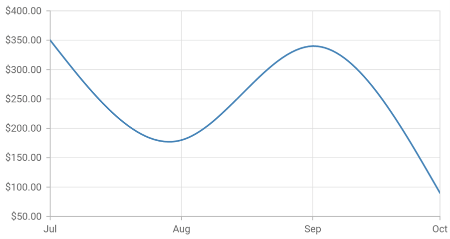
Label format
The globalized format is important when we use an application. Here, Charts provide an efficient way to format the axis labels. You can easily format the numbers and date-time values using the numberFormat and dateFormat properties, respectively.
//Import intl to use date and number formats.
import 'package:intl/intl.dart';

SfCartesianChart(
                primaryXAxis: DateTimeAxis(
                       dateFormat: DateFormat.MMM()
                ),
                primaryYAxis: NumericAxis(
                       numberFormat: NumberFormat.simpleCurrency()
                )
)
Label position
You can reduce the space occupied by the axis labels or move the axis labels anywhere inside the plot area using the labelPosition property. You may also move the tick line inside the plot area using the tickPosition property.
SfCartesianChart(
                primaryXAxis: NumericAxis(
                       labelPosition: ChartDataLabelPosition.inside,
                       tickPosition: TickPosition.inside
                ),
)
Label rotation
If the axis labels are so lengthy, you may rotate the labels to view them better with the labelRotation property. You can rotate the labels by specifying the required degree.
SfCartesianChart(
                primaryXAxis: NumericAxis(
                       labelRotation: 90
                )
)
Maximum width for labels
If you render a bar chart with lengthy labels, the entire label will be visible, but the chart seems to be small. So, to avoid this, you can specify the maximum width for axis labels with the maximumLabelWidth property.
If the axis label width exceeds the provided width, then it will be trimmed. An ellipsis (…) will be added at the end of the label and a tooltip will be shown while tapping or hovering the trimmed labels.
SfCartesianChart(
                primaryXAxis: NumericAxis(
                       maximumLabelWidth: 90
                )
)
Note: For more details, refer to the Maximum width for the labels demo.
Fixed width for axis labels
Also, you can specify the width for axis labels using the labelsExtent property. But here, the width represents the space between the axis line and the axis title. If an axis label width exceeds the provided width, then the axis label gets trimmed, and an ellipsis will be added. A tooltip will be shown on tapping or hovering over the trimmed labels.
SfCartesianChart(
                primaryXAxis: NumericAxis(
                       labelsExtent: 90
                )
)
Note: For more details, refer to the Enable label extent demo.
Additional axis elements
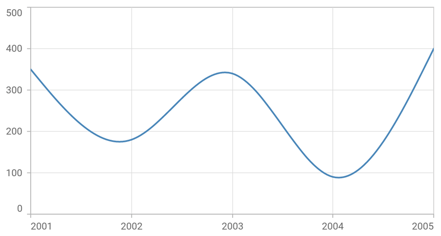
Plot bands
You can highlight a specific range in the plot area using the plot band ( stripline). This feature is used to shade the different ranges in the plot area, which will further enhance the readability of the chart.
SfCartesianChart(
       primaryXAxis: NumericAxis(
           plotBands: <PlotBand>[
                  PlotBand(
                      start: 2001,
                      end: 2002,
                      text: 'Segment 1',
                      color: const Color.fromRGBO(101, 199, 209, 1)),
                  PlotBand(
                      start: 2002,
                      end: 2003,
                      text: 'Segment 2',
                      color: const Color.fromRGBO(254, 213, 2, 1)),
                  PlotBand(
                      start: 2003,
                      end: 2004,
                      text: 'Segment 3',
                      color: const Color.fromRGBO(140, 198, 62, 1)),
                  PlotBand(
                      start: 2004,
                      end: 2005,
                      text: 'Segment 4',
                      color: const Color.fromRGBO(217, 112, 1, 1))
                ]
        )
)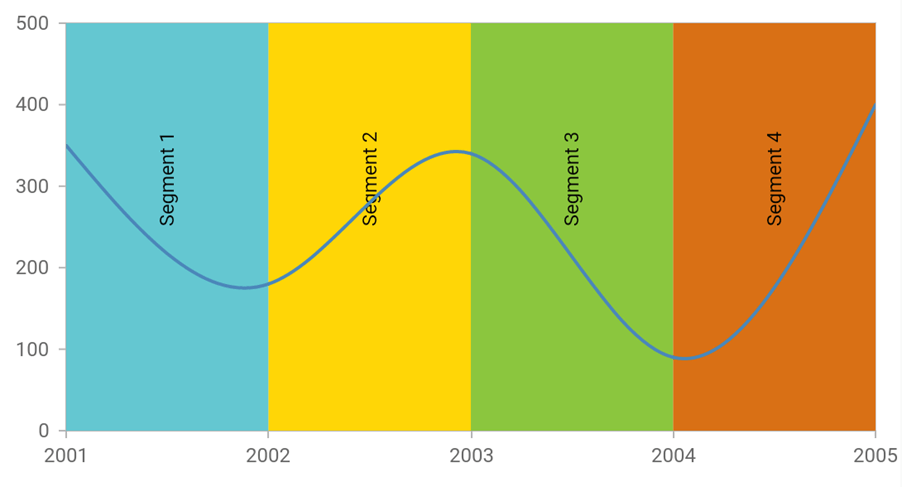
Note: For more details, refer to the Plot bands in the Flutter Charts demo.
Plot band recurrence
Also, you can mark an event that occurs recursively by enabling the plot band to be drawn repeatedly at regular intervals.
SfCartesianChart(
       primaryYAxis: NumericAxis(
           plotBands: <PlotBand>[
                  PlotBand(
                      isRepeatable: true,
                      repeatEvery: 100,
                      size: 50,
                      start: 0,
                      end: 100,
                      repeatUntil: 500,
                      shouldRenderAboveSeries: false,
                      color: Colors.grey.shade300
                  )
            ]
      )
)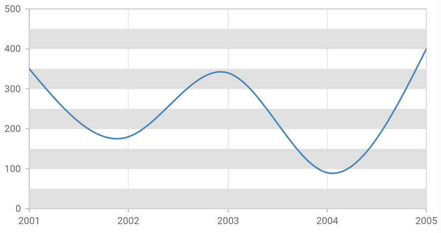
Note: For more details, refer to the Plot band recurrence demo.
Conclusion
Thanks for reading! I hope you are now more aware of all the axes features and customizing options available in Syncfusion Flutter Charts. With these features, you can enhance the appearance and readability of the data in your charts. Try them out, post any questions, and let us know which axis feature is useful for your scenario in the comments section below.
Browse our documentation to learn more about our other Flutter widgets. You can also see our Syncfusion Flutter app with many examples in this GitHub repo. Don’t miss our demo app in Google Play, App Store, Web, Windows Store, macOS, and Snapcraft (Linux).
If you aren’t a customer yet, you can try our 30-day free trial to check out these features.
You can also contact us through our support forum, feedback portal, or Direct-Trac support system. We are always happy to assist you!


 No spam, just valuable updates.